
Blue Birthday
Posted: March 26, 2024 Filed under: banner blooms, banner blooms cut out dies, Dies, exquisite envelope, online class, Penny Black | Tags: online class, Penny Black creative dies, Penny Black stamps, Ranger Distress inks 6 Comments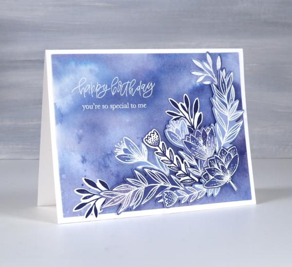
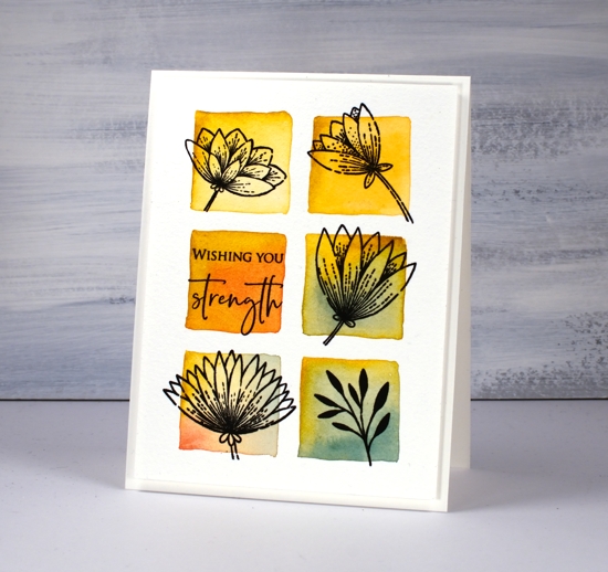
Blue is my favourite colour and the different hues seen on this card are examples of why it appeals to me so much. I tend to prefer the blues that are a little bit purply but I like the teal blues as well.
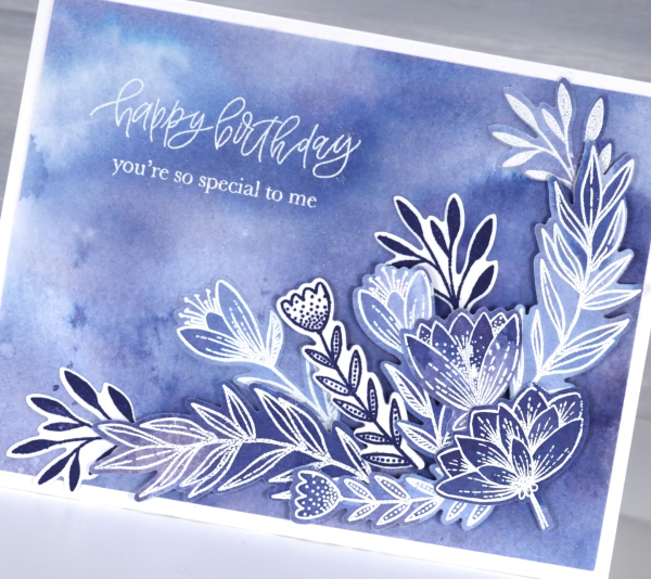
All the blues on the card are made from one ink, chipped sapphire distress ink. If you watercolour with your dye inks you have probably noticed that some inks separate into different hues when diluted. I thought I would share this card today because it features in one of the lessons in my Colour Clues online course. Colour Clues is a card making course which covers colour blending, contrast, separation and mixing. I created a 40% discount for all my online courses back on February 29, mentioned it in a blog post then forgot about it! That’s why I’ve been featuring it more this week. The discount code LEAPYEAR40 is active until the end of March 28 which is now two days away.
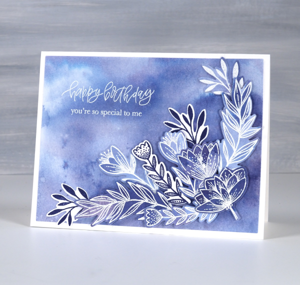
I chose the Penny Black sets Banner Blooms and Exquisite Envelope for this card because there were plenty of enclosed petals and leaves to trap colour. Banner Blooms just happens to have a co-ordinating die set which sped up the layering of blooms and leaves. This post includes affiliate links from Foiled Fox . If you buy through these links I receive a small commission at no extra cost to you.
Do you have a favourite colour. Does it turn up often in your crafting or perhaps in your wardrobe? I definitely wear a lot of blue!
Banner Blooms
Posted: February 13, 2020 Filed under: banner blooms, boxes, Darkroom Door, Penny Black, sennelier watercolours, Stencils | Tags: Darkroom Door stencils, Penny Black stamps, sennelier watercolours, Tsukineko Versafine inks 3 Comments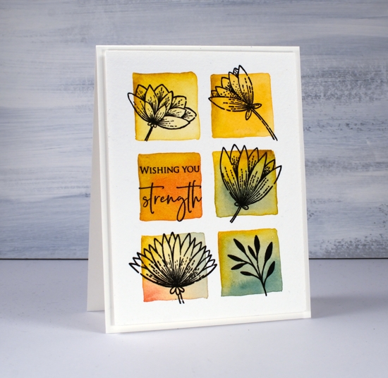
Recently I blended through a stencil to create square grid backgrounds for some floral silhouette stamping. Today’s card uses a similar technique but I wanted the squares to be less neat, a little imperfect but still recognisable as squares. I guess I could have freestyled them entirely but I wanted them to be evenly spaced and I didn’t trust myself to do that without the stencil as a guide. To achieve this look I once again taped a grid stencil (DD boxes 6 up) to a piece of cold pressed watercolour paper but instead of blending the squares then painting over them I just painted squares inside the stencil squares. I didn’t paint right up to the edges of the stencil because then liquid would have seeped underneath and made a mess. I used the stencil as my placement guide and painted a square inside each space.
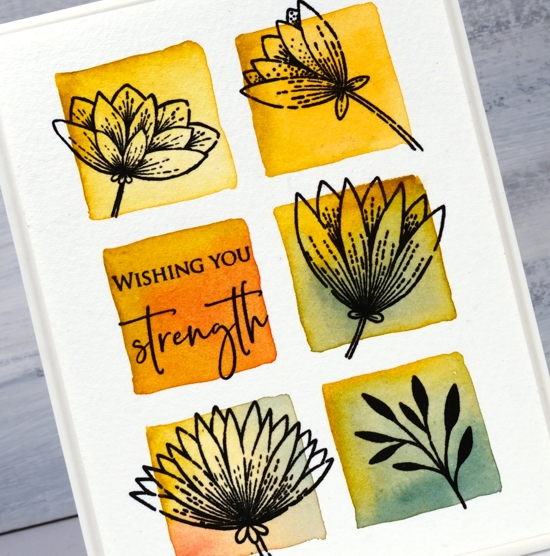
I used Sennelier watercolour paints but you could use any watercolour paints or inks. I started each square with a stroke or two of mustard yellow then added some blue, red or orange and blended it with the mustard. After it dried I flattened it in my minc then transferred it to the stamp positioner to stamp five different images from the PB banner blooms set in versafine clair nocturne ink. Simple but quite effective. I chose a sentiment from the PB ‘strength’ set for the last square.
I really like the simple ‘shadow frame’ created by popping up the panel on a piece of foam; that’s why you keep seeing it!
Supplies


