
Let’s try that again
Posted: January 28, 2011 Filed under: CAS, Garden silhouettes, Nature Silhouettes 11 CommentsToday’s post is a little different to the usual. I have a card which I initially tossed aside followed by the new and improved version. I have posted both below with a little discussion of what didn’t work and how I fixed it.

Both cards feature warm colours ranging from light to dark. On the card above I made my darkest colour black, which is too stark against the white cardstock and there is too much of it. Below the darkest colour was a chocolate brown which against the ivory cardstock is not quite so overwhelming.
I also changed the width of the strip. I have been playing around with masks a lot as you know and I may still use narrow strips like the one above, however on the card above it is too narrow; I have not followed the rule of thirds, it is more like a quarter. The one below is a little more generous and draws the eye into the image panel.
The plants in the one below are bigger and lead the eye down toward the sentiment. The sentiment in the one above was the initial reason I didn’t like the card. I tried to link it by colour to the panel beside it but it is just not strong enough or big enough to give the card balance. I think a longer sentiment might have worked better there. Below I have used a small sentiment but it takes the eye to the edge of the card. (It doesn’t look quite so washed out in real life)

So there you have it: a little design discussion and a few suggestions as to what elements to consider when you have a card that doesn’t quite work but you are not sure why. Thanks for dropping in and thanks for the comments you leave which I thoroughly enjoy reading.
Supplies:
Stamps: Garden Silhouettes, Nature Silhouettes, Teensy Tiny Wishes, Tag Lines (Flourishes)
Inks: Chocolate Chip, Summer Sun, Pumpkin Pie, Ruby Red, Basic Black
Cardstock: Flourishes Classic Ivory and White
Warm flowers
Posted: January 26, 2011 Filed under: CAS, Garden silhouettes 11 Comments
In a complete departure from the blues, greys and mauves of winter I have created a warm toned birthday card with Pumpkin Pie, Mellow Moss and Chocolate Chip. Despite the fact that orange has never been a favourite colour of mine I often reach for the pumpkin pie ink and cardstock.
To create the flower panel I stamped the branch in versamark and embossed in clear before sponging in all three colours listed above. There is very little shadow but you might just be able to see that this panel is popped up a little off the card base. I did try several combinations of layers and mattes but came back to this simple mix of ivory on pumpkin pie.
Inside the card I stamped a pale image by stamping it off on scrap first and then applying to the cardstock.
Thanks for dropping by; I will back with more warm tones later this week and then I’ll probably lapse back into the winter inspired cards!
Supplies:
Stamps: Garden Silhouettes, Teensy Tiny Wishes
Inks: Chocolate Chip, Mellow Moss, Pumpkin Pie, Versamark
Cardstock: Flourishes Classic Ivory, Pumpkin Pie
Also: Clear e.p.
OLW37 SentimentS
Posted: January 23, 2011 Filed under: CAS 12 Comments
Who would have thought the One Layer Wednesday challenge this week would be so hard? Thanks Susan for challenging me out of my comfort zone. I made three attempts before I settled with this design and I still have issues with it. I used the stamp positioner to try and get all these “thank yous” in the appropriate places but some are skewed which frustrates me.
There is no working camera here so the scanner came to the rescue. I will stamp “Many Thanks” on the inside also.
I am not going to list all the sets I grabbed thank you stamps from, suffice to say I believe this is all I own. I used Real Red and Basic Black ink on Flourishes Classic Ivory cardstock with some red grosgrain ribbon.
Thanks for dropping by today.
Woodland scene: Winter edition
Posted: January 22, 2011 Filed under: CAS, Lovely as a Tree, Stamped Landscapes 10 Comments
Back in the summer I created a card using Lovely as a Tree for the OLW Stamp a Scene challenge. I was quite happy with the outcome; both the layout and the technique worked well to suggest the depth of a forest on a summer’s day. I decided to use the same layout and technique to recreate the card in fall and today I’m posting the winter edition.
I masked my two edges as usual but then added a “snowy hill horizon mask” so I could sponge the sky. Without moving any masks I stamped some trees in blue. Then I removed the top mask and repositioned the “snowy hill horizon mask” and stamped the trees in black making sure that their trunks overlapped the horizon mask. Before lowering the mask again I sponged a little blue along the edge to create the snow bank. I move and sponged the bank in a few places again before lightly sponging along the bottom mask.
A favourite stamp, a favourite technique, a favourite layout and in my favourite colour!
Supplies:
Stamps: Lovely as a Tree, Teeny Tiny Wishes
Inks: Basic Black Brocade Blue
Cardstock: Flourishes Classic White
OLW36 Barely There
Posted: January 17, 2011 Filed under: Branch Out, CAS, Stamped Landscapes 13 Comments
Yesterday I had a chance to create something for the One Layer Wednesday Challenge, hosted this week by Jennifer. The challenge is to use a bare tree, bare branch or other vegetation just as long as it is bare. That is not a hard ask for me as I have been happily stamping bare trees in snow for a month or so now. When I looked back through my recent posts I realized the tree from “Branch Out has been appearing often. I really think I need a few new trees stamps don’t you?
I decided to try a reflection in my scene this time; a winter tree, but one by an unfrozen pond or stream. Any still water round here would have frozen solid last night as the temperature was down to 25 degrees below zero! My girls went skating on the canal yesterday, something they ordinarily love to do, but the bitter cold took most of the enjoyment out and they spent the rest of the day trying to warm up again!
The edges of the image panel were masked with post-it notes as were the horizon and water’s edge. To create the reflected tree I stamped it on the plastic square that came with the stamp-a-ma-jig and pressed that onto the sponged water. (I am sorry about the smudges on the photo, they are on the lens of my daughter’s camera)
If you haven’t already browsed through the OLW36 submissions check them out on Jennifer’s blog, there is plenty of inspiration to be found there.
Supplies:
Stamps: Branch Out, Hugs & Wishes
Inks: Basic black, Brocade Blue, Rose Red, Pretty in Pink, Chocolate Chip, Close to Cocoa
Cardstock: Flourishes classic white
A trio
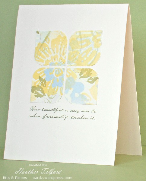
Posted: January 14, 2011 Filed under: CAS, Designer Paper 8 Comments
I have been wanting to make a few cards featuring designer paper as the main event rather than stamped images . I was inspired by Susan, Donelda and Karen who have all created some clever designs with patterned paper. The one above is a classic layout that I have seen done beautifully in many places.

In the second card I wanted to make the most of the lovely design on the paper without doing much to it; splitting the panel achieved the effect I was after. The card below started out on ivory with a portrait orientation but it suffered a nasty sentiment placement accident and underwent fairly drastic surgery before emerging as the card you see below. I have repeated the four circles inside the card but with halves instead of whole.

Thanks for dropping by today; I hope to be back soon with a card for the OLW challenge, which is right up my alley this week!
Supplies:
Stamps: Ageless Adornment, All Year Cheer, Fundamental Phrases
Inks: Artichoke
Cardstock: Mellow Moss, Le Jardin Designer paper, Flourishes Classic Ivory
Moon on the horizon
Posted: January 11, 2011 Filed under: Branch Out, CAS, Stamped Landscapes 9 Comments
The Clean and Simple challenge at Splitcoast this week is A Day in the Snow. It may be stretching it a little but here is my scene at the end of a day in the snow or perhaps the beginning, before all the fresh snow has been played in!
I used post-it notes to mask my moon and horizon first then sponged my sky in Amethyst and Navy. After removing the moon mask I added a little bit of grey sponging across the moon. I stamped the large tree after removing the horizon mask and then sponged the snowy hills in grey one at a time by moving the mask down and over a little each time.
When I was in the CAS101 gallery looking at the cards already posted I noticed an “enough already” card! I can understand the thought but here in Ottawa our snow disappeared and we had to start again so I am looking forward to more this weekend!
Supplies:
Stamps: Branch Out, Teeny Tiny Wishes
Inks: Night of Navy, Going Gray, Basic black, Almost Amethyst
Cardstock: Flourishes classic white
OLW35: Yellow
Posted: January 8, 2011 Filed under: CAS, Pocket Silhouettes 22 Comments
This was a stretch for me to pull out the yellow ink at this time of year but Susan’s One Layer Wednesday Challenge at Simplicity this week is to use yellow. I used my favourite SU yellow, Summer Sun, along with Pumpkin Pie and Ruby Red to sponge inside my squares. Then I removed the mask before stamping the plants in black. Although it was hard to create such a colour scheme while it is snowing outside I am happy with the results. Thanks for the challenge, Susan.
Check out the other cards featuring yellow; there is plenty of inspiration to be found. I was definitely inspired to create mine after seeing Kathy’s beautiful card.
Supplies:
Stamps: Pocket Silhouettes
Inks: Basic Black, Pumpkin Pie, Ruby Red, Summer Sun
Cardstock: Flourishes Classic White
Snowflakes-2 ways
Posted: January 7, 2011 Filed under: CAS, Snowflakes 13 Comments
Snowflakes 2 ways sounds a little like a restaurant dish. I did not set out to make two snowflake cards it just happened. I spent a large chunk of time creating the tiles on the card above. They were hard to photograph but you can see the effect above and in the close up below.
The process in making the tiles was:
- stamp snowflakes in versamark on white card
- emboss snowflakes in clear
- sponge around snowflakes randomly with three blue inks
- punch squares out containing the three snowflakes
- press versamark pad onto punched squares
- emboss with glassy glaze
- repeat 5 & 6 until you are happy with the glassy surface.

Once the tiles were completed I played around with the card base for a while before I was happy. My initial plan was to put them on a plain white card but there was too much white so I tried adding a snowflake and sponging to the card base and then lay the tiles on that but it didn’t look right either. (It became the base for the second card below). When I placed a white panel on a navy card base it looked balanced.

I didn’t want the sponged card base to go to waste so I made three more sponged squares without any glassy embossing and popped them up. My daughter, whose camera I am using, had to help me with her camera’s settings and had the bright idea of taking the side view closeups. I like them better than the front views!

Supplies:
Stamps: Snowflakes, Taglines(Flourishes), Hugs & Wishes
Inks: Versamark, Night of Navy, Brocade Blue, Bashful Blue
Cardstock: Flourishes Classic White, Night of Navy
Also: Clear & White e.p., Stampin’ dimensionals
Cooking pot thank you
Posted: January 5, 2011 Filed under: Coloured pencil, Hand drawn 4 Comments
I have something a little different to show you today. I was going to say “no stamping involved” but I did stamp that wee “thank you” above the pot. You only need to browse through my blog a little while to see that I don’t have many stamps that are not organic images of some kind. Other than a few “boy” stamps they are all decorative elements or plants! When I wanted a thank you card for a very generous friend who gave us a chili mix for Christmas I decided to draw my own image. I was also motivated by the desire to use my Christmas present.
I used the Flourishes classic white card stock which is way too shiny and smooth for drawing on but it was fun anyway.
Supplies:
Stamps: Everyday Flexible Phrases
Inks: Basic black
Cardstock: Flourishes classic white
Also: Faber-Castell Artist Color Pencils


