Less is More 30 Take Three
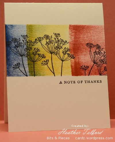
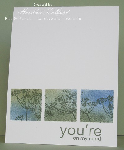
Posted: August 28, 2011 Filed under: CAS, Garden silhouettes 21 CommentsThe Less is More challenge this week is to revisit three of their previous challenges, combining them in one new card. I was inspired by a clever and vibrant card by Lydia of Understand Blue.
I revisited the following Less is More challenges:
- Week 6. Off the Edge
- Week 13. Thank you or Congratulations
- Week 28. Use Ink
I masked the top and bottom of the card with post-its then accepted the challenge to use ink in a new way. I rarely use the direct to paper effect with an ink pad but it does make a bold stripe of colour. After swiping the three ink pads I added the silhouette, removed the masks and added the sentiment.
Thank you to all the kind visitors who drop by here. I appreciated your comments regarding the weddings where my girls have been playing violin. The one last week in a garden did have great weather and all went beautifully. They are playing at the last one today; it was also meant to be outside, on a porch overlooking a beautiful garden. When I dropped them off it was beginning to rain and was also windy so I imagine the wedding was moved inside. If you are interested I have posted photos of my girls on my family blog.
Supplies:
Stamps: Garden Silhouettes, Thankyou Kindly (SU)
Inks: Not quite Navy, More Mustard, Ruby Red (SU), Versafine Black Onyx
Cardstock: Flourishes Classic Ivory
OLW 60 Layering ink
Posted: July 1, 2011 Filed under: CAS, Garden silhouettes 16 Comments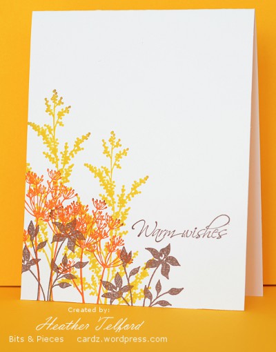
After several attempts I came up with a card which fits the brief from Susan for this week’s One Layer Wednesday challenge.
This week’s OLW challenge is to make quick and easy cards with nothing but layers of ink by overlapping the stamped images and/or sentiment.
I am used to layering ink with a sponge but that was not allowed; we had to aim for quick and easy and I have to admit sponging can be time consuming. So I decided if I could not use my favourite technique I could use my favourite stamp set.
Supplies:
Stamps: Garden Silhouettes, Hugs & Wishes
Inks: Daffodil Delight, Tangerine Tango, Close to Cocoa
Cardstock: Flourishes Classic Ivory
Casing the CAS (once more)
Posted: March 31, 2011 Filed under: CAS, Garden silhouettes 12 Comments
I delved into the CAS favorites thread at Splitcoast again for inspiration before making this card. I came across this lovely sponged panel card and wanted to create something just like it. I prefer Andrea’s beautiful scene with grasses to my silhouetted blossoms but I enjoyed creating something with a sponged panel over a sponged panel; most of my sponged cards lately have been one layer.
I masked the card base to create the horizontal panel, which I embossed in black then sponged in pretty in pink, almost amethyst and going gray. I then created a vertical image panel which I matted in black and popped up on the card base.
Supplies:
Stamps: Garden Silhouettes (SU), Taglines (Flourishes)
Inks: Versamark, Pretty in Pink, Almost Amethyst, Going Grey
Cardstock: Flourishes Classic White, Basic Black
Also: Black e.p.
Green silhouettes
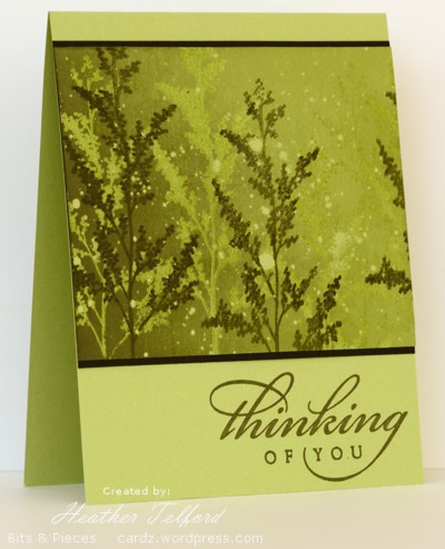
Posted: March 10, 2011 Filed under: Garden silhouettes 18 CommentsI decided to play around with some greens to create this card. To me it has a bit of a misty rainforest look.
I created the stamped panel first on certainly celery cardstock as follows:
- flick masking fluid around
- stamp branch in versamark
- stamp branch in artichoke
- emboss in clear
- brayer celery ink over whole panel
- brayer artichoke ink on left side of panel
- remove masking fluid
Although I didn’t used black on the stamped panel, black looked better than artichoke for framing the panel.
Edited to add: Several people asked about Masking fluid. It is a liquid you will find in the paint section of the art store. You use it to paint in the areas of a painting that you want free of paint, such as white highlights. When you have finished applying the surround paint you peel off the masking fluid and the paper underneath is untouched. I bought it to use when watercolour painting but it is very handy with stamping as well
Thanks for dropping in today.
Supplies:
Stamps: Garden Silhouettes, All Year Cheer (SU)
Inks: Versamark, Always Artichoke, Certainly Celery
Cardstock: Certainly Celery, Basic Black
Also: Clear e.p. Masking fluid(Windsor & Newton)
Less is More challenge
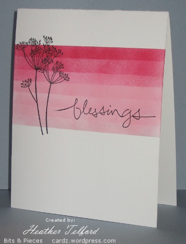
Posted: February 8, 2011 Filed under: CAS, Garden silhouettes 19 CommentsI had a chance to make a card for the new Less is More challenge blog over the weekend. The colours of the challenge were black, white and pink. Unfortunately this scan makes the pinks look a lot bolder than they are. The sponged pinks look much softer and the darkest colour, Rose Red does not look so red on the card. I am pretty fussy about colour matching so the pinks and reds clashing here are not pleasing me. Edited to add the photo below taken on a friend’s camera. You can see the colours are a little softer.
I used post it notes to mask and kept moving the bottom one up a little between spongings, changing from Pretty in Pink to Rose Red half way through. I stamped the Queen Anne’s Lace and the sentiment in black and extended the stems with a fine tip marker.
Make sure you check out the new blog, the challenge already has close to 100 participants, so it is off to a great start.
Supplies:
Stamps: Garden Silhouettes, Graceful words
Inks: Pretty in Pink, Rose Red, Basic Black
Cardstock: Flourishes Classic White
Let’s try that again
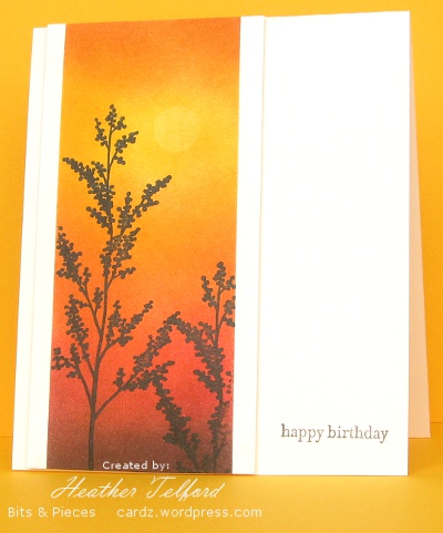
Posted: January 28, 2011 Filed under: CAS, Garden silhouettes, Nature Silhouettes 11 CommentsToday’s post is a little different to the usual. I have a card which I initially tossed aside followed by the new and improved version. I have posted both below with a little discussion of what didn’t work and how I fixed it.
Both cards feature warm colours ranging from light to dark. On the card above I made my darkest colour black, which is too stark against the white cardstock and there is too much of it. Below the darkest colour was a chocolate brown which against the ivory cardstock is not quite so overwhelming.
I also changed the width of the strip. I have been playing around with masks a lot as you know and I may still use narrow strips like the one above, however on the card above it is too narrow; I have not followed the rule of thirds, it is more like a quarter. The one below is a little more generous and draws the eye into the image panel.
The plants in the one below are bigger and lead the eye down toward the sentiment. The sentiment in the one above was the initial reason I didn’t like the card. I tried to link it by colour to the panel beside it but it is just not strong enough or big enough to give the card balance. I think a longer sentiment might have worked better there. Below I have used a small sentiment but it takes the eye to the edge of the card. (It doesn’t look quite so washed out in real life)
So there you have it: a little design discussion and a few suggestions as to what elements to consider when you have a card that doesn’t quite work but you are not sure why. Thanks for dropping in and thanks for the comments you leave which I thoroughly enjoy reading.
Supplies:
Stamps: Garden Silhouettes, Nature Silhouettes, Teensy Tiny Wishes, Tag Lines (Flourishes)
Inks: Chocolate Chip, Summer Sun, Pumpkin Pie, Ruby Red, Basic Black
Cardstock: Flourishes Classic Ivory and White
Warm flowers
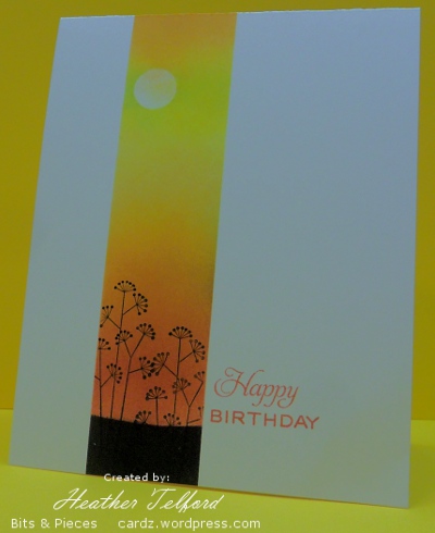
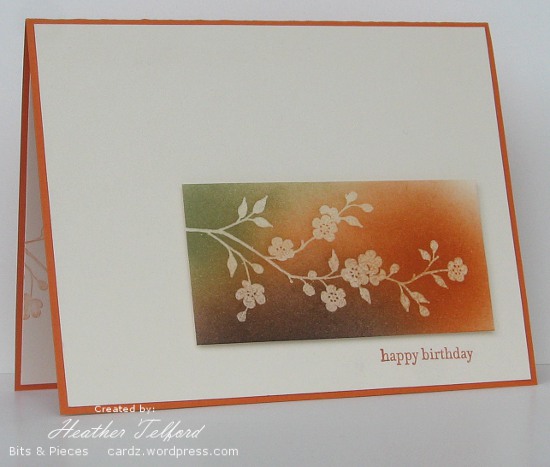
Posted: January 26, 2011 Filed under: CAS, Garden silhouettes 11 CommentsIn a complete departure from the blues, greys and mauves of winter I have created a warm toned birthday card with Pumpkin Pie, Mellow Moss and Chocolate Chip. Despite the fact that orange has never been a favourite colour of mine I often reach for the pumpkin pie ink and cardstock.
To create the flower panel I stamped the branch in versamark and embossed in clear before sponging in all three colours listed above. There is very little shadow but you might just be able to see that this panel is popped up a little off the card base. I did try several combinations of layers and mattes but came back to this simple mix of ivory on pumpkin pie.
Inside the card I stamped a pale image by stamping it off on scrap first and then applying to the cardstock.
Thanks for dropping by; I will back with more warm tones later this week and then I’ll probably lapse back into the winter inspired cards!
Supplies:
Stamps: Garden Silhouettes, Teensy Tiny Wishes
Inks: Chocolate Chip, Mellow Moss, Pumpkin Pie, Versamark
Cardstock: Flourishes Classic Ivory, Pumpkin Pie
Also: Clear e.p.
Congratulations
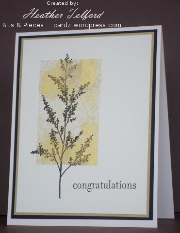
Posted: October 3, 2010 Filed under: CAS, Garden silhouettes 5 CommentsMy inspiration for this card came from AngelNorth. I wanted to make a simple but elegant engagement card for a friend who recently became engaged. She is a lovely girl who used to go to our church. Her mother still does and is a dear friend of mine so I plied her with questions regarding wedding plans. Her daughter does not want a big production wedding, she found the recent wedding show she attended absolutely overwhelming! I decide a little bit of nature and a touch of gold and black might be the right approach on a card.
To create the gold rectangle I stamped the stamp pad directly on the card stock and the black image over the top. A couple of mattes and a sentiment and it was done. The One Stop Craft Challenge blog is celebrating its 100th challenge and the theme is “Congratulations” so I’m joining in.
Supplies:
Stamps: Garden Silhouettes, Hugs &Wishes
Inks: Encore Gold, Basic Black
Cardstock: Flourishes Classic Ivory, Brushed Gold, Basic Black
OLW 20 Three Plus One
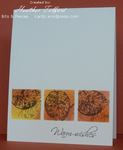
Posted: September 15, 2010 Filed under: CAS, Garden silhouettes, With Gratitude 16 CommentsThis week Susan’s One Layer Wednesday challenge is to use three images and a sentiment. If possible avoid embellishments, but that isn’t mandatory! I have two for this challenge: same layout and technique but different colour schemes. If you have visited here lately you will see I am still masking and sponging. As the current Speedy the Cat’s Friends Challenge is to use fall colours, I will participate in that one too.
To create these two cards I punched the squares out of post it notes to create the mask then sponged and stamped the images before removing the mask. I am enjoying stamping in autumn colours but in real life I am clinging to the last days of summer; perhaps that is why I did one in summer colours as well.
Supplies:
Stamps: Garden Silhouettes, With Gratitude, Upsy Daisy, Hugs and Wishes
Inks: Summer Sun, Really Rust, Chocolate Chip, Bashful Blue, Mellow Moss, Always Artichoke
Cardstock: Flourishes Classic Ivory
Creating with Kraft
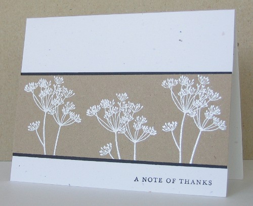
Posted: July 11, 2010 Filed under: CAS, Garden silhouettes 5 CommentsI had a chance to browse through the CAS favorites on Splicoast today and found loads of beautiful cards. I was inspired by Karen Dunbrook’s beautiful “white on Kraft” creation and ended up making a stack of Kraft cards, something new for me. Karen’s card was part of the CAS-tastic Krafty Kreations challenge so I will link mine over there also. I didn’t have any Kraft cardstock but found something similar in a promotional booklet from a paper company. I have a friend with a graphic design business who once gave me a stack of sample booklets from paper companies and they are full of interesting papers. I embossed in white and mounted it all on Confetti White which seems to work well with Kraft.
I’ll have some more to show tomorrow.
Supplies:
Stamps: Garden Silhouettes, Thank you Kindly
Inks: Versamark, Basic Black
Cardstock: Confetti White, Basic Black, Kraft
Also: White e.p.

