
National Scrapbooking Day
Posted: May 5, 2012 Filed under: Uncategorized 1 CommentHi everyone!
Did you know there are giveaways over on the Penny Black blog to celebrate National Scrapbooking Day?
Have a great weekend.
Graffiti Wall
Posted: May 4, 2012 Filed under: Brick Wall, Penny Black 5 Comments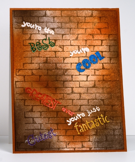
The new releases continue on the Penny Black blog today with the brick background and the floral frame. Check out the blog to see the some lovely creations featuring both new stamps. My card is a little different to the others featured as I created a card for a boy ie. no flowers or pastel colours, even the word ‘cutest’ has been crossed out! The words are all from the new set, Words Express.
I stamped and embossed all the words first, then sponged and finally added the brick wall. I think I may indulge in graffiti again; I quite enjoyed it!
Supplies:
Stamps: Brick Wall, Words Express (Penny Black)
Inks: Memento inks, Versamark (Tsukineko)
Cardstock: Penny Black Mix & Match Papers – Grand Canyon
When time is of the essence
Posted: May 3, 2012 Filed under: CAS, Free Flight, Penny Black 23 CommentsIt just so happens that I have quite a few things to achieve over the next few days; some by the end of today. But I also wanted to participate in a couple of challenges. The One Layer Wednesday challenge returned yesterday and as some of you noticed Cheryl and I have joined Susan and Jennifer on the hosting team. Thank you to those of you who have left me such kind messages expressing your excitement over the challenge and my involvement; I am really looking forward to it. So I really couldn’t miss the first challenge with the new team. The other challenge that appealed this week is the Less is More challenge because that sketch had my name all over it!
I have managed to create a card for to enter in both those challenges but more importantly a card I can send my mother for Mothers’ Day. As my mother lives on the other side of the world I really need to think ahead and the truth is, I rarely do. My parents read this blog so I don’t like to post their cards here on the blog before they have received them but this will have to be an exception. (Perhaps, Dad, you could just not show her this one!)
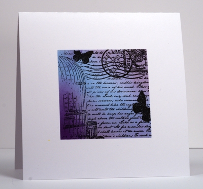
The OLW challenge is to make a card for a woman in your life. I have used my mother’s favourite colours and a stamp with a little postage/correspondence theme happening. My mother has been a faithful correspondent since I left home, I less so. It looks like I made a clever collage of script and postmark, butterflies and birdcage but no, I just used the clever collage stamp from the new Penny Black Free Flight set. (To see more cards made with this set and the rest of the set visit the Penny Black blog today.) Of course I masked and sponged first but you already know that about me don’t you? The Less is More challenge was a sketch with either a centered square or circle leaving plenty of white space all around.
Thanks for dropping by; I must get back to the daily tasks.
Supplies
Stamps: Free Flight (PB)
Ink: Memento Summer Sky, Lulu Lavender & Grape Jelly, Versafine Onyx Black (Tsukineko)
Puzzle Parts
Posted: May 2, 2012 Filed under: CAS, Penny Black, Puzzle Parts 8 Comments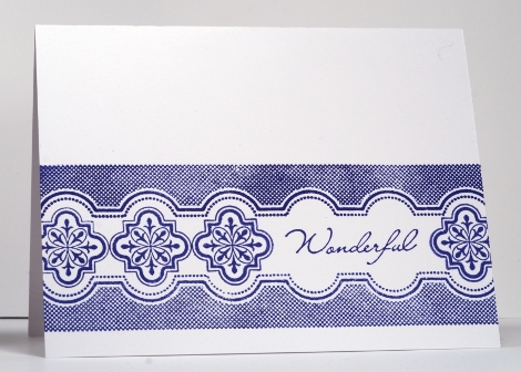
Today I have a card featuring new stamps from Penny Black. If you visit the Penny Black blog you can find several days of posts showcasing new releases.
This card is very simple as the clever patterns in the transparent Puzzle Parts set make it easy to create elegant backgrounds and borders. I always like navy and white as they remind me of Delft china but I am looking forward to trying all kinds of colour schemes with these stamps. The sentiment is from the new set, Word Express, which has over fifty stamps to combine for a personal greeting.
May your day be simple and elegant.
Supplies
Stamps: Puzzle Parts, Word Express (PB)
Ink: Memento Paris Dusk Tsukineko)
Flowers Sweet in monochrome
Posted: April 29, 2012 Filed under: Flowers Sweet, Penny Black 8 Comments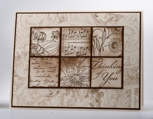
I have seen several beautiful cards lately which feature little squares or tiles lined up together so I decided to try the technique myself with a monochrome colour scheme. I was also trying for a bit of a vintage feel.
The three floral tiles were made using stamps from the transparent set “Flowers Sweet”. I also used the letter background and music background as well as a sentiment from the transparent “Gratitude” set.
After punching out the part of the stamped image I wanted I then sponged a little or a lot and matted the six tiles on a dark brown mat. The damask background was also stamped in the same rich cocoa ink but I stamped it off a few times on scrap paper so I would get a muted shade. The background image is also matted and then mounted on the ivory cardbase. Five layers in all which is a little bit of a departure from my usual one or two layers!
Supplies:
Stamps: Flowers Sweet, Damask Pattern, Letter Background, Music Background, Gratitude (Penny Black)
Inks: Memento Rich Cocoa (Tsukineko)
Cardstock: Penny Black Mix & Match Papers Sticks & Stones, Ivory
Embossed Paisley
Posted: April 25, 2012 Filed under: Paisley, Penny Black 15 Comments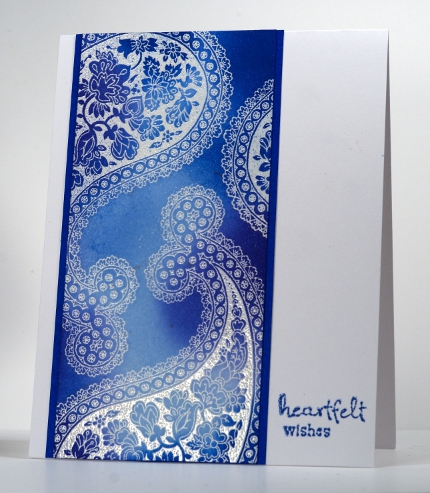
I mentioned in my last post that I had played around with the Paisley stamps on the weekend. I used the emboss resist technique on both cards, embossing the paisley images first in clear embossing powder and then sponging the entire panel in shades of blue or yellow & orange. In the card below I embossed both paisley stamps and the sentiment; after all the sponging was completed I stamped the unfilled paisley stamp a few times in brown.
I must admit that when I first saw these stamps, although I loved the intricate designs, I wondered how I was going to use such large images. Stamping the image off the edge of the panels works really well as the detail is still evident but fitting in multiple whole paisley images is not necessary.
I am going to have more fun with these stamps and the emboss resist technique; the two are made for each other!

Supplies:
Stamps: Paisley, Sweet Wishes, Wishes (Penny Black)
Inks: Memento Danube Blue, Summer Sky, Paris Dusk, Dandelion, Cantaloupe, Tangelo, Potter’s Clay, Versamark (Tsukineko)
Cardstock: Penny Black Mix & Match Papers
Resplendent
Posted: April 23, 2012 Filed under: CAS, Penny Black, Resplendent 14 Comments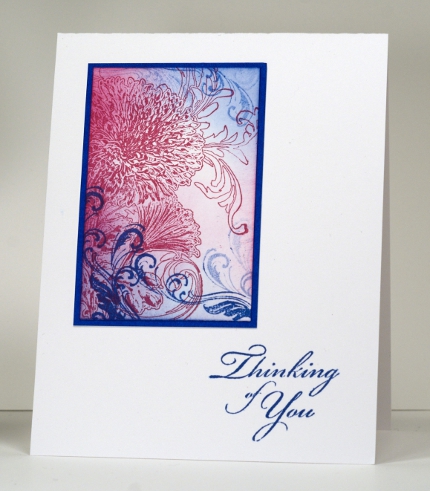
Sometimes a stamp really needs no help at all to be the star of a card. The Penny Black stamp, Resplendent, is one such stamp. Although the whole stamp is quite large I have just used a section of it to create this pink and blue panel. Resplendent is stamped in pink and the little flourish from the Gratitude set is stamped in blue. I added both blue and pink sponging and a mat before adding the sentiment, also from the Gratitude set, to the card base.
I had a chance to play with the elaborate Paisley stamp again yesterday so check back again this week to see what I came up with.
(There are sneak peeks of new Penny Black stamps on the PB blog this week)
Supplies:
Stamps: Resplendent, Gratitude (Penny Black)
Inks: Memento Danube Blue, Lilac Posies (Tsukineko)
Cardstock: Penny Black Mix & Match Papers
Spring Fling
Posted: April 19, 2012 Filed under: CAS, Delicate Florals, Flowers Sweet, Penny Black 10 Comments
Spring has definitely sprung here and on the Penny Black blog; there are two weeks of spring inspired projects to enjoy if you pop over there. The tulips are up in my garden but not blooming yet, so here are a few in bloom. After deciding to leave the tulips as outlines I wanted to add something a little fancier to my card so I embossed the whole card front in clear embossing powder using the Penny Black Damask Pattern background stamp. I was quite happy with the subtle result, it really looks like…well, linen damask! The close up below gives you an idea.
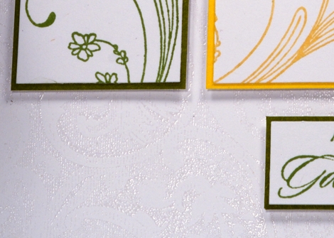
For the tulip card I used Delicate Florals, Gratitude and Damask Pattern. The inks are memento and the cardstock Penny Black Mix and Match papers Summer Sun, Fall Festival & Fern Green.
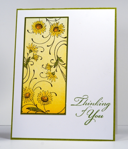
The daisies below were stamped in Versafine Onyx Black on a brayered panel and then coloured with Faber-Castell Polychromos pencils. The stamps are from Flowers Sweet and the very useful sentiment set, Gratitude and the cardstock Fern Green Mix & Match papers
Thanks for dropping by.
Simply Paisley
Posted: April 18, 2012 Filed under: CAS, Paisley, Penny Black 7 Comments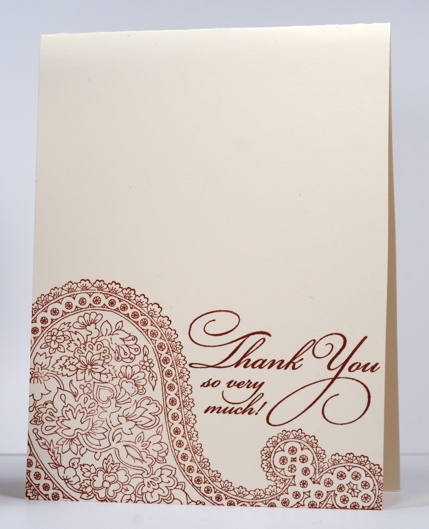
The title of this post says it all really. This card is made very simply with one of the Paisley stamps from Penny Black. There are two in the set; one is a partially negative image of the other. I love the intricacy of the design so I decided to stamp it very simpy in one colour; I will attempt to colour it in one day. (If you’d like to see how pretty it looks multicoloured, check out Jill’s tag here)
To coordinate with such an elaborate stamp I chose the beautifully flourished PB Thank You stamp.
Supplies:
Stamps: Paisley, Flourish Thank You(PB)
Inks: Cranberry Crisp (SU)
Doodling
Posted: April 16, 2012 Filed under: CAS, Penny Black 26 Comments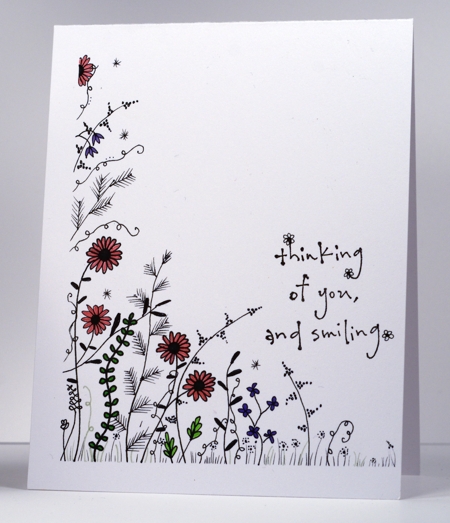
The challenge at Less is More this week is to add a little doodling to your one layer card. I added quite a bit of doodling! I was at a conference all day Saturday and drew this while listening to one of the speakers. I added the Penny Black sentiment and some colour when I got home. The markers I used are Prismacolor Premier fine line markers in five tip sizes. They are wonderful fineliners.
Supplies:
Stamps: Smiling(PB)
Inks: Prismacolor Premier fine line markers












