
Hot Rod
Posted: May 17, 2013 Filed under: Background Stamps, CAS, Damask Pattern, Hot Rod 8 Comments
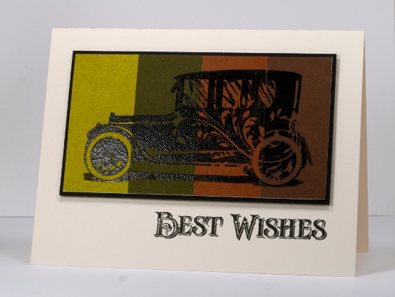
Today I am showing off this cool new stamp from Penny Black. I don’t often make cards with cars on them but the detail on this stamp and the flourish on the side of the hot rod won me over. As you can see I didn’t get too adventurous with the layout or even the ink colour. The image below is embossed on four colours of Penny Black mix & match cardstock and the one above is simply Versafine Onyx Black on white cardstock. To add a little colour to the one above I masked a panel and sponged three shades of blue and added a bit of the flourish from the damask pattern background stamp.
Supplies:
Stamps: Damask Pattern, Hot Rod (PB)
Inks: Memento Summer Sky, Bahama Blue, Danube Blue & Versafine Onyx Black (Tsukineko)
Cardstock: Penny Black Mix & Match Papers Olive Grove & Grand Canyon
Also: Black embossing powder

OLW 140 Borders
Posted: May 15, 2013 Filed under: CAS, Love is in the Air, OLW, Penny Black 16 Comments
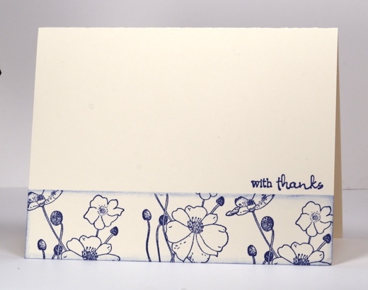
This week’s One Layer Wednesday challenge is all about making or stamping a border on your one layer card. You can use stamps designed for creating a border or you can create a border with any stamps as I did for these two cards. I masked both cards with a post-it note and then stamped and sponged below the mask so the stamping became a border pattern. On the card above I embossed a few flowers in white first, stamped some more in red then sponged over all the flowers with yellow, orange and red. On the card below I just stamped the delicate poppy stamp three times and sponged a tiny bit to define the edge of the border. For this challenge I want the border to be the main event on the card. Border and sentiment that’s it, no more!
1. A one-layer card is defined as a single layer of card stock folded in half. No other layers of card stock allowed!
2. Make a card with a border as the image; you can add a sentiment but please remember to keep embellishments to a minimum.
3. Upload your card somewhere online and link it using the InLinkz button on the bottom of this post. If you link to your blog, please make sure the link goes to the individual post, not to your blog’s home page.
4.HAVE FUN! That’s really what it’s all about.

Supplies:
Stamps: Love is in the Air, Poppies, Wishes, Foliage Fancy (PB)
Inks: Memento Dandelion, Cantaloupe, Lady Bug & Versamark & Versafine Habanero, Versafine Majestic Blue(Tsukineko)
Also: Clear embossing powder
Mothers’ Day Watercolour
Posted: May 9, 2013 Filed under: Blooming Garden, CAS, So Blessed, Watercolour 9 Comments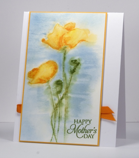
Watercolour and poppies. A combination I love to use. Karen made a lovely watercolour poppy card this week also. Did you see it?
To create this panel I dampened the water colour block with a paintbrush and water, inked the poppy stamp with Memento inks: Bamboo leaves for the stems and Cantaloupe for the blooms and stamped it on the damp paper. The colour bled immediately so I waited a little while before stamping the poppies again in the same place. I then used water colour pencils to fill in the petals and buds before blending the pencil with a paintbrush. The background Summer Sky ink applied with a paintbrush. To paint with ink from a stamp pad I just stamp the pad onto an acrylic block then use a damp brush to pick up some colour and paint it on the panel.
Supplies:
Stamps: Blooming Garden, So Blessed (PB)
Inks: Memento Summer Sky, Bamboo Leaves, Cantaloupe (Tsukineko)
Cardstock: Fabriano 100% cotton hot pressed watercolour paper, Summer Sun Mix & Match Papers
A Mothers’ Day card would definitely fit the bill for the challenge on the Penny Black blog. You can read about it here.

Water washed text
Posted: May 7, 2013 Filed under: Background Stamps, Bliss, CAS, Penny Black 19 Comments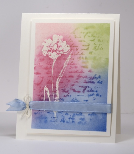
This is a quick experimental card which worked out. When working with watercolour you never know what might happen; the happenings were good this time.
I taped my watercolour panel to the table to avoid warping when wet then I stamped the flower in versamark. At this point I realized I should have embossed the flower before taping the paper to the table. Feeling a bit lazy I decided to move on without embossing and see what happened. I painted water onto the whole panel then inked the text stamp with three colours and stamped it onto the wet panel. The text bled nicely. (Hmm, ‘bled nicely” ?!) I dried it with a heat gun because I was impatient then sponged the same three colours over the text. At this point I didn’t know whether the versamark flower would still hold embossing powder but it was worth a try. I untaped the panel and embossed in clear powder. It worked so I added a little more sponging to highlight the flower and found some ribbon to match.
A happy experiment.
Supplies:
Stamps: Bliss, Letter Background (PB)
Inks: Memento Angel Pink, Rose Bud, Danube Blue, Bamboo Leaves & Versamark Tsukineko)
Cardstock: Fabriano 25% cotton hot pressed watercolour paper,
Also: Blue satin ribbon, ivory embroidery thread
Being Complementary
Posted: May 5, 2013 Filed under: Background Stamps, CAS, Damask Pattern, Love Chapter, Penny Black 18 Comments
This Damask stamp from Penny Black is such a beautifully detailed stamp I like to show it off rather than relegate it to background status. When I started making this card I embossed a couple of panels, one in clear and one in black then played around with both. The white image left by the clear embossing powder definitely created the look I was after; I will have to fiddle with the black a little more before I’m happy with it.
As I said I started by embossing in clear then sponged Memento Pistachio from one corner toward the centre and Love letter from the opposite corner. I darkened the green portion further with Olive grove and added a little definition with a Bamboo Leaves marker. I then sliced the side off my panel so that it would be predominantly green rather than half and half, matted it in green and added a ribbon. I didn’t have the correct green so I used a paler green and coloured it with a marker.
When that card was finished I didn’t want the little strip I cut off to go to waste so I set out to make a very minimal design with just the thin panel and a sentiment. But then I remembered the “Love” stamp which has elaborate fonts that remind me of damask and a second design was created.
The complementary colour scheme is inspired by the Less is More Challenge this week.

Supplies:
Stamps: Damask Pattern, Love Chapter, Happy Birthday (PB)
Inks: Memento Pistachio, Olive Grove, Love Letter & Versamark (Tsukineko)
Cardstock: Penny Black Mix & Match Papers Olive Grove
Also: Clear embossing powder, ribbon
Spring and a sketch that worked
Posted: May 2, 2013 Filed under: CAS, So Blessed, Winter Berries 13 Comments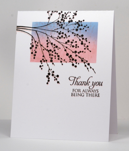
If at first you don’t succeed go back to something tried and true. After fiddling around with a new stamp and some fussy cutting unsuccessfully I decided to create another card with last week’s sketch from CAS(E)this sketch. I know they have a new sketch up but this one really appealed and worked for me last week so I am using it again, and maybe even again.
Same technique, a masked rectangle, some sponging in blue and pink and the spotty blossoms stamped several times in pink while the masks were still in place. After I removed the masks I stamped the branch again in pink then slightly higher in black and did the same with the sentiment.
There are blossoms here in Ottawa, not in my yard, but it won’t be long.
Have you heard about the new challenge on the Penny Black blog. You can read about it here.
Supplies:
Stamps: Winter Berries, So Blessed (PB)
Inks: Memento Angel Pink, Summer Sky & Versafine Onyx Black (Tsukineko)
Bird at sunrise
Posted: April 21, 2013 Filed under: CAS, Stamped Landscapes, Tweet Tweet 39 Comments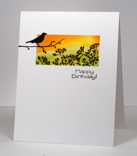
When I saw this week’s sketch from CAS(E) this sketch I knew it was perfect for a little scene. I created it using three stamps from one set, Tweet Tweet. It just so happens that the current Casual Fridays challenge is to create a birthday card so I’ll enter there too.
I positioned post-it notes to mask around a rectangle and punched a little circle mask for the sun. I then cut a wavy mask and positioned it to create the horizon, sponged yellow first, positioned the circle mask and sponged more yellow then orange. Next I lowered the horizon mask and sponged in green, moving the mask twice to create three hills. Before removing the perimeter masks I stamped the little berry branch stamp first in orange then slightly offset in black. Finally I removed all the masks and added the bird stamp and the sentiment.
Around here our grass is beginning to look green and there are even some flowers appearing but we did have snow and ice pellets yesterday!
Supplies:
Stamps: Tweet Tweet (PB)
Inks: Memento Dandelion, Tangelo, New Sprout, Pear Tart & Versafine Onyx Black(Tsukineko)
Blue Sympathy
Posted: April 18, 2013 Filed under: Penny Black, Schizeas, Sweet Melody 13 Comments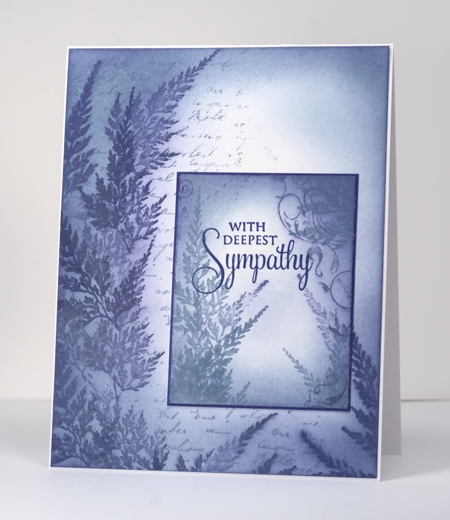
I have been playing with some Versamagic Chalk inks from Tsukineko and really like the soft effects I can create with them. Not only can I get great coverage with sponges, stamped images blend into the sponged areas creating a misty look. As the chalk inks take longer to dry than the Memento dye inks I usually use for sponging I was able to intentionally smudge the fern images by sponging straight after I stamped. Both panels were done with the same two chalk inks, Night Sky and Aegean Blue. I stamped the letter background, sponged over it in both blues, added the ferns in both blues, sponged a little more, added some curly flourishes using the little bird in the Sweet Melody set and finally stamped the sentiment with Versafine Majestic Blue.
I know my posts have been a bit sparse lately; I have been working on samples for some upcoming workshops I am doing. In May I will be doing a workshop using the PB set, Longing at Heather’s Stamping Haven. If you are interested you can see the dates here and the class details here.
Supplies:
Stamps: Schizeas, Letter Background, Sweet Melody PB)
Inks: Versamagic Night Sky and Aegean Blue, Versafine Majestic Blue(Tsukineko)
Someday scraps
Posted: April 13, 2013 Filed under: Breezy, CAS, Winter Berries 25 Comments
If you read Godelieve Tijsken’s blog, Stamping Matilda you will know I have borrowed the title of her regular Sunday post but changed it slightly. Each week she gathers scraps from her work table, creates something from them and posts it on her blog under the title ‘Sunday Scraps’. It is always interesting to see how she has made use of leftovers. I am nowhere near organized enough to have a project made from leftovers every week but I recently started saving my stamped scraps in the hope using them in a project someday. After checking with Godelieve I decided to call my post “Someday Scraps” ; you never know it might be come a regular thing. If you are not familiar with Godelieve’s blog you need to go there right now because it is full of wonderful creations which are very innovative and artistic.
Having said all that, I haven’t really created a new card from scraps the way Godelieve does. A few weeks ago I made a one layer card for One Layer Wednesday which was inspired by packaging. You can see it here. When I was making that card I tried embossing the white berries before stamping the green leaves and vice versa. Which ever worked best ( sorry I don’t remember) became the card for One Layer Wednesday; the other trial became the scrap you see here. I took the scrap and changed the orientation. I also added some sponging to make the berries pop a little more and mounted it on a white mat on a green cardbase. In my ribbon drawer I found a very wide piece of organza ribbon so I cut a piece off and attached it across the panel before adding a sentiment.
I now have a little box beside my worktable with “Someday Scraps” in it. You might see them someday…
Supplies:
Stamps: Breezy, Foliage Fancy, Winter Berries(PB)
Inks: Memento Bamboo Leaves, New Sprout & Versamark (Tsukineko)
Cardstock: Penny Black Mix & Match papers “Olive Green”
Also: White embossing powder, Olive organza ribbon
Emboss resist tiles
Posted: April 10, 2013 Filed under: CAS, Every Happiness 13 Comments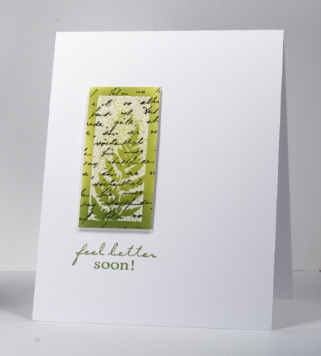
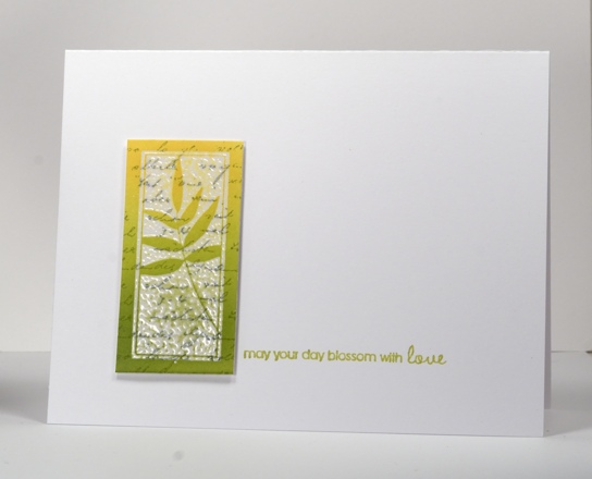
I have two emboss resist cards for you today, one inspired by the Less is More colour challenge for this week Lime Green & Black. Both tiles were created by stamping the letter background first then the tile stamp in versamark next so it could be embossed with clear powder. I finished the tiles by sponging two tones over the panel and trimming back to an even rectangle. The tiles are popped up on dimensional tape.
A note about sentiment placement: These tiles really don’t take up much space on the cardbase so I tried to make a triangle when adding the sentiment, to lead the eye across the card. In order to work out the best position for the sentiment I stamped it on an acrylic sheet with a stamp positioner first so I could move it around and see the possibilities. When playing with the “feel better” stamp above it did not look good side by side with the tile but did work below. I think the eye is lead down by the gradation of colour and ending up on the sentiment. On the card below I was able to create my triangle but not as I expected to, by lining the sentiment up with the base of the tile but by moving it up ever so slightly. All that to say it pays to work with a stamp positioner. There was a time I thought I wouldn’t ever use one but now I pull it out often.
PS. Two posts today! Scroll down for this week’s One Layer Wednesday
Supplies:
Stamps: Letter Background, Feel Better, Every Happiness (PB)
Inks: Memento Dandelion, Pear Tart, Bamboo Leaves, London Fog & Versafine Onyx Black & Versamark(Tsukineko)
Also: Clear embossing powder











 Heather Telford