
Pink blooms
Posted: April 1, 2013 Filed under: CAS, Sweetness 32 Comments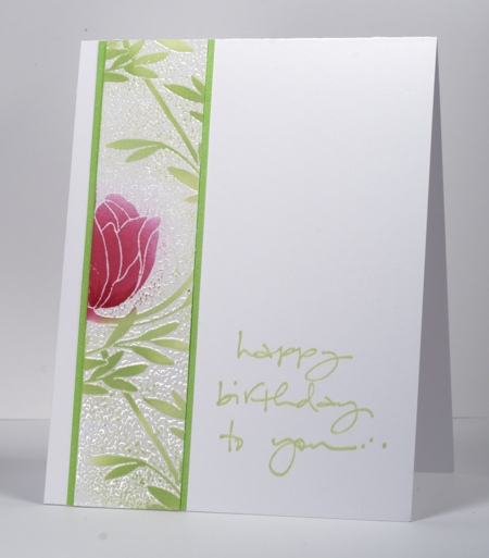
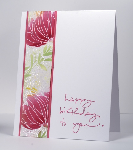
Today’s cards feature another of Penny Black’s pretty background stamps: Sweetness. I started by making a large floral panel triple the size of the panels you see here using almost the whole background stamp. I embossed the image with clear embossing powder. The coverage wasn’t 100% but I don’t mind that because it makes a batik-like effect. After embossing I sponged Memento Rosebud ink over the flowers varying the amount of colour and adding some with a marker. The leaves and stems are sponged with Memento New Sprout and you can see on the card below I also sponged a little Dandelion ink.
I played around with the large panel and a green mat, eventually deciding to slice the panel into three pieces to try and make it look a bit like a Chinese screen. The three panels were still too much for my clean and simple ways so I tried a single panel per card ending up with the two you see here. I didn’t have quite the right pink card stock to mat the card below so I used a lighter pink and sponged the edges with Rose bud ink.
Have a wonderful day.
Supplies:
Stamps: Sweetness, To You… (PB)
Inks: Memento Rose Bud, New Sprout, Dandelion & Versamark (Tsukineko)
Cardstock: Mix & Match cardstock rose garden & spring meadow
Also: Clear embossing powder
Spring Blessings
Posted: March 27, 2013 Filed under: April Showers, CAS, Watercolour 19 Comments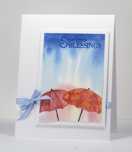
I have made several attempts at stamping these sweet umbrella stamps but this is the first one to be successfully turned into a card. I propped up my watercolour panel slightly to encourage the ink and water to roll down the paper then wet the whole panel and stamped the blue inkpad directly on the top of the paper. The ink spread immediately, heading down as I intended, to look like rain. I stamped the red and yellow inks on an acrylic block then picked some up with a brush and applied it to the wet watercolour paper. When the blended ink was dry I stamped the umbrellas in red and black and added colour to them with water colour pencils blended with water. I cropped on all sides before matting it with white then popping it up on a white card base.
The Penny Black blog is full of clean and simple inspiration this week, check it out if you haven’t already.
This week’s One Layer Wednesday Challenge can be found over on Susan’s blog.
Supplies:
Stamps: April Showers (PB)
Inks: Memento Danube Blue, Love letter, Dandelion ink pads & Tuxedo Black Marker(Tsukineko)
Cardstock: Fabriano 100% cotton hot pressed watercolour paper
Also: Faber-Castell watercolour pencils, blue gingham ribbon
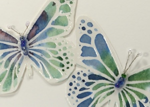
Watercolour butterflies
Posted: March 24, 2013 Filed under: CAS, Free Flight, Watercolour 40 Comments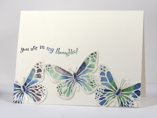
I have more water colouring for you today but I didn’t use my pencils this time. I used three colours of Memento inks and a large acrylic block. I stamped the ink pad directly onto the acrylic block and then picked up ink with a aqua painter . The aqua painter already has water in it so the ink immediately diluted a little. Any way I am jumping ahead with my description.
Back to the beginning…I stamped the butterflies in versamark and and embossed in clear powder onto watercolour cardstock. At this point I hadn’t decided how to use the butterflies so I taped the panel down on my work table so it wouldn’t warp once I started painting. I worked on one butterfly at a time, painting it with water first then adding colour blue, green and purple to different sections of the butterfly and watching the ink blend. As the ink dried and the intensity of the colour decreased I added a bit more here and there with markers which I then blended with water.
Once I decided to cut around all three butterflies I knew I would not attempt to cut our their antennae ( you know I am not a “fussy cutter”). The Less is More challenge this week is to use beads so I found some tiny beads which matched and started searching for thin wire to thread them together. I ended up using a discarded violin string (not uncommon around here) but it was too thick so I unwound the very fine wire which is tightly wound around the inner wire. Too much information? Anyway it worked and I made little four-bead bodies with another bead for each antenna.
Supplies:
Stamps: Free Flight, In my Thoughts (PB)
Inks: Memento Elderberry, Cottage Ivy, Nautical Blue & Versamark (Tsukineko)
Cardstock: Fabriano Hotpress 25%cotton watercolour paper
Also: Clear embossing powder, tiny beads and wire from a violin D string
Fern birthday card
Posted: March 21, 2013 Filed under: Background Stamps, CAS, Penny Black, Schizeas 8 Comments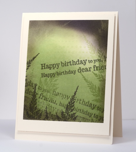
After playing around with sponging on tags the other day I decided to make my panel a bit larger and use the same technique. These colours are an unusual combination but made me think of rainforests with a bit of sun breaking through the canopy. If you look closely at the top right hand corner of the panel the green and purple inks have created a cool “photo negative” effect. I am going to play with that idea again for sure.
My process was pretty much the same as with the tags. I stamped the dot background in green, sponged in green then added fern stamps in green. I chose elderberry as my contrasting colour and added perimeter sponging, ferns and the sentiment several times to complete the panel. I did a little intentional restamping again for the out of focus effect; I am just messing with your eyesight!
This card works for the current Less is More challenge where we have to frame something on our card. I have framed both by masking the border of my image panel and by popping it up on the card base.
Supplies:
Stamps: Schizeas, Edge to Edge, Dots in Space PB)
Inks: Memento New Sprout, Bamboo Leaves, Elderberry (Tsukineko)
OLW 132 Inspired by packaging
Posted: March 20, 2013 Filed under: Breezy, CAS, Kate's Alphabet, OLW, Winter Berries 13 Comments
Hopefully this challenge is not a hard one. So many products we buy are beautifully packaged; I am sure you will find inspiration all around your house. Some of the herbal teas I drink come in lovely boxes and I had planned to take inspiration from one of them but the brand I have right now is not so inspiring. After browsing the shower gels and shampoo bottles I settled instead on a tiny piece of packaging my daughter received with a gift a couple of days ago.
I like everything about this little card mount for a pair of earrings. The colours are restful, the layout is balanced and the sentiment bold, but not over powering. Packaging is great inspiration to try something you wouldn’t otherwise. I rarely use white on beige or ivory cardstock but is is very elegant. I would never have thought of adding a tiny bit of pink in the sentiment and nowhere else but it works.
OLW128 Rules
1. A one-layer card is defined as a single layer of card stock. No other layers allowed.
2. Make a one-layer card inspired by some packaging.
3. Post your cards online and link to them using the InLinkz button at the end of this post. If you link to your blog, be sure to link to the specific post, not just your blog’s main page.
4. Have fun
Supplies:

Stamps: Breezy, Kate’s Alphabet, Winter Berries(PB)
Inks: Memento Bamboo Leaves, New Sprout, Angel Pink & Versamark (Tsukineko)
Also: White embossing powder
Shabby Chic tag cards
Posted: March 16, 2013 Filed under: Background Stamps, CAS, Cuttlebug, Love Chapter, Penny Black 10 Comments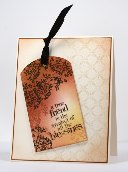
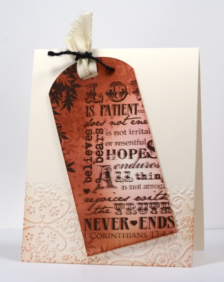
Today I have a couple of cards which developed as I stamped; I had a rough idea how I would do the tag above but nothing more than that. Once the first tag was finished I wanted to try the same technique with another text stamp. When both were finished I played around with layouts for quite a while before I settled on the ones you see here.
To create the tags I stamped the Dots in space background stamp then sponged three colours over most of the tag. Each tag has a branch motif which I stamped in brown tones first then black. The text stamps have an out of focus look intentionally; I stamped them first in Potter’s Clay then again in black but slightly offset from the first impression.
Both the tags were designed to feature but needed to be grounded on the card bases so I picked out a background stamp and an embossing folder. To ground the tag above I stamped part of the background stamp Indian Wheel in Wheat versamagic then embossed in clear powder before sponging the perimeter of the ivory panel in Memento Potter’s Clay. The tag below is grounded on the card base by an embossed panel created using a cuttlebug embossing folder which I sponged over lightly.
I do make tags from time to time but I rarely put a tag on a gift; I usually add a card in an envelope to a gift so these tags are more likely to get given this way than if they had remained as tags. What about you,do you make tags? Do you use them?
Supplies:
Stamps: Love Chapter, Friendship, Dots in Space, Indian Wheel, Tweet Tweet (PB)
Inks: Memento Potter’s Clay, Rhubarb Stalk, Dandelion, Angel Pink & Versafine Onyx Black & Versamagic Wheat (Tsukineko)
Cardstock: Mix & Match Grand Canyon
Also: Cuttlebug Folder Textile Texture, black ribbon, black twine
Spots and stripes
Posted: March 15, 2013 Filed under: Background Stamps, CAS 10 Comments
I am just going to make the deadline for this week’s Less is More challenge. I haven’t taken on many stamping challenges lately so I wanted to do this one. When I saw this dramatic card by Pamela, I knew I had my layout; I just needed to work out how to add the spots and stripes. I reached for my trusty background stamps including one I rarely pull out, the woodgrain stamp from the Penny Black slapstick cling set, Inspiring. I also used the new background Dots in Space. Both stamps were inked with Memento ink pads but markers would have worked well too. I used the same inks to sponge after stamping.
It took me two attempts to make this card! On my first try I had all the colour panel complete, then managed to stamp the sentiment straight also only to mess up the line of dashes! What line of dashes, you ask? It did not get invited back for my second attempt but if I had found the right little birthday silhoutte stamp to stamp over the colour panel on the left I might have done that.
Anyway, there you have it a colourful card for any age, male or female.
Supplies:
Stamps: Dots in Space, Friendship, Inspiring (PB)
Inks: Memento Love Letter, Tangelo, Dandelion, Cottage Ivy, Danube Blue & Versafine Onyx Black(Tsukineko)
Golden blessings
Posted: March 14, 2013 Filed under: Blooming Garden, CAS, Penny Black, Watercolour 12 Comments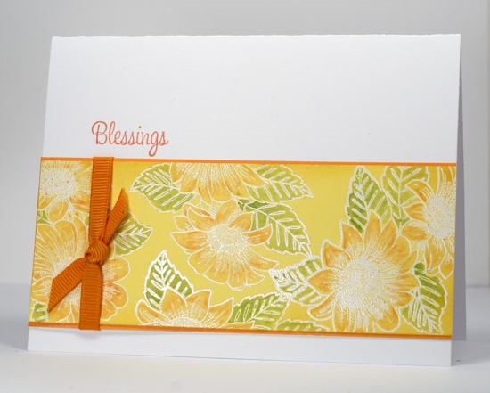
I have a bright spring card today made using a colouring technique which is quick and easy but really pops on coloured cardstock. I stamped the flowers in versamark and embossed in white powder on Summer Sun mix & match cardstock. I used watercolour pencils to add colour to the flowers and leaves. Blending them with water is very simple as it stays contained within the embossed outlines.
Thanks for visiting today.
Supplies:
Stamps: Blooming Garden, Treemendous PB)
Inks: Memento Cantaloupe & Versamark (Tsukineko)
Cardstock: Summer Sun mix & match cardstock
Also: Faber-Castell watercolour pencils, white e.p., orange grosgrain ribbon
Home sweet home
Posted: March 10, 2013 Filed under: CAS, Sweet Home, Uptown, Watercolour 14 Comments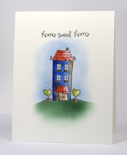
I have another one layer watercolour card made on the Fabriano watercolour paper. This one combines watercolouring and sponging. I think the house ended up looking more like a “fixer-upper” than a sparkling new home but that’s ok. It’s still a home, sweet home.
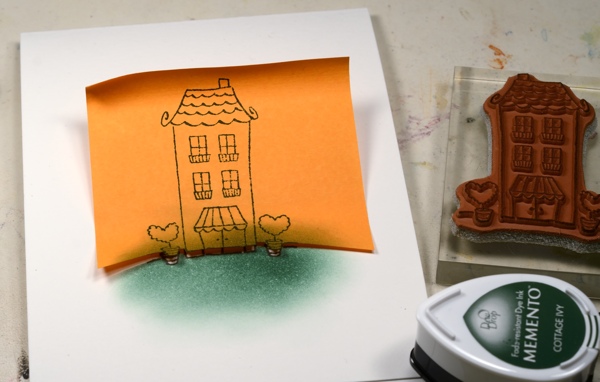
I stamped the house in versafine smokey gray then used a mask to sponge a green hill. All the colouring is done with watercolour pencils blended with water and a little highlighting done at the end with the pencil dipped in water. To finish I cut a complete house mask so I could sponge the sky in blue.
Thanks for dropping by.
Supplies
Stamps: Uptown, Sweet Home (Penny Black)
Inks: Memento Summer Sky, Cottage Ivy & Versafine Smokey Gray (Tsukineko)
Cardstock: Fabriano 25% cotton hot pressed watercolour paper
Also: Fabercastell watercolour pencils
Watercolour one layer
Posted: March 9, 2013 Filed under: Blooming Garden, CAS, Watercolour 17 Comments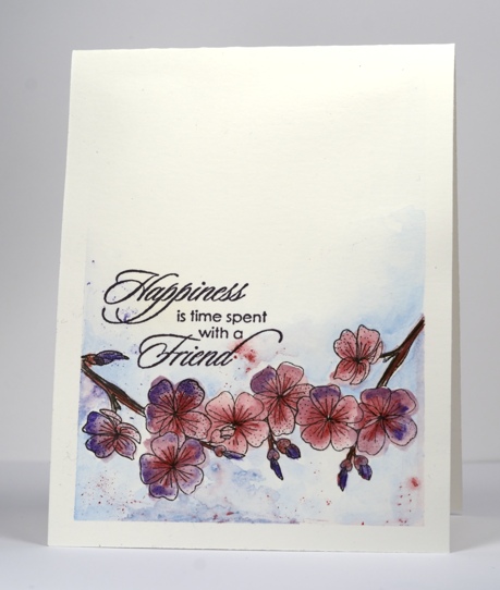
The watercolour cards I’ve been making lately have been several layers as I usually create them on a 5″x7″ pad then cut and mat them with co-ordinating cardstock. I recently bought a larger pad of watercolour paper so, for this card, I cut and scored a 4.25″ x 5.5″ card and taped it to my work desk before watercolouring. I taped it to the desk carefully to create the border you see on the card. The card warped slightly due to the watercolouring but, because it was taped down until it was completely dry, the warping is minimal.
I stamped the branch from Blooming garden on the right and the left then masked both branches so I could stamp the branch again between the two branches adding only two more flowers. The flowers are stamped in versafine onyx black which is waterproof so it did not bleed when I started adding the colour. I used watercolour pencils to add pink and purple to all the blossoms and blended it with water. The stems are coloured with two browns, the background with blue. While the paper was still wet I sharpened three pencils over the image dropping slivers and specks of pink, blue and purple pigment onto the damp paper. I spritzed with water too and sat back to watch the bits of pigment bleed colour.
And, I almost forgot to add, this layout was inspired by CAS(E) this sketch #18
Supplies:
Stamps: Blooming Garden, Gratitude(PB)
Inks: Memento Elderberry & Versafine Onyx Black (Tsukineko)
Cardstock: Fabriano Hotpress 25%cotton watercolour paper
Also: Fabercastell watercolour pencils


