
Bird at sunrise
Posted: April 21, 2013 Filed under: CAS, Stamped Landscapes, Tweet Tweet 39 Comments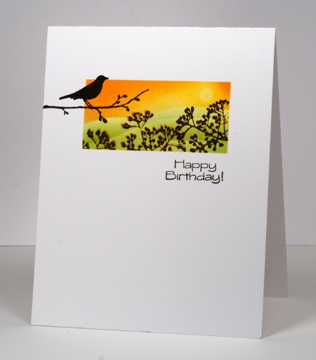
When I saw this week’s sketch from CAS(E) this sketch I knew it was perfect for a little scene. I created it using three stamps from one set, Tweet Tweet. It just so happens that the current Casual Fridays challenge is to create a birthday card so I’ll enter there too.
I positioned post-it notes to mask around a rectangle and punched a little circle mask for the sun. I then cut a wavy mask and positioned it to create the horizon, sponged yellow first, positioned the circle mask and sponged more yellow then orange. Next I lowered the horizon mask and sponged in green, moving the mask twice to create three hills. Before removing the perimeter masks I stamped the little berry branch stamp first in orange then slightly offset in black. Finally I removed all the masks and added the bird stamp and the sentiment.
Around here our grass is beginning to look green and there are even some flowers appearing but we did have snow and ice pellets yesterday!
Supplies:
Stamps: Tweet Tweet (PB)
Inks: Memento Dandelion, Tangelo, New Sprout, Pear Tart & Versafine Onyx Black(Tsukineko)
Someday scraps
Posted: April 13, 2013 Filed under: Breezy, CAS, Winter Berries 25 Comments
If you read Godelieve Tijsken’s blog, Stamping Matilda you will know I have borrowed the title of her regular Sunday post but changed it slightly. Each week she gathers scraps from her work table, creates something from them and posts it on her blog under the title ‘Sunday Scraps’. It is always interesting to see how she has made use of leftovers. I am nowhere near organized enough to have a project made from leftovers every week but I recently started saving my stamped scraps in the hope using them in a project someday. After checking with Godelieve I decided to call my post “Someday Scraps” ; you never know it might be come a regular thing. If you are not familiar with Godelieve’s blog you need to go there right now because it is full of wonderful creations which are very innovative and artistic.
Having said all that, I haven’t really created a new card from scraps the way Godelieve does. A few weeks ago I made a one layer card for One Layer Wednesday which was inspired by packaging. You can see it here. When I was making that card I tried embossing the white berries before stamping the green leaves and vice versa. Which ever worked best ( sorry I don’t remember) became the card for One Layer Wednesday; the other trial became the scrap you see here. I took the scrap and changed the orientation. I also added some sponging to make the berries pop a little more and mounted it on a white mat on a green cardbase. In my ribbon drawer I found a very wide piece of organza ribbon so I cut a piece off and attached it across the panel before adding a sentiment.
I now have a little box beside my worktable with “Someday Scraps” in it. You might see them someday…
Supplies:
Stamps: Breezy, Foliage Fancy, Winter Berries(PB)
Inks: Memento Bamboo Leaves, New Sprout & Versamark (Tsukineko)
Cardstock: Penny Black Mix & Match papers “Olive Green”
Also: White embossing powder, Olive organza ribbon
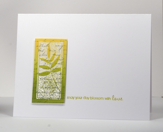
Emboss resist tiles
Posted: April 10, 2013 Filed under: CAS, Every Happiness 13 Comments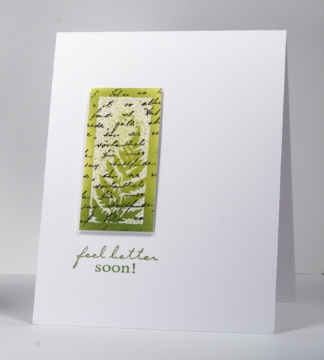
I have two emboss resist cards for you today, one inspired by the Less is More colour challenge for this week Lime Green & Black. Both tiles were created by stamping the letter background first then the tile stamp in versamark next so it could be embossed with clear powder. I finished the tiles by sponging two tones over the panel and trimming back to an even rectangle. The tiles are popped up on dimensional tape.
A note about sentiment placement: These tiles really don’t take up much space on the cardbase so I tried to make a triangle when adding the sentiment, to lead the eye across the card. In order to work out the best position for the sentiment I stamped it on an acrylic sheet with a stamp positioner first so I could move it around and see the possibilities. When playing with the “feel better” stamp above it did not look good side by side with the tile but did work below. I think the eye is lead down by the gradation of colour and ending up on the sentiment. On the card below I was able to create my triangle but not as I expected to, by lining the sentiment up with the base of the tile but by moving it up ever so slightly. All that to say it pays to work with a stamp positioner. There was a time I thought I wouldn’t ever use one but now I pull it out often.
PS. Two posts today! Scroll down for this week’s One Layer Wednesday
Supplies:
Stamps: Letter Background, Feel Better, Every Happiness (PB)
Inks: Memento Dandelion, Pear Tart, Bamboo Leaves, London Fog & Versafine Onyx Black & Versamark(Tsukineko)
Also: Clear embossing powder
OLW 135 Tall and Thin
Posted: April 10, 2013 Filed under: Bliss, CAS, Irises, OLW 9 Comments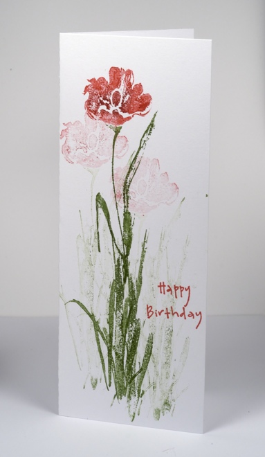
Time for a One Layer Wednesday challenge again and it’s all about the card shape this time. My daughter has made some tall and thin or low and wide cards lately which inspired me to choose it as a challenge. I decided to feature a flower but I did not have one with anywhere near a long enough stem so I either had to add some length by drawing it in or by combining two stamps. I chose to use the grass from another “brush stroke” style stamp for the added stem length. I inked the stamps with Memento markers and re-stamped twice to get the shadow flowers. My card is 7″ x 2¾” but you can choose whatever “tall and thin” size suits you.
OLW135 Rules
1. A one-layer card is defined as a single piece of card stock folded in half. No other layers allowed!!!
2. Make it tall and thin. Remember to keep embellishments to a minimum.
3. Post your card somewhere online and link to it using the InLinkz box on the sidebar of MASKerade. In your post, tell us how many threesomes you used in your card. If you link to your blog, please make sure it’s to the individual post and not your home page.
4. The most important rule of all: HAVE FUN!

Supplies:
Stamps: Bliss, Irises, Happy Birthday (PB)
Inks: Memento Lady bug, Rhubarb Stalk & Bamboo Leaves Markers(Tsukineko)
Emerging Butterfly
Posted: April 8, 2013 Filed under: CAS, Delicate Florals, Soft Wings 22 Comments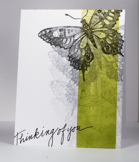
Yet another card from me which ended up looking totally different to the original plan! But never mind that, I ended up with a card which fits the Less is More challenge this week to use Lime Green and Black.
I began by masking the sides of the vertical strip with post-it notes. In the strip I repeatedly stamped a flower from Delicate Florals then sponged over the top getting gradually darker towards the bottom. The Soft Wings butterfly was stamped five times in grey before the final one and the sentiment were added in black.
Supplies:
Stamps: Soft Wings, Delicate Florals, Thinking of You (Penny Black)
Ink: Memento Pear Tart, London Fog & Versafine Onyx Black (Tsukineko)
Pink blooms
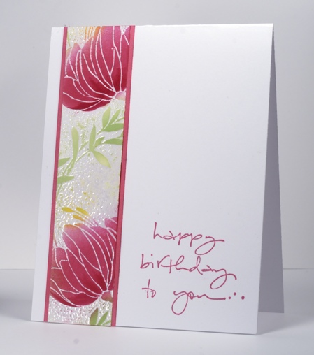
Posted: April 1, 2013 Filed under: CAS, Sweetness 32 Comments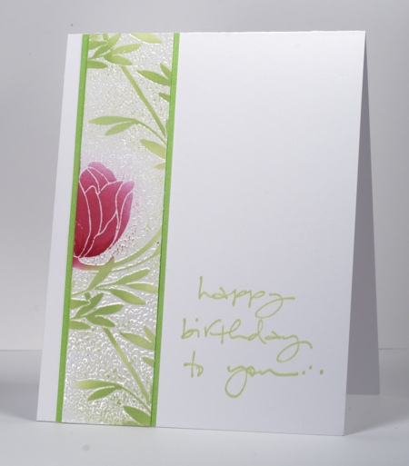
Today’s cards feature another of Penny Black’s pretty background stamps: Sweetness. I started by making a large floral panel triple the size of the panels you see here using almost the whole background stamp. I embossed the image with clear embossing powder. The coverage wasn’t 100% but I don’t mind that because it makes a batik-like effect. After embossing I sponged Memento Rosebud ink over the flowers varying the amount of colour and adding some with a marker. The leaves and stems are sponged with Memento New Sprout and you can see on the card below I also sponged a little Dandelion ink.
I played around with the large panel and a green mat, eventually deciding to slice the panel into three pieces to try and make it look a bit like a Chinese screen. The three panels were still too much for my clean and simple ways so I tried a single panel per card ending up with the two you see here. I didn’t have quite the right pink card stock to mat the card below so I used a lighter pink and sponged the edges with Rose bud ink.
Have a wonderful day.
Supplies:
Stamps: Sweetness, To You… (PB)
Inks: Memento Rose Bud, New Sprout, Dandelion & Versamark (Tsukineko)
Cardstock: Mix & Match cardstock rose garden & spring meadow
Also: Clear embossing powder
Spring Blessings
Posted: March 27, 2013 Filed under: April Showers, CAS, Watercolour 19 Comments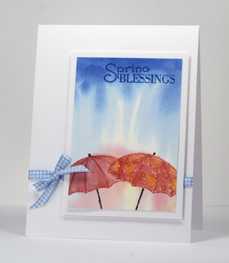
I have made several attempts at stamping these sweet umbrella stamps but this is the first one to be successfully turned into a card. I propped up my watercolour panel slightly to encourage the ink and water to roll down the paper then wet the whole panel and stamped the blue inkpad directly on the top of the paper. The ink spread immediately, heading down as I intended, to look like rain. I stamped the red and yellow inks on an acrylic block then picked some up with a brush and applied it to the wet watercolour paper. When the blended ink was dry I stamped the umbrellas in red and black and added colour to them with water colour pencils blended with water. I cropped on all sides before matting it with white then popping it up on a white card base.
The Penny Black blog is full of clean and simple inspiration this week, check it out if you haven’t already.
This week’s One Layer Wednesday Challenge can be found over on Susan’s blog.
Supplies:
Stamps: April Showers (PB)
Inks: Memento Danube Blue, Love letter, Dandelion ink pads & Tuxedo Black Marker(Tsukineko)
Cardstock: Fabriano 100% cotton hot pressed watercolour paper
Also: Faber-Castell watercolour pencils, blue gingham ribbon
Watercolour butterflies
Posted: March 24, 2013 Filed under: CAS, Free Flight, Watercolour 40 Comments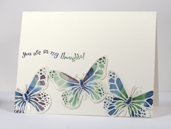
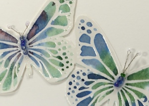
I have more water colouring for you today but I didn’t use my pencils this time. I used three colours of Memento inks and a large acrylic block. I stamped the ink pad directly onto the acrylic block and then picked up ink with a aqua painter . The aqua painter already has water in it so the ink immediately diluted a little. Any way I am jumping ahead with my description.
Back to the beginning…I stamped the butterflies in versamark and and embossed in clear powder onto watercolour cardstock. At this point I hadn’t decided how to use the butterflies so I taped the panel down on my work table so it wouldn’t warp once I started painting. I worked on one butterfly at a time, painting it with water first then adding colour blue, green and purple to different sections of the butterfly and watching the ink blend. As the ink dried and the intensity of the colour decreased I added a bit more here and there with markers which I then blended with water.
Once I decided to cut around all three butterflies I knew I would not attempt to cut our their antennae ( you know I am not a “fussy cutter”). The Less is More challenge this week is to use beads so I found some tiny beads which matched and started searching for thin wire to thread them together. I ended up using a discarded violin string (not uncommon around here) but it was too thick so I unwound the very fine wire which is tightly wound around the inner wire. Too much information? Anyway it worked and I made little four-bead bodies with another bead for each antenna.
Supplies:
Stamps: Free Flight, In my Thoughts (PB)
Inks: Memento Elderberry, Cottage Ivy, Nautical Blue & Versamark (Tsukineko)
Cardstock: Fabriano Hotpress 25%cotton watercolour paper
Also: Clear embossing powder, tiny beads and wire from a violin D string
Fern birthday card
Posted: March 21, 2013 Filed under: Background Stamps, CAS, Penny Black, Schizeas 8 Comments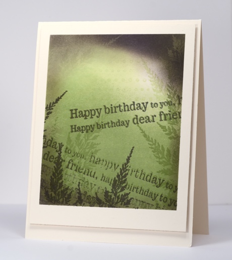
After playing around with sponging on tags the other day I decided to make my panel a bit larger and use the same technique. These colours are an unusual combination but made me think of rainforests with a bit of sun breaking through the canopy. If you look closely at the top right hand corner of the panel the green and purple inks have created a cool “photo negative” effect. I am going to play with that idea again for sure.
My process was pretty much the same as with the tags. I stamped the dot background in green, sponged in green then added fern stamps in green. I chose elderberry as my contrasting colour and added perimeter sponging, ferns and the sentiment several times to complete the panel. I did a little intentional restamping again for the out of focus effect; I am just messing with your eyesight!
This card works for the current Less is More challenge where we have to frame something on our card. I have framed both by masking the border of my image panel and by popping it up on the card base.
Supplies:
Stamps: Schizeas, Edge to Edge, Dots in Space PB)
Inks: Memento New Sprout, Bamboo Leaves, Elderberry (Tsukineko)
OLW 132 Inspired by packaging
Posted: March 20, 2013 Filed under: Breezy, CAS, Kate's Alphabet, OLW, Winter Berries 13 Comments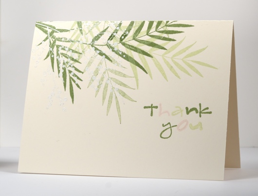
Hopefully this challenge is not a hard one. So many products we buy are beautifully packaged; I am sure you will find inspiration all around your house. Some of the herbal teas I drink come in lovely boxes and I had planned to take inspiration from one of them but the brand I have right now is not so inspiring. After browsing the shower gels and shampoo bottles I settled instead on a tiny piece of packaging my daughter received with a gift a couple of days ago.
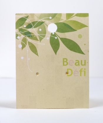
I like everything about this little card mount for a pair of earrings. The colours are restful, the layout is balanced and the sentiment bold, but not over powering. Packaging is great inspiration to try something you wouldn’t otherwise. I rarely use white on beige or ivory cardstock but is is very elegant. I would never have thought of adding a tiny bit of pink in the sentiment and nowhere else but it works.
OLW128 Rules
1. A one-layer card is defined as a single layer of card stock. No other layers allowed.
2. Make a one-layer card inspired by some packaging.
3. Post your cards online and link to them using the InLinkz button at the end of this post. If you link to your blog, be sure to link to the specific post, not just your blog’s main page.
4. Have fun
Supplies:

Stamps: Breezy, Kate’s Alphabet, Winter Berries(PB)
Inks: Memento Bamboo Leaves, New Sprout, Angel Pink & Versamark (Tsukineko)
Also: White embossing powder


