
Bamboo
Posted: April 20, 2017 Filed under: Alcohol Ink, bamboo cut out | Tags: Penny Black creative dies, Ranger Alcohol Ink, Yupo Paper 6 Comments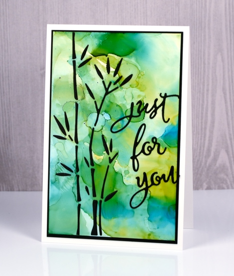
I have combined a new die, ‘bamboo cut out’ with an alcohol ink background to create this simple design. As the name of the die suggests, the die cuts out all the little pieces to make up some stalks of bamboo. The easiest way to make this card would have been to cut the bamboo out of the alcohol ink panel to reveal the black background behind and I would suggest using that method. For some strange reason however, I chose to cut the bamboo out of black cardstock and attach all the little pieces to the alcohol ink panel.
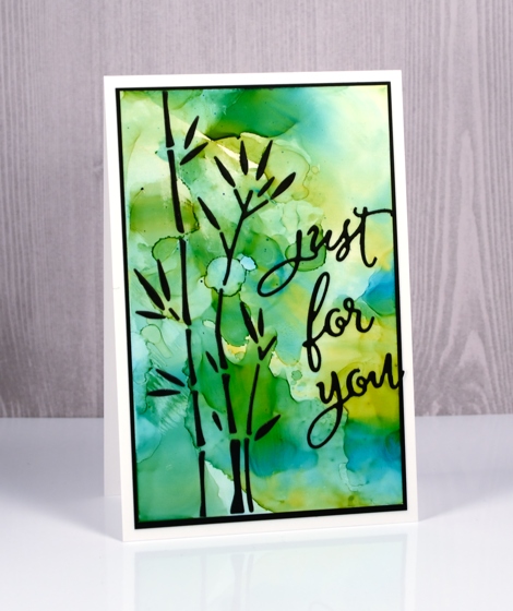
I put double sided adhesive on the back of the black cardstock before die cutting then held all the pieces together with a sheet of ‘press & seal’ so I could attach them to the alcohol ink panel but it was a tad fiddly!
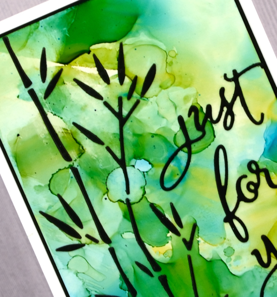
I made the alcohol ink panel on white yupo paper. I dropped some blue and yellow alcohol inks on a craft sheet, added some rubbing alcohol then swiped the yupo through it to pick up the blended coloured patterns. The colours reminded me of light through a forest so I chose the bamboo to be my feature image.
Supplies
Dies: bamboo cut out, for you
Inks: honeycomb & stream alcohol inks (Ranger)
Paper: white yupo paper, black cardstock
Also: stick it adhesive, rubbing alcohol
Fancy Fish
Posted: March 22, 2017 Filed under: Alcohol Ink, Fancy Fish | Tags: Penny Black creative dies, Ranger Alcohol Ink 7 Comments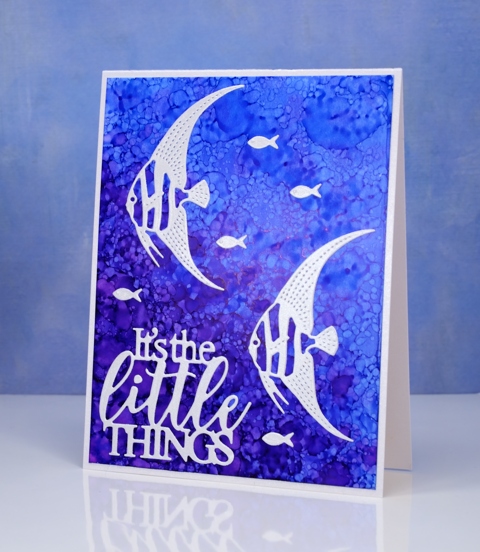
I have another alcohol ink background to share today. If you didn’t see the yesterday’s card you might want to click here (there’s a giveaway provided by The Foiled Fox so it’s worth a visit!) When I saw the new fancy fish dies from Penny Black, I immediately thought of the patterns possible with alcohol inks and blending solution. To create this kind of pattern I started with plenty of dark and light blue ink on my yupo paper then dropped some blending solution on a felt pad and pounced that all over the panel. The blending solution creates little bubble shapes in the ink. The felt pad also picks up blue ink from the yupo paper and prints it down again so more little bubbles.
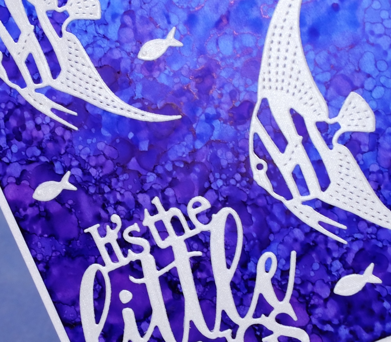
I die cut the fish and sentiment from a silvery grey envelope I had saved; it had a bit of texture and a little shimmer to it. The die set, Fancy Fish includes two detailed fish and a teeny tiny fish; I have a card tomorrow featuring the third fish.
Supplies
Dies: Fancy Fish, Dream big
Inks: indigo, pool alcohol inks (Ranger)
Paper: white yupo, neenah solar white, silver envelope
Silhouette blossoms & Foiled Fox Giveaway
Posted: March 21, 2017 Filed under: Alcohol Ink, Spring blossoms | Tags: Penny Black creative dies, Penny Black stamps, Ranger Alcohol Ink 59 Comments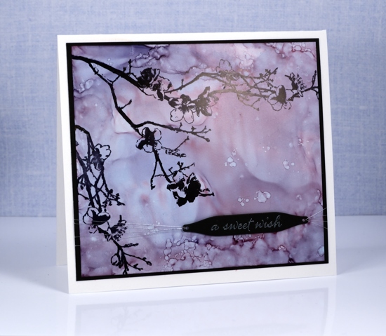
I am a guest of the wonderful Foiled Fox crew again today. To find out more about this silhouette blossom card you will need to pop over there. Once you are there you will want to browse through the lovely projects on their blog and wander the listings in their store.

Shauna from the Foiled Fox is offering one of my readers a $35 gift certificate from the Foiled Fox store this week. To enter the draw you need to check out their store then come back here to my blog and leave a comment letting me know what item you would put on your wishlist. You have until the end of Sunday March 26th EDT to let me know what you have your eye on. We will announce a winner next Monday.
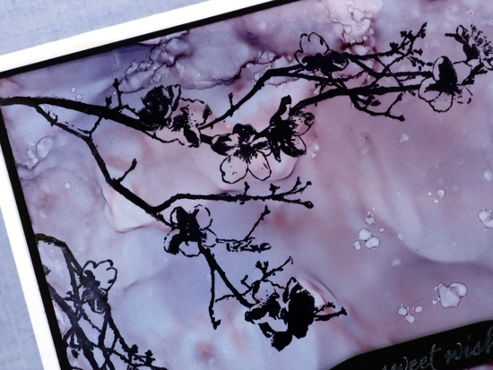
I have linked to the products I used below, you will find them all in the Foiled Fox store.
Supplies
Stamps: Spring blossoms, Happy snippets (PB)
Dies: gift card pocket set (PB)
Inks: stonewashed, cranberry & eggplant alcohol inks, Jet black archival ink(Ranger), versamark (Tsukineko)
Paper: neenah solar white cardstock, neenah epic black cardstock, white yupo paper
Also: Wow white pearl embossing powder, silver thread
Stamping with alcohol inks
Posted: June 4, 2016 Filed under: Alcohol Ink, Autumn Jewels, Pinwheel | Tags: Penny Black creative dies, Penny Black stamps, Ranger Alcohol Ink 11 Comments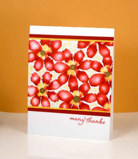
A few months ago I tried all sorts of fun techniques with alcohol inks and I am keen to get them back off the shelf to try some more. Today’s cards are all examples of stamping with alcohol inks, using die-cut felt as the ‘stamp’.

I did all the stamping on glossy photo paper which allows the inks to move and blend a little but nowhere near as much as the on yupo paper. Yupo paper is a synthetic paper which is totally waterproof so the ink does not soak into it at all but spreads across it as it dries. The photo paper does absorb ink even as the glossy surface lets it spread and blend a little.
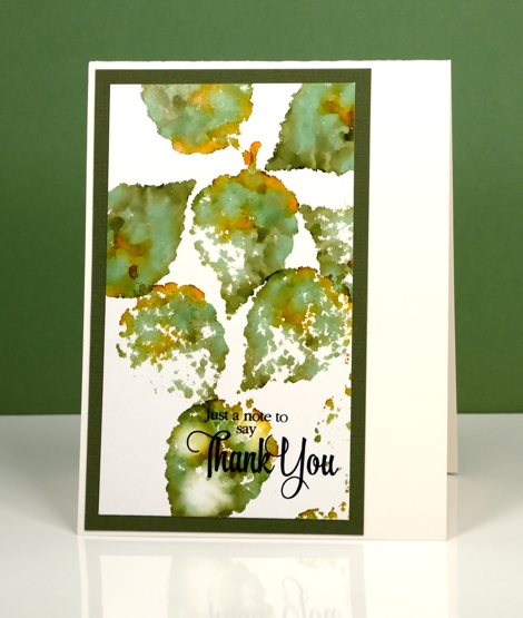
By varying the amount of ink you drop on the felt die-cut you can get a lacy effect or a full print. By adding a little blending solution to the felt you can dilute the colour and get a blurry effect within the shape. The possibilities are extensive with this technique.
Supplies:
Stamp: Words of Kindness, Sentiment Collection, Happy Snippets (PB)
Die: Autumn Jewels , Pinwheel (PB)
Ink: Alcohol inks (Ranger)
Cardstock: Glossy photo paper, coloured cardstock, Neenah solar white & natural white
Stencilled
Posted: May 31, 2016 Filed under: Alcohol Ink, Hypnotic | Tags: Penny Black creative dies, Penny Black stencils, Ranger Alcohol Ink 16 Comments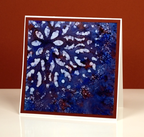
If you haven’t tried stencils with your alcohol inks you might be surprised at the lovely effects you can get. Let me warn you though, they might not do what you want them to, but they will probably do something cool. There is a bit of trial and error involved when working out how much blending solution or rubbing alcohol to apply through the stencil. Too much and it spreads under the stencil and you lose the pattern definition. Too little and you will not remove enough colour to get a pattern. It is worth playing with applicators too. Applying solution with a q-tip will take much longer but you will have more control.
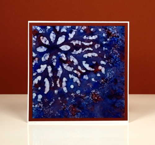
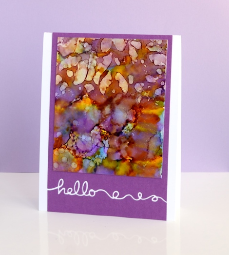
I started with a deep blue pattern on yupo paper with little patches of burgandy ink. When it was dry I positioned the ‘hypnotic’ stencil over one corner then removed colour with blending solution on a felt applicator. I kept an eye on the felt as I pounced it through the stencil because it was picking up blue ink. If it got too blue it wasn’t removing ink anymore. I like the batik look with some lines of blue in the white spaces
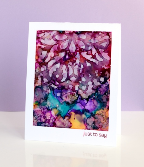
On these two purple toned panels I used the same technique but was not as careful to keep the stencil still on the one below. The pattern from the stencil is just a mix of abstract shapes. The blue panel at the top of this post is all about the stencilled pattern but these two messy purple ones are just here because I love the colours. Before I die cut the word ‘hello’ out of the purple cardstock I positioned a strip of ‘stick it’ adhesive on the back where the word would be. That made it easy to attach the panel to the card base and pop in the little loops and circles that were cut out. I saved the purple ‘hello’ cut out of the card below and stuck it inside the card above.
Supplies:
Stencil: Hypnotic (PB)
Stamp: Happy Snippets (PB)
Die: Doodles (PB)
Ink: Alcohol inks (Ranger)
Cardstock: Yupo, mauve cardstock, Neenah solar white
Folk Flower
Posted: May 17, 2016 Filed under: Alcohol Ink, CAS, folk flower | Tags: Penny Black creative dies, Penny Black stamps, Ranger Alcohol Ink 7 Comments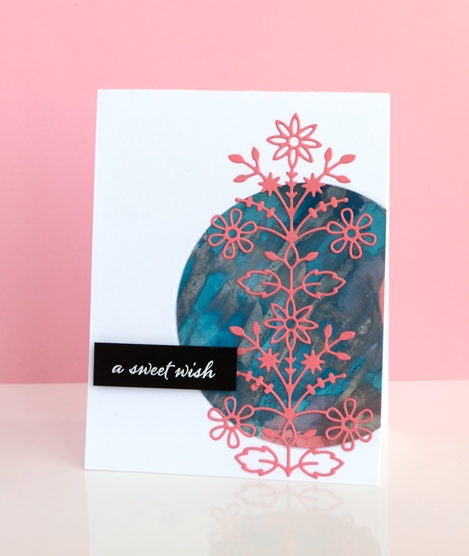
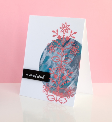
Having so many alcohol ink experiments on hand is helping with my resolve to try new layouts and sketches. The colours and patterns that appear almost magically when working with alcohol inks need little or no adornment. This panel was mainly aqua with some splotches of coral pink here and there until I added silver and scraped it across the panel with the coffee stirrer. I ended up with the rock formation style patterns which were kind of cool but the silver had taken over.
I played around with several ideas for using the panel including tossing it but finally settled on a layout inspired by this card on JJ Bolton’s blog. I chose the coral coloured cardstock for the die cut to bring out the few patches on the panel. The assembly of this layout did not go smoothly for me, (there is more than one reason I stick to the portrait gallery layout!) I cut a piece of light weight cardstock to stick behind the circle to keep everything together. When I ran my finger over the edge of the circle to press it firmly onto the backing, the silver ink smudged onto my clean white card base. I managed to transfer silver ink via my die cutting plates also. The metallic alcohol inks sit on the surface and therefore need some sort of fixative; (I have watched a tutorial about this just haven’t looked into whether I have the right fixative) Rather than make the same mistake three times I decided to polish the patterned circle with a paper towel as someone had done successfully in class to see how much silver would come off. I removed quite a bit which revealed more aqua and left the panel less smudgy. The rest of the assembly was more straight forward; I used ‘stick it’ adhesive on the back of the folk flower die cut and embossed the sentiment on black cardstock for contrast.
When I visited JJ Bolton’s blog to look at her card layout I read about the clever wax crayon technique she used on her card…something to try another day.
Supplies:
Stamps: Happy Snippets (PB)
Dies: Folk Flower (PB)
Ink: Alcohol inks, Versafine ink (Ranger)
Paper: glossy photo paper, Neenah Epic Black 100lb cardstock, Neenah solar white cardstock, coral cardstock
Also: stick it adhesive, white embossing powder
Alcohol ink backgrounds
Posted: May 14, 2016 Filed under: Alcohol Ink, In the Garden, Love Art, Serenity | Tags: Penny Black creative dies, Penny Black stamps, Ranger Alcohol Ink 2 Comments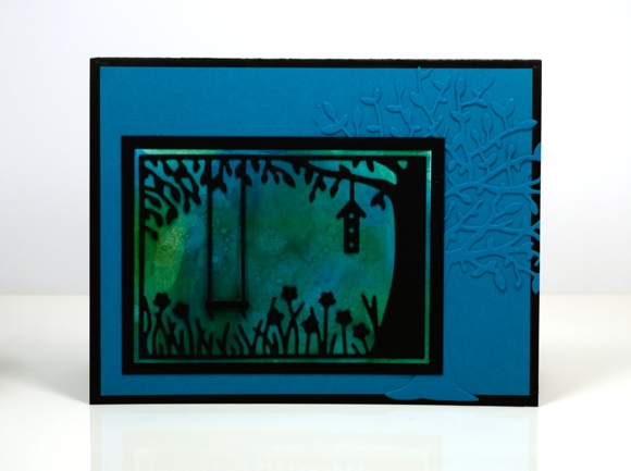
Yesterday I shared some alcohol ink abstract panels; today I have more abstract panels but these ones have become backgrounds for dies or stamps. The one above looked so forest-like I had to pair it with trees. It is a fairly dark mix of colour so I think it must be dusk or dawn. The ‘in the garden’ die was perfect for turning the blue-green panel into a scene and the new ‘serenity’ tree die just added to the woodland feel.
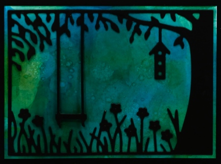
Supplies:
Dies: Serenity, In the Garden (PB)
Ink: Alcohol inks (Ranger)
Paper: glossy photo paper, Neenah Epic Black 100lb cardstock, blue cardstock
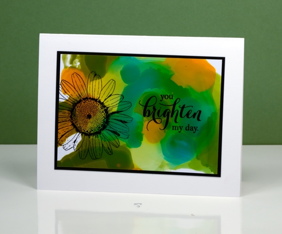
The colours in this panel again determined what I would add. Orange, yellow and green patterns seem an appropriate background for a daisy. I used archival ink which gave a crisp fast drying print. There was another card made from this background but I made the mistake of laying a stamp on top of the panel for positioning before inking the stamp. The natural stickiness of the stamp on the glossy paper lifted the surface off the paper removing the alcohol ink (not in a cool resist type way!). It didn’t happen on the daisy card because I just inked, stamped and hoped for the best.
Supplies:
Stamps: Love Art, Special Thoughts (PB)
Ink: Alcohol inks, Jet black archival ink (Ranger)
Paper: glossy photo paper, Neenah Epic Black 100lb cardstock, Neenah solar white cardstock
Abstract alcohol inks
Posted: May 13, 2016 Filed under: Alcohol Ink | Tags: Ranger Alcohol Ink, Yupo Paper 13 Comments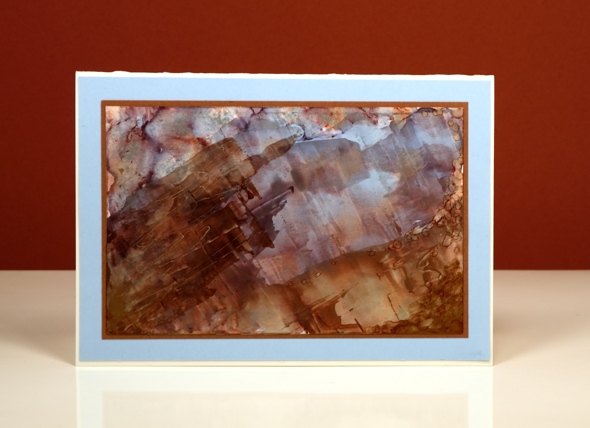
During my recent adventures with alcohol inks I enjoyed creating abstract panels. Some of them I turned into backgrounds or scenes by adding stamps and die cuts but others I left alone because I liked the pattern and colours just as they were. The one above reminds me of a geological cross section. There is an example of some type of cross section down the road from us and a few times a year I see a class of students on a field trip climbing around taking photos. The blues in the design above are particularly pretty in real life and there are threads of copper here and there also.
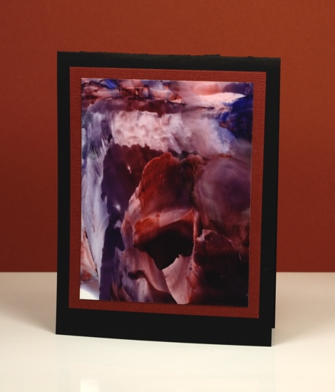
This abstract reminds me of a waterfall but several people saw icebergs and crevices in it. Both these designs were done on yupo paper. I started as I often do by just dropping three colours of ink on the yupo; the sharp edges and lines were achieved by dragging the inks across the paper with a coffee stirrer. I don’t remember the ink colours I used other than the copper in the top one.
Layouts and sketches
Posted: May 6, 2016 Filed under: Alcohol Ink, CAS, Dies | Tags: CAS, Penny Black creative dies, Penny Black stamps, Ranger Alcohol Ink 7 Comments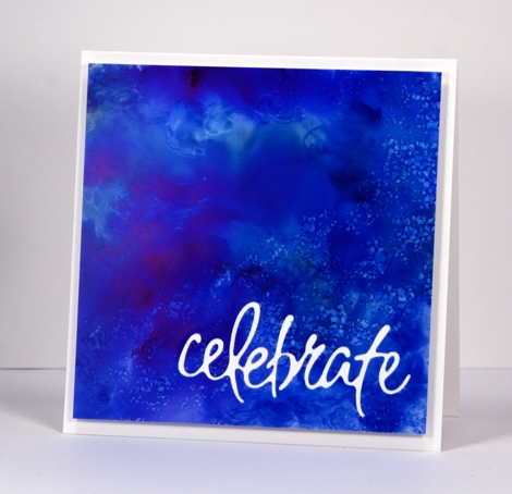
Recently I noticed how often my card designs involve a simple square or rectangle. Sometimes the panel is matted in black or a co-ordinating colour; other times it is popped up on the card base which creates a type of shadow mat. A matted panel with little embellishment is my most used layout. I’m not saying there is anything wrong with the matted panel approach; I often try to create a mini painting so framing it seems like an appropriate way to turn it into a card. However, there are many clever card makers who never default to the square or rectangular layout; each new card features angles, diagonal lines, curves, cutouts and all manner of creative designs. I’ve decided I need to mix things up a little in the sketch and layout area. Take the card above for example, the alcohol ink design reminded me of the ocean from beneath the surface with light above and bubbles all around. I really didn’t want to loose much of the blue pattern so I cut the sentiment out of the blue panel and popped it up. I like how it turned out but it was very much my usual style.
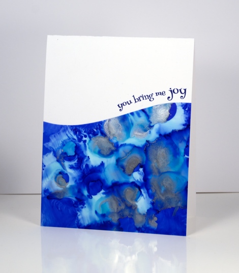
When I put this next card together I was working with a similar panel; the alcohol inks had done cool things creating a pattern I wanted to save if possible but not in yet another rectangular layout. By cutting a curve across the patterned yupo panel I was able to add some interest and bend a transparent sentiment stamp to hug the curve.

Once again I wanted to retain most of this warm toned alcohol ink design so I chose a cool new border die with curves that created a contrast with the angles of the stenciled pattern.
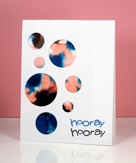
I have a board on pinterest where I am saving inspiration for new layouts. The card above was inspired by Paula Dobson’s bright happy card, pinned recently. Sketch challenges are another source of inspiration I hope to make use of more often. You may have noticed all the cards in this post were made from patterned panels, which of course, are easier to adapt to interesting layouts than pictures of real things! I may get adventurous and creative with my scenic or floral panels too, who knows?
Supplies:
Dies: Celebrations, Border Edges (PB)
Stamps: Happy Snippets, Sweet Wishes
Ink: Alcohol inks (Ranger) Versafine inks (Tsukineko)
Paper: Yupo paper, Neenah SolarWhite 110lb cardstock, Neenah Natural white cardstock
You’re Sweet
Posted: May 3, 2016 Filed under: Alcohol Ink, CAS, Dies | Tags: CAS, Penny Black creative dies, Ranger Alcohol Ink 5 Comments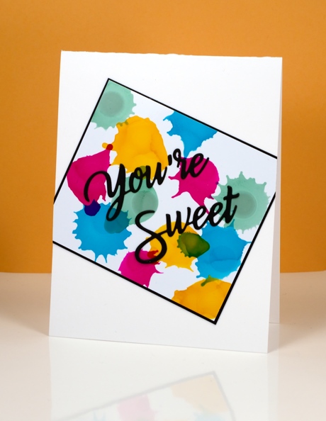
Earlier today I was admiring yet another fabulous card by Ardyth Percy-Robb, who is not only clever and creative, but also a faithful challenge participant. The card that caught my eye was for the May Pinterest Inspired Challenge featuring the image below:
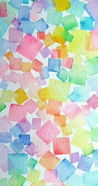
Even though I love watercolour and the image above is full of lovely soft blends and bleeds I chose to use my recent arty crush, alcohol inks. I dropped sunshine yellow, pool, raspberry and juniper one colour at a time so I could squirt air at each drop before it dried. You can see how some inks create a new colour when they intersect but others cover or push the other colour. I matted in black and attached my panel to the card base askew before adding a die cut sentiment.
Supplies:
Die: You’re Sweet (PB)
Alcohol Ink: sunshine yellow, pool, raspberry, juniper (Ranger)
Paper: Kirkland photo paper, Neenah SolarWhite 110lb cardstock, Neenah epic black cardstock












