
Playing with texture
Posted: March 23, 2011 Filed under: CAS, Infinite Goodness 7 Comments
Creating my floral panel was a little like designing a piece of fabric. I started by stamping the flowers in versamark and embossing in clear. Then I added pink by using a direct to paper technique. I wanted to create a little texture in my background so I laid the cardstock on the stamp pad and rolled over the top with my brayer. The fabric of the stamp pad as well as the edges showed up on the cardstock. It was very patchy coverage so I added sponging in many places otherwise the embossed flowers would not have been prominent enough.
The panel was still a bit empty so I randomly added pink flowers. There was still something missing so I stamped some more flowers in black. After adding a black mat I was happy with the way the flowers popped, both the black and the white. So this was definitely one of those cards that evolved.
Thanks for dropping by; I’ll have another card featuring the same texture technique later in the week.

Supplies:
Stamps: Infinite Goodness, Hugs and Wishes
Inks: Basic Black, Pixie Pink, Versamark
Cardstock: Basic Black, Pixie Pink, Flourishes classic white
Also: Clear e.p.
Monochrome and Masculine
Posted: March 19, 2011 Filed under: CAS, Lovely as a Tree, Stamped Landscapes 50 Comments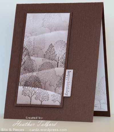
The challenge at Less is More this week is to make a masculine card. I certainly don’t have many masculine cards in my stash so it will come in handy. There are not many masculine stamps in my collection either, most were bought with my son and his friends in mind: the extreme sports stamps from Stampin’ Up. Rather than be extreme I pulled out the ever faithful “Lovely as a Tree set” and created a foggy hillside scene.
I worked on a piece of cardstock larger than the finished panel so I could crop it to the most appealing view. I used chocolate chip ink for the whole panel, stamping the foreground trees first then adding a mask, stamping again, sponging, then moving the mask and repeating the pattern until I was stamping the final pale trees in the distance.
So my clean and simple does not include “white space” this time but plenty of empty unstamped space surrounding my image panel. The matted panel is popped up over the textured card base.
Supplies:
Stamps: Lovely as a Tree, Teeny Tiny Wishes
Inks: Chocolate Chip
Cardstock: Whisper White, Chocolate Chip, textured and flat
Card makeover 1
Posted: March 17, 2011 Filed under: CAS, With Gratitude 10 Comments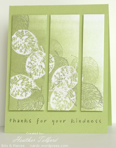
I mentioned in the last couple of posts that I had cast several cards aside because they didn’t work for some reason. They did not, however end up in the garbage, I photographed them and put them in the makeover pile as there was something in them worth saving.
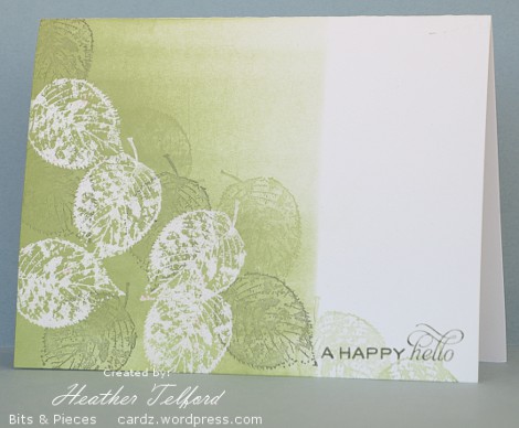
The card above is the made over card. The card below is the rejected one. It was the reject that I was happiest with, the one that almost made the cut as it was, but it had a few issues. One was the badly stamped sentiment and the other was the edge of the sponging. I wish I had softly diminished the sponging instead of using a mask to create a line.
In the makeover I just used the leaf panel, sliced into three and popped up. Slicing is a very helpful technique to apply when making over a card. I was going to use a white card base but, inspired by Susan Raihala’s commitment to use up more of her coloured cardstock, I reached for a coloured card instead. I definitely do have plenty of coloured cardstock lounging around.
That is the first of the makeovers, the others will be harder to do as the rejects were not as pretty as this one!
Supplies:
Stamps: With Gratitude, Simple Sayings 2 (SU)
Inks: Versamark, Certainly Celery, Always Artichoke
Cardstock: Flourishes Classic White, Certainly Celery
Also: White e.p.
Less is More challenge 6: Off the Edge
Posted: March 15, 2011 Filed under: CAS, With Gratitude 16 Comments
The challenge at Less is More this week is a One Layer Card which includes stamping off the edge. I often stamp off the edge of my cards so you would think I could whip one of these out quickly. Sadly it took three attempts before I had something I was happy with. I have a growing pile of “blunders” that I have to turn into something attractive.
I masked with post-it notes leaving a long thin panel to stamp on. Before sponging I stamped the leaf four times, some without reinking. Then I sponged in four colours and removed the masks. I added the sentiment and three more leaves to complete the card. Who knows why I am stamping fall colours just as spring is appearing?
Supplies:
Stamps: With Gratitude, Thoughts & Prayers (SU)
Inks: Summer Sun, Pumpkin Pie, Really Rust, Close to Cocoa
Cardstock: Flourishes Classic Ivory
OLW 44 Marta’s Pinterest Inspires
Posted: March 14, 2011 Filed under: CAS 14 Comments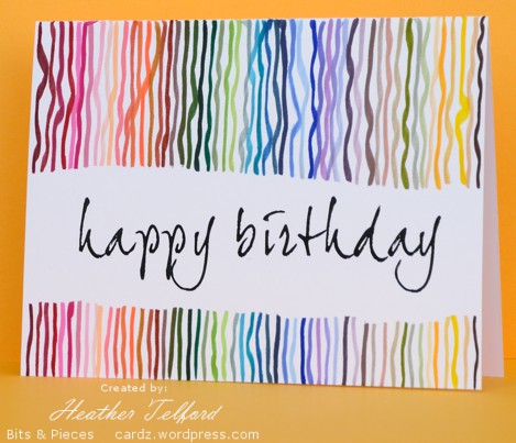
Many thanks to Susan at Simplicity for introducing me to Marta’s fabulous pinboards. Pinterest is a site where people catalog the things they love by “pinning” them on boards. Susan directed us to Marta’s boards so that we could find inspiration for this week’s One Layer Wednesday challenge.
I chose two inspiring boards. I’m not sure if that is bending the rules, but it ended up working for me, which is more than I can say for some of my cardmaking lately! I chose the pictures below.
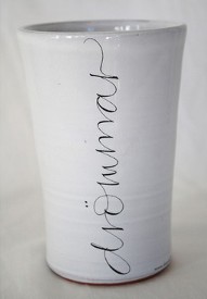
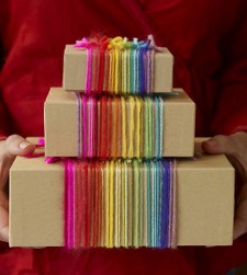
I created the whole card without stamping which was not my initial intention. I wanted a funky font like the one on the mug so I scanned through the fonts on my computer and chose joehand2 which I printed onto white cardstock. The white mug is beautiful as it is, but my card was lacking a little with just the words happy birthday so I created my own yarn wrap with markers. This part was fun as I pulled out one Stampin’ Up marker after another and drew lines from bottom to top over the torn mask I had covering the words. I ended up using 52 markers and did not repeat a single colour.
Check out the other nifty cards linked on Susan’s blog.
Supplies:
Computer Font: Joehand2
Inks: 52 Stampin’ Up Markers
Cardstock: Flourishes Classic White
Green silhouettes
Posted: March 10, 2011 Filed under: Garden silhouettes 18 Comments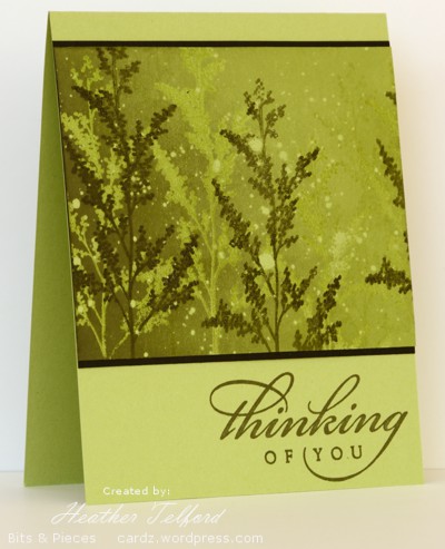
I decided to play around with some greens to create this card. To me it has a bit of a misty rainforest look.
I created the stamped panel first on certainly celery cardstock as follows:
- flick masking fluid around
- stamp branch in versamark
- stamp branch in artichoke
- emboss in clear
- brayer celery ink over whole panel
- brayer artichoke ink on left side of panel
- remove masking fluid
Although I didn’t used black on the stamped panel, black looked better than artichoke for framing the panel.
Edited to add: Several people asked about Masking fluid. It is a liquid you will find in the paint section of the art store. You use it to paint in the areas of a painting that you want free of paint, such as white highlights. When you have finished applying the surround paint you peel off the masking fluid and the paper underneath is untouched. I bought it to use when watercolour painting but it is very handy with stamping as well
Thanks for dropping in today.
Supplies:
Stamps: Garden Silhouettes, All Year Cheer (SU)
Inks: Versamark, Always Artichoke, Certainly Celery
Cardstock: Certainly Celery, Basic Black
Also: Clear e.p. Masking fluid(Windsor & Newton)
Pastel Panels
Posted: March 8, 2011 Filed under: CAS, Cuttlebug 22 Comments
The current challenge from Mandi and Chrissie at Less is More is to use pastel colours. I tried three different designs before settling on the one above. The totally pastel colour scheme gave me trouble, but that’s part of the challenge isn’t it? I have set aside the other attempts to transform into something else when inspiration hits.
I cut my cuttlebug panel in three strips and sponged in celery, amethyst and pretty in pink. I popped up the strips before adding some gingham ribbon and a little oval tag.
Supplies:
Stamps: Teensy Tiny Wishes (SU)
Inks: Pretty in Pink, Certainly Celery, Almost Amethyst
Cardstock: Flourishes Classic white
Also: Cuttlebug Birds and Swirls folder, pink gingham ribbon
OLW 43 Shimmer
Posted: March 6, 2011 Filed under: CAS, Rollers 7 Comments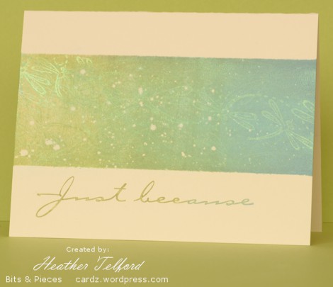
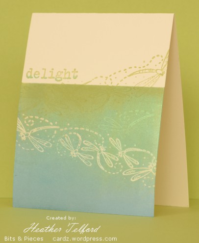
Susan’s challenge on Simplicity this week was to add a little shimmer. Once again this was indeed a challenge to me. I rarely add shimmer and could only think of one product I had which would provide any shimmer: some pearl ex powders from SU. I have hardly used them and have forgotten the techniques I once tried.
To make the top card I flicked around a bit of masking fluid first then rolled the dragonflies with versamark before brayering celery and bordering blue over the top of that. I shook pearl ex powder onto the coloured panel and it stuck to the versamark but also lightly to the rest of the area. You can see a bit of shimmer at either edge of the card but the string of shimmery dragonflies actually goes right across the card.
The card below was done in a similar order but I embossed a string of dragonflies first. After that I added a string in versamark and pearl ex and a few coming off onto the ivory cardbase.
All in all it was a fairly experimental exercise which is half the fun of challenges. As others have said in their posts there is a lot more shimmer to be seen in real life but there are glimpses in the photos.
Supplies:
Stamps: Dragonfly roller, Paint Prings, Simple Sayings 2 (all SU)
Inks: Versamark, Certainly Celery, Bordering Blue
Cardstock: Flourishes Classic Ivory
Also: clear e.p., Pearl Ex powder
OLW 42 I’ve got the music
Posted: February 27, 2011 Filed under: CAS, Rollers 51 Comments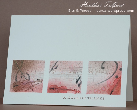 Jennifer gave us a musical challenge this week for One Layer Wednesday while Mandi and Chrissie at Less is More sent out a three square challenge. I don’t often combine challenges as that makes them all the more challenging but I had a picture in my mind as to how these two themes might work together.
For the music theme I wanted to create the feel of an aged piece of sheet music and combine it with the warm colours of the wood of a violin. Both my girls have lovely violins; one is over 100 years old and the wood is a warm muted colour, the other is under 10 years old and is a darker, shinier finish. I knew when creating this card I would have to get the musical elements right or they would tell me so.
I cut three 1½” squares out of a post-it note mask and used the SU roller “Music Notes” to fill all three squares. I didn’t re-ink it as I wanted the faded look. I then sponged in close to cocoa and ruby red before stamping my little violin stamp in the same colours. I coloured the violins with watercolour pencils and blended them with water, flicking a little around at the same time to add to the aged look. The treble and bass clefs and the sharp and flat were drawn with black watercolour pencil.
Supplies
Stamps: Music Notes roller(SU), Fiddle(Parlour Victorian Atlantic Canada), Thank You Kindly(SU)
Inks: Ruby Red, Close to Cocoa
Paper: Flourishes Classic Ivory
Also: FaberCastell Watercolour pencils
Three panel daisies
Posted: February 26, 2011 Filed under: CAS, Upsy Daisy 5 Comments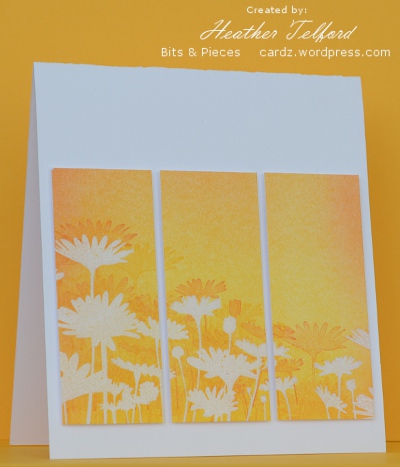
Here is another spring inspired card using the daisy silhouette stamp from Stampin Up. I clear embossed the daisies then brayered the whole panel with summer sun and and pumpkin pie. Before splitting the panel into three I stamped and restamped the daisy stamp in pumpkin pie. Each panel is popped up on stampin’ dimensionals.
I did try a couple of sentiments both on scraps and on the bottom of the card. None of them added to the design so I sliced the bottom off and left it without any text. This is the first card I have photographed with the new camera, I am not convinced my settings were the best but I will keep learning, practising and posting. I have high hopes. What is great is that the colour is exactly what is on the card.
Supplies:
Stamps: Upsy Daisy (SU)
Inks: Versamark, Pumpkin Pie, Summer Sun
Cardstock: Flourishes Classic White
Also: clear e.p.











 Heather Telford