
Watercoloured Background
Posted: January 21, 2013 Filed under: Background Stamps, Penny Black, Watercolour 3 Comments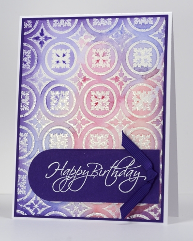
There is a new catalog from Penny Black out today. Pop on over to the Penny Black blog this week to check out the new stamps and maybe win some too. I am featuring one of the new background stamps, Roman Surround, in my card today with another watercolour method.
In yesterday’s card I wet the watercolour paper first before stamping. For this card I embossed the background image first and then wet the watercolour paper before adding and blending pinks, blues and purples. My inspiration came from this lovely card by Jennifer McGuire. Once again I was so happy with the background that I added very little, casing Jennifer’s layout to make a birthday card.
Supplies
Stamps: Flourish Birthday, Roman Surround(PB)
Ink: Versamark (Tsukineko)
Also: white and clear embossing powder, Faber Castell watercolour pencils, grosgrain ribbon
Cardstock: Purple Mountain mix & match cardstock
My unusual creative process
Posted: January 20, 2013 Filed under: Background Stamps, Penny Black, Social Butterfly, Watercolour | Tags: arts, CAS, Penny Black stamps 18 Comments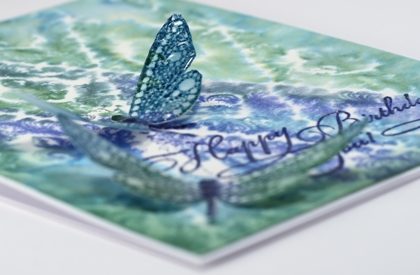
I visited my Handmade Cards board on Pinterest this afternoon for inspiration. However, the inspiration pic. and my finished card bear absolutely no resemblance to each other. I had a totally different design almost ready to put together when I decided to try and watercolour a background stamp, just in case I wanted a bit more going on in the card. (Unusual for me, I know) As it turned out I liked the background panel so much it became the main event, I tossed the other panel and kept only the little dragonflies from my original design.
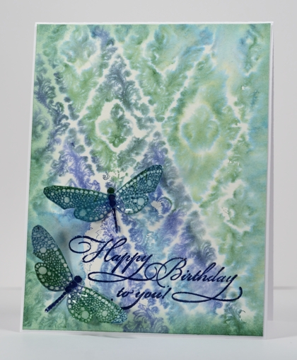
So, without mentioning the discarded process, here is how I made this card:
- dampened a piece of watercolour paper, inked the dragonfly stamp in blues and green and stamped it on the damp paper.
- when the dragonflies were dry I cut them out, added a little sponging and used a marker to darken their spines.
- stamped the dragon flies with a versamark pad to totally cover them then embossed with a thick glossy embossing powder, twice.
- to make the background panel, I wet a piece of watercolour paper (much wetter than for the dragonflies).
- I inked the background stamp randomly in the two blues and the green ink and stamped it onto the wet paper.
- when all was dry I trimmed the background panel, sponged the edges and embossed the sentiment.
- attached the background to the card base and the dragonflies with glue dots.
Not what I set out to create, and if I told you I my initial intention was to make a friendship themed card for the Less is More challenge you would just laugh wouldn’t you?
Supplies
Stamps: Special Time, Wall Paper Print, Social Butterfly (PB)
Ink: Memento Teal Zeal, Paris Dusk, Cottage Ivy and Versamark (Tsukineko)
Also: Thick Glaze embossing powder
Blue
Posted: January 18, 2013 Filed under: CAS, Inclinations 20 Comments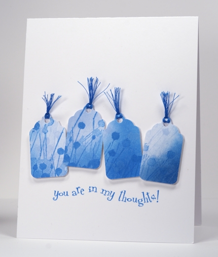
The current CASology challenge theme is BLUE, my favourite colour, so I made some little blue tags and stuck them in a row. It was amusing to read the comments on my last card-the one with no sponging on it!! You can relax; I am back to sponging on this one. I sponged two blue inks on a remnant of white cardstock then stamped the image in the same two blues before punching out four little tags. I chose my sentiment then arranged the tags and popped them up to follow the line of the sentiment. As I had no ribbon or embroidery floss the right colour I used multiple strands of cotton thread.
This morning it was -24°C here and we woke up to read that Sydney, Australia had just had a record high temperature of 46°C! We are experiencing one extreme and our families, the other.
Supplies:
Stamps: Inclinations, In my Thoughts (PB)
Inks: Memento Summer Sky & Bahama Blue (Tsukineko)
Also: Blue cotton thread, Tag punch
A little bird told me
Posted: January 17, 2013 Filed under: CAS, Enjoy LIfe, Watercolour 15 Comments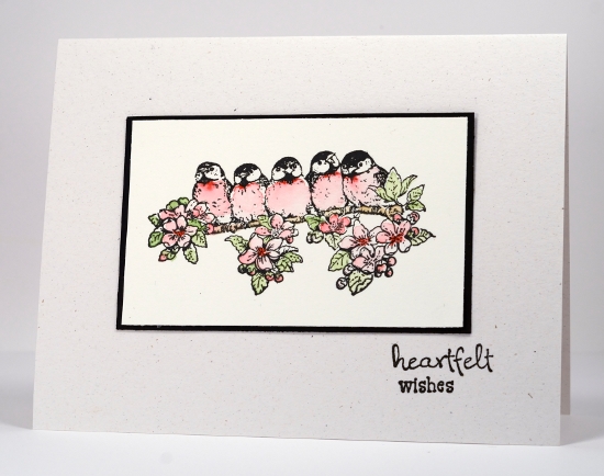
A week or so ago the challenge at Less is More was black and white with one other colour so I stamped these little birds and watercoloured their breast feathers red to enter the challenge. The problem was the flowers and leaves did not like being ignored. I coloured them and no longer had a card I could enter in the challenge.
As the watercolour paper is neither white or ivory I mounted the panel on black and made a card base out of flecked natural cardstock.
Supplies:
Stamps: Enjoy Life, Wishes (PB)
Inks: VersafineOnyx Black (Tsukineko)
Also: Faber-Castell watercolour pencils
Cardstock: Fabriano 100% cotton hot pressed watercolour paper
OLW 123 Keep Warm
Posted: January 16, 2013 Filed under: CAS, OLW 17 Comments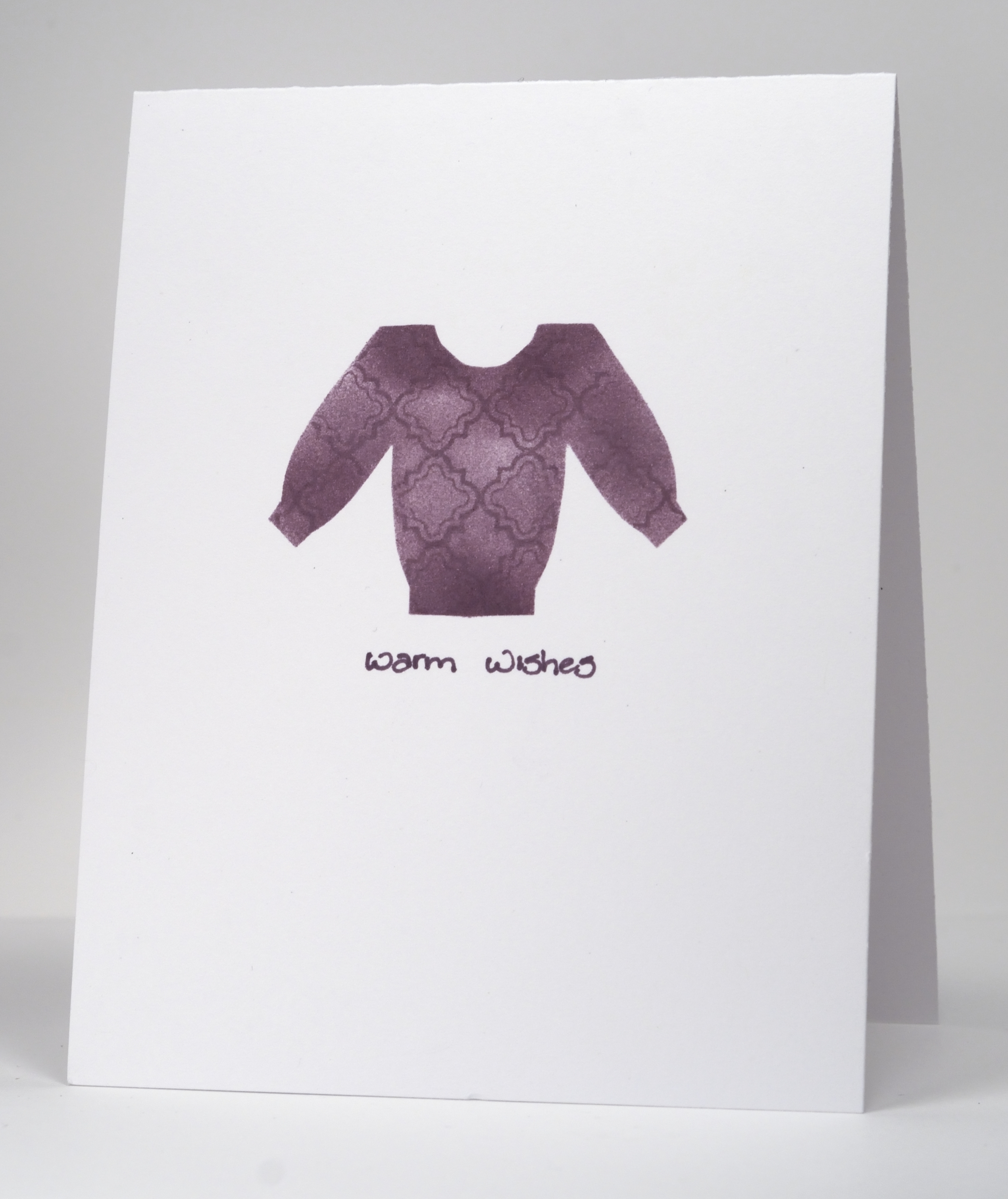
You would think that on the week that I host the One Layer Wednesday challenge I would not find it such a challenge, since I picked the theme! Not so, I really had to think this one through. The challenge is to have a warm theme to your card. The image can be something warm, or the colour scheme or perhaps the sentiment. In the dead of winter pick something to warm us up. If you happen to be playing along in the southern hemisphere I guess you won’t be short on warm inspiration.
I decided not to go for a warm colour scheme as my previous two cards were all about colour schemes so I looked for a warm image and didn’t find one. Nonetheless I persevered and created a little sweater mask and sponged myself a sweater, adding a border stamp to give it a little pattern and texture. Wouldn’t you know it, I did not have a stamp that said ‘warm wishes’ so I wrote it myself.
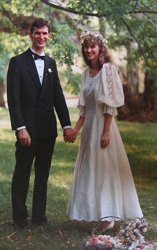
Warm Congratulations: Some of you might know Darnell of djkardkreations. She and her husband are celebrating their anniversary today so why don’t you pop over and give her some warm wishes. Have a wonderful day, Darnell. Edited to add: Ardyth is hosting an Anniversary Link party on her blog. I have added my wedding photo. see below
OLW123 Rules
1. A one-layer card is defined as a single layer of card stock. No other layers allowed.
2. Make a one-layer card with theme of warmth
3. Post your cards online and link to them using the InLinkz button at the end of this post. If you link to your blog, be sure to link to the specific post, not just your blog’s main page.
4. Have fun!

Supplies
Stamps: Puzzle Parts (PB)
Ink: Memento Sweet plum stamp pad and marker (Tsukineko)
Analogous collage
Posted: January 15, 2013 Filed under: Background Stamps, Berry Branch, CAS, Collage cards 22 Comments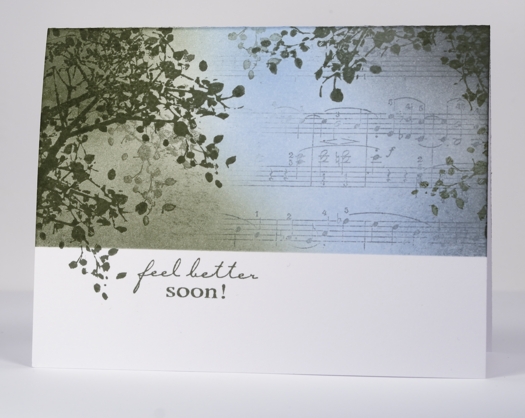
I have another collage card today, this one with a colour scheme more common in my work but probably not as striking as the previous contrasting scheme. An analogous colour scheme is one made up of colours side by side on the colour wheel. An analogous colour scheme works well for a sympathy or get well card because it is more soothing and harmonious than a contrasting one.
To create this card I positioned a mask across the lower third of the card and stamped the branch around the edges, lifting the mask once so a twig could fall below the line. I stamped a couple of times without re-inking to get that misty background look. I partially inked the music background in grey and stamped to the right of the panel then added the blue and green sponging with a little grey on the right.
My older daughter and I were discussing the sentiment; she felt that it always seems a little odd to send a card saying “get well soon” or “feel better soon” as it sounds like a command! As if someone wouldn’t feel better if they could. I guess it is probably short for “I hope you feel better soon”. That is the meaning behind this card made for my son’s writing class teacher who has fractured her wrist.
Supplies:
Stamps: Berry Branch, Music Background, Feel Better (Penny Black)
Inks: Memento London Fog, Summer Sky, Olive Grove (Tsukineko)
Complementary collage
Posted: January 14, 2013 Filed under: Bliss, CAS, Collage cards 14 Comments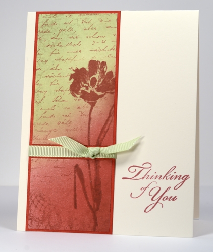
Most, if not all of the collages I have done previously have been analagous colour schemes. This one is a complementary colour scheme meaning that it uses colours opposite each other on the colour wheel. Complementary colours create more contrast and each colour promotes the other. In creating this card with red and green together you can see that my natural tendency for muted and harmonious tones influenced which red and green I chose to put together.
I started by stamping a very light impression of lace background in red where the image was darker at the bottom and hardly visible at the top. I then sponged the red from the bottom right hand corner to around the middle and the green from the opposite corner down. I stamped the flower in the same red but with some brown added on the stem. Finally I added the letter background in red to tie the whole panel together. I sliced the panel and matted it before adding the ribbon.
Tomorrow I have a collage in an analogous colour scheme, more of what you are used to from me. Thanks for dropping in. I am glad when I have inspired you to try something new and love reading your kind comments.
You probably realize this, but on the right side of my blog I have a little drop down menu that allows you to search my archives by single stamp, set, technique, tutorials, manufacturer, etc. I have just added a “collage” category and there is already a stamped landscape category. Just thought I’d mention it as it might be helpful if you are looking for something specific.
Supplies:
Stamps: Letter Background, Floral Thread, Gratitude, Bliss (PB)
Inks: Memento Rhubarb Stalk, Rich Cocoa and New Sprout, (Tsukineko)
Cardstock: Mix & Match Coral Reef
Lemon and Lace
Posted: January 13, 2013 Filed under: Background Stamps, Collage cards, Lace Flower, Penny Black 16 Comments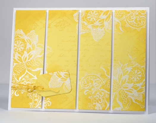
This is an unusual colour scheme for me but a happy one. Because the flower is made of lace I think it works well in white. I began the design on a rectangular piece of Penny Black Mix & Match Summer Sun cardstock by stamping the diamond design background stamp around the edge of the panel and the letter background in the middle. I then stamped the lace flower several times on in versamark ink and embossed in white embossing powder. To highlight the edges and the flowers I sponged some memento dandelion ink around the edges of the panel then sliced it into four pieces. I had a scrap left over so I punched a tag out and tied it on with embroidery floss. The four panels are popped up for a little added dimension.
I hope your day is happy and sunny.
Supplies
Stamps: Letter Background , Diamond Pattern, Lace Flower, (PB)
Ink: Memento Dandelion, Versamark (Tsukineko)
Cardstock: Penny Black Mix & Match Summer Sun
Also: embroidery thread
Winter challenges
Posted: January 12, 2013 Filed under: CAS, Hoot of a Time, Stamped Landscapes 47 Comments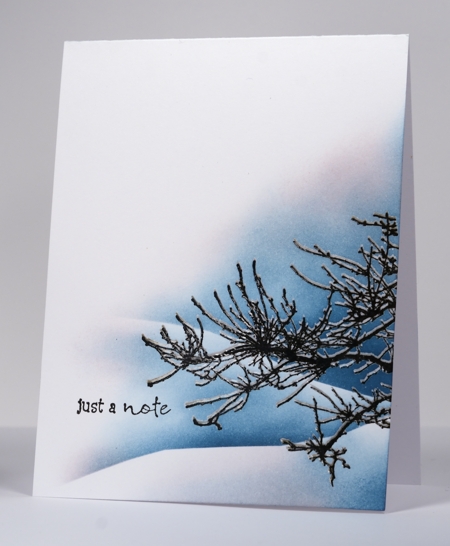
One of the challenges of winter is the warm days, like today. It may not sound hard to take but when you get rain instead of snow you get ice covering everything. And, I may be wrong, but the bitter cold seems to keep the germs at bay whereas the unseasonal thaws don’t.
But this post is really about a couple of card making challenges I am entering. The first is the current CASology challenge “winter”
and the second is CASe this Sketch #10.
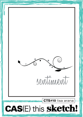
I have been inspired to enter a few more challenges by Ardyth who enters several regularly and always nails each one. I think I have said it before but I actually find challenges quite, well “challenging”. It seems to me that being given the parameters for a card is a sure way for all my inspiration to disappear. I was pretty safe with the ‘winter” challenge as I never seem to tire of those winter scenes and the sketch was similar to one of my favourite layouts so I was, this time, up to the challenge. It still took me two attempts to get it right!
This branch is from a Penny Black halloween set but as far as I am concerned it can be useful all year round; I just left the bats out! I stamped the branch in black first then, using a stamp positioning tool I stamped it again in versamark a little above the black image. After embossing in clear powder I was able to sponge the sky behind and expose the snow laden branch. When I had the snow banks and sky completed, the scene really cried out for a little contrast. A few red berries would have been perfect but I didn’t want to risk wrecking it by adding them over the sponging so instead I added a few hints of pink to the sky and snow.
Enjoy your weekend.
Supplies:
Stamps: Wishes, Hoot of a Time (PB)
Inks: Memento Teal Zeal, Angel Pink,Versafine Onyx Black, Versamark(Tsukineko)
Also: clear embossing powder
Butterfly Symphony
Posted: January 9, 2013 Filed under: Background Stamps, Butterfly Symphony, CAS, Penny Black 21 Comments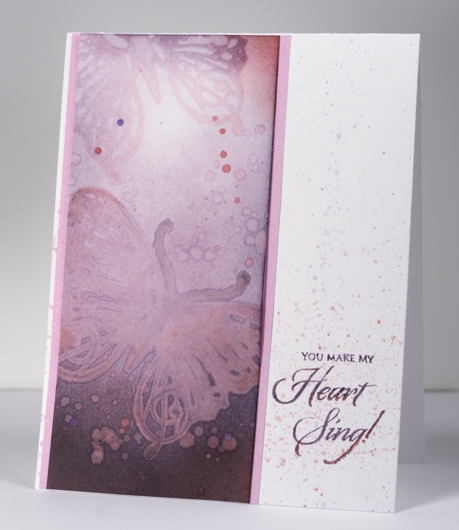
The design team at Penny Black are playing with Valentine Stamps this week; to show the versatility of the stamps we are each making a couple of cards using the same stamp. One card is celebrating love and the other is for another occasion. I created the pink toned card above by sponging a panel in pink and plum tones. The lower butterfly image is stamped with water rather than ink and the upper one a mix of ink and water. To finish I flicked water and ink droplets over the panel and the card base.
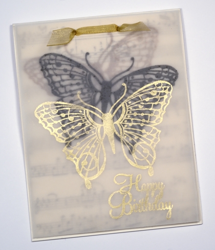
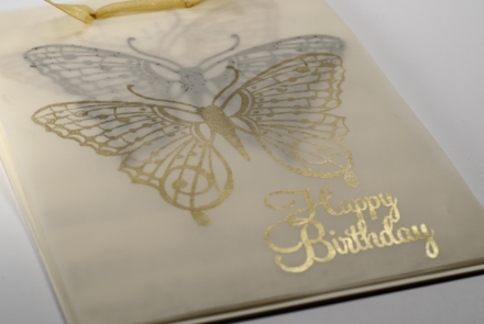
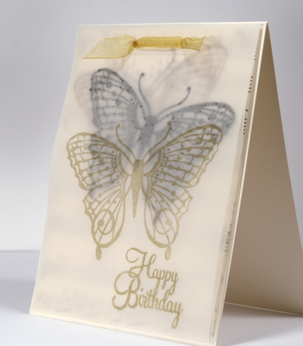
My second card is a birthday card for my daughters’ violin teacher made using layers of vellum. Because of the vellum it was very hard to photograph, hence the three perspectives to try and give you the idea. There are four layers and a card base making up this card which is rather unusual for me! The first layer is ivory cardstock stamped with the music background in black. The next three layers are all vellum each stamped with the butterfly from Butterfly Symphony, once in sepia, then black and finally gold.
Supplies
Stamps: Butterfly Symphony, Music Background, Sweet Wishes (PB)
Ink: Memento Angel Pink, Sweet Plum, Elderberry, Versafine Onyx Black and Sepia, Encore Metallic Gold (Tsukineko)
Card stock: Vellum and Mix & Match cardstock Rose Garden











 Heather Telford