A new brayer makes all the difference
Posted: February 18, 2011 Filed under: CAS, Thoughts and Prayers 8 CommentsI am sure many of you have visited the new CAS challenge blog Less is More. With so many card makers participating it is a great source of inspiration. One of the cards which caught my eye was this lovely card by Sylvia who lives in Gibralter. I must admit that I was also taken by the fact that the ocean is in the background of the photo as she snaps her cards on the edge of her balcony. How lovely that must be.
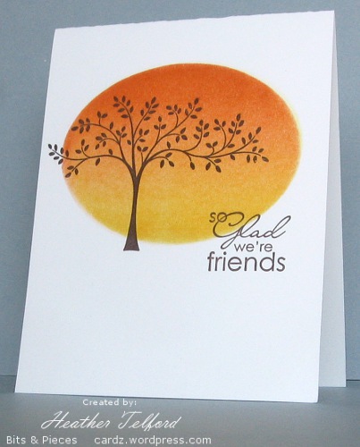
Sylvia’s card is so rich in colour and balanced in layout that I really did not change much at all when I made mine. I cut an oval out of a post it note then brayered with summer sun followed by pumpkin pie. I bought a new brayer last weekend as I have long suspected that I did not have the best one for spreading ink on cardstock. The new one is a soft rubber brayer whereas the old one was hard. The difference is quite dramatic. The new one spreads colour more quickly and evenly. I removed the mask and added the tree and sentiment.
Thanks Sylvia for the inspiration.
Supplies:
Stamps: Thoughts and Prayers, Best is yet
Inks: Summer Sun, Pumpkin Pie, Chocolate Chip
Cardstock: Flourishes Classic White
OLW 40 Two for the show
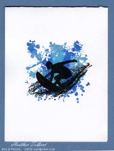
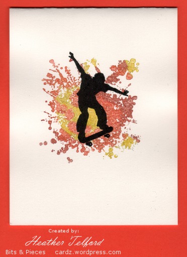
Posted: February 11, 2011 Filed under: CAS, Extreme Elements, Extreme Surfboard 16 CommentsJennifer at Styles Ink described her current One Layer Wednesday challenge as a bit tricksy. I tend to agree. She was very strict, limiting us to two stamps and neither could be a sentiment. She also limited us to heat embossing or colouring with markers!
I was a bit stumped until I remembered these stamps from the Extreme collection. I coloured directly onto the splat image with markers then misted it before stamping on the card front. The surfer and the skater are both embossed in black.
It is always good to have a few boy cards in reserve, the inspiration does not always come when I need it!
Supplies:
Stamps: Extreme Surfboard, Extreme Skateboard, Extreme Elements
Inks: Versamark, Tempting Turquoise, Brilliant Blue, Baja Breeze, Yoyo Yellow, Only Orange, Real Rust.
Cardstock: Flourishes Classic White
Also: Black e.p.
Queen of the sponge takes it to the edge!
Posted: February 10, 2011 Filed under: One of a Kind, Upsy Daisy 6 CommentsArdyth left a comment on my last post which made me laugh and prompted the title to this post!
You are the Queen of the Sponge. And I mean that better than it sounds! LOL
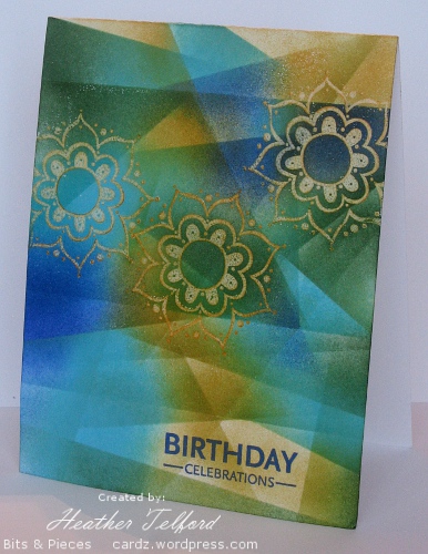
After a comment like that it seemed appropriate to post my latest card, a one-layer covered entirely in sponging. This is one of those cards that evolved. I certainly didn’t set out to sponged the entire card front. As I sponged and moved the mask to randomly place more sponging I kept wanting to increase the amount of colour until I had covered the whole card.
The inspiration for this card came from my daughter’s violin teacher. She was wearing a top the other day with these colours and flowers printed in a batik style. I stamped the flowers in versamark and mustard so I could emboss them in clear. I then began to sponge in turquoise, garden green, brilliant blue and mustard. I moved a post-it note around to create criss cross patterns of colour which, now that it is finished, remind me of light coming through stain glass windows.
As this card was quite experimental I am going to play with the technique a little more when I get the chance and see how other colour combinations work. Thanks for stopping by today and thanks for the kind comments you have left me, they are so encouraging.
Supplies:
Stamps: Upsy Daisy, One of a Kind
Inks: Versamark, More Mustard, Tempting Turquoise, Brilliant Blue, Garden Green
Cardstock: Flourishes Classic White
Less is More challenge
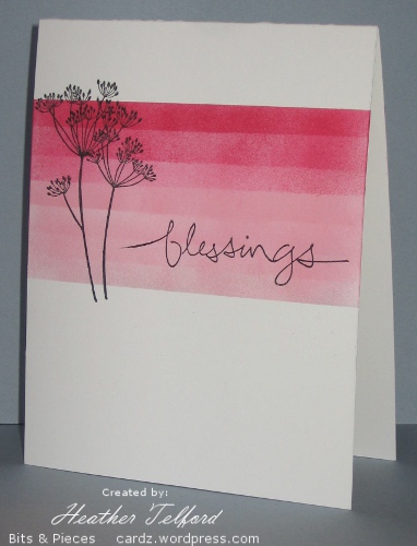
Posted: February 8, 2011 Filed under: CAS, Garden silhouettes 19 CommentsI had a chance to make a card for the new Less is More challenge blog over the weekend. The colours of the challenge were black, white and pink. Unfortunately this scan makes the pinks look a lot bolder than they are. The sponged pinks look much softer and the darkest colour, Rose Red does not look so red on the card. I am pretty fussy about colour matching so the pinks and reds clashing here are not pleasing me. Edited to add the photo below taken on a friend’s camera. You can see the colours are a little softer.
I used post it notes to mask and kept moving the bottom one up a little between spongings, changing from Pretty in Pink to Rose Red half way through. I stamped the Queen Anne’s Lace and the sentiment in black and extended the stems with a fine tip marker.
Make sure you check out the new blog, the challenge already has close to 100 participants, so it is off to a great start.
Supplies:
Stamps: Garden Silhouettes, Graceful words
Inks: Pretty in Pink, Rose Red, Basic Black
Cardstock: Flourishes Classic White
OLW 38 Let’s get sketchy
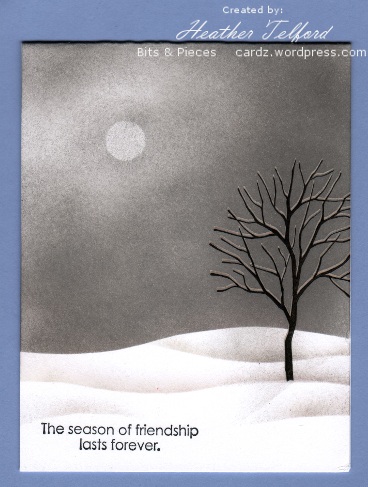
Posted: January 31, 2011 Filed under: Branch Out, CAS, Stamped Landscapes 11 CommentsI guess they’re called challenges for a reason! This week’s One Layer Wednesday challenge was to use a design sketch. I tried several pretty flower themed cards before I settled back into the comfort of my sponged winter scenes. I will post one of the flower cards later this week. After cropping, matting and layering it was no longer anywhere near the brief for this challenge.
Several times lately I have noticed that an overcast day can look quite pretty particularly when the trees are still laden with snow. The colour scheme tends to be very monochromatic though. I tried to recreate that here with the sun weakly shining through the cloud. It is not a particularly “pretty” card, but I thought it might be appropriate to send, with encouraging words inside, to someone going through a difficult “season”.
To see a much prettier card using this technique check out the beautiful one by Sarah at Criminal Grace
Supplies:
Stamps: Branch Out, Season of Friendship
Inks: Basic black, Going Gray
Cardstock: Flourishes classic white
Also: White e.p.
Let’s try that again
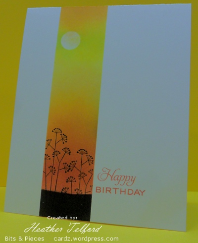
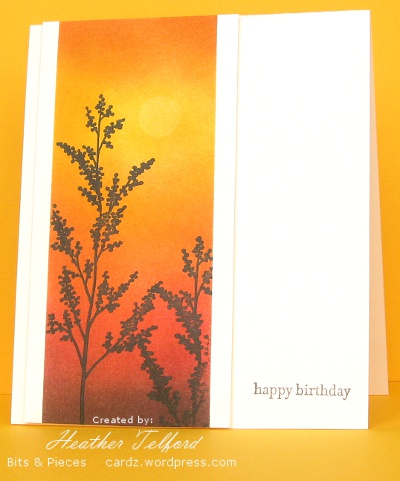
Posted: January 28, 2011 Filed under: CAS, Garden silhouettes, Nature Silhouettes 11 CommentsToday’s post is a little different to the usual. I have a card which I initially tossed aside followed by the new and improved version. I have posted both below with a little discussion of what didn’t work and how I fixed it.
Both cards feature warm colours ranging from light to dark. On the card above I made my darkest colour black, which is too stark against the white cardstock and there is too much of it. Below the darkest colour was a chocolate brown which against the ivory cardstock is not quite so overwhelming.
I also changed the width of the strip. I have been playing around with masks a lot as you know and I may still use narrow strips like the one above, however on the card above it is too narrow; I have not followed the rule of thirds, it is more like a quarter. The one below is a little more generous and draws the eye into the image panel.
The plants in the one below are bigger and lead the eye down toward the sentiment. The sentiment in the one above was the initial reason I didn’t like the card. I tried to link it by colour to the panel beside it but it is just not strong enough or big enough to give the card balance. I think a longer sentiment might have worked better there. Below I have used a small sentiment but it takes the eye to the edge of the card. (It doesn’t look quite so washed out in real life)
So there you have it: a little design discussion and a few suggestions as to what elements to consider when you have a card that doesn’t quite work but you are not sure why. Thanks for dropping in and thanks for the comments you leave which I thoroughly enjoy reading.
Supplies:
Stamps: Garden Silhouettes, Nature Silhouettes, Teensy Tiny Wishes, Tag Lines (Flourishes)
Inks: Chocolate Chip, Summer Sun, Pumpkin Pie, Ruby Red, Basic Black
Cardstock: Flourishes Classic Ivory and White
Warm flowers
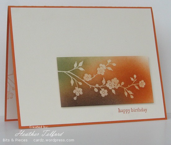
Posted: January 26, 2011 Filed under: CAS, Garden silhouettes 11 CommentsIn a complete departure from the blues, greys and mauves of winter I have created a warm toned birthday card with Pumpkin Pie, Mellow Moss and Chocolate Chip. Despite the fact that orange has never been a favourite colour of mine I often reach for the pumpkin pie ink and cardstock.
To create the flower panel I stamped the branch in versamark and embossed in clear before sponging in all three colours listed above. There is very little shadow but you might just be able to see that this panel is popped up a little off the card base. I did try several combinations of layers and mattes but came back to this simple mix of ivory on pumpkin pie.
Inside the card I stamped a pale image by stamping it off on scrap first and then applying to the cardstock.
Thanks for dropping by; I will back with more warm tones later this week and then I’ll probably lapse back into the winter inspired cards!
Supplies:
Stamps: Garden Silhouettes, Teensy Tiny Wishes
Inks: Chocolate Chip, Mellow Moss, Pumpkin Pie, Versamark
Cardstock: Flourishes Classic Ivory, Pumpkin Pie
Also: Clear e.p.
Woodland scene: Winter edition
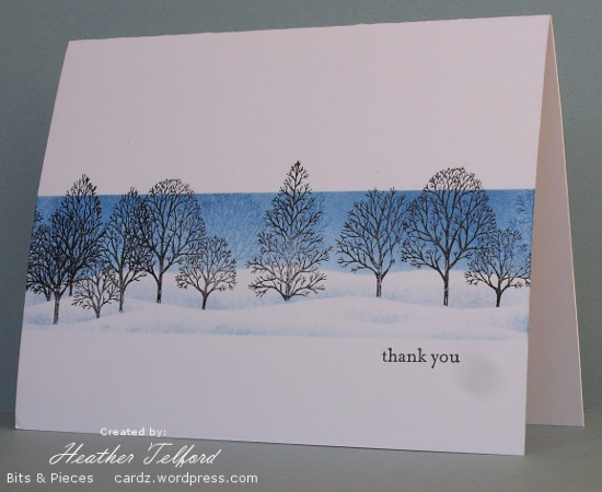
Posted: January 22, 2011 Filed under: CAS, Lovely as a Tree, Stamped Landscapes 10 CommentsBack in the summer I created a card using Lovely as a Tree for the OLW Stamp a Scene challenge. I was quite happy with the outcome; both the layout and the technique worked well to suggest the depth of a forest on a summer’s day. I decided to use the same layout and technique to recreate the card in fall and today I’m posting the winter edition.
I masked my two edges as usual but then added a “snowy hill horizon mask” so I could sponge the sky. Without moving any masks I stamped some trees in blue. Then I removed the top mask and repositioned the “snowy hill horizon mask” and stamped the trees in black making sure that their trunks overlapped the horizon mask. Before lowering the mask again I sponged a little blue along the edge to create the snow bank. I move and sponged the bank in a few places again before lightly sponging along the bottom mask.
A favourite stamp, a favourite technique, a favourite layout and in my favourite colour!
Supplies:
Stamps: Lovely as a Tree, Teeny Tiny Wishes
Inks: Basic Black Brocade Blue
Cardstock: Flourishes Classic White
OLW36 Barely There
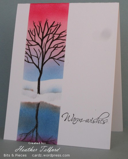
Posted: January 17, 2011 Filed under: Branch Out, CAS, Stamped Landscapes 13 CommentsYesterday I had a chance to create something for the One Layer Wednesday Challenge, hosted this week by Jennifer. The challenge is to use a bare tree, bare branch or other vegetation just as long as it is bare. That is not a hard ask for me as I have been happily stamping bare trees in snow for a month or so now. When I looked back through my recent posts I realized the tree from “Branch Out has been appearing often. I really think I need a few new trees stamps don’t you?
I decided to try a reflection in my scene this time; a winter tree, but one by an unfrozen pond or stream. Any still water round here would have frozen solid last night as the temperature was down to 25 degrees below zero! My girls went skating on the canal yesterday, something they ordinarily love to do, but the bitter cold took most of the enjoyment out and they spent the rest of the day trying to warm up again!
The edges of the image panel were masked with post-it notes as were the horizon and water’s edge. To create the reflected tree I stamped it on the plastic square that came with the stamp-a-ma-jig and pressed that onto the sponged water. (I am sorry about the smudges on the photo, they are on the lens of my daughter’s camera)
If you haven’t already browsed through the OLW36 submissions check them out on Jennifer’s blog, there is plenty of inspiration to be found there.
Supplies:
Stamps: Branch Out, Hugs & Wishes
Inks: Basic black, Brocade Blue, Rose Red, Pretty in Pink, Chocolate Chip, Close to Cocoa
Cardstock: Flourishes classic white

