
Love is in the air
Posted: January 29, 2013 Filed under: CAS, Love Paris, Penny Black, Sweet on You 7 Comments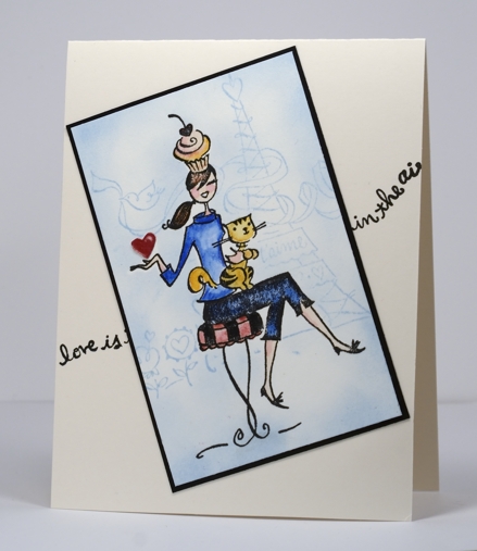
Love in the Air with a little watercolouring. The girl is a wood mounted stamp, “Sweet on You” from the new Penny Black catalog and the background a slapstick cling stamp, “Love Paris”. I stamped the girl in Versafine Onyx Black then coloured it with Faber-Castell watercolour pencils. I placed a girl shaped mask over her (that is pretty much the extent of my ‘fussy cutting’!) so I could put Paris in the background. The tiny heart wanted more attention so I stamped it on red cardstock and embossed in clear to give it a little shine.
Supplies:
Stamps: 4295K Sweet on You, 40-185 Love Paris, 30-144 Love is in the Air (PB)
Inks: Memento Summer Sky and Versafine Onyx Black (Tsukineko)
Also: Faber-Castell coloured pencils, clear e.p.
Dandelion wishes
Posted: January 25, 2013 Filed under: CAS, Penny Black, Tweet Tweet 29 Comments
I have another card using stamps from the new transparent set, “Tweet Tweet”. Yesterday’s card featured the Queen Anne’s Lace and Happy Birthday Sentiment, today’s the Dandelion stamp and Wish sentiment from the same set. The set also has a lovely branch of leaves and some sweet birds.
Once again I used the emboss resist technique. I stamped the dandelion twice on a scrap taking care not to ink the fly away seeds. I then embossed, sponged and punched the images to pop up beside a third image featuring the whole stamp. The blue sponging is all Memento Summer Sky.
Supplies:
Stamps: Tweet, Tweet PB)
Inks: Memento Summer Sky (Tsukineko)
Queen Anne’s Lace
Posted: January 24, 2013 Filed under: CAS, Penny Black, Tweet Tweet 19 Comments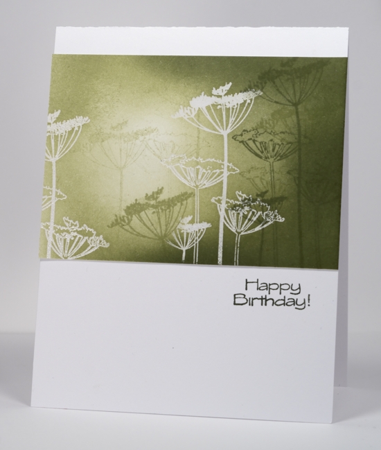
I was very happy to receive this stamp from the new catalog as I love the delicate appearance of Queen Anne’s Lace. I revisited a favourite technique when trying the stamp for the first time.
I stamped and embossed the image in clear powder then added sponging, deciding as I sponged where the light would be coming from. I used three green inks to sponge and stamped the floral stamp with the same three greens. You will be seeing more of this stamp for sure and the other delicate, pretty images in the transparent set too.
The introductions continue on the Penny Black blog today with transparent sets featured and give-aways offered (including the stamp above).
Supplies:
Stamps: Tweet, Tweet PB)
Inks: Memento Pistachio, Bamboo Leaves, Olive Grove (Tsukineko)
Venetian Summer
Posted: January 23, 2013 Filed under: CAS, Penny Black, Venetian Summer, Watercolour 15 Comments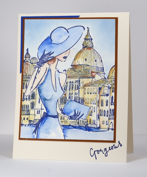
I have another new stamp from the Penny Black 2013 Take Flight Catalog today. This whole scene is quite appealing when the weather is white and -26°C (-15°F) outside. A sun hat, a sundress, a walk around Venice sounds rather nice.
To watercolour this scene I first stamped it on watercolour paper in Versafine Majestic Blue ink. I then stamped it again on a post-it note so I could make a mask of the girl. I positioned the mask over the girl while I coloured and blended the background with watercolour pencils and water (I sponged the sky, as I would). After removing the mask I coloured the girl also with watercolour pencils and blended my colouring with water.
For a chance to win this stamp and four other new stamps visit the Penny Black blog today and leave a comment.
Supplies:
Stamps: Venetian Summer (PB)
Inks: Versafine Majestic Blue, Memento Summer Sky (Tsukineko)
Also: Faber-Castell watercolour pencils
Cardstock: Fabriano 100% cotton hot pressed watercolour paper, Clear Skies and Grand Canyon Mix & Match Papers
CASology # 28
Posted: January 22, 2013 Filed under: Background Stamps, CAS, Penny Black 23 Comments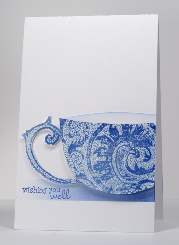
I am the guest designer at the CASology challenge blog this week. I felt honoured to be asked and said yes, not knowing what a challenge it would turn out to be! I keep saying that about challenges don’t I?
The cue card this week is…
I was already pretty sure, but a quick look through my stamps revealed a lack of ‘drink’ related images. Once again I had to think outside the box. The thought I came up with involved a Penny Black background stamp and the emboss resist technique. The background I chose is called Damask Pattern and reminded me of china cups. I stamped it in versamark and embossed in clear powder before sponging over the top with blue ink. As I was sketching a cup shape I noticed that the stamp already included the perfect handle shape in the design, so I cut that out determined to make it work as the handle of my cup. After much fiddling around with layout I settled on the design below which involved slicing off the side of the cup and popping it up over the sponged strip. I made this card narrower than usual so will enter it in the CAS-ual Fridays Long and Short challenge too. The size is 3½” x 5½”.
So check out the cards at CASology and get thinking, outside the box if necessary.
Supplies
Stamps: Wishes, Damask Pattern (PB)
Ink: Memento Danube Blue & Versamark (Tsukineko)
Also: Clear embossing powder
Watercoloured Background
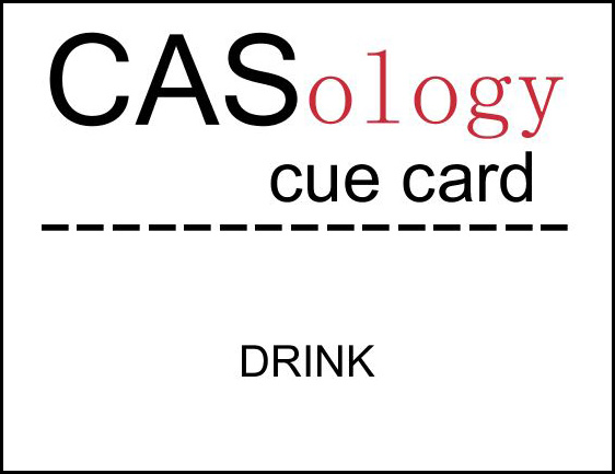
Posted: January 21, 2013 Filed under: Background Stamps, Penny Black, Watercolour 3 Comments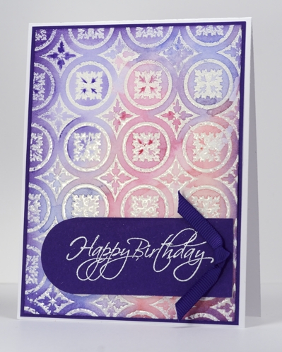
There is a new catalog from Penny Black out today. Pop on over to the Penny Black blog this week to check out the new stamps and maybe win some too. I am featuring one of the new background stamps, Roman Surround, in my card today with another watercolour method.
In yesterday’s card I wet the watercolour paper first before stamping. For this card I embossed the background image first and then wet the watercolour paper before adding and blending pinks, blues and purples. My inspiration came from this lovely card by Jennifer McGuire. Once again I was so happy with the background that I added very little, casing Jennifer’s layout to make a birthday card.
Supplies
Stamps: Flourish Birthday, Roman Surround(PB)
Ink: Versamark (Tsukineko)
Also: white and clear embossing powder, Faber Castell watercolour pencils, grosgrain ribbon
Cardstock: Purple Mountain mix & match cardstock
My unusual creative process
Posted: January 20, 2013 Filed under: Background Stamps, Penny Black, Social Butterfly, Watercolour | Tags: arts, CAS, Penny Black stamps 18 Comments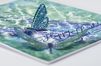
I visited my Handmade Cards board on Pinterest this afternoon for inspiration. However, the inspiration pic. and my finished card bear absolutely no resemblance to each other. I had a totally different design almost ready to put together when I decided to try and watercolour a background stamp, just in case I wanted a bit more going on in the card. (Unusual for me, I know) As it turned out I liked the background panel so much it became the main event, I tossed the other panel and kept only the little dragonflies from my original design.
So, without mentioning the discarded process, here is how I made this card:
- dampened a piece of watercolour paper, inked the dragonfly stamp in blues and green and stamped it on the damp paper.
- when the dragonflies were dry I cut them out, added a little sponging and used a marker to darken their spines.
- stamped the dragon flies with a versamark pad to totally cover them then embossed with a thick glossy embossing powder, twice.
- to make the background panel, I wet a piece of watercolour paper (much wetter than for the dragonflies).
- I inked the background stamp randomly in the two blues and the green ink and stamped it onto the wet paper.
- when all was dry I trimmed the background panel, sponged the edges and embossed the sentiment.
- attached the background to the card base and the dragonflies with glue dots.
Not what I set out to create, and if I told you I my initial intention was to make a friendship themed card for the Less is More challenge you would just laugh wouldn’t you?
Supplies
Stamps: Special Time, Wall Paper Print, Social Butterfly (PB)
Ink: Memento Teal Zeal, Paris Dusk, Cottage Ivy and Versamark (Tsukineko)
Also: Thick Glaze embossing powder
Blue
Posted: January 18, 2013 Filed under: CAS, Inclinations 20 Comments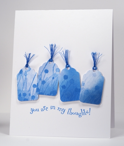
The current CASology challenge theme is BLUE, my favourite colour, so I made some little blue tags and stuck them in a row. It was amusing to read the comments on my last card-the one with no sponging on it!! You can relax; I am back to sponging on this one. I sponged two blue inks on a remnant of white cardstock then stamped the image in the same two blues before punching out four little tags. I chose my sentiment then arranged the tags and popped them up to follow the line of the sentiment. As I had no ribbon or embroidery floss the right colour I used multiple strands of cotton thread.
This morning it was -24°C here and we woke up to read that Sydney, Australia had just had a record high temperature of 46°C! We are experiencing one extreme and our families, the other.
Supplies:
Stamps: Inclinations, In my Thoughts (PB)
Inks: Memento Summer Sky & Bahama Blue (Tsukineko)
Also: Blue cotton thread, Tag punch
A little bird told me
Posted: January 17, 2013 Filed under: CAS, Enjoy LIfe, Watercolour 15 Comments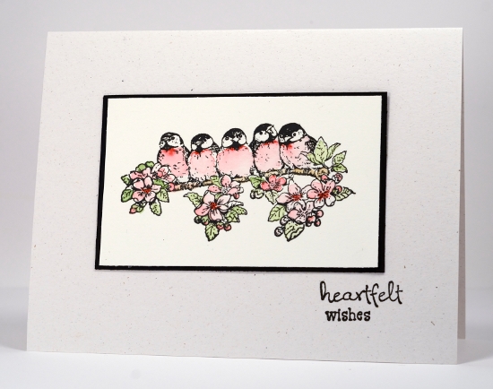
A week or so ago the challenge at Less is More was black and white with one other colour so I stamped these little birds and watercoloured their breast feathers red to enter the challenge. The problem was the flowers and leaves did not like being ignored. I coloured them and no longer had a card I could enter in the challenge.
As the watercolour paper is neither white or ivory I mounted the panel on black and made a card base out of flecked natural cardstock.
Supplies:
Stamps: Enjoy Life, Wishes (PB)
Inks: VersafineOnyx Black (Tsukineko)
Also: Faber-Castell watercolour pencils
Cardstock: Fabriano 100% cotton hot pressed watercolour paper
Analogous collage
Posted: January 15, 2013 Filed under: Background Stamps, Berry Branch, CAS, Collage cards 22 Comments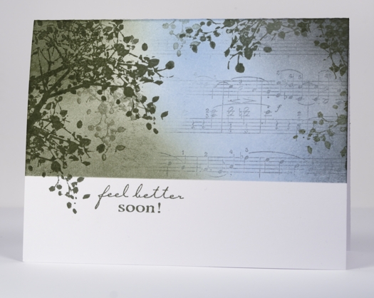
I have another collage card today, this one with a colour scheme more common in my work but probably not as striking as the previous contrasting scheme. An analogous colour scheme is one made up of colours side by side on the colour wheel. An analogous colour scheme works well for a sympathy or get well card because it is more soothing and harmonious than a contrasting one.
To create this card I positioned a mask across the lower third of the card and stamped the branch around the edges, lifting the mask once so a twig could fall below the line. I stamped a couple of times without re-inking to get that misty background look. I partially inked the music background in grey and stamped to the right of the panel then added the blue and green sponging with a little grey on the right.
My older daughter and I were discussing the sentiment; she felt that it always seems a little odd to send a card saying “get well soon” or “feel better soon” as it sounds like a command! As if someone wouldn’t feel better if they could. I guess it is probably short for “I hope you feel better soon”. That is the meaning behind this card made for my son’s writing class teacher who has fractured her wrist.
Supplies:
Stamps: Berry Branch, Music Background, Feel Better (Penny Black)
Inks: Memento London Fog, Summer Sky, Olive Grove (Tsukineko)


