
Roses on black
Posted: January 28, 2020 Filed under: Finetec paints, key to kindness, Penny Black, rose romance, winsome wreath | Tags: Finetec artist mica watercolour paint, Penny Black stamps, WOW embossing powders 15 Comments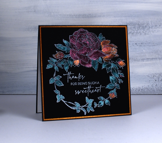
Today’s cards are my first experiment with black watercolour paper. I have already learnt a few things I will take into consideration on my next projects. I could have waited until I had played with the paper more but I decided to jump right in with these rather unusual valentine/friendship cards. The card with purple flowers does have a valentine sentiment but the other two could be used anytime to send a friendly message. Unfortunately the photos don’t convey how shimmery the paint is and the colours are brighter in real life.
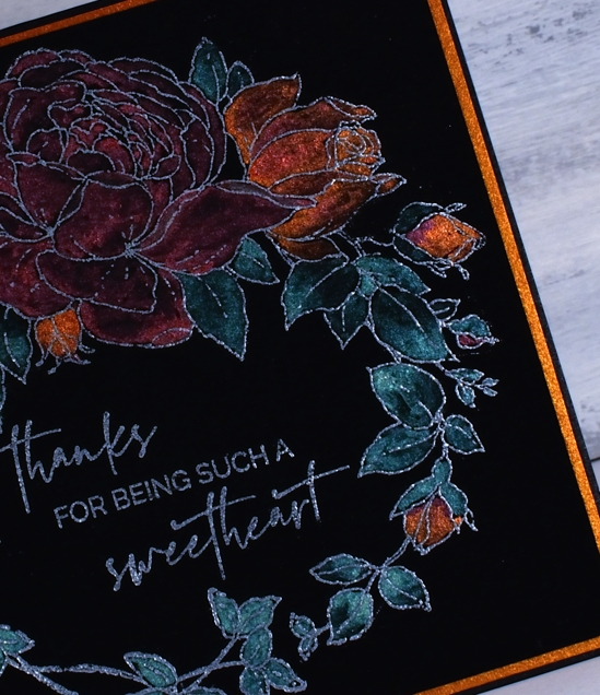
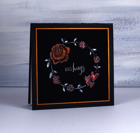
I’ve seen a few people on the interwebs using this new Stonehenge black cold press watercolour paper so I had to give it a try. As you can probably see I’ve paired it with pearlescent paints this time. I plan to try oxides next time. Because it is new to me I tried three different embossing powders wondering how much they would show up on black. On the card above I embossed PB ‘winsome wreath’with WOW silver pearl; it looks a bit silvery. On the card below I used WOW white pearl on PB ‘rose romance’: it also looks a bit silvery. On the final card I used Ranger gun metal with a wreath from PB ‘key to kindness’ set, it is a bit darker but still looks a bit silvery.
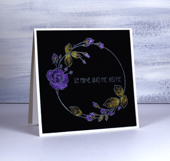
To paint the flowers I used both my Finetec pearlescent paints and pearl paints. I don’t find the two sets all that different but I think there might be a bit more shimmer in the pearlescent ones. I also have some Ken Oliver liquid metals so I used the verdi gris for the leaves above. I carried through the shimmer theme by cutting mats from copper shimmer cardstock and I made card bases from black shimmer and quartz shimmer.
What do you think about predominantly black cards? I know some would find them too dark and sombre, some may be reminded of the painted velvet pictures from the 70’s but maybe you like the added drama. Will you try the black watercolour paper if you get a chance?
Supplies
https://linkdeli.com/widget.js?1559654439292


I like the drama and the painted velvet look. These are gorgeous cards!
These are stunning, Heather! I have some black watercolor paper and pearlescent paints that were a Christmas gift and are still waiting for an outing. You have inspired me with these beauties!
Thank you Bonnie! It is a different type of watercolouring for sure but I intend to do some more experimenting.
Wow! These are really dramatic. Thank you for leading the way and showing us how impactful using a black background can be.
Thanks my friend!
Yours are exquisitely done however I much prefer an ethereal watery look so, no, I would not use this method personally.
Thank you, Donata. I think I prefer the ethereal watery look too but I’m enjoying the challenge of trying something new.
Love these cards! Really striking against the black paper. Really looks quite spectacular Heather. Great projects.
The black paper with the pearlescent and metallic paints together with the pretty PB wreath stamps look terrific Heather and I think that all the looks are fantastic. I look forward to seeing more. x
Wow! These are truly amazing!
Stunning!!! You have inspired me to get out my black watercolor paper and pearlescent watercolors once again! I love the richness of the cards and have only embossed in fine line white powder, never thought the silvers/pearls would show up. This is yummy and reminds me of the year I planted a moon flower garden…the flowers glowed in the moonlight. With fresh snow on the ground and temps in the teens, I thank you for the memory and smell of spring. Love it!!!
I have never heard of a moon flower. I looked it up and watched a video of one opening up. Amazing!
I think the extra drama is fantastic!
[…] might not recognise this stamp straight away but it is the ‘winsome wreath’ I used on a black card earlier in the week. It looks a bit different on the more traditional white watercolour paper. It […]
[…] Card originally posted HERE […]