
OLW 62 Make it personal
Posted: July 13, 2011 Filed under: CAS, Itty Bitty Buds 12 Comments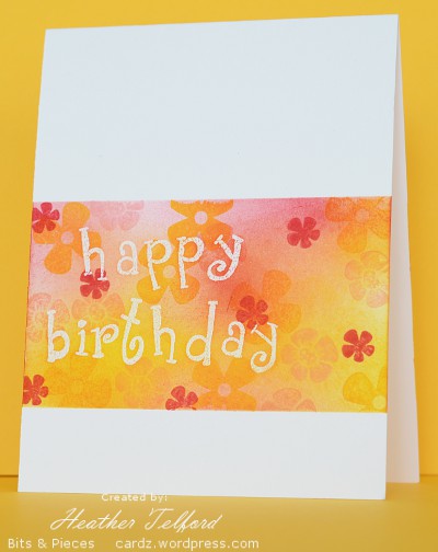
Susan from Simplicity has designed a one layer challenge for this week which requires us to create a card with a personal touch. Her card features a map of the USA with the states coloured in where she and her husband have lived; a very cool idea. As it is my daughter’s birthday today and no, I did not have the card made ahead of time, I decided to make hers my challenge card. Her favourite colour is yellow so I chose to feature yellow on her card. For her I would usually match it with green but for a change I decided to throw some pink into the mix which, when blended, added a bit of orange. I made the birthday greeting using a funky alphabet from Close to my Heart. She also likes funky designs.
I masked the area first and stamped the letters in versamark before embossing in clear. I then stamped the flowers randomly around the panel in yellow and pink. I sponged in yellow and pink then added the rose red flowers and a bit more sponging.
Supplies:
Stamps: Itty Bitty Buds(SU), Alphabet from Close to my Heart
Inks: Versamark, Summer Sun, Pretty in pink, Rose Red
Cardstock: Flourishes Classic White
Aqua and Green together
Posted: July 11, 2011 Filed under: CAS, Upsy Daisy 18 Comments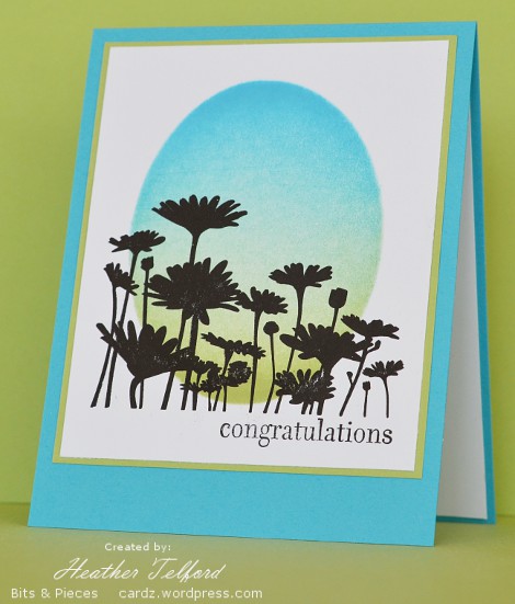
I needed a card for a bridal shower on the weekend. Looking around for inspiration I decided to take my colour scheme from the gift bag I was using. The gift bag was very geometric in its design but I didn’t follow that I just needed the pretty summery colours: aqua and green.
I cut a mask in a post it note and brayered tempting turquoise and certainly celery. I then removed the mask and stamped the daisies in black. It took countless repetitions with the daisy stamp before I had a solid image. Even when I stopped it did not quite have complete coverage. I was using my SU classic basic black ink pad. It is not that old so I am a bit frustrated that I find it hard to completely ink a larger stamp with it. If anyone has a favourite black inkpad please let me know. It might be time to branch out.
I matted the image panel and then tried a white card base and a turquoise; as you can see the turquoise won the challenge.
My daughters and I went to the bridal shower and enjoyed watching the bride ooh and aah about all her lovely homewares. She is getting married in August and my girls are going to play violin at the wedding. It will be the first of three weddings they are playing at this summer. I guess I should be thinking about wedding cards too.
Supplies:
Stamps: Upsy Daisy , Hugs & Wishes(SU)
Inks: Tempting Turquoise, Certainly Celery, Basic Black
Cardstock: Flourishes Classic White, Tempting Turquoise, Certainly Celery
Colour blocking
Posted: July 6, 2011 Filed under: CAS, In Full Bloom 8 Comments
In search of inspiration recently I came upon a bright artistic card from Vicki and decided to try something similar myself. I chose three colours and made sponged strips using post it note masks. I really like Vicki’s black line flowers and considered trying to draw my own but decided instead to use the In Full Bloom set. I then matted in black and used a coloured card base for a change. By adding a few dots to the sentiment I made it look like it belonged in the flower set.
Thanks for the inspiration Vicki.
Supplies:
Stamps: In Full Bloom, Short & Sweet
Inks: Basic Black, Certainly Celery, Bashful Blue, Summer Sun
Cardstock: Whisper White, Certainly Celery
Feeling Blue?
Posted: July 3, 2011 Filed under: CAS, Trees 25 Comments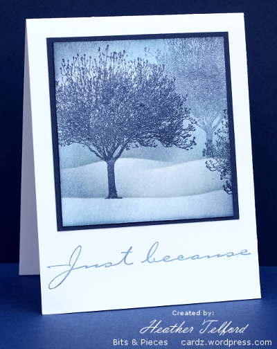
The challenge at Less is More this week is to use shades of blue. I often do snow scenes with shades of blue so that is what I tried initially. It seems that I am a seasonal stamper. I could not managed a successful snow scene when it was 31°C outside! I decided to stick with the landscape idea but forget the snow. Although it still looks a little snowy it is meant to be a misty blue hillside. I used Night of Navy for the trees, stamping the pale one without re-inking then a mix of blues for the sponging.
Speaking of shades of blue, I am not sure that this photo is exactly representative of my card. I edited the photo on one computer, then went to two other computers to compare. All the monitors in our house show the colours slightly differently. Apparently what we need is a monitor calibrater. Who knew?
Supplies:
Stamps: Trees (Darkroom Door), Simple Sayings 2
Inks: Night of Navy, Bashful Blue, Brocade Blue
Cardstock: Whisper White, Night of Navy, Flourishes Classic White
OLW 60 Layering ink
Posted: July 1, 2011 Filed under: CAS, Garden silhouettes 16 Comments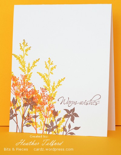
After several attempts I came up with a card which fits the brief from Susan for this week’s One Layer Wednesday challenge.
This week’s OLW challenge is to make quick and easy cards with nothing but layers of ink by overlapping the stamped images and/or sentiment.
I am used to layering ink with a sponge but that was not allowed; we had to aim for quick and easy and I have to admit sponging can be time consuming. So I decided if I could not use my favourite technique I could use my favourite stamp set.
Supplies:
Stamps: Garden Silhouettes, Hugs & Wishes
Inks: Daffodil Delight, Tangerine Tango, Close to Cocoa
Cardstock: Flourishes Classic Ivory
Mix and match
Posted: June 30, 2011 Filed under: Berry Branch, Collage cards 23 Comments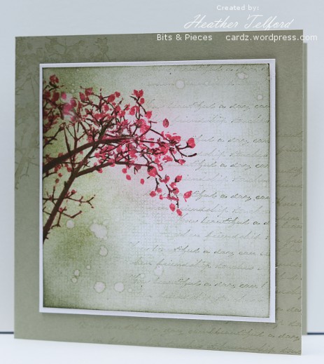
I’m not sure what to call this style of card but I have been trying to successfully create one for a while. I like the mix of image with text and a little texture. I have seen several superb examples where different textures and images are mixed very cohesively, sometimes with several layers, other times with one.
I started by working on one layer but decided a mat and an extension of the stamping would work best. I stamped the branch first after inking it with regal rose, using marker to add choc chip twigs and branch colour. I find this stamp quite frustrating although I love the design, as I always want it in two colours but it is very hard to ink it successfully with markers. What I ended up doing here was drawing with choc chip marker over a lot of the twigs after I had stamped them.
I don’t own a large text stamp so I stamped a sentiment stamp repeatedly to give the impression of a page of text. I also inked my large canvas background stamp but stamped it off first so I would only get a faint impression. Finally I sponged the parts of the panel and flicked some water droplets around. The panel is popped up ever so slightly.
Thanks for dropping in; I’ve enjoyed reading the comments you have kindly left here lately.
Supplies:
Stamps: Berry Branch (Penny Black), Canvas (SU), Ageless Adornment (SU)
Inks: Certainly Celery, Regal Rose, Choc Chip, Pretty in Pink
Cardstock: SU Whisper White, Mellow Moss
OLW 59 Inspiration challenge
Posted: June 27, 2011 Filed under: CAS, Pocket Silhouettes 15 Comments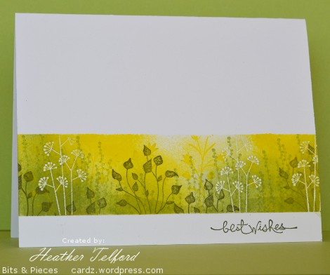
I enjoy playing along with the One Layer Wednesday challenge when I can which hasn’t been lately. This week Susan provided a pretty photo of flowers in jars to inspire us. I decided to use the colours and the flowers but not mention the jars.
The technique is nothing new for me; same old masking and sponging that I love to do. I sponged a hint of a hill this time not the well defined slopes I sometimes have. I also sponged a hint of sunrise by leaving a little white space unsponged. The white flowers were embossed in clear before the sponging and everything else was stamped over the top of the sponging.
Supplies:
Stamps: Pocket Silhouettes, Short & Sweet
Inks: Yoyo Yellow, Certainly Celery, Always Artichoke, Versamark
Cardstock: Flourishes Classic White
Also: Clear e.p.
Less is more lemons
Posted: June 26, 2011 Filed under: CAS, Tart and Tangy 24 Comments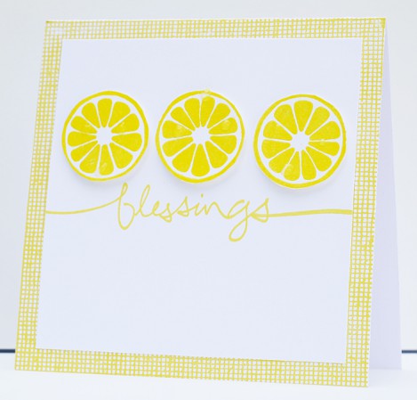
It is quite a while since I joined in the Less is More challenge which seems to have more participants every week. Even when I don’t get to play along I enjoy browsing through all that creativity.
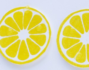
It is a sketch challenge this week at Less is More and I settled on lemons for a bright summery card. I initially stamped the lemons in a row and fiddled with a canvas border either side but ended up cutting out the lemons and popping them up instead. I also began with a yellow card base but much preferred the canvas print instead. My favorite part of the card is the little water droplets I added with crystal effects.
Supplies:
Stamps: Tart & Tangy, Graceful Words, Canvas
Inks: Yoyo Yellow
Cardstock: Whisper White, Flourishes Classic White, Yoyo Yellow
Also: Crystal Effects
Under a tree
Posted: June 25, 2011 Filed under: CAS, Stamped Landscapes, Trees 10 Comments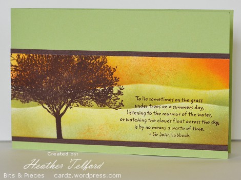
With the busyness of the end of the school year there hasn’t been much time to stamp of late. When I sat down to create something the other night I was somewhat lacking in ideas. A little bit of time spent on other people’s inspiring blogs helped but I think I am out of practice. Hopefully now that the summer holidays have officially begun you will see a little more action here on bits & pieces.
To create this card I pulled out another tree from the Darkroom Door Trees set. I think I’ve tried three out of the four now. I like the wide spread of this tree so went for a wide card base and a quote which matched also. The sponging was done with a post it note mask placed twice.
Supplies:
Stamps: Trees (Darkroom Door)
Inks: Chocolate Chip, Pumpkin Pie, Summer Sun, Certainly Celery
Cardstock: Whisper White, Certainly Celery, Chocolate Chip textured
Fern frond fragments
Posted: May 31, 2011 Filed under: CAS, Wilderness Vol.2 10 Comments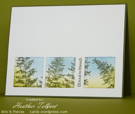
This is the last of my fern frond cards for now. The next stamping task I have is some simple garden wedding invitations.
I did not set out to create three squares for this card; it just happened. I stamped the ferns across a piece of cardstock but there was nothing special about the arrangement. After punching out three fragments and adding the green and blue sponging I was much happier. Dividing the squares with the sentiment was also experimental but I like the way it turned out. As the sponging was applied after the squares were punched each one has a slightly dark border. Although I started out with a white card base, artichoke turned out to be the best choice as it created a border which highlighted the ferns and words.
I think this one might be my favourite out of the three fern cards I created recently.
Supplies:
Stamps: Wilderness Vol.2 (Darkroom Door), Teeny Tiny Wishes
Inks: Old Olive, Always Artichoke, Bashful Blue
Cardstock: Flourishes Classic White, Always Artichoke











 Heather Telford