
Garden wedding card
Posted: August 20, 2011 Filed under: CAS, Greenhouse Garden 6 Comments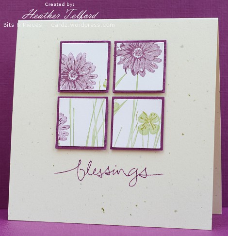
This weekend we are off to another wedding and the colour scheme is purple and green just like the one we attended last Saturday. As I helped design and make the invitations for today’s wedding I had plenty of samples and examples on hand for making a matching wedding card. I really like the four square layout so I punched out previously stamped flowers and grass and matted in Rich Razzleberry. The squares are popped up and the sentiment shortened so its length matched the width of the squares.
The wedding is in the garden of the groom’s family so we have been watching the weather all week. My girls are playing violin and I will be trying to snap as many photos as I can. My son has agreed to wear a button up shirt and long pants but is adamant that he will not tuck the shirt in!
Have a great day.
Supplies:
Stamps: Greenhouse Garden, Graceful Words(SU)
Inks: Certainly Celery, Perfect Plum, Rich Razzleberry
Cardstock: Confetti Cream, Very Vanilla, Rich Razzleberry
Fern frond wedding card
Posted: August 16, 2011 Filed under: CAS, Wilderness Vol.2 16 CommentsAfter being a little experimental the other day I returned to the safety and comfort of masking and sponging. Sigh…that’s more like it.
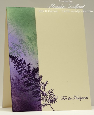
We went to a beautiful wedding on Saturday where the bridesmaids wore purple and carried green and red flowers. I went with purple and green colour scheme for my card. I masked so I could sponged about a third of the card. I sponged with sage shadow, almost amethyst and elegant eggplant. Before removing the mask I stamped the fern a few times. With the mask off I stamped the fern again and added the sentiment.
Thank you for all the encouraging comments about my “experiment”. I appreciate you taking the time to write me a note.
Supplies:
Stamps: Wilderness Vol.2 (Darkroom Door), Teeny Tiny wishes(SU)
Inks: Sage Shadow, Almost Amethyst, Elegant Eggplant
Cardstock: Flourishes Classic Ivory
An Inky Experiment
Posted: August 15, 2011 Filed under: CAS 13 CommentsThe Less is More challenge this week calls for us to use ink. Well that is no problem; I always use ink. When I read more however, I noticed the encouragement to use it in a way you haven’t tried before. So my card is somewhat experimental. It was only after I had completed two expermiments that I noticed the challenge also suggested using a favourite technique! Now that would have been easier. But experimentation is important; occasionally wonderful effects are created. This experiment needs a little refining but I will show you anyhow.
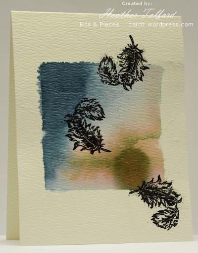
I used watercolour paper which had a lot of texture. Unfortunately this paper does not work well for stamping but is fine for sloshing ink around. I used masking fluid to paint a square border and then painted water into the square area before adding droplets of ink. I let the ink spread, tilting the paper a little to make it head in different directions. I used only two colours but the green ink split into pigments which gave me a pinky brown as well. After the ink dried I stamped the feathers and embossed them. The texture of the paper was difficult to work with as the ink didn’t reach the indents but the powder did.
I may continue to play around with this technique, particularly trialing different papers. Make sure you check out the challenge gallery at Less is More. Inspiration abounds as always.
Supplies:
Stamps: Feather C-1536 (PSX)
Inks: Buckaroo Blue & True Thyme inks (SU), Versafine Onyx Black
Cardstock: Demco Watercolour paper
Sponged wooded path
Posted: August 9, 2011 Filed under: CAS, Wilderness Vol.2 9 Comments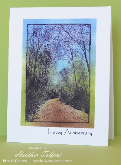
This stamp is so lovely that it doesn’t really need me to add anything. I have used it once before with embossing and autumn colours so this time I tried the colours I see around at present and a little sponging outside the lines.
I spent most of the weekend at the National Youth Track & Field Championships volunteering and watching my daughter compete so I am now catching up on the inspiring cards that were posted over the weekend.
Supplies:
Stamps: Wilderness Vol.2 (Darkroom Door), Hugs & Wishes(SU)
Inks: Basic Black, Certainly Celery, Bashful Blue, Close to Cocoa
Cardstock: Flourishes Classic White
Recycled panels
Posted: August 3, 2011 Filed under: CAS, Eastern Influences 10 Comments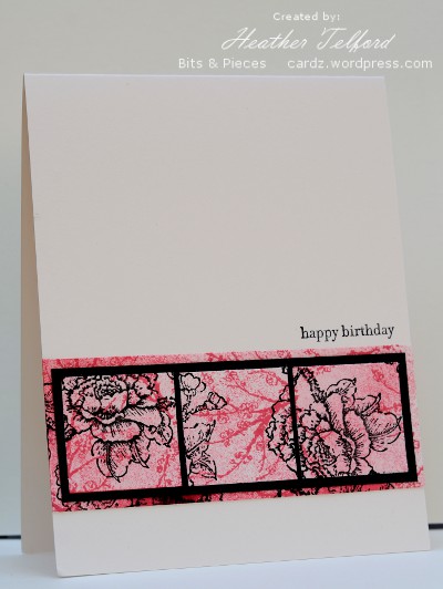
In the process of creating one layer cards with the Eastern Influences set last week I ended up with a failed attempt that I cut up and made into a multi-layered card for my older daughter’s birthday. After sponging and stamping blossoms on the original card I punched out three squares, matted them in black and layered them on more of the blossom panel which became a strip across the new card.
Supplies:
Stamps: Eastern Influences, Teeny Tiny Wishes
Inks: Pretty in Pink, Regal Rose, Basic Black
Cardstock: Flourishes Classic Ivory, SU Basic Black
Eastern influences
Posted: July 27, 2011 Filed under: CAS, Eastern Influences 6 Comments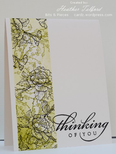
I have been inspired by the beautiful layering of sponging and images that Vicky does over at Crafting Clare. I pulled out my Eastern Influences set and used two stamps and two colours for both the cards posted today. I masked first, sponged, then stamped the small branch of blossoms in olive, above and bashful blue below. I then stamped the larger branch of blossoms in black and added the two sentiments.
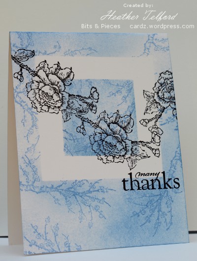
I have been asked a few questions in the comments section lately that I will try to answer now. Firstly about the brayer I use. I have two speedball brayers but I have been using the soft brayer lately and have had a lot more success than I had with the hard rubber one. One of the key steps is to start rolling it completely off the cardstock and move onto the cardstock gradually. It does take longer this way and use more ink but it makes for an smoother coverage.
Someone also asked me how I tied that teeny little bow on my button on this card. I don’t know-it just worked the first time and I ran with it!!
Supplies:
Stamps: Eastern Influences, All Year Cheer
Inks: Bashful Blue, Old Olive, Basic Black
Cardstock: Flourishes Classic Ivory
An Autumn fix
Posted: July 25, 2011 Filed under: CAS, Trees, With Gratitude 12 Comments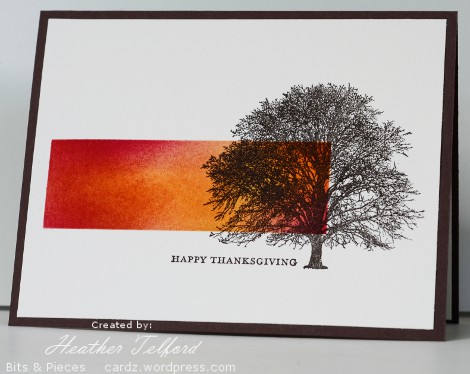
I really like one layer cards particularly the ones with a masked and sponged area on them. They certainly do not all work the first time however which results in card bases with mistakes on them. I can fix them by either covering the mistake with another layer or by cutting the card front up and attaching it onto a new card base. Either way the failed one layer often becomes a two or more layer. I hate to waste a whole card base so that is what I usually do. If the recipients of my cards peeled off the image layer off their cards and turned it over they might just see one of my mistakes!
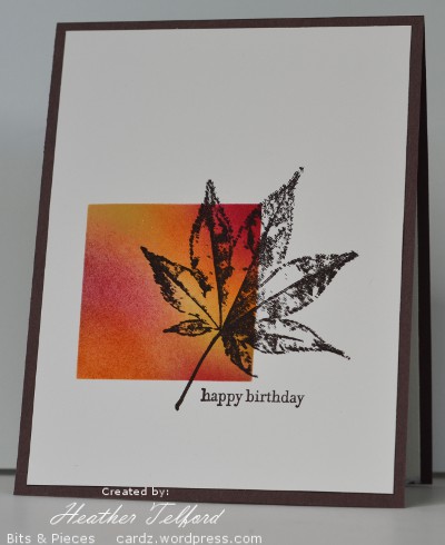
What I have to show you today are a couple of one layers which became two layers! The errors this time were such that I cut the card base in half, turned it over and started again but still managed to create the clean look of a one layer card. I masked an area and sponged in Saffron, Rose Red and Pumpkin then stamped my image and sentiment in Early Espresso.
Supplies:
Stamps: Trees (Darkroom Door), With Gratitude, Teeny Tiny Wishes (SU)
Inks: Early Espresso, So Saffron, Rose Red, Pumpkin Pie
Cardstock: Flourishes Classic Ivory, Chocolate Chip
Buttons & Bows
Posted: July 23, 2011 Filed under: CAS, Pocket Silhouettes 43 Comments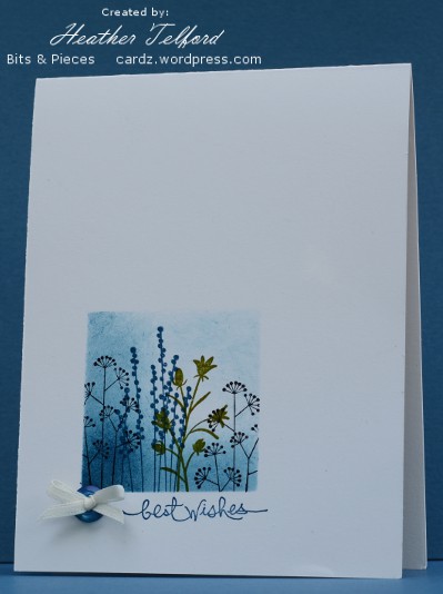
I opened the Less is More blog this morning to see this week’s theme and found the challenge is to use ribbons and/or buttons. I don’t think I have ever used a button on a card but I have a selection of ribbon types and colours so I started thinking. When I went down to my craft table however, I saw a little blue button sitting there and decided to try and incorporate it into my design. I found a very narrow piece of ivory ribbon which I managed to get threaded and tied through the button’s holes.
So the tiny little button and ribbon set the colour scheme for the card. I cut a square mask into a post-it note and used sponging in Not quite Navy to define the square before stamping the three Pocket Silhouette stamps.
Supplies:
Stamps: Pocket Silhouettes, Short & Sweet
Inks: Basic Black, Old Olive, Not quite Navy
Cardstock: Flourishes Classic Ivory
Also: a button, a bow and a glue dot
Summer Haze
Posted: July 22, 2011 Filed under: CAS, Stamped Landscapes, Trees 10 CommentsWe have had some hot summer days this week; perhaps that is why I ended up stamping with warm yellows and reds again. Each day this week I have dropped all my children off at camp and had the day to myself-a very rare occurrence. Each time I picked them up my son has asked whether I made a card and uploaded it. Finally I have one.
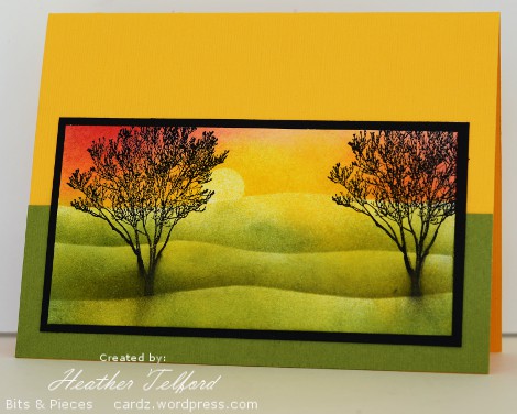
I created the picture panel on white cardstock, masking the sun and sky first before sponging in summer sun, apricot and rose red. I then created the hills with a curved mask and celery and summer sun inks. The trees were stamped in black while the final (lowest) mask was still in place. It is not clear in the photo but both the card base and olive strip are textured cardstock,
I hope you are enjoying some great weather wherever you are. Thanks for dropping in today.
Supplies:
Stamps: Trees (Darkroom Door
Inks: Basic Black, Summer Sun,Apricot Appeal, Rose Red, Certainly Celery
Cardstock: Flourishes Classic White, Textured Summer Sun & Old Olive, Basic Black
Sponged Circles
Posted: July 17, 2011 Filed under: CAS, Itty Bitty Buds 26 Comments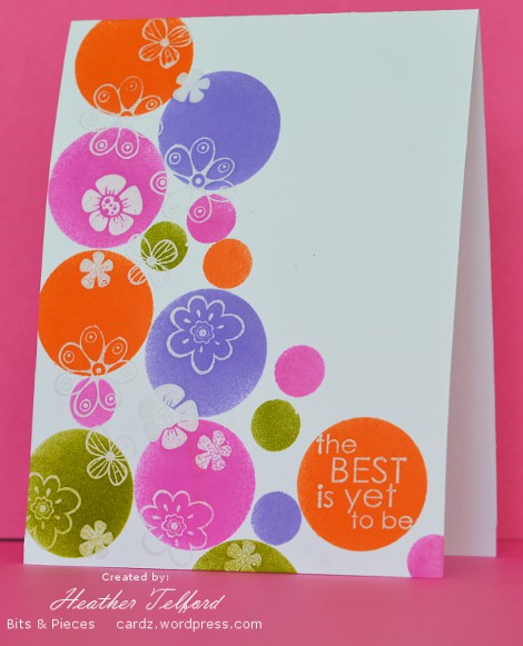
The Less is More challenge for this week is to use circles. I had fun creating this card with plenty of circles sponged across it. I started by randomly stamping and embossing a bunch of little flowers from SU’s Itty Bitty Buds set. As they were embossed in clear they were not easily seen at this stage. To reveal them I sponged green, purple, orange and pink circles over the top. The fun part was watching parts of the flowers appear. The sponging was done through post-it notes masks made with circle punches.
As usual there is oodles of inspiration to be found on the Less is More blog. Check it out.
Thank you to everyone who gave me suggestions for solving my black stamp pad dilemma. I appreciate the time you took sharing the techniques and products which work for you. I might experiment with a few new products. I think the problem may have been that my stamp pad and my stamp were both a little concave as neither were new and both get quite a bit of use.
Supplies:
Stamps: Itty Bitty Buds(SU), Best is Yet
Inks: Versamark, Passion Pink, Lovely Lilac, Only Orange, Old Olive
Cardstock: Flourishes Classic White
Also: Clear e.p.











 Heather Telford