Ready to bloom
Posted: October 4, 2019 Filed under: Catherine Pooler inks, floral background, ready to bloom | Tags: Catherine Pooler inks, Ink to Paper, The Stamp Market 3 Comments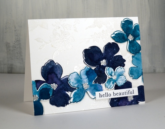
These lovely blooms are new from the Stamp Market and I’ve paired them with the Stamp Market floral background stamp. I experimented with some new to me cardstock and my Catherine Pooler inks to create this design. The cardstock is bristol smooth from Koh-I-Noor and even though this is only my first card with it I am impressed. As you can probably see I subjected it to a decent amount of water. I didn’t flood it but I did spritz each solid stamp before stamping all the petals so the paper had to be able to take a little water. It didn’t respond in the same way as watercolour paper does but it did let the water sit on top and blend as it dried rather than soaking through the instant it got wet. This made it possible for me to get some blurs, blends and watermarks on each flower.
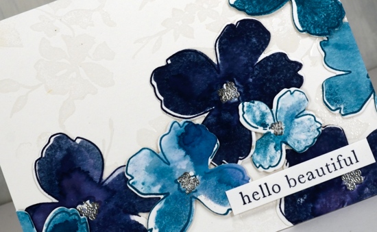
I stamped all the outline stamps first, the larger ones in juniper mist and the smaller ones in daydream CP inks. I then stamped the matching solid stamps in the same colours but spritzed each stamp before pressing it down to fill the outline shape. I love the watermarks and variation of shades I achieved by doing this. I’m not sure if there is a recommended order for stamping outline and fill stamps but I think I have more success when I try to put the filler inside the outline rather than the other way round. As you can see they aren’t exactly lined up but that was intentional.
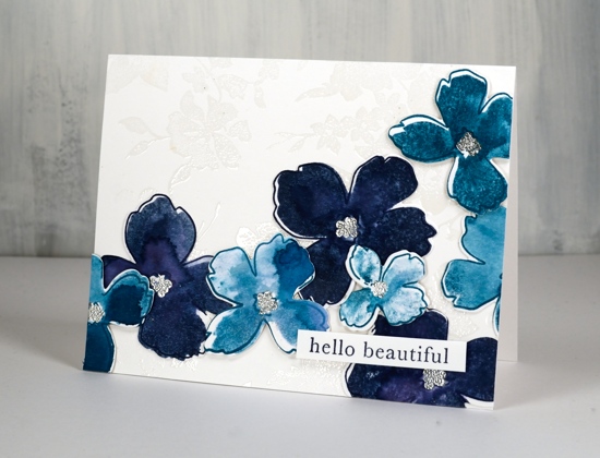
I stamped little centres on the flowers and embossed in silver powder then cut them all out with the co-ordinating dies. I arranged them to flow across a white panel but decided I wanted a little bit of non-distracting interest in the background panel. Clear embossing the ‘flower background’ stamp was enough, it looks a bit like a white damask table cloth. I glued the dark flowers directly to the background panel and popped the lighter flowers up on dimensional tape. The little sentiment is from the Ink to Paper set ‘tagged’.
Have a beautiful weekend.
Supplies
Poppy background watercoloured
Posted: August 29, 2019 Filed under: Ink to Paper, My Favorite Things, poppy background | Tags: Faber-Castell Polychromos Colour Pencil, Ink to Paper, My Favorite Things, Ranger Distress inks, sennelier watercolours 10 Comments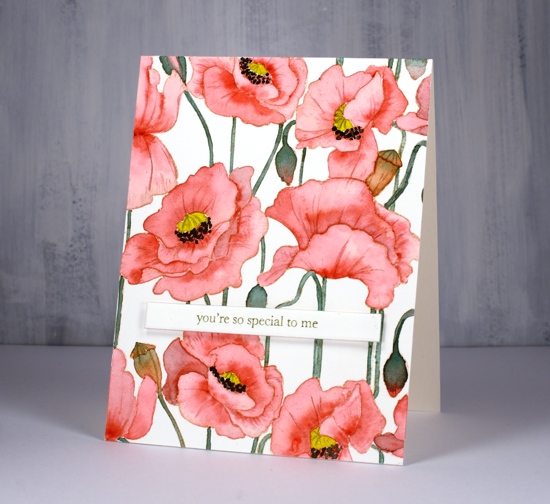
I did not plan to post this stamp two days in a row but it was there on the desk within reach and you have to admit it is perfect for no line watercolour because the outlines are so clear. So, instead of working on my to do list I painted on this card.
I stamped on hot pressed watercolour paper with antique linen distress ink for a pale but easily seen outline image. I decided to use my sennelier watercolours because they are lovely to work with. I used a red, a yellow, and a green. To make brown I mixed the red and green, then to make the black I added more red and green. The green I used for the stems and buds was not straight from the pan I mixed in a little red first to make it more olive toned. Once again I was happy with the results from sticking to a limited palette. You can definitely try the same approach with whatever watercolours you have on hand. If your green is a little bright, as mine was, add in a bit of red.
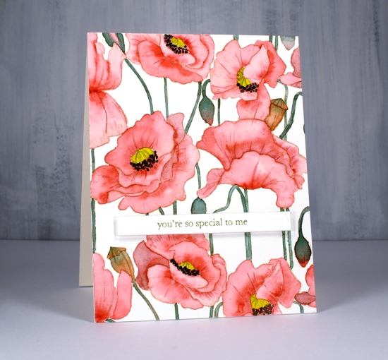
I painted the petals one at a time with diluted red and while each was wet I added more red where I wanted depth or shadow. I paid attention this time to whether I was painting buds or pods. I painted the buds with green blended into red and painted the pods in browns. I added a little of the mixed green to my yellow before painting the poppy centres and used my red+green=almost-black to paint the little black dots around the poppy centres.
After all the painting was done I added a bit more shading and veins on petals with polychromos coloured pencils.
I decided to use another of the lovely little sentiments from my new Ink to Paper ‘tagged’ sentiments set. To achieve a matching olive green on the sentiment I stamped with versafine clair shady lane ink but I stamped on a scrap first so I could get a pale ‘second generation’ print.
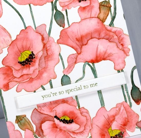
I hope you see how versatile this stamp is; it worked beautifully with the loose distress stain watercolour and the more precise no-line watercolour. I have an idea for a third look too.
Supplies
Poppy Background split
Posted: August 28, 2019 Filed under: Ink to Paper, My Favorite Things, poppy background | Tags: Ink to Paper, My Favorite Things, Ranger Distress stains 10 Comments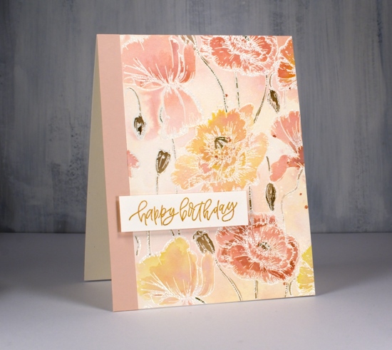
While I was a way this lovely MFT poppy background stamp arrived. (Thank you Foiled Fox) It has lovely detail which I will try to paint more realistically later but I thought I’d start with some emboss resist loose colour.
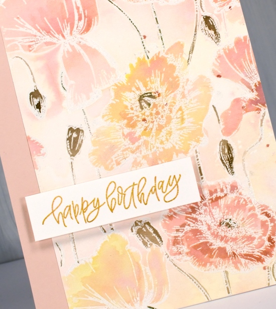
I embossed the large stamp on hot pressed watercolour paper with versamark and clear embossing powder. Next I sprayed some tattered rose, scattered straw and spun sugar distress stains on my glass mat then spritzed some homemade gold shimmer spray (interference gold pearl-ex mixed with water) to blend the three colours. I swiped my panel through the stains and discovered the spun sugar was not showing so I added more tattered rose and swiped again. Once it dried I had a panel with patches of blended colour, some yellow some pink, some blends of the two.
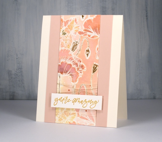
I painted all the poppies and buds by picking up undiluted stain from my glass mat with a paint brush. I did a few layers letting them dry in between coats so I could see how dark they were. I used frayed burlap to paint the stems, buds and pods and splattered a few dots of tattered rose over the finished panel.
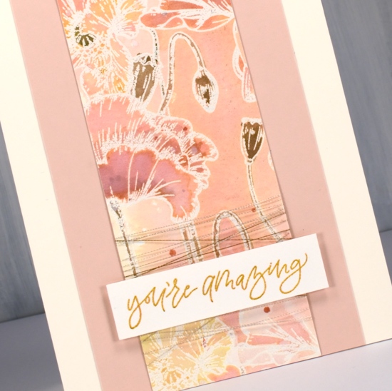
Rather than make a big square card I cut the panel in two pieces and paired them with some blush coloured cardstock and cream card bases. The sentiments are from an ‘Ink to Paper’ set called ‘tagged’. It is a sweet little set featuring several different fonts and nine sentiments. To make my sentiments match my watercoloured panel I stamped them first in versafine clair golden meadow but it was too yellow so I stamped over the top with tattered rose until it was a little more peachy. I think these new stamps are peachy don’t you?
Supplies