CAS Rock ‘n’ Roll
Posted: May 18, 2009 Filed under: CAS, Season of Friendship 7 Comments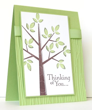
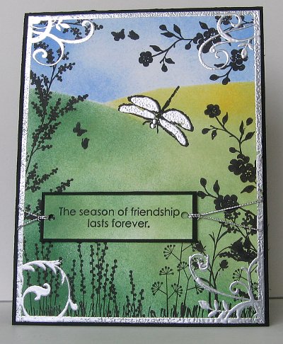
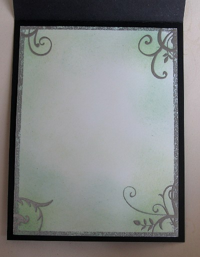
I have been aiming to participate in as many of the Splitcoast Clean and Simple challenges as possible but I seem to get to them just as a new one is posted. Anyway, last week’s was a challenge using the Rock and roll technique which means you ink up your stamp in a light colour and then roll the edges on a darker ink pad. I used the technique to ink my leaves for this card, in Celery first and Artichoke second.
The panel of embossing is done using the Cuttlebug Forest Branches folder and the ribbon is Celery twill from the sale-a-bration bundle. This week’s challenge is Black & White & 1 bold bright, which sounds fun, I might try and do that one tonight.
Supplies:
Stamps: Season of Friendship, Thoughts and Prayers
Inks: Certainly Celery, Always Artichoke, Chocolate Chip
Cardstock: Certainly Celery, Whisper White
Also: Celery twill ribbon, cuttlebug Forest branches embossing folder
Cards for my birthday boy
Posted: October 29, 2008 Filed under: By Land, My Kid's cards, Season of Friendship 2 CommentsYou would think that, as a card maker I would always have cards ready for my own children’s birthdays! But again and again I get to the night before and think, “Oh no, I don’t have a card ready!” For the girls there are always some pretty cards in the stash that I could use, but they have usually seen and maybe critiqued them for me, so what I really want is one designed especially for them. For my boy I don’t even have any in the stash, as I don’t own many boy stamps, only one set actually, By Land.
So this year, true to form the night before the birthday arrives, I am about to go to bed and I realise, no card! I cannot use By Land again, and besides one of my daughters used it for her card. (below) My solution was to make a scruffy skate theme card for my skateboarding eight year old. It came together surprisingly quickly and I popped it in with the gift. The next day he started opening his presents, reading every card before opening and examining every gift. It was only when he came to the one from my husband and I that I realised that the card was there, but I hadn’t written a word in it…
How Silently
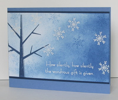
Posted: October 19, 2008 Filed under: Season of Friendship, Uncategorized, Wondrous Gift 2 CommentsAfter I made the Snow Laden Tree a week or so ago I wanted to make a similar card, but one that I could make more quickly and demonstrate easily. This is what I came up with. I have used some of the same techniques but there is definitely less sponging and less embossing steps. I stamped the snowflakes first in versamark and embossed in clear e.p. I then sponged with bashful blue and brocade blue, taking care to build up the sponging toward the right hand side. Once I was happy with the sponging I stamped the tree in navy and a few snowflakes in brocade blue. Lastly I stamped the sentiment and embossed it in white.
Supplies:
Stamps: Season of Friendship, Wondrous Gift
Inks: Brocade Blue, Versamark, Bashful Blue
Cardstock: Brocade Blue, Night of Navy , Whisper White
Also: Clear and white embossing powders, sponges
Snow laden tree
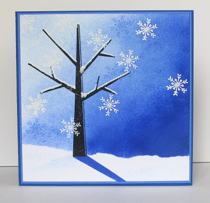
Posted: October 8, 2008 Filed under: Season of Friendship, Stamped Landscapes 10 CommentsI have several Christmas card events to plan for in the coming months so I have been playing with snowflakes stamps again. This tree and the snowflake is from the Season of Friendship set in the Stampin’ Up Holiday Mini. I think the projects featuring different seasons caught my eye more than anything else, but I have been having fun making winter scenes.
I have spent a bit of time lately browsing through the wonderful artwork of Michelle Zindorf and was inspired to try a scene complete with shadows and heavily sponged skies. To make this card I stamped the tree in versamark and embossed with black embossing powder. I then stamped the snowflakes in versamark and drew snow on the branches with the versmarker before embossing again, this time with white e.p. To make the tree’s shadow I inked the trunk with Brilliant Blue and stamped it at an angle, using a little scrap of paper near the base to mask any area I didn’t want stamped.
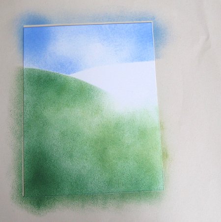
The sponging for the sky had to be built up layer by layer creating the impression that the moon was shining from the left. In order to have the snowy ground I ripped a piece of paper to use as a mask while I sponged. I used Bashful Blue, Ballet Blue and Brilliant Blue. Finally I stamped a few more snowflakes in Ballet Blue and matted it to fit on a 5½”x5½” square card. It was fun to make so I’ll be revisiting this style and method for sure.
Supplies:
Stamps: Season of Friendship
Inks: Brilliant Blue, Ballet Blue, Versamark, Bashful Blue
Cardstock: Brilliant Blue, Ballet Blue: , Whisper White
Also: Black and white embossing powders, versamarker sponges
Season of Friendship
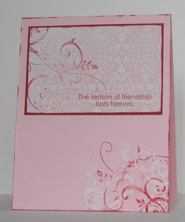
Posted: October 2, 2008 Filed under: Season of Friendship, Uncategorized 1 CommentThe inspiration for this card was a card made by Sharyn Tormanen on page 64 of the August/September edition of Papercrafts magazine. Once again a simple but striking card caught my eye. The red flourishes were stamped with the gorgeous flourish from Baroque Motifs and the white flourishes are rub-ons from the retired Cherished Memories set.
When my older daughter saw this one it appealed to her because of its simple unclutterd style. Her motto in many things is “less is more” which is often a good guide when it comes to decoration.
Supplies:
Stamps: Baroque Motifs, Season of Friendship
Inks: Riding Hood Red
Cardstock: Riding Hood Red, Pirouette Pink, Bella Rose designer paper
Also: Cherished Memories rub-ons

