
Poppy background watercoloured
Posted: August 29, 2019 Filed under: Ink to Paper, My Favorite Things, poppy background | Tags: Faber-Castell Polychromos Colour Pencil, Ink to Paper, My Favorite Things, Ranger Distress inks, sennelier watercolours 10 Comments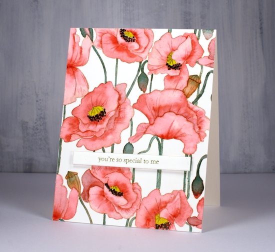
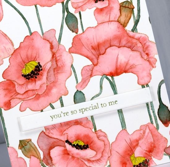
I did not plan to post this stamp two days in a row but it was there on the desk within reach and you have to admit it is perfect for no line watercolour because the outlines are so clear. So, instead of working on my to do list I painted on this card.
I stamped on hot pressed watercolour paper with antique linen distress ink for a pale but easily seen outline image. I decided to use my sennelier watercolours because they are lovely to work with. I used a red, a yellow, and a green. To make brown I mixed the red and green, then to make the black I added more red and green. The green I used for the stems and buds was not straight from the pan I mixed in a little red first to make it more olive toned. Once again I was happy with the results from sticking to a limited palette. You can definitely try the same approach with whatever watercolours you have on hand. If your green is a little bright, as mine was, add in a bit of red.
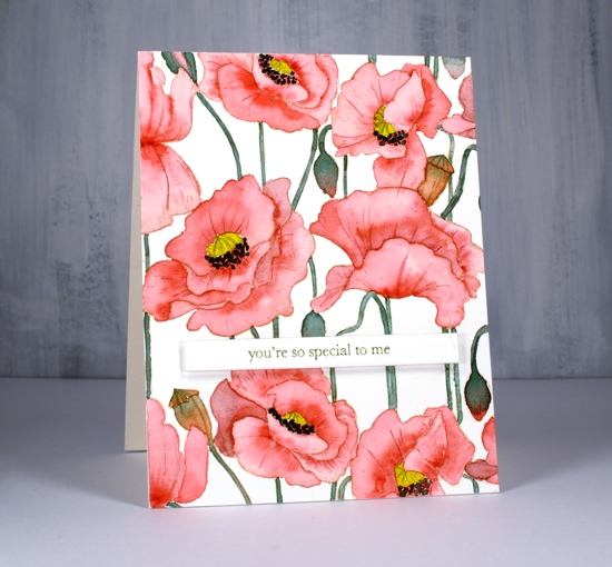
I painted the petals one at a time with diluted red and while each was wet I added more red where I wanted depth or shadow. I paid attention this time to whether I was painting buds or pods. I painted the buds with green blended into red and painted the pods in browns. I added a little of the mixed green to my yellow before painting the poppy centres and used my red+green=almost-black to paint the little black dots around the poppy centres.
After all the painting was done I added a bit more shading and veins on petals with polychromos coloured pencils.
I decided to use another of the lovely little sentiments from my new Ink to Paper ‘tagged’ sentiments set. To achieve a matching olive green on the sentiment I stamped with versafine clair shady lane ink but I stamped on a scrap first so I could get a pale ‘second generation’ print.
I hope you see how versatile this stamp is; it worked beautifully with the loose distress stain watercolour and the more precise no-line watercolour. I have an idea for a third look too.
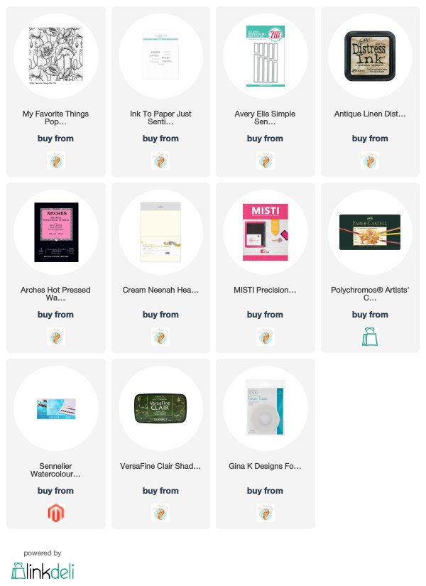
Supplies


That is just beautiful!
This is even more beautiful than the ones yesterday! WOW!
Thank you, I’m pretty happy with it!
Your watercoloured poppies are absolutely beautiful Heather and I love the way you have mixed the colours to keep the colour palette unified and it looks gorgeous and even the sentiment tones in perfectly. x
Oh my, Heather. I have this stamp and have found a lot of inspiration for it, but this is the prettiest I’ve seen! Can’t wait to see your third look.
Gorgeous painted poppies! I’m impressed that you just used 3 colors to achieve all these colors!
Thank you! I’ve discovered it really does make a difference when I take the time to mix my colours rather than use many individual paints or inks.
Well, we are happy to get this card out before your to do list. I tend to get lazy in my watercoloring in that I just add a color in whatever method I am doing..but you help us in being motivated to mix. Thank you.
Tish Rowe
New here, that’s amazing!
the card design and coloring is stunning; I appreciate your helpful direction and tips on watercoloring techniques.