
Jubilant
Posted: April 9, 2014 Filed under: CAS, Jubilant | Tags: Fabriano Watercolour Paper, Penny Black stamps, Ranger Distress stains 14 Comments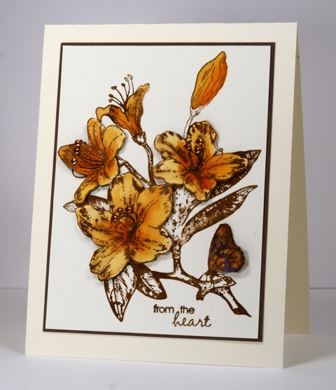
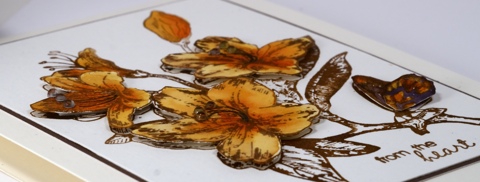
I think this is the first time this gorgeous stamp has appeared on my blog. I inked it up ages ago and had the simple dark brown image sitting around waiting for further inspiration. Because I inked the stamp with distress stain the ink pooled in some areas of the stamp more than others. I really like the effect of darker and lighter tones along with thicker and thinner lines so initially I didn’t want to add colour to the image. I eventually decided to colour a few flowers, cut them out and pop them up. I have said before I am not a fussy cutter, these three relatively simple blooms were enough for me. As if the fussy cutting wasn’t enough of a surprise I also decided to add half pearls which I coloured to match with an alcohol marker!
Supplies:
Stamps: Jubilant, Every Happiness (PB)
Inks: Memento Espresso Truffle Marker (Tsukineko) Vintage Photo, Spiced Marmalade, Dusty Concord Distress Stains (Ranger) Brown Marker TN8 (Spectrum Noir)
Cardstock: Fabriano 25% cotton hot pressed watercolour paper, Sticks & Stones Mix & Match Paper
Also: Keepsakes Memories half pearls


Its a wonderful Idea, just to color the flowers and the butterfly and to pop them up. Perhaps I would set some more half pearls on the flower on the top left.
I love this, it is spot on. Not too much color and the pop of interest, makes it perfect.
That is such a unique look and a real WOW card!!!
Absolutely gorgeous, looks so very lush, thank you for sharing
Pearls and fussy-cutting? I’d wonder what was going on; but the overall look still has your classic touch, Heather — a beautiful card.
Oh, Heather, this is stunning! I love the colors, and the popped blossoms are fabulous with the pearls! And the CAS with the wonderful matting…all so exquisite! Hugs!
Definitely gorgeous. Love the golden color, and agree with you, fussy cutting is not something I enjoy either. You did a fab job on this one. Neat idea to color your matching pearls.
This is just gorgeous–beautifully stamped and colored.
Beautiful! So glad you took a step out of your comfort zone and cut it out and added those pearls. Makes your coloring even prettier.
I agree with Lindsey. 🙂
It’s not your usual, but I love it, the tone on tone is nice. I know you will agree, some things just have to tell you how they want to be painted. I feel that way about furniture. And people look at me, like I’m a bit crazy when I say that. As crafters, we can all see the potential in something to be fun or great, but sometimes I need to mull it over a while before I know what to do. The world is our oyster and deciding is hard. And when you know, you know. LOL
Wow–this is just gorgeous, Heather!
This is so stunning!! love the colors
Well, it certainly came out beautiful! I like the effect of coloring the blooms and leaving the rest uncolored. The pearls are a fabulous touch!