
Alcohol lift ink and a collage stamp
Posted: October 10, 2018 Filed under: Alcohol Ink, Butterfly garden | Tags: Darkroom Door stamps, Ranger Alcohol Ink 15 Comments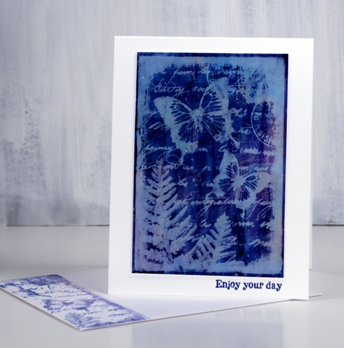
I have done some experimenting with alcohol lift ink in the past month and learnt a few things along the way. There are a couple of variables that can affect the process and results. The main thing I learnt is that it does not hurt to let things dry longer than you think might be necessary. Let me give you some examples. So far I have done all my experimentation on yupo paper with one or two colours of ink and some rubbing alcohol to help move the ink around and create colour variation. When you create an abstract background on yupo paper let it dry for at least 10 minutes but preferably longer; if it is humid weather it will need to be longer. Sometimes I have so much fun creating pretty background panels with alcohol ink I end up with a lot of ink on the yupo; the process will work best if I give all that ink plenty of time to dry.
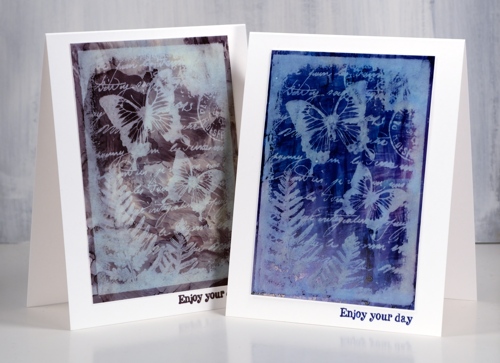
Once the coloured panel is dry it is time to use the alcohol lift ink. The ink takes out some colour but not all the colour. You can see in the two panels below it went from dark to light. Even with a light panel the lift ink will still remove some colour but the contrast will be less and the effect more subtle. This Darkroom Door collage stamp was perfect for the technique and shows you that solid stamping and fine detail stamping both work with the alcohol lift technique. I positioned the stamp in my stamp positioner, inked it with alcohol lift ink and pressed it down onto the coloured panel. After a few seconds I lifted the stamp, removed the panel and set it aside for more waiting. While I was waiting I pressed an envelope down onto the stamp which was now covered with the ‘lifted ink’. I pressed the edge of the envelope onto one side of the stamp because I did not want the whole stamp image. You could put a piece of cardstock into the stamp positioner and stamp the whole lifted image.
After at least ten minutes of drying time I returned to my alcohol ink panel and started dabbing the lift ink off with a paper towel. Each dab picks up some colour so I kept rearranging my paper towel so I would not be dabbing colour back onto my panel. When there was no more evidence of ‘shiny’ lift ink on the panel I gently buffed the panel with a clean area of paper towel. If all the ink is dry at this point the stamped image will get clearer as you polish. If there is any wet alcohol ink or lift ink the image will blur or spread. This is why it is worth giving the panel plenty of drying time and dabbing time.
The card on the left was made with just ranger pitch black alcohol ink and rubbing alcohol; I ended up with black, pale blue and burgandy areas on the panel. The card on the right was made with ranger indigo alcohol ink and I think some cloudy blue as well but I didn’t write them down so I’m not sure. The stamp has its own frame so I just trimmed my panel close to that and attached it to a white card base.
It is worth watching a couple of alcohol lift ink videos before you try the technique. After completing a few panels I found myself wondering which stamps I would try next.
Supplies
Stamps: butterfly garden, happy birthday sentiment stamp (DD)


Inks: pitch black , indigo ranger alcohol inks, ranger alcohol lift ink, distress chipped sapphire, versafine clair nocturne


Paper: yupo heavy white, neenah solar white


Tools: stamp positioner

Butterfly Border
Posted: March 14, 2017 Filed under: Butterfly garden | Tags: Darkroom Door stamps, Ranger Distress stains, Tsukineko Versafine inks, WOW embossing powders 10 Comments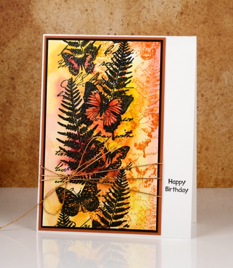
I have a couple of cards today featuring the border stamp ‘Butterfly Garden’ from Darkroom Door. The stamp is quite large, as it was designed with scrapbooks and art journals in mind. It is such a lovely stamp I wanted to feature it on cards also. I used an emboss resist technique on both cards, stamping in black ink then embossing in clear powder. The embossing resists liquid when I add it over the top making it possible to paint and blend over the image to create a colourful background.
To create the warm toned card above I stamped the butterfly garden stamp in spiced marmalade ink beside the embossed image then added distress stains over and around the stamping. I left soft blends in most places but added extra stain inside the butterflies. Once the background was dry I splattered some water drops to create a few watermarks.
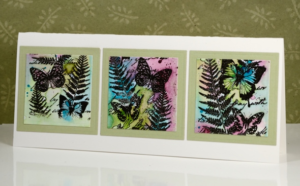
On this second card I wanted to feature as much of the large stamp as I could so I designed a wide card that would fit in a business envelope. I once again added distress stains over the embossed image trapping colour inside the butterflies and amongst the fern fronds. I die cut the panel into three squares then framed with before adding them to a natural coloured card base.
Supplies
Stamps: butterfly garden, happy birthday (Darkroom Door)
Cardstock: hot pressed watercolour paper, pale green, black and rust cardstock
Ink: versafine onyx black ink (Tsukineko), Spiced Marmalade distress ink & Spiced Marmalade, Barn Door, Rusty Hinge, Scattered Straw, Aged Mahogany, Broken China, Seedless Preserves, Salty Ocean, Peeled Paint distress stains(Ranger)
Also: clear embossing powder, gold cord


