Black on Kraft
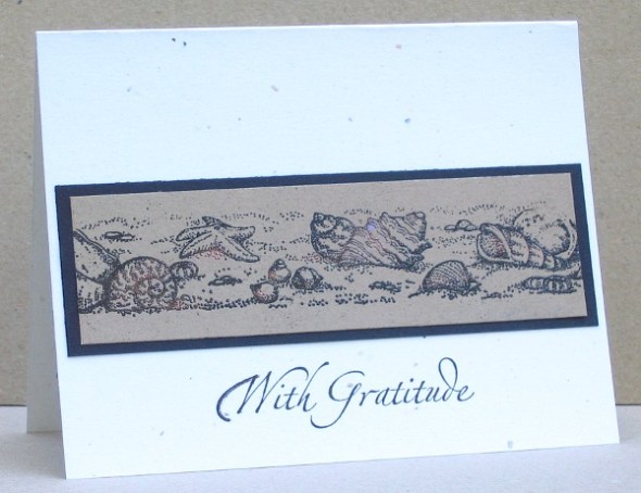
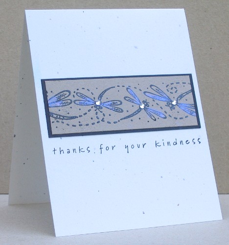
Posted: July 20, 2010 Filed under: CAS, Rollers Leave a commentLast week when I was playing with Kraft I switched from white to black embossing and had fun with that too. I pulled out some rollers that I haven’t used in very long time and inked them up with versamark and embossed in black. I decided that the dragonflies needed a little extra something and went in search of my Pearl Ex powders, another item that hasn’t seen the light of day in quite a while. The blue powder was exactly what I needed to add a little lift but then I decided to add a little bling as well. I also used a little copper Pearl Ex on the shells ever so lightly.
That’s all my Kraft cards for now but I know I will reach for it more often than I used to.
Supplies:
Stamps: By the Sea roller, Dragonfly roller, With Gratitude, Simple Sayings 2
Inks: Versamark, Basic Black
Cardstock: Confetti White, Basic Black, Kraft
Also: Black e.p., Pearl Ex powder, Rhinestones
More Kraft
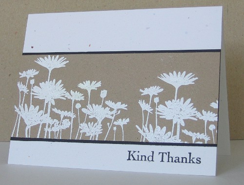
Posted: July 15, 2010 Filed under: CAS, Upsy Daisy, With Gratitude Leave a commentI mentioned the other day that the CAS-tastic challenge to use Kraft had inspired me to create a bunch of cards. I decided to make them all thank you cards and perhaps box them up in a set to use as a gift. This is the second one I made using white on Kraft again and the same layout. I stamped the daisy stamp twice to fill the space.
Supplies:
Stamps: Upsy Daisy, Thank you Kindly
Inks: Versamark, Basic Black
Cardstock: Confetti White, Basic Black, Kraft
Also: White e.p.
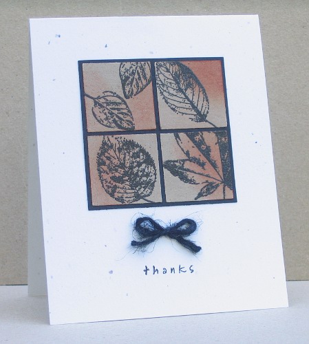
I was also inspired by the beautiful card Karen, from the Bald Dragonfly, made, I made a few changes but basically CASEd her lovely four squared design.
I added a little sponging in rust and matted the foursome in black before adding a little bow and the sentiment. I’m so glad I came across the Bald Dragonfly; Karen’s blog is full of inspiration and beauty.
Supplies:
Stamps: Simple Sayings 2, With Gratitude
Inks: Versamark, Basic Black, Really Rust
Cardstock: Confetti White, Basic Black, Kraft
Also: Black e.p., Black twine
Creating with Kraft
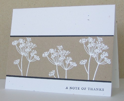
Posted: July 11, 2010 Filed under: CAS, Garden silhouettes 5 CommentsI had a chance to browse through the CAS favorites on Splicoast today and found loads of beautiful cards. I was inspired by Karen Dunbrook’s beautiful “white on Kraft” creation and ended up making a stack of Kraft cards, something new for me. Karen’s card was part of the CAS-tastic Krafty Kreations challenge so I will link mine over there also. I didn’t have any Kraft cardstock but found something similar in a promotional booklet from a paper company. I have a friend with a graphic design business who once gave me a stack of sample booklets from paper companies and they are full of interesting papers. I embossed in white and mounted it all on Confetti White which seems to work well with Kraft.
I’ll have some more to show tomorrow.
Supplies:
Stamps: Garden Silhouettes, Thank you Kindly
Inks: Versamark, Basic Black
Cardstock: Confetti White, Basic Black, Kraft
Also: White e.p.
Shabby squares
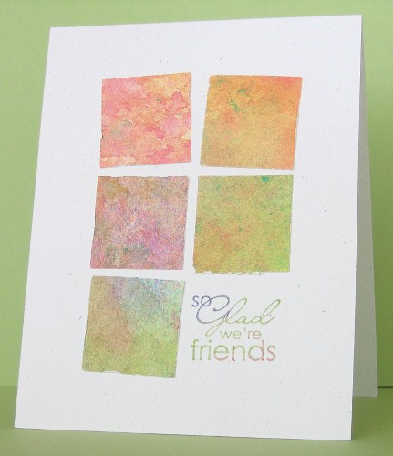
Posted: July 10, 2010 Filed under: Best Yet, CAS 1 CommentI have set the sponges aside for now and returned to a favourite element for cards: a collection of squares. I have done this type of layout before, inspired by Susan at Simplicity. Last time I did it I only used three squares plus a sentiment and kept them in line with each other. I decided to intentionally have them out of line and a little shabby around the edges. The paper was a beautiful paint speckled piece sitting in the stash from long ago. I used Celery, Lovely Lilac and Pixie Pink on the sentiment.
Supplies:
Stamps: Best is Yet
Inks: Certainly Celery, Lovely Lilac and Pixie Pink
Cardstock: Confetti White
Also: 1 3/8″ Square punch
Snowscape thank you cards
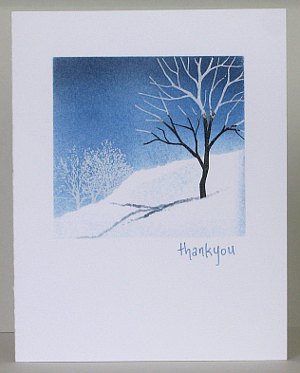
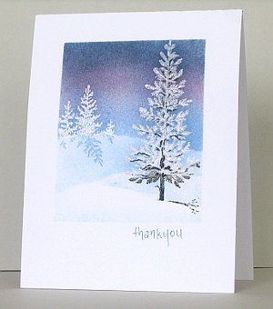
Posted: January 2, 2010 Filed under: Branch Out, CAS, Lovely as a Tree, Stamped Landscapes 15 CommentsIt isn’t a new year resolution but I have been thinking for a while that this cardmaker should send a few more cards! Last night I sat down and chose a few thank you cards out of my stash to write to the very kind and hospitable friends whose homes we were welcomed into over Christmas.
During the day I had been sorting through drawers and shelves of school and craft supplies trying to make some room. I found some old Christmas cards which inspired me straight away to get creating again. I would like to give credit to the artist who inspired the card above but the Hallmark card doesn’t give any information.
To make both cards I masked off the picture area with post it notes and then inked up my tree with versamark and added a bit of black to the base of the tree. After placing another mask where the base of the tree would be I stamped the main tree and the smaller trees, then embossed in clear. To create the sky I positioned a hill mask and sponged in the blues and red (listed below). Creating the shadows was trial and error. For the top card I sponged the shadow between two ripped pieces of post it note. For the shadow below I drew it with marker for the large tree and stamped it for the small trees. I also used a marker to add more black to the tree below. Finally I removed the hill mask and did a little sponging to give the snow definition.
The sentiment is written in my own handwriting because I wanted something small and delicate but didn’t have a ‘thank you” in that style. I particularly wanted to make these one layer cards so was pleased that I managed to get to the end without smudging any of the white area. The photo once again is not great, I’m not quite sure what the problem is, probably the photographer not the camera!
Supplies:
Stamps: Lovely as a Tree, Branch Out, two little tree stamps I was given
Inks: Versamark, Basic Black, Night of Navy, Bashful Blue, Brocade Blue, Rose Red
Cardstock: Flourishes Classic White
Also: Clear e.p.
Framed Trees
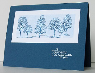
Posted: October 31, 2009 Filed under: CAS, Lovely as a Tree 1 CommentThis is another of the cards I designed for the Christmas Card Workshop at my church last weekend. This one was my favourite because I was really pleased with the way the sponged background worked out. I positioned post-it notes around the edges of the white piece of cardstock and sponged in Bashful Blue before stamping the trees in Not Quite Navy. I purposely made the “window’ a little smaller than the size of the tree stamp so the image would go the edges. I’m not sure why, but it was what I wanted! I then embossed the sentiment in white e.p.
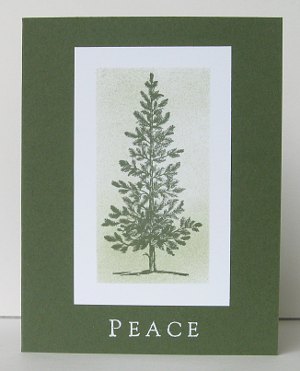
I liked the framed area idea so much I tried it with the lone pine from Lovely as a Tree as well. This time I sponged in Mellow Moss and stamped in Always Artichoke.
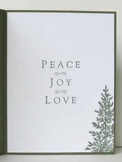
It needed a white insert so I used the complete sentiment from All Year Cheer with a bit of tree on the side.
By the way if you are ever searching for cards using a particular stamp set, my categories are pretty much all stamp sets with a few exceptions and are listed in the drop down menu on the right hand side labeled Categories. Thanks for dropping in, there are a couple more from the workshop which I hope to post soon.
Supplies:
Stamps: Lovely as a Tree, Best Yet, All Year Cheer
Inks: Versamark, Not quite Navy, Bashful Blue, Always Artichoke, Mellow Moss
Cardstock: Not quite Navy, Always Artichoke, Whisper White
Also: White e.p.
CAS Three Square
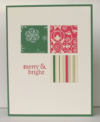
Posted: October 27, 2009 Filed under: CAS, Designer Paper, Uncategorized 2 CommentsWhen I saw this card on Susan’s blog I knew it would be perfect for the Christmas Card workshop I did for the ladies at my church on Saturday night. There is plenty of room for creativity with three pretty squares and “merry & bright”. Some women are happy to create the cards exactly as I designed them. Others like to change it up a little.
Susan was inspired by this card by Donelda and when I went over and looked at her blog Wiggy’s World I found inspiration all over the place.
There isn’t really much to say about making my card other than go and try it, you’ll like it.
Supplies:
Stamps: All Year Cheer
Inks: Real Red
Cardstock: Very Vanilla, Garden Green
Also: Merry Moments D.P.
1 set, 1 colour scheme: 2 ways
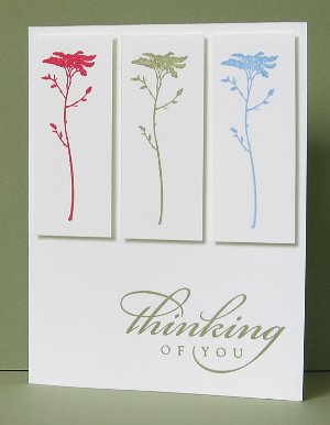
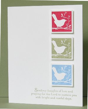
Posted: August 23, 2009 Filed under: CAS, Of the Earth 9 CommentsI played with the new hostess set, Of the Earth, the other day. It has three pretty picture stamps and a quote. I decided against the quote and chose “thinking of you” sentiments instead. The colour scheme I used is a calm one so I wanted the words to be restful as well.
I used Rose Red, Mellow Moss and Bashful Blue on both cards. The little bird stamp is easy to punch out with the 1¼” square punch, but the rectangular pieces I cut before stamping to make sure they were identical. All the images are popped up on stampin’ dimensionals.
Thanks for dropping in today.
Supplies:
Stamps: Of the Earth, Thoughts and Prayers, All Year Cheer
Inks: Mellow Moss, Rose Red, Bashful Blue
Cardstock: Whisper White
Also: Stampin’ dimensionals, square punch
Bloom Away
Posted: August 16, 2009 Filed under: Bloom Away, CAS 12 CommentsMy parents arrived from Australia a week or so ago, with this stamp set. It is an SU set but I don’t imagine it will ever appear in my Canadian catalog because it features Australian native flowers. I was browsing some blogs one day and saw a card which featured a gum blossom, so followed up the card information to find the set in the Australian catalog. My dad located a demonstrator not far from their place and… now I have a new set.
The set includes a waratah, a gum blossom and a banksia, these are a couple of my first attempts with the gum and banksia. I know the gum blossom will be my favourite stamp from the set. I have like gum blossoms ever since my mum read Snugglepot and Cuddlepie to me when I was five or six. I even won a prize in Grade 1, when I dressed up as Ragged Blossom for a Book Week parade!
I stamped the full image twice for both cards, once in green, once in black. I coloured the black images using watercolour pencils, ink from the stamp pad lids and a blender pen. I then punched out a feature square from the coloured image, matted it and attached it to the green image with stampin’ dimensionals. In the gum blossom card above I masked the edge of the background image using a post-it note and then stamped the left of the stamp again to create a larger bunch of blossom.
Thank you for dropping in today and a special thanks for the encouraging comments people have been leaving for me. I have really enjoyed your kind words.
Supplies:
Stamps: Bloom Away, Fundamental Phrases
Inks: Basic Black, Always Artichoke, Old Olive, Pixie Pink
Cardstock: Always Artichoke, Old Olive, Whisper White
Also: Faber-Castell watercolour pencils, square punches

