
Watercoloured florals
Posted: May 17, 2019 Filed under: flower cascade, harmony, peaceful time, Penny Black | Tags: Penny Black stamps, Ranger Distress inks 8 Comments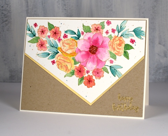
I’ve been doing some more watercolour with a limited colour palette. I am hosting a colour challenge with the Foiled Fox until the end of the month so I’ve been working with three colours whenever I get the chance. I’d love to see any three colour cards you’ve made added to our challenge link up. The card above was painted with only three colours, picked raspberry, fossilized amber and evergreen bough. The orange tones are a mix of pink and yellow, the blue/green leaves are evergreen bough, the other leaves are a mix of evergreen bough and fossilized amber.
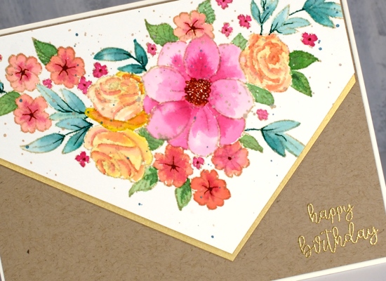
I stamped PB ‘flower cascade’ in antique linen ink which is perfect for no-line watercolour. After I had finished the painting I splattered some antique linen oxide and some metallic green paint over the panel. I completed the card with some kraft and shimmer gold cardstock and added a gold embossed sentiment.

I want to let you know that The Foiled Fox is having a sale all weekend so if you are wanting to do a little arty crafty shopping pop on over there.
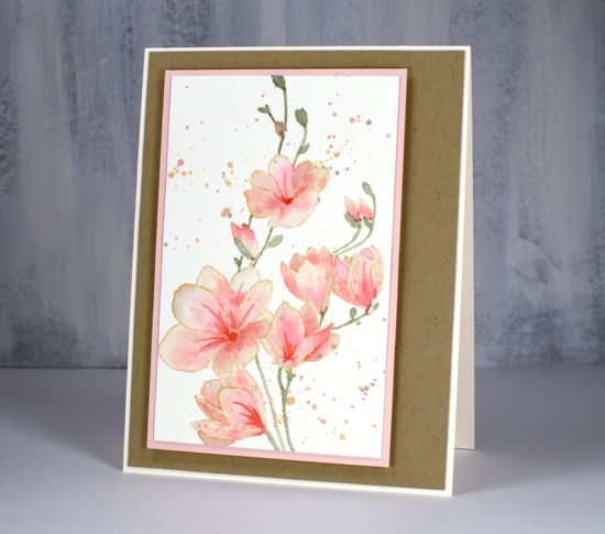
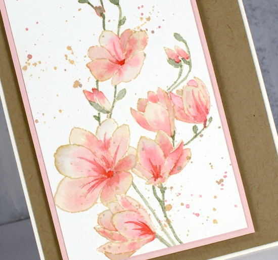
My second card is also a three colour image painted with bundled sage, worn lipstick and antique linen inks. I stamped the image in antique linen ink then smooshed the distress ink on my glass mat so I could dilute and paint with it. I painted one petal at a time so I could blend dark to light and let it dry before painting an adjacent petal.
Have a great weekend and maybe try a colour trio card!
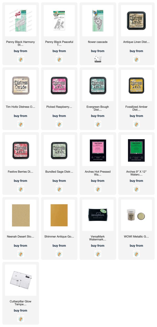
Supplies


Wow…how beautiful and with only three colours! Wonderful no-line colouring!. The pink spray card is ethereal!
Gorgeous original card Heather. Your watercolouring is beyond perfect. So lovely.
Beautiful cards. Your choice of colors and your watercoloring are wonderful!
Beautifully done with just a few colors!
Gorgeous creations! I love your no-line watercoloring!
What a gorgeous card Heather and I love the way you have given it the look of an envelope with the image on the flap, so so pretty, also love the colour mixing using just three colours, and I think it gives harmony to the whole piece. x
Sorry Heather, I thought this beautiful magnolia was on a separate post, but it is so wonderful using just three more pretty tones, and both this and the last look great backed with the kraft card. x
These are gorgeous! I especially love the delicacy and transparency of the painting on the second card. On the first card, I love the three colors you chose and how beautifully you combined them to make extra colors. Thank you for sharing the details.