
Pink Poppies
Posted: March 9, 2015 Filed under: Blooming tags, Sprigs | Tags: Faber-Castell Albrecht Durer Watercolour pencils, Penny Black creative dies, Penny Black stamps 18 Comments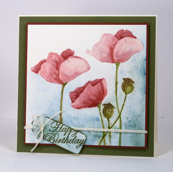
Last week I posted several loosely watercoloured cards. The poppies on today’s card were painted with more precision and there was no spritzing to make the colours blend and bleed. I worked on a watercolour block which I had splattered with a fine mist of masking fluid. The end result with such a fine mist could represent snow but I think it could pass for rain too. I have had snow fall on my daffodils and tulips but the poppies are pretty safe! Once the masking fluid was dry I inked the poppy image from ‘blooming garden‘ with memento angel pink and new sprout markers. The colours are fairly pale so I had an outline to work with but not so dark that it would be noticeable after I had added all the colour. For this one I used my watercolour pencils as paints. I do this by picking up colour from the lead of the pencil with a waterbrush then painting with it. For the poppies I used colour from three pink pencils (listed below), for the stems and seed heads two greens and a brown then a blue and a green for the background.
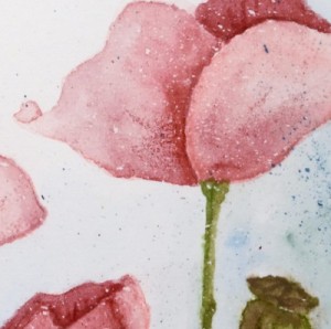
I didn’t want both of the tall poppies to look exactly the same so I altered the petals a bit on the left hand one. When I checked a photo of seed pods to choose my colours I saw many were quite round so I fattened mine up a little. When the poppies and seed heads had dried I drew some veins and ridges with the watercolour pencils.

To create the little tag I painted a scrap of watercolour paper with the same colours I had used on the background of the main panel, die cut a ‘flower tag’, then stamped the sentiment from the ‘sprigs’ set across it. To complete the card I matted the panel with a narrow red mat, tied the tag on with embroidery floss, popped the panel up on a wider green mat and attached it to a cream card base.
As you know I love doing the loose watery images but I also find it quite satisfying to work slowly to paint a more formal image.
Kathy Racoosin is doing a 30 day coloring challenge at present which inspired me to do pull out my pencils.
Supplies:
Stamps: Blooming Garden, Sprigs (PB)
Creative Dies: flower tags (PB)
Inks: Memento Angel Pink, New Sprout, Olive Grove markers (Tsukineko)
Cardstock: Fabriano 100% cotton hot pressed watercolour paper, Neenah Classic Crest Natural White 110lb smooth, pink and green cardstock
Also: Albrecht Durer watercolour pencils medium flesh 131, dark red 225, indian red 192, night green 155, pine green 267, olive green 173, moss green 168, apple green 170(Faber-Castell), Cream embroidery floss


I do love this more formal painting, Heather, even though it still retains a lovely misty ethereal quality to me! And I really love the way you did your sweet tag treatment, too!! Hugs, Darnell
Simply gorgeous.
Beautiful. I think I like the more ‘structured’ look on this one, although I loved the looser, freer look of your earlier w/colored flowers. The background does evoke a misty rainy day in a spring garden, and I like all the extra details you’ve added with the pencil veining. A really lovely card with all the pretty embellies you’ve added to make it so specially yours. TFS & Hugs
Your coloring is soft and lovely! I love the effect of the masking fluid too–it really does look like rain.
Exquisite card Heather!!! You certainly have what it takes to make beautiful cards!!!!
Paper Hugs,
Jan
This is beautiful.
I envy your talent, Heather! The poppies are GORGEOUS!
Wow – these poppies are gorgeous! What a beautiful card.
Beautiful rainy day poppies, Heather. I love the gentle pink shades too … nice change from bright red 🙂 Elizabeth
Hi Heather ,Gorgeous card,love how you made the water colour technique
on these poppies
Maria
This is gorgeous and I do so love Poppies. You have kept it much tighter than normal and the touches of darker blue in the bottom right hand corner and up the side are really lovely, and the delicate splatters suit it perfectly and it certainly has a soft dreamy quality. x
I think I will have to CASE the way you’ve placed the sentiment on the tag — I really like how it looks. Of course I love the poppies, too… I would just be far less successful trying to CASE those. 😉
I love the soft pink poppies! Another gorgeous card, Heather!
Love the soft colours on this – it’s just beautiful! xxx
Wow – what a soft beauty! I want a lesson on how you keep the petals separate – do you do them one by one and let them dry in between?
[…] off this one that the watercolouring has got progressively looser in each design. In the first one, Pink Poppies I worked slowly with a fairly small brush, the second, Red Poppies, my brush work was looser but […]
[…] like a mini colouring challenge. If you haven’t seen my first three, here are the links: Pink Poppies, Red Poppies and Orange Poppies. I don’t think I have ever done blue poppies but Penny Ward […]
This is your card that taught me about Frisket! I can’t wait to try!