Let’s try that again
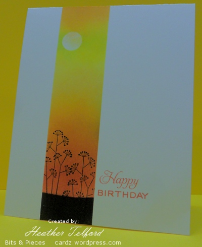
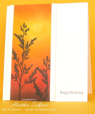
Posted: January 28, 2011 Filed under: CAS, Garden silhouettes, Nature Silhouettes 11 CommentsToday’s post is a little different to the usual. I have a card which I initially tossed aside followed by the new and improved version. I have posted both below with a little discussion of what didn’t work and how I fixed it.
Both cards feature warm colours ranging from light to dark. On the card above I made my darkest colour black, which is too stark against the white cardstock and there is too much of it. Below the darkest colour was a chocolate brown which against the ivory cardstock is not quite so overwhelming.
I also changed the width of the strip. I have been playing around with masks a lot as you know and I may still use narrow strips like the one above, however on the card above it is too narrow; I have not followed the rule of thirds, it is more like a quarter. The one below is a little more generous and draws the eye into the image panel.
The plants in the one below are bigger and lead the eye down toward the sentiment. The sentiment in the one above was the initial reason I didn’t like the card. I tried to link it by colour to the panel beside it but it is just not strong enough or big enough to give the card balance. I think a longer sentiment might have worked better there. Below I have used a small sentiment but it takes the eye to the edge of the card. (It doesn’t look quite so washed out in real life)
So there you have it: a little design discussion and a few suggestions as to what elements to consider when you have a card that doesn’t quite work but you are not sure why. Thanks for dropping in and thanks for the comments you leave which I thoroughly enjoy reading.
Supplies:
Stamps: Garden Silhouettes, Nature Silhouettes, Teensy Tiny Wishes, Tag Lines (Flourishes)
Inks: Chocolate Chip, Summer Sun, Pumpkin Pie, Ruby Red, Basic Black
Cardstock: Flourishes Classic Ivory and White
Birthday Silhouette
Posted: March 16, 2010 Filed under: Nature Silhouettes 3 CommentsThis is a quick post of a quick card I whipped up for a friend of my husband. We were going to the birthday party on Saturday night so I looked through the stash only to find that I had no “manly” cards. When I finished this one I asked my husband if it was manly enough and he gave me a hesitant yes. It was later in the evening that I began to wonder if we had given a card to the same person a couple of years ago made with the same stamp. He and his wife were quite impressed then to receive a handmade card. I wonder if they will be impressed this time when they see I’ve been using the same stamp for two years! It’s not as if I don’t own a few other stamps!
I embossed the tree in black and then sponged in yellow, apricot and blue to create the sunrise scene. I was going for the CAS look so I popped up the scene and stamped a greeting. Problem was I didn’t bother using the stampamajig for my words so they ended up crooked. To remedy that error I cut the picture off the white card I had attached it to leaving a narrow border of white around it. I then attached the two lavers to a new base and stamped the words again. So the picture is doubly popped up, which I don’t mind. The photo is a little strange as I took it on my craft table under the fluorescent light without the tripod. Time was of the essence.
Supplies:
Stamps: Nature Silhouettes, Teensy Tiny Wishes
Inks: Versamark, Bashful Blue, Yoyo Yellow, Apricot Appeal
Cardstock: Flourishes Classic White
Also: black e.p.
Sunlit Woods
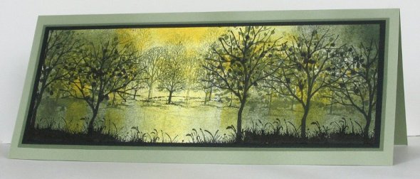
Posted: June 24, 2009 Filed under: Branch Out, Lovely as a Tree, Nature Silhouettes, Stamped Landscapes 15 CommentsIn case you hadn’t noticed I like creating scenes with trees! I have combined three different tree stamps from three different sets to make this sunlit woodland scene.
I started by stamping the tree from Branching Out in Basic Black ink. I then stamped the row of trees from Lovely as a Tree in the background using Always Artichoke and Mellow Moss. I actually stamped them several times without reinking to give the appearance of trees in the distance. When I did this I masked with a post it note so I didn’t get the bases of the trees.
It is hard to see in the picture but I added leaves to the foreground trees in Mellow Moss, Always Artichoke, Basic Black and Summer Sun. (You can click on the photo for a larger image) I then began sponging in the same greens and yellow to create the sunlight. To create the grass in the foreground I used the tree stamp from Nature Silhouettes and a post it note to mask the tree out.
Thanks for dropping in, school should finish tomorrow, so I might be posting a bit more. Hope to see you soon.
Supplies:
Stamps: Branch Out, Lovely as a Tree, Nature Silhouettes
Inks: Basic Black, Always Artichoke, Mellow Moss, Summer Sun
Cardstock: Whisper white, Basic Black, Always Artichoke, Mellow Moss
Featured stamper scene
Posted: June 2, 2009 Filed under: Nature Silhouettes, Pocket Silhouettes 2 Comments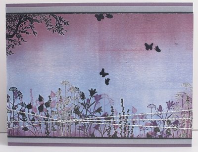
I had a chance to be inspired by the talented ROX, who was Splitcoast’s Featured Stamper on Sunday. I chose her card here. I did change quite a few things in the end but my inspiration was definitely her silhouetted garden across the base of the picture. I stamped and embossed the tree in the corner and the plants along the bottom before doing the background. I chose to use a brayer and sponges to do my background rather than a background stamp. I then added more plants in Perfect Plum and Eggplant and a touch of silver embossing and cord.
Supplies:
Stamps: Pocket Silhouettes, Nature Silhouettes
Inks: Bashful Blue, Brocade Blue, Pale Plum, Perfect Plum, Elegant Eggplant, Versamark
Cardstock: Whisper white, Perfect Plum, Brushed Silver, Basic Black
Also: Silver cord, Black and silver embossing powder
Deer at dawn
Posted: February 16, 2009 Filed under: Nature Silhouettes, Stamped Landscapes 1 Comment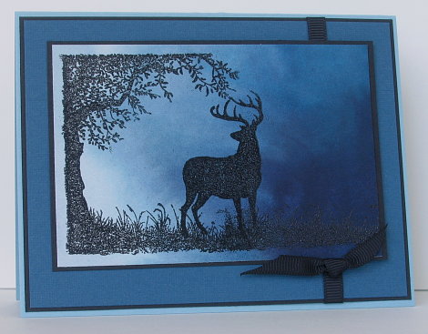
I think my title is a little cheesy, but don’t you think this deer is gazing into the brightness of the new day!! With the dark blues and the lack of flowers or hearts I think it is destined to be another man card. Speaking of man cards, check here to see an incredible one.
The background was done on watercolour paper using Not quite Navy and Night of Navy ink, I think. I actually painted the background before Christmas to use for a snow scene, but it just sat on the watercolour pad and I never got around to using it. I was looking at it the other day and decided to make it the sky for the deer under the tree. I turned the watercolour sheet around several times before settling on this orientation with the light in one corner. The images are stamped in versmark and embossed with Black e.p. The colours are not true, I tried several times to get a better shot but the blues are all lighter than they are in reality.
Supplies:
Inks: Versamark
Cardstock: Watercolour paper, Not quite Navy, Basic Black, Cool Caribbean
Stamps: Nature Silhouettes
Also: Black e.p., Black grosgrain ribbon
Silhouetted seascape
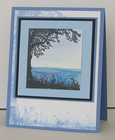
Posted: September 6, 2008 Filed under: Nature Silhouettes, Pocket Silhouettes 5 CommentsI bought Nature Silhouettes for this tree, I love silhouettes of trees. I remember when I was in highschool art doing a pen and ink drawing of an old gnarled tree. It was a silhouette which had branches twisted and entwined all over the place; it was quite time consuming. I think I still have it in a folio somewhere. When I saw this set in the catalogue I knew I would have fun with the tree but doubted that I would use the deer and wolf much. You never know, the deer might turn up on some of my Christmas designs.
To make this card I stamped with versamark on watercolour paper and embossed with black e.p. I painted on the watercolour sky and sea with a small brush dipped in water before picking up some ink off the lid of the stamp pad. (When the stamp pad is closed if you squeeze lid against the ink pad you get a small amount of ink that you can dip a brush or blender pen in)
The background tree is made using the same stamp but I inked it selectively in order to make a larger tree. First I inked the top branches of the tree with a bit of the trunk and stamped that in the corner of the white background piece. Then I inked the base of the trunk with the grass next to it and stamped that at the bottom of the white piece. To lengthen the trunk I just inked the trunk and stamped it in between, then did the same thing again. It is not neatly done, but the mattes cover a lot of it anyway. To fill out the grass at the base I used a few stamps from Pocket Silhouettes.
Supplies:
Stamps: Nature Silhouettes, Pocket Silhouettes
Inks: Versamark, Bashful Blue, Not quite Navy, Brocade Blue, Almost Amethyst
Cardstock: Brocade Blue, Basic Black, Bashful Blue, Whisper White, Watercolour paper
Also: black e.p.

