
CASEing the CAS
Posted: August 9, 2010 Filed under: Branch Out, CAS, Infinite Goodness 6 Comments
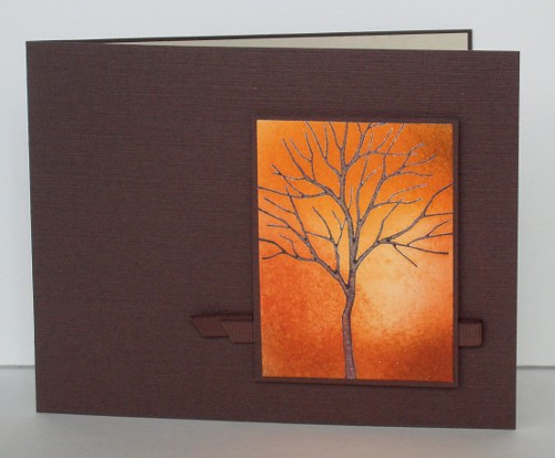
Each Sunday on the Splitcoast general stamping talk forum there is a thread where people list their favourite CAS cards of the week. Whenever I can I browse through the lists and end up inspired and ready to stamp. Yesterday was no exception, I think I saved at least a dozen cards in my favourites file. I picked two to CASE straight away and share with you today. The first was made by girlgeek101 and I decided to keep her colour scheme and technique but changed the stamp and orientation. I love tree stamps and images and thought the chocolate textured cardstock she used was rich and warm. The tree is stamped in Craft ink, clear embossed and the background sponged.
Supplies:
Stamps: Branch Out
Inks: Close to Cocoa Craft, Pumpkin Pie, Really Rust, Close to Cocoa
Cardstock: Chocolate Chip, Whisper White
Also: Chocolate grosgrain ribbon

The second card I CASEd was quite different. Made by Jennifer Styles it featured a classic single square in the top half of the card with some very sweet stitching and text. I have tried stitching on cardstock with my sewing machine but it doesn’t like it so I did not even attempt it this time. Instead I punched a square out of some cardstock I had coloured with a brayer and then stamped my dragonfly in silver and embossed in silver. Using the Stamp-a-ma-jig I stamped the dragonfly again on the card so the wings and tail would line up, then added the word “dream” This card is part of a set of five dragonfly cards that I will post later in the week.
Supplies:
Stamps: Infinite Goodness, Everyday Flexible Phrases
Inks: Taken with Teal, Elegant Eggplant, Encore silver
Cardstock: Naturals White, Whisper White
Also: Silver e.p
Thanks for dropping and thanks girlgeek101 and Jennifer for the inspiration.
Snowscape thank you cards
Posted: January 2, 2010 Filed under: Branch Out, CAS, Lovely as a Tree, Stamped Landscapes 15 Comments
It isn’t a new year resolution but I have been thinking for a while that this cardmaker should send a few more cards! Last night I sat down and chose a few thank you cards out of my stash to write to the very kind and hospitable friends whose homes we were welcomed into over Christmas.
During the day I had been sorting through drawers and shelves of school and craft supplies trying to make some room. I found some old Christmas cards which inspired me straight away to get creating again. I would like to give credit to the artist who inspired the card above but the Hallmark card doesn’t give any information.
To make both cards I masked off the picture area with post it notes and then inked up my tree with versamark and added a bit of black to the base of the tree. After placing another mask where the base of the tree would be I stamped the main tree and the smaller trees, then embossed in clear. To create the sky I positioned a hill mask and sponged in the blues and red (listed below). Creating the shadows was trial and error. For the top card I sponged the shadow between two ripped pieces of post it note. For the shadow below I drew it with marker for the large tree and stamped it for the small trees. I also used a marker to add more black to the tree below. Finally I removed the hill mask and did a little sponging to give the snow definition.
The sentiment is written in my own handwriting because I wanted something small and delicate but didn’t have a ‘thank you” in that style. I particularly wanted to make these one layer cards so was pleased that I managed to get to the end without smudging any of the white area. The photo once again is not great, I’m not quite sure what the problem is, probably the photographer not the camera!

Supplies:
Stamps: Lovely as a Tree, Branch Out, two little tree stamps I was given
Inks: Versamark, Basic Black, Night of Navy, Bashful Blue, Brocade Blue, Rose Red
Cardstock: Flourishes Classic White
Also: Clear e.p.
Stamped Brindabellas
Posted: October 17, 2009 Filed under: Branch Out, Lovely as a Tree, Stamped Landscapes 9 Comments
Hi again, it has been a while between cards hasn’t it? Life has been very busy here with one thing and another. Sadly there has been no time for stamping and no time even for posting cards already completed.
I made this one quite a few weeks ago. The inspiration was a card from my parents which was sitting on the cabinet next to my stamping table. It sits there because it has such a beautiful moonrise on it. The photo was taken by my father and made into a card for me. When my dad saw it there he suggested I try creating a similar stamped image. This is my attempt at stamping a scene from the Brindabellas, an Australian mountain range.
It has been so long since I stamped it I hope I can remember the process I used. I know I threw away the first attempt. To begin I stamped the moon, a little circle stamp from a flower set and then embossed it in clear. Then I worked on the coloured sky. I sponged in Bordering Blue, Going Grey, Apricot Appeal, Pretty in Pink, Pale Plum, Perfect Plum and Almost Amethyst to create the sunset. The silhouette of the hill was sponged in over a torn paper masking sheet. The trees are from Branch Out and Lovely as a Tree. I inked parts of the Branch Out tree so I could create a little variety on the horizon and mimic the trees in the original photo somewhat. The moon was meant to be in the space between two trees but I missed so I reheated the moon slightly to heat set the black branch on the embossed moon.
The original photo taken by my dad is below. The trees are blackened and bare because of horrendous bushfires which destroyed forest in the area.
Thanks for dropping in, it shouldn’t be so long between posts next time as I have a Christmas card workshop next weekend so some stamping must happen this weekend! I hope to have designed four cards by tomorrow evening.

Supplies:
Stamps: Branch Out, Lovely as a Tree
Inks: Basic Black, Bordering Blue, Going Grey, Apricot Appeal, Pretty in Pink, Pale Plum, Perfect Plum, Almost Amethyst
Cardstock: Whisper white, Basic Black, Buckaroo Blue
Birthday girls
Posted: August 8, 2009 Filed under: Branch Out, Itty Bitty Buds 4 Comments
Above is the card my 15 year old daughter made for her 13 year sister on her birthday.
Below is the card my 13 year old made for her sister for her birthday.
Two very different cards.
Two very striking cards.
Two lovely and talented girls, but then I am biased!

Supplies:
Stamps: Branch Out, Itty Bitty Buds, Simple Sayings 2
Inks: Basic Black, Bold Brights & Rich Regals markers, Summer Sun, Real Red, Pumpkin Pie
Cardstock: Whisper white, Basic Black, Pixie Pink, Summer Sun, Real Red, Pumpkin Pie
Sunlit Woods
Posted: June 24, 2009 Filed under: Branch Out, Lovely as a Tree, Nature Silhouettes, Stamped Landscapes 15 Comments
In case you hadn’t noticed I like creating scenes with trees! I have combined three different tree stamps from three different sets to make this sunlit woodland scene.
I started by stamping the tree from Branching Out in Basic Black ink. I then stamped the row of trees from Lovely as a Tree in the background using Always Artichoke and Mellow Moss. I actually stamped them several times without reinking to give the appearance of trees in the distance. When I did this I masked with a post it note so I didn’t get the bases of the trees.
It is hard to see in the picture but I added leaves to the foreground trees in Mellow Moss, Always Artichoke, Basic Black and Summer Sun. (You can click on the photo for a larger image) I then began sponging in the same greens and yellow to create the sunlight. To create the grass in the foreground I used the tree stamp from Nature Silhouettes and a post it note to mask the tree out.
Thanks for dropping in, school should finish tomorrow, so I might be posting a bit more. Hope to see you soon.
Supplies:
Stamps: Branch Out, Lovely as a Tree, Nature Silhouettes
Inks: Basic Black, Always Artichoke, Mellow Moss, Summer Sun
Cardstock: Whisper white, Basic Black, Always Artichoke, Mellow Moss
Think Summer
Posted: March 29, 2009 Filed under: Branch Out, Designer Paper 5 Comments
As I mentioned in my last post Julie Koerber and Laura Fredrickson are celebrating milestones on their blogs. Yesterday I posted my CASE of one of Laura’s cards, today Julie has been my inspiration, I chose her card ‘Think Spring’ and made my own Think Summer card. The colours and image in Julie’s card are beautiful and the colouring very delicate. My tree is a different style altogether, using the cute little bird and bird house that come with the ‘Branch Out’ tree. I masked a hill shape and sponged my sky in Bashful Blue then used the reverse mask to sponge a hill in Certainly Celery. The rest is self explanatory with colour details belov.
Congratulations Julie and Laura, thank you for all the inspiration.
Supplies:
Stamps: Branch Out
Inks: Ballet Blue, Certainly Celery, Chocolate Chip, Bashful Blue, More Mustard, Garden Green
Cardstock: Whisper White, Certainly Celery, Delicate Dots d.p.
Also: Celery twill ribbon, Hodgepodge Hardware Antique Brass buckle
Branch Out – Summer
Posted: March 18, 2009 Filed under: Branch Out, Pocket Silhouettes 3 Comments
I am making a set of cards for a friend, which I will first show at a workshop, using the designer paper from the Sale-a-bration catalog. This blue paper is so bright and pretty, like a summer sky, that I decided to make it the background for this summertime scene. I didn’t emboss this time just started with a chocolate chip tree, added lots of celery leaves, a swing and a few butterflies.
To make the little friend to friend tab I stamped the sentiment and then punched it out with one side of a square punch (and the matte with a larger sqaure punch), which was much easier than trying to cut it evenly with my big cutter.
This is such a cute stamp set, but I need to play around a bit so I can come up with some different layouts and ways of using the tree.
Supplies:
Stamps: Branch Out, Pocket Silhouettes
Inks: Ballet Blue, Certainly Celery, Chocolate Chip, Basic Black
Cardstock: Whisper White, Certainly Celery, Delicate Dots d.p.
Blossom tree
Posted: March 17, 2009 Filed under: Branch Out 7 Comments
Here is my first effort with the Branch Out set. Although our trees are nowhere near looking like this and our grass is just beginning to appear from under the ice and snow, I hold out hope that I will see blossoms blowing off trees in the not too distant future.
The first thing I did was stamp the tree in Close to Cocoa Craft ink, then embossed with clear e.p. To make the blossoms I used versamark and Pretty in Pink so I could emboss them in clear also. I then ripped a piece of paper to make the hill shape and kept both pieces so I could mask the hill area while I sponged the sky with Bahsful Blue and Ballet Blue, then vice versa for the grass, which is sponged in Garden Green.
Thanks for dropping by, I hope you are enjoying some spring where you are.
Supplies:
Stamps: Branch Out
Inks: Bashful Blue, Ballet Blue, Garden Green, Close to Cocoa Craft, Pretty in Pink, Versamark
Cardstock: Whisper White, Pirouette Pink, Garden Green
Also: clear e.p.
Story-book window & tutorial
Posted: March 7, 2009 Filed under: Baroque Motifs, Branch Out, Garden silhouettes, Pocket Silhouettes, Season of Friendship, Stamped Landscapes, Tutorial 6 Comments
I have finally completed a card tutorial! I had hoped to do one for a snowscape, but the seasons are changing and I have more of a spring scene instead. I used some of the same techniques to do this scene as I used for my snowscapes. The inspiration for this card came from the cover of a children’s novel The Dragonfly Pool by Eva Ibbotson
First I cut a piece of scrap card to be a mask for my hillside. I kept both pieces so I could mask the sky and the hills at different times. Of course you don’t need the huge piece I have, I’m not sure why I went so large?

I started with the sky, holding the mask in place while I sponged with both Bashful Blue and Ballet Blue.

To do the hills I swapped masks and sponged down the left hand side and across the bottom with Garden Green.

I then moved the mask a little to make the edge of a hillside and sponged with more Garden Green and some Certainly Celery.


On the right hand side of the hills I sponged with Summer Sun which I blended into Certainly Celery to create a lighter hillside.


With all the background sponging done I began to stamp the silhouettes along the bottom of the card. I used Basic Black, stamping some of the stamps upside down to use just the stems as grass. Where the flower stems were a little short I lengthened them with a black marker. I used two stamps from Garden Silhouettes to frame the picture in foliage.

Around the outside of the scene I embossed a silver border using an embossing marker and ruler to make a line down each edge.

I added a little flourish to each corner with versamark and the large flourish stamp from Baroque Motifs.

Rather than pouring embossing powder over the whole image I dipped the edges into silver e.p. one at at time and then did the corners.

I stamped the dragonfly in black and coloured the wings with an embossing pen before embossing them in silver.

To make the sentiment I sponged a rectangle of Whisper White cardstock in Garden Green and Certainly Celery, then stamped the words in Basic Black and matted in black.( the photo didn’t turn out, sorry) I attached silver cord to both ends, wrapped it around the back of the cardstock and taped it. I also added the tiny butterflies from the Branch Out set.

As I was mounting the card on black I needed a white panel inside, so I sponged a bit in both greens and made the silver edges and flourishes using the same method described above.

I hope my instructions make sense, the method is fairly straight forward so have fun if you try it. Thanks for dropping in and reading this far! Have a great weekend.

Supplies:
Stamps: Garden Silhouettes, Pocket Silhouettes, Infinite Goodness, Season of Friendship, Baroque Motifs, Branch Out
Inks: Bashful Blue, Ballet Blue, Garden Green, Certainly Celery, Summer Sun, Basic Black, Versamark
Cardstock: Whisper White, Basic Black
Also: Silver e.p., silver cord


