
Distress oxide trials – brushstroke floral
Posted: April 30, 2017 Filed under: Bejeweled | Tags: distress oxide inks, Penny Black stamps 14 Comments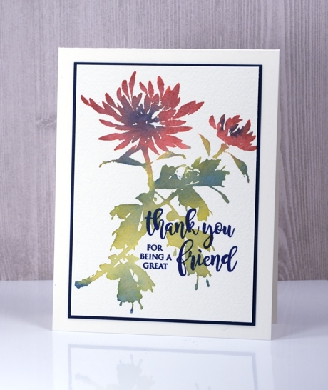
The distress oxide trials continue with some brushstroke floral stamps. I generally use distress stains or markers with these stamps because I love to blend the colours either on the paper or the stamp to create the look of a watercolour painting. I was happy with the solid, but blended colour I achieved with the three oxide inks, quite different but muted and pretty.
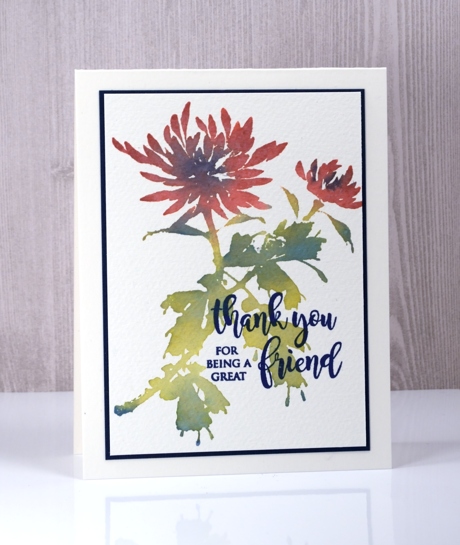
As with earlier experiments the blending is lovely and smooth. I was able to blend blue into both the red petals and the green leaves by using my MISTI to apply one colour at a time. I inked and stamped the petals first in fired brick, wiping off any stray ink from the leaves with a wet wipe before stamping. I inked and stamped the leaves and stems in peeled paint next. I wanted some blended accents on the both flowers and leaves so I dabbed the faded jeans ink in a few places, spritzed to soften sharp edges then stamped again. The chalky look is quite different from the original distress inks but the blending is just as smooth. I used cold pressed watercolour paper so there is some nice texture showing through the solid ink.
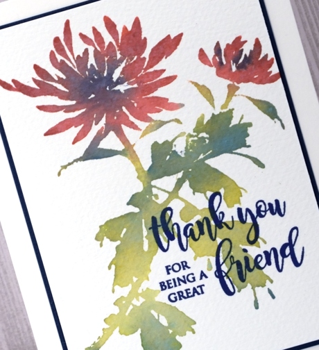
I probably could have stamped the sentiment in faded jeans oxide ink but I my ink of choice for sentiments continues to be versafine. The majestic blue co-ordinated beautifully and I was able to find the same colour for my mat also.
Thank you for your responses to my first distress oxide post; I am interested to hear what other people are trying and happy to prove any insights as I experiment. I know some people are wondering whether it is worth getting the distress oxides if you have the original distress inks. I will give some feedback as I post my experiments and then give a wrap up when I’ve tried a range of techniques.


Thanks for the update on the Oxide ink. Always want to hear what you think of it. I only have 1 and haven’t tried it yet but will soon. Edna
I love the soft muted look of the colours on your card, and it is a gorgeous design and layout. A whole different effect to the vibrancy you achieve with the Distress Stains. I’m really enjoying your experiments with the Oxide inks – super helpful as I bought the whole set so am eager to learn to use them in different ways.
Your artwork is always so stunning, so it is really interesting to see you work with the new inks. Thinking, I’m not blown away with the muted colors, but they might be really appropriate for sympathy/thinking of you cards.
This is just gorgeous Heather and the colours of these oxide inks definitely dry more muted but they have other properties which the original distress inks don’t have which makes it difficult to decide whether to invest in them or not. x
Very pretty and such a different look with the Distress Oxides! TFS your experiments Heather…very helpful!!!
Paper Hugs,
Jan
Thank you for posting, as I have been debating the cost of another Distress line purchase. The look that you achieved makes me want to try it myself.
Wonderful card and thank you for the trial with the oxides! I love this stamp and I have it on order at the moment! xxx
Thanks for news re oxides Heather.. I am very interested. Hope to craft show in Brisbane in June to see them, but now going to dentist instead, sound as interesting? Not… but can’t be helped, at least we can get our teeth fixed up.
I think I will get one or two just to try and gauging on colours think I’ll use regular DI to guide my colour selection.
One thing I’ve wondered is can you emboss them???
Haven’t seen anyone doing that but I reckon if they’re like pigment ink you could. I too love versafine for my sentiments
Love this stamp. Great card of course
Shaz in Oz.x
I will add embossing to my ‘trials’.
Hope the dental visit is uneventful!
The DOX inks work well with this technique. Thanks for sharing Heather. I have been experimenting a little too and am continuing to learn as they are quite different than any other inks I’ve used before. xx
Wow, you got gorgeous results with the inks, neat that you were able to do it in steps and they blended so well!
Wow, this is beautiful! I really like the busted but rich tones.
Busted, sheesh. MUTED, I meant MUTED. 😛
I’m in need of these new inks.