
Inch by Inch 1: Gold Snowflakes
Posted: November 17, 2014 Filed under: All is Bright, Winter Pine | Tags: Inchie Arts, Penny Black stamps, Ranger Distress stains, Sharpies 20 Comments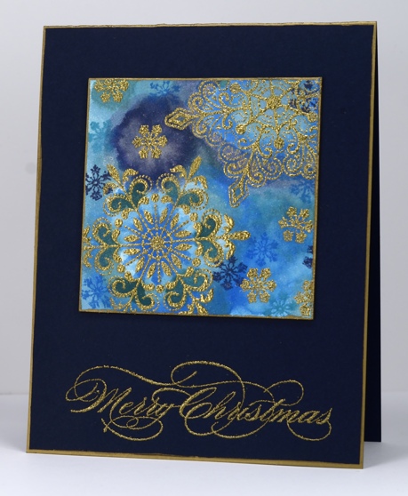
The Penny Black design team are collaborating with Inchie Arts this week and I will be sharing an Inchie Arts project here each day too. I have really enjoyed creating on a smaller scale, trying to make a visual impact in a couple of inches square. I have several projects on a single square and a couple where I lined up more than one. I did not end up working with ‘true inchies’ (1″x 1″); I had 1.5 inch, 2 inch and 3 inch matboard tiles to experiment with.
Today’s card features a 3 inch cream square. I started by embossing the snowflakes in gold powder then used distress stains to add colour. Distress stains react a little differently on matboard than on watercolour paper as the matboard absorbs liquids more quickly. I not only blended the colours on the matboard but layered them creating different colours and tones. The matboard is sturdy and does not warp with the addition of water and stains. I can’t remember exactly which distress stains I used (sorry) but I have taken a guess in the list below. I also stamped a few little snowflakes in light and dark blue ink. I added a border to both the square and the navy card base with a gold sharpie. I was impressed that the sharpie matched the embossing so well and showed up on the dark cardstock. Running the sharpie along the edge is a very quick way to ‘gild’ the edge of panels.
Thanks so much for visiting today.
Supplies:
Stamps: All is Bright, Most Wonderful, Winter Pine (PB)
Inks: Versamark ink (Imagine Crafts/Tsukineko) Chipped Sapphire, Salty Ocean, Pine Needles, Tumbled Glass distress stains & Chipped Sapphire, Salty Ocean distress ink(Ranger)
Cardstock: Neenah Navy 100lb cardstock, Inchie Arts 3″ cream square
Also: gold embossing powder, gold sharpie


This is glorious Heather… the gold makes such an impact against the wonderful blues… definitely one for CAS-ing!
Chrissie x
I love this one! Very elegant. Such vibrant colors.
This is gorgeous! I have always avoided gold on blue for some reason, but no more! This colour combo looks stunning! Thank you xxx
Great colour combo. The light blue compliments nicely.
Your gorgeous blue background is the perfect way to show off those beautiful embossed snowflakes. I just pinned your wonderful card!
What a stunning card!! The gold looks so elegant with that beautiful blue background! I love this!
Better with designer paper background, I think. B
Sent from my iPad
>
Stunning colors combo!
This beautiful card truly looks like a rich jewel set against that dark navy background. Loved the blues used to create & the gold looked so brilliant embossed over that blue. Outlining the edge certainly enforced that gold coloration and it is just amazing. Will have to look into the matboard…never worked with that. TFS & Hugs
Beautiful card Heather!!! Love your gilding and the different shades of smaller snowflakes!
Hugs,
Jan
WOW what a festive design love the gold blue combinbation.
Hugs Anja
WOWZERS! This is Gorgeous!
Beautiful! I obviously need to own more than one distress stain to use effectively. 😉 I’m also glad this is actually a 3-inchie and not a very tiny card.
This is truly one of the most gorgeous cards I’ve seen this season.
Gorgeous! Totally impressed with your gold sharpie gilding. LOVE that pretty “Merry Christmas”, too.
This is a gloriously gorgeous pop of colour card!! I love the gold and how it is complemented by the blues!! Distress markers are on my wish list along with the ink pads as well as everything else!!! TFS!!
I love this and will definitely try it.
This card is simply stunning! Please tell me why you used distress stains AND distress inks? Does it make a difference? I’ve never used the stains and don’t really get what the difference is…can you explain? Thanks!
Hi Kelly,
In this card I used the liquid distress stains to paint the background colour; the stains blended and spread like watercolour paints. I used the inks to stamp the little blue snowflakes so they would have definition and not look too watery.
So glad you liked it.
Beautiful!