Less is More Fishy
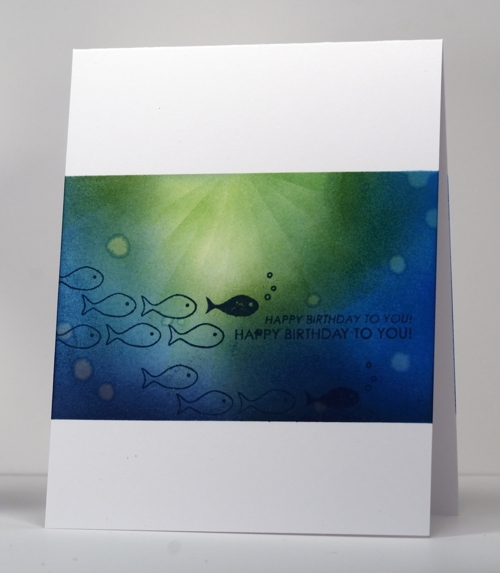
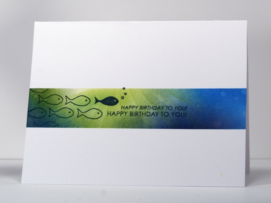
Posted: August 7, 2012 Filed under: CAS, Penny Black, Wishing You 39 CommentsThe challenge at Less is More this week is to use blue and green in a card. What better subject for a blue and green card than the ocean. I made the card below first because I wanted to try a narrow image panel then, because it worked, I did the same thing with a larger panel.
I masked first then sponged in blues and greens keeping the lightest sponging and shades at the top. When the panel was covered I used a straight strip of post-it to sponge rays with the lightest green, Memento New Sprout. Finally I dropped some water on the panel and added my fishy happy birthday stamp.
Supplies:
Stamps: Wishing You (PB)
Inks: Memento New Sprout, Bamboo Leaves, Bahama Blue Nautical Blue & Teal Zeal (Tsukineko)


Inventive brain? Oh, yeah. WOW result? Oh, yeah.
One word: Gorgeous. Thanks for sharing. And explaining how you did the technique.
OMG! You’re so TALENTED! xo, Marian
The shading in this is fabulous Heather.. the impression of the sunlight filtering through the water is wonderful.
I actually rather like the narrow panel best, but both are wonderful!
Thanks so much
Chrissie
“Less is More”
Extraordinary Heather…like them both, but especially like the narrow one!!!!
Paper Hugs,
Jan
PS…having a group to my house on the 19th and we are going to give your one-layer cards a go…thanks so much for always letting us know how you do your creations!!!
Oh my, Heather, this technique is so very beautiful … A work of art! Did you say that you use a piece of post-it (paper) to move your ink around? I would love to see a video of that, do you have one? Have you given online classes? I would love to learn how you did this, even though I know I do not have a thimble-full of your talent!
Fondly,
Ellen- CardMonkey
http://cardmonkeyspaperjungle.com
wow,absolutly stunning cards and great colors!
Amazing cards, love them both
Beautiful cards – love how you’ve shaded the green to make it look like sun’s rays through the water!
Both cards are stunning, and unmistakably you!
I always love your creations! I just had to say that these are WAY cool!
Wonderful card Heather, love the rays in the water, so effective! I like the large panel:)
Val x
very nice card!!!
This technique is so cool – I love it! Blue and green are my very favorite colors so combining them like this is over the top! Thanks so much for sharing this!
OMG – really lovely cards!! such talent!
Excellent!!!!!!
Just a gorgeous card.
Anita
There are really fantastic. I love the way the green radiates and turns to blue. Love the water drops. I need to try this. Thanks for the inspiration!
So creative, I love ocean scenes!
Absolutely brilliant! LOVE this!
Totally fabulous Heather, xxx
gorgeous! Love those rays!
This is superb and love the technique that you used to make the rays and the bubbles! x
Wow, that is sublime ink shading, I love it! Elaine
Yowser, like deep sea diving on a sunny day! Perfect sponging.
WOW! love both of those beautiful backgrounds.
Totally fabulous, you have caught the undersea lighting perfectly.
Oh Heather, this is such fun (almost typed ‘such fin’ there!)
I realised it’s been ages since I’ve visited your blog and now I remember why – my jaw gets sore from hitting the floor so often! So many stunning creations!
Beautiful light quality on these two inky pretties! Hugs, Lesley
Love it! Beautiful job melding the blue and green. 🙂
These are fabulous cards
Stunning card!
Another Fabulous technique I need to try! Both cards are stunning 🙂
Two totally amazing cards – love the use of the blue and green to simulate the suns rays reflecting – brilliant idea
Kathyk
Sensational inking as ever Heather
You blow me away with your inky talents
Thanks very much
mandi
“Less is More”
Two fabulous cards Heather, just amazing ! :)Viv xx
Brilliant inking, as always. What an amazing scene.
wow! your background is stunning – very marine like! the fish complement it perfectly 🙂