
Grassy sunset
Posted: May 20, 2009 Filed under: Inspired by Nature, Stamped Landscapes 8 Comments
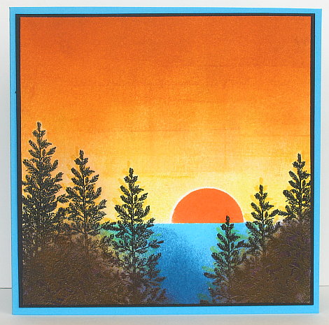
I created this scene a week or so ago but did not get it made into a card until the other day. There are no flowers or butterflies so I decided to created a card for Sharon’s “For the Guys” challenge. Aside from a scene which would work for a man I needed a little bit of string or rope somewhere. I actually unraveled the natural hemp twine and used one strand which gave it the nice wavy look.
The scene is done on watercolour paper which I embossed first. I inked the grass with Artichoke first and then versamark so I could emboss in clear. As the watercolour paper was fairly course the embossed image is not sharp. I don’t have a circle stamp that size for the sun so I punched a circle out of a scrap and then used it as a stencil to stamp the versmark pad through before embossing in clear. After embossing I soaked the whole piece with water and started dropping and spreading inks across the paper with a large paintbrush. The only Stampin Up ink I used was Always Artichoke, the others are Winsor and Newton drawing inks. The size is suitable for a business size envelope, and hopefully suitable for a guy!
Supplies:
Stamps: Inspired by Nature, Fundamental Phrases
Inks: Versamark, Always Artichoke, Winsor & Newton drawing inks
Cardstock: Always Artichoke, Confetti Cream, Watercolour paper
Also: Natural hemp twine, Clear e.p.
Story-book window & tutorial
Posted: March 7, 2009 Filed under: Baroque Motifs, Branch Out, Garden silhouettes, Pocket Silhouettes, Season of Friendship, Stamped Landscapes, Tutorial 6 Comments
I have finally completed a card tutorial! I had hoped to do one for a snowscape, but the seasons are changing and I have more of a spring scene instead. I used some of the same techniques to do this scene as I used for my snowscapes. The inspiration for this card came from the cover of a children’s novel The Dragonfly Pool by Eva Ibbotson
First I cut a piece of scrap card to be a mask for my hillside. I kept both pieces so I could mask the sky and the hills at different times. Of course you don’t need the huge piece I have, I’m not sure why I went so large?

I started with the sky, holding the mask in place while I sponged with both Bashful Blue and Ballet Blue.

To do the hills I swapped masks and sponged down the left hand side and across the bottom with Garden Green.

I then moved the mask a little to make the edge of a hillside and sponged with more Garden Green and some Certainly Celery.


On the right hand side of the hills I sponged with Summer Sun which I blended into Certainly Celery to create a lighter hillside.


With all the background sponging done I began to stamp the silhouettes along the bottom of the card. I used Basic Black, stamping some of the stamps upside down to use just the stems as grass. Where the flower stems were a little short I lengthened them with a black marker. I used two stamps from Garden Silhouettes to frame the picture in foliage.

Around the outside of the scene I embossed a silver border using an embossing marker and ruler to make a line down each edge.

I added a little flourish to each corner with versamark and the large flourish stamp from Baroque Motifs.

Rather than pouring embossing powder over the whole image I dipped the edges into silver e.p. one at at time and then did the corners.

I stamped the dragonfly in black and coloured the wings with an embossing pen before embossing them in silver.

To make the sentiment I sponged a rectangle of Whisper White cardstock in Garden Green and Certainly Celery, then stamped the words in Basic Black and matted in black.( the photo didn’t turn out, sorry) I attached silver cord to both ends, wrapped it around the back of the cardstock and taped it. I also added the tiny butterflies from the Branch Out set.

As I was mounting the card on black I needed a white panel inside, so I sponged a bit in both greens and made the silver edges and flourishes using the same method described above.

I hope my instructions make sense, the method is fairly straight forward so have fun if you try it. Thanks for dropping in and reading this far! Have a great weekend.

Supplies:
Stamps: Garden Silhouettes, Pocket Silhouettes, Infinite Goodness, Season of Friendship, Baroque Motifs, Branch Out
Inks: Bashful Blue, Ballet Blue, Garden Green, Certainly Celery, Summer Sun, Basic Black, Versamark
Cardstock: Whisper White, Basic Black
Also: Silver e.p., silver cord
Deer at dawn
Posted: February 16, 2009 Filed under: Nature Silhouettes, Stamped Landscapes 1 Comment
I think my title is a little cheesy, but don’t you think this deer is gazing into the brightness of the new day!! With the dark blues and the lack of flowers or hearts I think it is destined to be another man card. Speaking of man cards, check here to see an incredible one.
The background was done on watercolour paper using Not quite Navy and Night of Navy ink, I think. I actually painted the background before Christmas to use for a snow scene, but it just sat on the watercolour pad and I never got around to using it. I was looking at it the other day and decided to make it the sky for the deer under the tree. I turned the watercolour sheet around several times before settling on this orientation with the light in one corner. The images are stamped in versmark and embossed with Black e.p. The colours are not true, I tried several times to get a better shot but the blues are all lighter than they are in reality.
Supplies:
Inks: Versamark
Cardstock: Watercolour paper, Not quite Navy, Basic Black, Cool Caribbean
Stamps: Nature Silhouettes
Also: Black e.p., Black grosgrain ribbon
Snowscape
Posted: January 22, 2009 Filed under: Stamped Landscapes 4 Comments
I started out with a landscape orientation for this scene but ended up chopping chunks off both sides. As with other snowy scenes I’ve done I tore pieces of paper to mask off the sky and the snow. The stamp is a small three tree stamp which a friend passed on to me.
I started by tearing a jagged piece of paper for the mountains and a wavy piece for the snowy hill below the mountains. With the mountain mask in place I sponged the sky with Bashful Blue and Brocade Blue. I then added the hill mask and covered the sky to sponge the mountains in Night of Navy. I stamped trees in Going Grey over the navy and further down also.
The foreground trees I stamped in Basic Black, then restamped slightly higher in versamark before embossing in clear. This left a snowy outline around the top of the trees. In real life the trees are very black but in the picture the light has reflected off the embossing making it look whiter. I did a bit more sponging on the snowy hill with Bashful Blue and then realized that such a snowy scene needed snowy mountains not plain navy ones. To add snowy tops to the mountains I masked the sky again and sponged versamark along the top edge of the mountains. After sprinkling white embossing powder on the versamark I used a small paintbrush to brush off some of the powder before I heated it.
I realize that a tutorial might make more sense than my description, I’ll try to manage one soon. I know I’ve said that before…
Supplies:
Stamps: Three Tree stamp (Embossing Arts), Hugs and Wishes
Inks: Brocade Blue, Bashful Blue, Basic Black, versamark
Cardstock: Whisper White, Brocade Blue, Basic Black
Still winter
Posted: January 9, 2009 Filed under: Lovely as a Tree, Snowflakes, Stamp Simply challenges, Stamped Landscapes 2 CommentsMy children are big Narnia fans, so when I saw Sharon’s challenge this week I thought of The Lion, the Witch and the Wardrobe where in Narnia it is “always winter, but never Christmas”. So although, we may use the same stamps we used at Christmas, the challenge is to make a card that says “Winter” It is very much “still winter” here and we had a snowstorm this week to prove it.

For my card I decided to continue playing with the snowy landscape idea, once again using Lovely as a Tree. I punched a small moon out of a post it note and tore a strip of paper to mask my snow at the bottom. I sponged in all the sky first using summer sun, apricot appeal and pumpkin pie. Then I stamped the background trees in grey with the mask still in place. I then swapped the mask over and covered the sponged sky and lightly stamped the trees upside down to try and make a shadow. It didn’t work that well so I sponged more shadow in grey. Finally I stamped two black trees and a greeting.
It’s nice to be stamping again. Thanks for stopping by.
Supplies:
Stamps: Lovely as a Tree, Snowflakes
Inks: Summer Sun, Apricot Appeal, Pumpkin Pie, Going Gray
Cardstock: Whisper White, Apricot Appeal, Going Grey, Basic Black
the wondrous gift is given
Posted: December 13, 2008 Filed under: Lovely as a Tree, Stamped Landscapes, Wondrous Gift 4 Comments
Last night I sat down and wrote in most of my Christmas cards, discovering in the process that I needed a few more. The inspiration for this one was a picture I saw on a friend’s blog yesterday. This kind of scene can be seen around here quite often at sunset or sunrise.
To make it I tore a piece of card to place across the bottom to mask my snowy area. I positioned it at the bottom before stamping the trees in versamark. I embossed them with black and then positioned the masking strip a little higher before sponging my sky, first in Pretty in Pink, then Almost Amethyst, Going Gray and Bashful Blue. I sponged a little Amethyst behind the trees and stamped some background trees in Going Grey. To give the foreground snow a bit of definition I tore tiny strips out of a piece of paper and sponged through the holes.
Supplies:
Stamps: Lovely as a Tree, Wondrous Gift
Inks: Almost Amethyst, Pretty in Pink, Going Gray, Bashful Blue, Versamark
Cardstock: Whisper White, Almost Amethyst, Basic Black
Also: black e.p.
Moonlit Skate
Posted: November 12, 2008 Filed under: Lovely as a Tree, Stamped Landscapes, WInter Post 3 Comments
My inspiration for this card was a similar card my daughter and a friend of hers designed. When I bought the Winter Post set, I wasn’t sure what to do with the skaters but their idea of a tree lined skating rink definitely appealed to me. I wonder how long before it begins to look like this outside?
To begin I tore a piece of paper to be about the size of the rink which I used to mask the space while I stamped the trees. I stamped the small trees, which are just the top of the tree from Lovely as a Tree, with Night of Navy and versamark. The larger trees in the front I stamped in Basic Black and versamark, then I embossed them all with clear embossing powder. To fill in the forest I stamped the tree over and over in Night of Navy creating some dark and some lighter trees. I stamped the skaters in black and then coloured with some Stamping markers and some watercolour pencils. It is hard to see but there are some skate marks embossed with iridescent ice. The sponging on the ice is Bashful Blue. The moon was an afterthought, embossed with white e.p. The sky was brayered with Brocade Blue, Navy and a little Black.
I realise that a picture or two of the process would be more helpful than all my description here but I just haven’t had time lately to do a tutorial. Some time soon I hope. Thanks so much for dropping in.
Supplies:
Stamps: Lovely as a Tree, Winter Post
Inks: Night of Navy, Brocade Blue, Bashful Blue, Basic Black Versamark.
Cardstock: Whisper White, Bashful Blue, Night of Navy
Also: Clear and white e.p., watercolour pencils, Stamping markers, Blue Taffeta ribbon, Brayer
Sunrise or Sunset?
Posted: November 7, 2008 Filed under: Lovely as a Tree, Stamped Landscapes 3 Comments
Remember I set my self a “keep it simple, cards in less than half an hour challenge”? Well I did make a card in less than half an hour and then sat for quite a bit longer making this one. I am not entirely happy with it but I learnt a few things as I was making it, which should help make my next attempt better. There is more definition in the trees in the left and right hand corners in real life, but I didn’t capture it with the camera. That is one area where I should be able to improve the sponging by taking it a bit slower and building it up only to the point where you can still see the tree outlines. It looks brown in the picture but it is actually black. But that is enough excuses!
It was really a trial and error process creating this scene, I stamped the trees in yellow first and then versamark/black a little offset. This was an attempt to get the look of light coming through the trees. It looked odd so I decided to brayer it instead. I started with Summer Sun , then Apricot Appeal and finally Pumpkin Pie at the top. The only other time I had tried using my brayer on a card I had ended up with lines and patches, but I have been reading Michelle Zindorf“s tutorials ( can you tell!?!) and she said plenty of ink, over and over. I used a piece of paper to mask the lake area and a punched out circle for the sun. Originally the sun was pale yellow and looked almost white. Even though this is often what the sun looks like when it is rising it didn’t look right so I masked the sky and sea and sponged the sun in orange, the colour I’ve occasionally seen at sunset. The lake is sponged in Turquoise and Not quite Navy.
Supplies:
Stamps: Lovely as a Tree
Inks: Summer Sun, Apricot Appeal, Pumpkin Pie, Only Orange, Tempting Turquoise, Not quite Navy, Versamark.
Cardstock: Whisper White, Tempting Turquoise, Basic black
Also: Circle Punch, Brayer
Snow laden tree
Posted: October 8, 2008 Filed under: Season of Friendship, Stamped Landscapes 10 Comments
I have several Christmas card events to plan for in the coming months so I have been playing with snowflakes stamps again. This tree and the snowflake is from the Season of Friendship set in the Stampin’ Up Holiday Mini. I think the projects featuring different seasons caught my eye more than anything else, but I have been having fun making winter scenes.
I have spent a bit of time lately browsing through the wonderful artwork of Michelle Zindorf and was inspired to try a scene complete with shadows and heavily sponged skies. To make this card I stamped the tree in versamark and embossed with black embossing powder. I then stamped the snowflakes in versamark and drew snow on the branches with the versmarker before embossing again, this time with white e.p. To make the tree’s shadow I inked the trunk with Brilliant Blue and stamped it at an angle, using a little scrap of paper near the base to mask any area I didn’t want stamped.
The sponging for the sky had to be built up layer by layer creating the impression that the moon was shining from the left. In order to have the snowy ground I ripped a piece of paper to use as a mask while I sponged. I used Bashful Blue, Ballet Blue and Brilliant Blue. Finally I stamped a few more snowflakes in Ballet Blue and matted it to fit on a 5½”x5½” square card. It was fun to make so I’ll be revisiting this style and method for sure.
Supplies:
Stamps: Season of Friendship
Inks: Brilliant Blue, Ballet Blue, Versamark, Bashful Blue
Cardstock: Brilliant Blue, Ballet Blue: , Whisper White
Also: Black and white embossing powders, versamarker sponges
Thoughts of China
Posted: July 28, 2008 Filed under: Garden silhouettes, Stamped Landscapes 1 Comment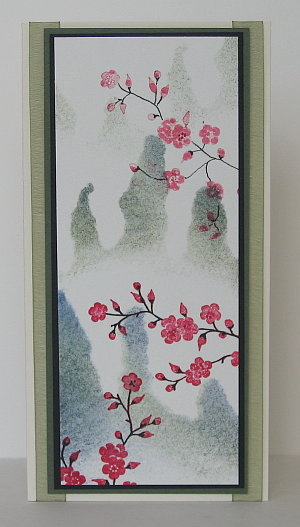 It has been over a month since I had anything to share here on my card blog. There is a reason. My girls and I have been to China and back. I intended to write a short post before I left explaining why and where we were going but with all the preparations I ran out of time. If you are interested you can read about our trip on my family blog. While I was away I was on the lookout for cards or even stamps made with Chinese motives and artwork, but I did not see much. I did buy my younger daughter a marble stamp with her name written in Chinese characters, but I didn’t think of buying myself one to stamp on my cards!
One of the places we visited was Huangshan or Yellow Mountain. It was enveloped in fog the day we climbed but the following day as we walked through an art gallery I saw many impressions of what we had missed. There were the somewhat familiar images of mountains and blossoms with whispy clouds around the slopes. That is what I have tried to recreate in these cards. In the gallery there was a series of four paintings showing a misty mountain side with branches of flowers in the foreground. Each one represented a different season.
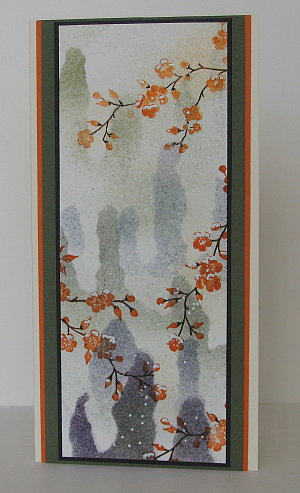 To create my two cards I tore the mountain shapes out of a piece of card and used the negative piece as a stencil. I sponged in Night of Navy, Always Artichoke and Basic Black. Then I stamped the blossom stamp from Garden silhouettes in Rose Red on one card and Pumpkin Pie on the other. To create some variation in the blossoms I blended with a blender pen and highlighted with a marker. I used a black marker to trace over the stems. On the orange blossom card I wanted to create a light dusting of snow so I added dots and sprinkles of snow on the blossoms with an embossing marker and then used white embossing powder. The pink blossom card is mounted on black then artichoke and finally over two pieces of olive organza ribbon. The orange blossom card is mounted on black , artichoke and pumpkin pie.
Supplies:
Stamps:Garden Silhouettes
Inks: Always Artichoke, Night of Navy, Basic Black, Rose Red, Pumpkin Pie
Cardstock: Watercolour paper, Very Vanilla, Always Artichoke, Basic Black, Pumpkin Pie
Also: Olive organza ribbon, white embossing powder


