Black, white and teal
Posted: March 5, 2009 Filed under: Boho Backgrounds, Designer Paper, One of a Kind 3 Comments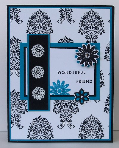
This card is a bit of a departure from the soft spring designs I have been creating lately. I wanted to use the beautiful digital paper designed by Jak Heath, and decided not to reach for red as an accent colour but teal, a colour I rarely pull out. The layout is a sketch by Kurt on StampTV.
I embossed the flowers on the black cardstock with white e.p and stamped the other flowers with black or teal, colouring one in with a teal marker and adding a rhinestone to the other. Not my usual style, but it is fun to try something a little different from time to time.
Supplies:
Stamps: Boho backgrounds, One of a Kind
Inks: Basic Black, Taken with Teal, Versamark
Cardstock: Whisper White, Basic Black, Taken with Teal, Damask d.p.(from Jak Heath)
Also: Rhinesones, Boho Blossoms punch, stampin’ dimensionals
Splashed Daisies
Posted: March 3, 2009 Filed under: Upsy Daisy 5 Comments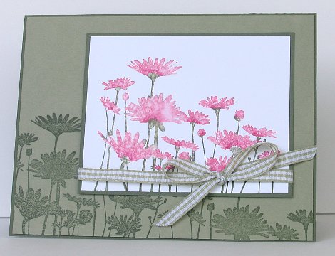
My post will be short and sweet tonight as I am having issues with my back and cannot sit for long without being in too much pain. I intend to take my marking and lesson planning off to bed.
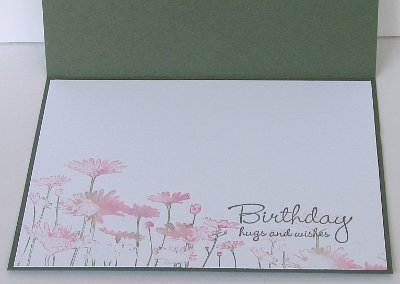
I love the way the pink daisies turned out for this card, I’m not sure that I could make it happen twice though. I coloured the stamp with markers, the same ones I used for Sharon’s Spring challenge, I seem to be stuck on those three markers (Artichoke, Regal Rose and Rose Red). Then I spritzed the stamp with water; I used the perfume method, where you spray perfume in the air and walk into the spray! I sprayed water and walked my stamp into the mist… tada… water marked petals. A little bow and a few more daisies in the background and there you have it. I did add a white panel inside with even paler watermarked daisies and the birthday sentiment.
Thanks for dropping in, see you soon.
Supplies:
Stamps: Upsy Daisy, Hugs and Wishes
Inks: Rose Red, Regal Rose and Always Artichoke Markers, Always Artichoke
Cardstock: Always Artichoke, Mellow Moss, Whisper White
Also: Moss gingham ribbon
Olive Dream
Posted: March 1, 2009 Filed under: Lovely as a Tree 8 Comments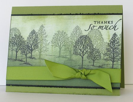
Remember the other day I mentioned that I had made a card just the way I had planned it in my head? And it had worked! Well this one did not happen the same way. I tried a couple of different colour schemes before I settled on this one and then decided that I would complete it for the Stampers Dream Dreamy Challenge, where you needed to create a monochrome card with three different shades of the same colour. I would say I have a light, medium and dark olive green in there wouldn’t you. I used Always Artichoke and Old Olive to brayer the background and stamped the trees in Artichoke and Black. The black matte and the bottom of the card have distressed edges.
I hope to be back with something else tomorrow, thanks for dropping in.
Supplies:
Stamps: Lovely as a Tree, Sincere Salutations
Inks: Basic Black, Old Olive, Always Artichoke
Cardstock: Old Olive, Whisper White
Also: Olive wide grosgrain ribbon
Glimpse of Spring
Posted: February 26, 2009 Filed under: Best Yet, Garden silhouettes, Stamp Simply challenges 17 Comments
Today is my last day as guest designer for Sharon’s Stamp Simply Challenge at No Time to Stamp. I have enjoyed myself immensely. Thanks, Sharon and your wonderful design team for the opportunity to join in the fun.
Stamp Simply challenge #76 is to provide a remedy for Cabin Fever. We need to see some spring. I don’t know what it is like where you are but the ground is still well and truly snow covered where I am! The temperature today did rise above zero today, though, so some would say spring must be on it’s way.
This is one of those cards I designed in my head and then when I came to try it out it actually worked out! Sometimes I can see a design clearly in my head and no matter what I do I cannot make it happen on cardstock. To make the spring scene I first cut an oval out of cardstock with my Creative memory cutters. I used the piece with the oval missing to make a mask, laying it on my white cardstock and stamping, then sponging everything except the sentiment without moving the mask.
I used the blossom stamp from Garden Silhouettes which is a favourite set of mine. Using the Rose Red, Regal Rose, Bravo Burgandy and Always Artichoke markers I coloured directly onto the stamp. The flowers were done with Regal Rose, but I added a centre dots with Bravo Burgandy and a few highlights on the edges with Rose Red. The leaves and stems were all Artichoke. It sounds fiddly but it onlytook me about 10 minutes to colour and stamp, this is the Stamp Simply challenge after all. I sponged Pretty in Pink and Mellow Moss around the oval edges. After removing the mask I used my Stamp-a-ma-jig to place my sentiment exactly where I wanted it.
(Just for the record, I did try to add ribbon, on the white, on the green, in bows or knots or just flat, but I couldn’t make it improve the composition at all!)
Don’t forget to check out the design team’s spring inspirations:
Dee, Tammy, Janine, AJ, Jennifer, Julie and Sharon
Supplies:
Stamps: Garden Silhouettes, Best Yet
Inks: Rose Red, Regal Rose, Bravo Burgandy and Always Artichoke Markers, Pretty in Pink, Mellow Moss
Cardstock: Always Artichoke, Mellow Moss, Whisper White
Also: Creative Memories oval cutters
Beautiful Blue
Posted: February 23, 2009 Filed under: Eastern Influences, Ever After, Uncategorized 5 Comments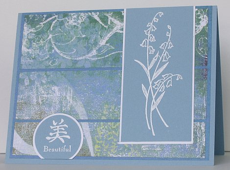
I finally managed to make another of the CPS Sketches, something I intend to do every week but some how don’t often manage. When I decided to do sketch #104 I realized straight away that it would take me out of my comfort zone. It is very asymmetrical, with images coming in from the side not placed in the centre where I usually put them.
Anyway, I decided that a piece of lovely paper I picked up on sale at Michaels would be just the inspiration I needed to get started. The paper has very large floral images on it but the bit I wanted to feature on the card was the white flourishes at the top of the card. The flourishes prompted me to do my stamping in white only and the blue in the paper blended in well with Baja Breeze cardstock. My stamped images were very simple so I deviated from the sketch ever so slightly with the divided panels and yes, the orientation of the card itself. The darker blue behind my patterned panels is the reverse side of the designer paper.
Supplies:
Inks: Versamark
Cardstock: Whisper White, Baja Breeze, Bohemia Paper (My Mind’s Eye)
Stamps: Ever After, Eastern Influences
Also: White e.p.
Saffron Daisies
Posted: February 22, 2009 Filed under: Upsy Daisy Leave a comment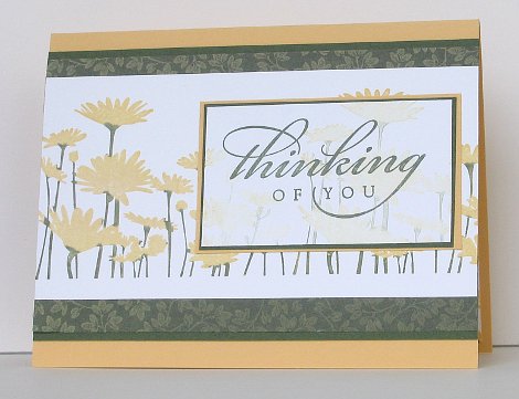
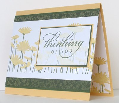
Yesterday a friend asked me to make a condolence card for her. I have a new set coming which would be perfect, but it is not here yet. Instead I chose to use the “Thinking of You” sentiment with some saffron daisies.
I inked the whole daisy stamp on the So Saffron pad and then inked the stems on the stamp with an Artichoke marker. I spritzed the stamp slightly before stamping and then stamped a second time without reinking to make a pale image to stamp the words on. I also stamped a few daisies on the inside bottom right corner.
Thanks for dropping in.
Supplies:
Stamps: Upsy Daisy, All Year Cheer
Inks: So Saffron, Always Artichoke
Cardstock: Whisper White, So Saffron, Always Artichoke, Le Jardin d.p.
Deer at dawn
Posted: February 16, 2009 Filed under: Nature Silhouettes, Stamped Landscapes 1 Comment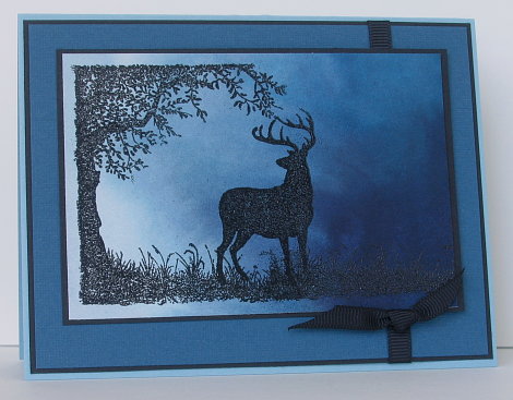
I think my title is a little cheesy, but don’t you think this deer is gazing into the brightness of the new day!! With the dark blues and the lack of flowers or hearts I think it is destined to be another man card. Speaking of man cards, check here to see an incredible one.
The background was done on watercolour paper using Not quite Navy and Night of Navy ink, I think. I actually painted the background before Christmas to use for a snow scene, but it just sat on the watercolour pad and I never got around to using it. I was looking at it the other day and decided to make it the sky for the deer under the tree. I turned the watercolour sheet around several times before settling on this orientation with the light in one corner. The images are stamped in versmark and embossed with Black e.p. The colours are not true, I tried several times to get a better shot but the blues are all lighter than they are in reality.
Supplies:
Inks: Versamark
Cardstock: Watercolour paper, Not quite Navy, Basic Black, Cool Caribbean
Stamps: Nature Silhouettes
Also: Black e.p., Black grosgrain ribbon
Peacock Inspiration
Posted: February 15, 2009 Filed under: Ever After 2 Comments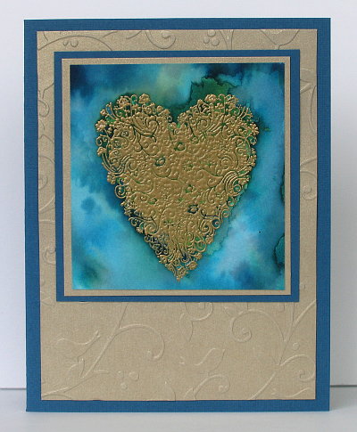
Flourishes released three new sets this week and held a challenge to celebrate. As one of the sets is a Peacock set, the challenge was to use the colours of a peacock feather in your card. I love the blues and greens of peacock feathers, but the picture on the Flourishes blog had a very definite gold in it also so I decide to go with those three colours.
I stamped the heart first on watercolour paper and embossed with gold glory e.p. Then I brushed water across the sheet of paper and squeezed droplets of Garden Green ink and Not quite Navy ink onto the wet paper. It bled across the paper and the colours blurred into each other. I think I will try this technique again but wait for the ink to dry and emboss afterwards; it was hard to get ink into all the little spaces in the centre of the heart.
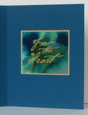
I used the same technique to do the “From the Heart” greeting on the inside of the card. The greeting was meant to be on the front but no matter how I arranged things I wasn’t happy with it on the front so it got put inside and I added the embossied gold background on the front.
Hope you had a happy Valentines Day, but don’t forget let your loved ones know you love them everyday!
Supplies:
Inks: Versamark, Garden Green, Not quite Navy
Cardstock: Watercolour paper, Not quite Navy, Brushed Gold
Stamps: Ever After, All Year Cheer
Also: Gold Glory e.p.

