Inspired by the beach
Posted: June 7, 2009 Filed under: Inspired by Nature, Stamped Landscapes 8 Comments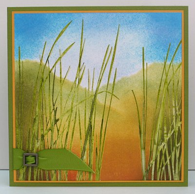
When I got the big “Inspired by Nature” stamps I knew I would be making “landscape” cards with them. I love making scenes like this but they do take a little more time and sometimes do not work at all! This scene reminds me of walking from the parking lot to the beach as a child. The sand was darker or dirtier near the parking lot and often we couldn’t even see the beach. We would cart our surf mats and towels through the gap in the sand dunes and there would be the surf! I showed my Canadian born son a picture of some sand dunes yesterday on an Australian calendar and he asked,” What are sand dunes?” I see there is a whole section of his education being neglected!!
I started with the grass for this card. I inked the stamp with versamark and Old Olive and then added some Always Artichoke with a marker to create two-tone grass. I then embossed in clear. Next I tore a hillside edge into a piece of paper to create a mask which I used to sponge in the sandy hill. I sponged So Saffron first and then Certainly Celery and Old Olive. I used the brayer at the base with Really Rust on it. To do the sky I sponged in both Tempting Turquoise and Brocade Blue. The picture is matted in Marigold Morning and mounted on textured Old Olive with an Old Olive ribbon strip and antique brass buckle.
Thanks for dropping by today.
Supplies:
Stamps: Inspired by Nature
Inks: Versamark, Always Artichoke, So Saffron, Old Olive, Certainly Celery, Really Rust
Cardstock: Whisper White, Old Olive textured, Marigold Morning
Also: Old Olive grosgrain ribbon, Clear e.p., Antique Brass hodgepodge hardware
Featured stamper scene
Posted: June 2, 2009 Filed under: Nature Silhouettes, Pocket Silhouettes 2 Comments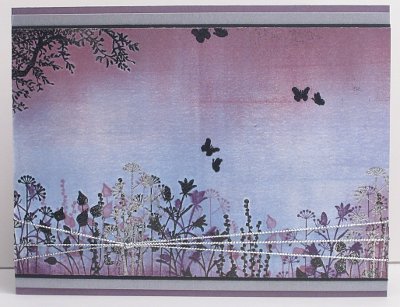
I had a chance to be inspired by the talented ROX, who was Splitcoast’s Featured Stamper on Sunday. I chose her card here. I did change quite a few things in the end but my inspiration was definitely her silhouetted garden across the base of the picture. I stamped and embossed the tree in the corner and the plants along the bottom before doing the background. I chose to use a brayer and sponges to do my background rather than a background stamp. I then added more plants in Perfect Plum and Eggplant and a touch of silver embossing and cord.
Supplies:
Stamps: Pocket Silhouettes, Nature Silhouettes
Inks: Bashful Blue, Brocade Blue, Pale Plum, Perfect Plum, Elegant Eggplant, Versamark
Cardstock: Whisper white, Perfect Plum, Brushed Silver, Basic Black
Also: Silver cord, Black and silver embossing powder
Vintage Blue
Posted: June 1, 2009 Filed under: Cuttlebug, Eastern Influences 3 Comments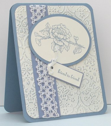
Although I love lace and the vintage look, I don’t often make vintage themed cards. I was inspired by a card I saw with an embossed, then sponged background. I used the Textile cuttlebug folder and sponged lightly over the top. I stamped my flower and my sentiment then cut them out. The oval was cut using the CM oval cutters and the tag with the ticket corner punch and a little trimming. I wanted the same thread on the tag as is in the lace so I unraveled some of the lace to get enough thread to tie a little bow.
Thanks for dropping in today. I hope to be back tomorrow with my CASE from the Sunday’s featured stamper on Splitcoast.
Supplies:
Stamps: Eastern Influences, Pocket Silhouettes
Inks: Bordering Blue
Cardstock: Very Vanilla, Bordering Blue
Also: Cotton Lace
Simple grasses
Posted: May 28, 2009 Filed under: Inspired by Nature 7 Comments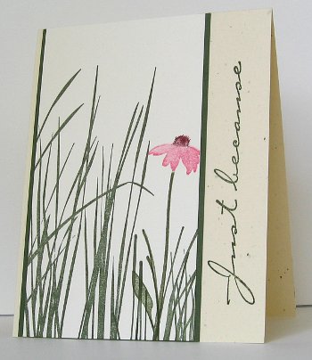
I have found so many inspiring cards made with this set. The inspiration for mine came from a beautiful card I found at Splitcoast by Jane Mercer. There is not much to mine as you can see. I stamped the grass in Always Artichoke and then used markers to ink up a single flower on the flower stamp. After matting the picture panel in Artichoke I wanted something more down the side but not ribbon. If I had had the right buttons they might have worked but the simple cursive script of this sentiment seemed to be the right thing.
And without realizing it I have made a card which works for Sharon’s Spring challenge this week, thanks for the nudge, Julie!
Supplies:
Stamps: Inspired by Nature, Simple Sayings 2
Inks: Always Artichoke, Always Artichoke, Bravo Burgandy & Regal Rose markers
Cardstock: Always Artichoke, Confetti Cream, Very Vanillla
CAS Black, white, lilac
Posted: May 23, 2009 Filed under: In Full Bloom 5 Comments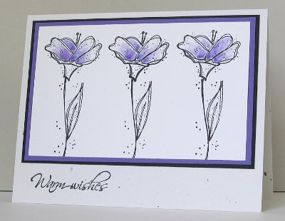
This week’s Clean and Simple challenge is to use Black, White and one Bold Bright. What I envisioned in my head was a black tree branch with green leaves. As you can see, that is not what happened. I stamped these three flower and stem combos using In Full Bloom and then added just a little lilac ink with a blender pen dipped in the lid. I fiddled around a bit with black hemp twine, which filled some space on the bottom right hand side, but it was not delicate enough so I took it off. That is why the sentiment is on the left, whereas I would normally put it on the right.
So glad you dropped in.
Supplies:
Stamps: In Full Bloom, Hugs and Wishes
Inks: Basic Black, Lovely Lilac
Cardstock: Basic Black, Lovely Lilac, Whisper White, Confetti White
Also: Blender Pen
Grassy sunset
Posted: May 20, 2009 Filed under: Inspired by Nature, Stamped Landscapes 8 Comments
I created this scene a week or so ago but did not get it made into a card until the other day. There are no flowers or butterflies so I decided to created a card for Sharon’s “For the Guys” challenge. Aside from a scene which would work for a man I needed a little bit of string or rope somewhere. I actually unraveled the natural hemp twine and used one strand which gave it the nice wavy look.
The scene is done on watercolour paper which I embossed first. I inked the grass with Artichoke first and then versamark so I could emboss in clear. As the watercolour paper was fairly course the embossed image is not sharp. I don’t have a circle stamp that size for the sun so I punched a circle out of a scrap and then used it as a stencil to stamp the versmark pad through before embossing in clear. After embossing I soaked the whole piece with water and started dropping and spreading inks across the paper with a large paintbrush. The only Stampin Up ink I used was Always Artichoke, the others are Winsor and Newton drawing inks. The size is suitable for a business size envelope, and hopefully suitable for a guy!
Supplies:
Stamps: Inspired by Nature, Fundamental Phrases
Inks: Versamark, Always Artichoke, Winsor & Newton drawing inks
Cardstock: Always Artichoke, Confetti Cream, Watercolour paper
Also: Natural hemp twine, Clear e.p.
CAS Rock ‘n’ Roll
Posted: May 18, 2009 Filed under: CAS, Season of Friendship 7 Comments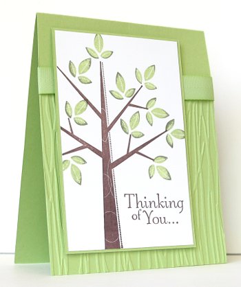
I have been aiming to participate in as many of the Splitcoast Clean and Simple challenges as possible but I seem to get to them just as a new one is posted. Anyway, last week’s was a challenge using the Rock and roll technique which means you ink up your stamp in a light colour and then roll the edges on a darker ink pad. I used the technique to ink my leaves for this card, in Celery first and Artichoke second.
The panel of embossing is done using the Cuttlebug Forest Branches folder and the ribbon is Celery twill from the sale-a-bration bundle. This week’s challenge is Black & White & 1 bold bright, which sounds fun, I might try and do that one tonight.
Supplies:
Stamps: Season of Friendship, Thoughts and Prayers
Inks: Certainly Celery, Always Artichoke, Chocolate Chip
Cardstock: Certainly Celery, Whisper White
Also: Celery twill ribbon, cuttlebug Forest branches embossing folder
Glossy flowers
Posted: May 15, 2009 Filed under: Inspired by Nature 4 Comments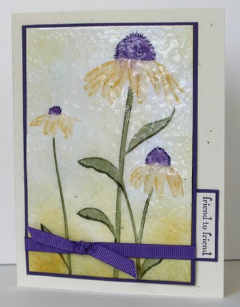
I think I am going to have fun with this new set (new to me, that is). I used markers to ink up the stamp and spritzed it with water before stamping it. I then decided to give it a little more definition with the markers by drawing in some petal lines and giving the lower edge of the petals a dark line. I softened the background with some sponging in Saffron, Mustard and Artichoke.
When I began I didn’t set out to make a cracked glass card but it happened any way. As you can imagine an image that size takes a lot of embossing powder so I stopped short of making a smooth surface. Probably another coating of Glossy Glaze would have done that. I decided instead to have the stippled glass look. When I had added the ribbon and the matte, it still needed something so I added the little friend tab which seems to have balanced it out.
I hope to play with this set again this weekend.
Thanks for dropping in.
Supplies:
Stamps: Inspired by Nature, Pocket Silhouettes
Inks: Versamark, So Saffron, More Mustard, Elegant Eggplant, Always Artichoke stamp pads and markers
Cardstock: Very Vanilla, Elegant Eggplant,Confetti Cream
Also: Eggplant Grosgrain ribbon, Glossy Glaze e.p.
Butterfly thank you
Posted: May 13, 2009 Filed under: Ageless Adornment 4 Comments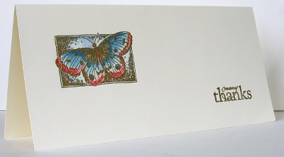
Last week my daughters played in a benefit concert for the Royal Ottawa Mental Health Centre. It was quite a big deal, and it attracted quite a bit of attention in the local medai resulting in a sell out and a wonderful fundraising result. After such an event there are always many people to thank so I designed a card which I could mass produce without too much trouble. ( I have since decided that if I want to mass produce I shouldn’t include embossing and watercolouring!)
The logo of the Royal Ottawa is a butterfly and the benefit was called Bows for Butterflies so I chose a butterfly for the card. I made them business size so individual letters could be slipped inside. As you can imagine I didn’t make them identical. All had the same butterfly stamp on the left but to keep myself from getting bored I used a different sentiment, different colours and made them on Whisper White, Very Vanilla and Watercolour cardstock. To do the watercolouring I used a blender pen dipped into the ink left on the lid of a stamp pad when the pad is pressed down.
Supplies:
Stamps: Ageless Adornment, All Year Cheer
Inks: Versamark, selection of classic stamp pads
Cardstock: Very Vanilla
Also: Gold e.p, blender pen
Field of daisies
Posted: May 6, 2009 Filed under: Upsy Daisy 8 Comments
At last… a new card! This card was something of an experiment, because I was watercolouring the background. I love the look of watercolouring but I am far from an expert in the technique so I just play around with the colours and hope for the best. I totally covered the watercolour paper with water and then dropped drips of Brocade Blue ink in the sky area and guided them with my paint brush. I wanted dark and light areas so I removed ink in some places with paper towel and added more in other places. On the bottom two thirds I dropped Garden Green ink and kept the coverage fairly uniform. After it had dried a little I turned the Garden Green ink pad on its side and “painted” the grass.
To create the daisy feature I inked the stamp with versamark and then drew yellow centres with the So Saffron marker and stalks in Garden Green. I embossed in clear before sponging the background with Bashful Blue and Ballet Blue. I thought the hemp twine was appropriate for my country scene and added the knots so it would look a little like a fence. The left side of the card is scored so it opens like a folio. The daisies are stamped on Whisper White but the card base and the distressed matte are Confetti White.
I am so pleased you dropped in ( and pleased I finally managed to post!).
Supplies:
Stamps: Upsy Daisy
Inks: Garden Green and Brocade Blue reinkers, Bashful Blue, Ballet Blue, versamark
Cardstock: Whisper White, Confetti White, Watercolour paper
Also: Natural hemp twine


