
Strange things are happening
Posted: August 1, 2016 Filed under: Field of Dreams, Zigs & zags | Tags: Kuretake Gansai Tambi watercolour paints, Penny Black creative dies, Penny Black stencils 9 Comments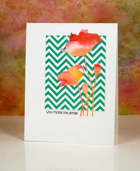
Strange indeed to see me enter a challenge, follow a sketch, use a chevron pattern and texture paste! I would not be surprised if you thought someone else had taken over my blog. There are two signs, however that this is my card, those watercoloured poppies might look familiar and the placement of that little sentiment is pretty standard for me also.
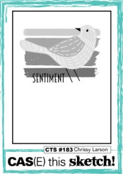
How did this happen? Well, I have been meaning to try adding texture to cards for a while so I picked up some molding paste and applied it through a couple of stencils. In this experiment I mixed liquid metal into the paste before spreading it through the ‘Zigs and Zags’ stencil from Penny Black. It didn’t end up with a metallic look but it took on the green of the ‘verdi gris’ liquid metal. It has been a while since I did a challenge other than One Layer Simplicity (new one is up today) so I checked a couple of my favourites and found the sketch on “Case this Sketch“.

The die-cut poppies were sitting on my desk along with some other left over watercolour painted panels. (I will share projects featuring the other panels later this week.) This card really is an exercise in contrasts, the soft blends of the paint against the sharp corners of the zigzag, the pops of red over the stripes of green and the tiny black letters in the midst of a large expanse of white space.
As Joan Bardee would say:
MOOD WHEN DONE: Surprised but satisfied!

Supplies:
Stamps: Snippets (PB)
Dies: Field of Dreams (PB)
Stencil: Zigs & Zags (PB)
Inks: Versafine onyx black (Tsukineko)
Mediums: Molding paste (Golden) Verdi gris liquid metal (Ken Oliver) Watercolour paint (Kuretake Gansai Tambi)
Cardstock: Hot pressed Fabriano watercolour paper, Neenah solar white cardstock


Exciting to try new things!! I have that die and youve inspired me to use it. Beautiful card. Your ending made me smile!!
Very different – but pleasing to the eye and I like what you did Heather!
Paper Hugs,
Jan
So different for you but lovely
This is a great departure for you Heather and has worked beautifully and I love the green chevrons with the orangy red poppies. x
Beautiful and bright card, it would definitely stand out on any mantle piece.
Love Alli Xx
You can do anything Heather!
Oh, I love those gorgeous flowers layered over the chevron like that! Fabulous take on the sketch!
Very pretty!..I have been doing alittle “creative stretching” myself, lately. It’s like a little breeze of fresh “fun”, huh! 🙂
Love the title of your blog post, and your card is wonderful, Heather! The texture, the poppies–so pretty!