
Venetian Summer
Posted: May 23, 2016 Filed under: Venetian Summer | Tags: Penny Black stamps, Tsukineko Memento inks 10 Comments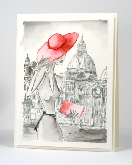
The sun is shining and although it is not technically summer yet, it finally feels like it is. I made this card over a year ago, during my stint on the Dirty Dozen. It is not vintage style in the same sense as my recent ‘sepia toned’ cards but it does have a bit of an old b&w photo feel. Just as it is possible to highlight one part of a b&w photo, it is fun to do the same with watercolouring. I inked my stamp in London Fog but avoided the hat so I could ink that in red. I added shading to the buildings and the woman by picking up ink with a small watercolour brush. I chose for the sun to be coming from the left hand side of the scene and kept my darkest shading on the right of the buildings, hat and body. You can see where I taped the watercolour panel to begin which left a frame around the picture. Sometimes when I am teaching I am asked what to do about those little areas where the ink seeps under the masking tape. If it is only in a few places or a small area I do not worry about it; I think it makes it look like a watercolour sketch. If it really does detract from the design, I trim the whole border off and frame it with another colour or by popping it up on foam tape to create a ‘shadow border’.
We have had a long weekend in Ontario and the weather has been beautiful. I’ve been bike riding a couple of times and enjoyed the tulips planted by the canal for the tulip festival which is currently happening in Ottawa. I have also been outside planting flowers in my garden and pots. It is hard to believe just over a week ago we were bundled up in multiple layers watching my son play soccer while it was 3°C!
Supplies:
Stamps: Venetian Summer(PB)
Inks: London Fog, Love Letter memento ink (Imagine Craft/Tsukineko)
Cardstock: Fabriano 100% cotton hot pressed watercolour paper


I love the black and white look with those small touches of red – great card
I love this card and am so glad you shared it. I just ordered this stamp and several other city stamps from PB and can’t wait to play with this technique – THANK YOU!!
What a stunning card!! I love how the red just pops in this card. Kind of reminds me of the movie “The Red Balloon.” So lovely!
Love this card… so classy and of course there’s that pop of red! I’m sure, like me, you’re hoping the frost is gone for good after planting this weekend.
Your painting is amazing on each and every card! You create those shadows and highlights so perfectly! This card is gorgeous, Heather! I would love to be able to watercolor like this! Love the pop of red in your black and white image!
what a cool card…love the look!
Paper Hugs,
Jan
What a wonderful card!…I love the touches of red amongst the gray-tone! I love that you remember just what you used a year ago!…I have trouble remembering what I did with a card design from last week! 🙂 Oh, and I love “tape seepage” edges (as well as watercolour “bloom” where two colours push against each other!)…it gives individual character to each piece! 🙂 So glad it finally warmed up in your neck of the woods!
The grey tones with that touch of red work beautifully here Heather using this lovely PB stamp and the loose water colouring suits this perfectly. x
I am reminded of photographs your grandfather took of your grandmother in the 1920s and 1930s. He then printed them himself in sepia tones before adding pastel tone tints to create highlights.
They would both be delighted and proud of your beautiful work.
[…] Heather Telford’s Venetian Summer was the inspiration for my card. […]