
Penny Black plays along with Less is More
Posted: August 31, 2013 Filed under: CAS, Floral Applique, Love Chapter 14 Comments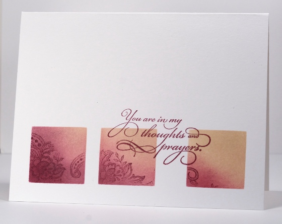
The Penny Black design team is playing along with the “Less is More” challenge this week which is to ‘use a stamp’ with the added suggestion of using watercolour too.
To use a stamp is not too much if a stretch for the Penny Black designers! I decided to limit my stamped area in keeping with the less is more guidelines. I punched squares out of a post it note to create a three square layout through which I sponged chalk inks. I stamped images from the floral appliqué set in chalk inks also. I had intentionally spaced my squares further apart on the right so I could place the sentiment in between the two squares.
As I was enjoying working with the chalk inks I used the same mask on a portrait oriented card switching the plum ink for a couple of blue inks. The colour scheme reminds me of the beach.

Supplies:
Stamps: Floral Applique, Sentimental, Love Chapter (PB)
Inks: Versamagic Perfect Plumeria & Wheat, Aegean Blue & Night Sky (Tsukineko)


These are lovely, Heather. I had to make a sympathy card today, but I think I would much rather use your first card, it’s just so pretty and peaceful. The second one is subtly beachy, isn’t it? I’ll have to try using my chalk inks for sponging now.
Both cards are very pretty. I really like the way you overlapped the sentiment into the squares on the first one!
Simply awesome, both of them. The 2nd one did invoke a beachy seaside feel. TFS
c’est magnifique ! ! !
Stunning work Heather!!!
Both are simply beautiful, but my favourite is the first one. I love how simple changes can create a whole new piece.
both cards are terrific but my favorite is the vertical card. I like how you stamped the saying in the empty space.
stamping sue
http://stampingsueinconnecticut.blogspot.com/
Love both cards! Simple but stunning. Thank you for the inspiration!
~Shery
Hi popped over from ‘LiM’blog, Love the first card, it is so subtle and the wording/sentiment is lovely
Subtle and classy as ever, Heather. Many thanks for the idea of punching through a post-it note.
Wow this card is stunning.
Both these are gorgeous and such a fab idea xx
I adore all your work. You make it sound easy but your use of PB stamps and the color blending make you an artist that rivals others. You are so talented and I love that you share with us. Thanks!
[…] couple using the right hand side layout: i love you, green […]