
A little bird told me
Posted: January 17, 2013 Filed under: CAS, Enjoy LIfe, Watercolour 15 Comments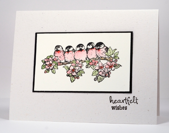
A week or so ago the challenge at Less is More was black and white with one other colour so I stamped these little birds and watercoloured their breast feathers red to enter the challenge. The problem was the flowers and leaves did not like being ignored. I coloured them and no longer had a card I could enter in the challenge.
As the watercolour paper is neither white or ivory I mounted the panel on black and made a card base out of flecked natural cardstock.
Supplies:
Stamps: Enjoy Life, Wishes (PB)
Inks: VersafineOnyx Black (Tsukineko)
Also: Faber-Castell watercolour pencils
Cardstock: Fabriano 100% cotton hot pressed watercolour paper


That is such a cute design.
I hardly recognized you in this card – where’s the sponging? lol! I’ts nice to do something different from time to time. And in one little card, you’ve hit on a lot of my ‘problems’ with cardmaking – I’m not great at colouring these types of images (although I must say that I love how the red turned out on the birds’ breasts!) and I hate it when cardstock doesn’t match! But you’ve overcome both problems and come up with an adorable card!
This gal has a handle on “clean and simple” that doesn’t look PLAIN & BORING! “Ain’t nothin’ like ridin’ a fine horse in new country.” ~ Augustus (Gus) McCrae in Lonesome Dove
Gorgeous card, I love those little birds! xx
Love it, love it, even though it doesnt have your gorgeous sponging technique so much. (Bet you sponged some of it!) I have this stamp, and you know what I’ll try next! These birds are just too pretty not to try this way. (I’ve done ’em blue, done ’em yellow, but never with the soft pinks). Too, too pretty not to try this way. Thanks for the inspiration once more. Have a great day. Hugs
In my mind, nothing requires more talent than C &S – no camouflaging with bows, bling and other embellishments. Just C & S. Your card reveals that you’ve got this down pat. Wow! Double wow!
Hi Heather. I just love all your cards; you’re a wonderful creative artist! I wonder if you can tell me your card-stock of choice, especially the white cs. I look forward to all your posts and have tried many of your methods.
I agree with your thinking on this one, Heather! That image just cries out to be colored and you did it brilliantly!!
Beautiful!!
Great choices for the mounting. It just wouldn’t be right without those green leaves. Beautiful!
Hi, I`ve seen your cards and I love them. You make the most wonderful cards, I think I can learn from you!
Annerieke
It’s a gorgeous card Heather and very delicate! The way you mounted it works very well. I think if I were going to use this stamp in such a challenge, I would go for the spot highlight technique, i.e. stamp your image twice, once on the main panel,(don’t colour) and another on scrap, colour a section of the image on scrap and cut it out, ( a shape, eg circle, square, heart), mat it if wished and then layer it to match the same portion on your main image. However I like what you have done here a lot, so I wouldn’t enter the challenge either!
Like some other comments Heather it’s different from you usual gorgeous sponging style, but absolutely lovely. I’m glad the flowers and leaves refused to be left black and white!!! lol
Karen x
So sweet! Just the perfect touches of colour. I have the same dilemma with my watercolour paper sometimes, too — not white, but not quite ivory or cream, either.
Love this one – you could instigate a “happy families” challenge,!!And the winner is – ta da….
Clean, simple and delicate use of colour…fab hugs…Denise (UK)