
Complementary collage
Posted: January 14, 2013 Filed under: Bliss, CAS, Collage cards 14 Comments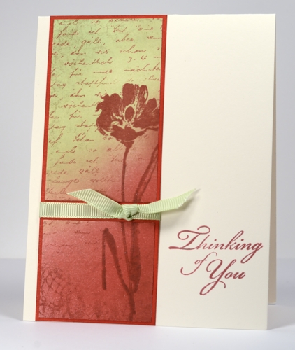
Most, if not all of the collages I have done previously have been analagous colour schemes. This one is a complementary colour scheme meaning that it uses colours opposite each other on the colour wheel. Complementary colours create more contrast and each colour promotes the other. In creating this card with red and green together you can see that my natural tendency for muted and harmonious tones influenced which red and green I chose to put together.
I started by stamping a very light impression of lace background in red where the image was darker at the bottom and hardly visible at the top. I then sponged the red from the bottom right hand corner to around the middle and the green from the opposite corner down. I stamped the flower in the same red but with some brown added on the stem. Finally I added the letter background in red to tie the whole panel together. I sliced the panel and matted it before adding the ribbon.
Tomorrow I have a collage in an analogous colour scheme, more of what you are used to from me. Thanks for dropping in. I am glad when I have inspired you to try something new and love reading your kind comments.
You probably realize this, but on the right side of my blog I have a little drop down menu that allows you to search my archives by single stamp, set, technique, tutorials, manufacturer, etc. I have just added a “collage” category and there is already a stamped landscape category. Just thought I’d mention it as it might be helpful if you are looking for something specific.
Supplies:
Stamps: Letter Background, Floral Thread, Gratitude, Bliss (PB)
Inks: Memento Rhubarb Stalk, Rich Cocoa and New Sprout, (Tsukineko)
Cardstock: Mix & Match Coral Reef


Love this effect, Heather! So beautiful–I’ll give it a try!
Your cards are lovely.
Yes, this is different from your usual beautiful blues, but very pretty just the same. Love the different color combo, and your sponging is still perfection. Thanks for the new idea.
What a beautiful card! The ribbon really adds a nice touch.
What beautiful colours – great to see green and red when it isn’t Christmas. A lovely combination of stamps too
You have such talent, the sofe look is beautiful
You have such a magical way with any colour scheme you choose.
Beautiful work!
Reblogged this on aandeketting and commented:
Een blog waarvan ik elke keer weer geniet en van leer:
As always … beautiful!
Another stunning card! I don’t have the courage to try a collage, well not yet! I wouldn’t have attempted sponging before I found you and your great tutorials!!!!! Can I ask what size of card you use please? Your compositions all look so well balance on your base cards! Thank you for sharing your talents and know how with us and keeping us inspired…..and inky!
Gorgeous! I love the colours. Thank you so much for sharing all your tips and techniques xx
Thank you Heather for the info on how you did this lovely card…and the tip about the Archives! It was such a treat to see some of your work in person at CHA in Anaheim, CA this week – even better than your pictures on the computer! Woo Hoo!!!
Paper Hugs,
Jan
Wow, this is a beauty! I find using complementary colours a little daunting, sometimes — your use is perfect!