
Holly & Mistletoe
Posted: November 23, 2018 Filed under: a berry branch | Tags: Penny Black stamps 6 Comments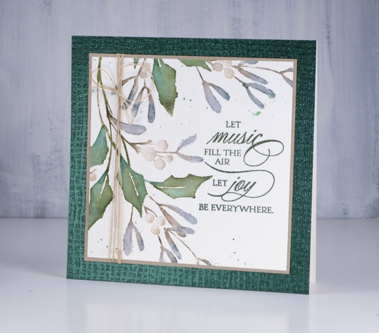
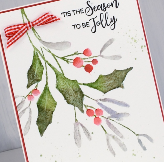
This festive foliage features ‘berry branch’ from Penny Black. I chose a soft muted colour palette and after looking up the colour of mistletoe I kept my mistletoe berries looking white rather than make them red and popping!
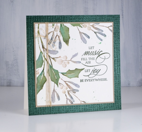
First I inked all the mistletoe leaves with distress markers, half iced spruce and half forest moss. I spritzed the stamp lightly and stamped on cold pressed watercolour paper. I blended the leaves with water then inked the holly leaves with a peeled paint distress marker and stamped. To add some blue tones to the holly I pressed the pine needles ink pad on my glass mat, diluted the ink then blended the holly leaves with diluted pine needles ink.
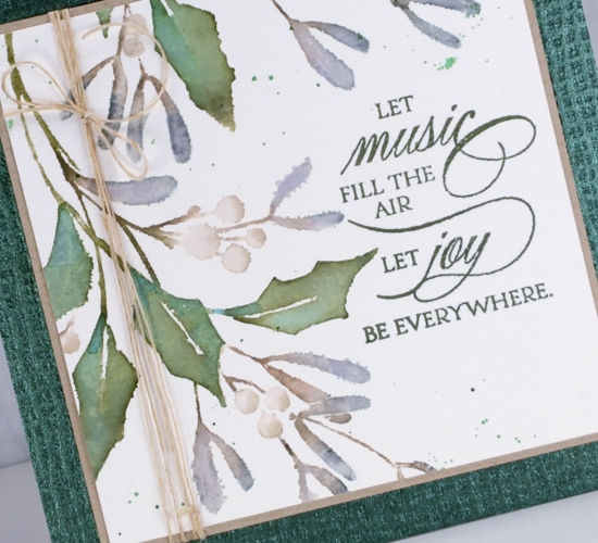
To create my ‘white’ berries I inked them with an old paper distress marker, then diluted the ink with water. While the berry was wet I added a little more old paper ink to make a shadow. I tucked a sentiment into a space that looked like I planned it (unlikely) and added some hemp twine to one side of the panel. I gave the panel two mats, one a simple kraft layer, the other a fancy shmancy textured shimmery green layer. This is quite a big card, 6″x 6″.
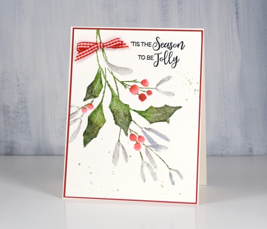
I decided to try one with red berries too, so used ‘candied apple’ distress marker instead of ‘old paper’. I had a wee bit of red gingham ribbon and a red mat to tie it all together. I know the red pops but the white berries are my favourite this time.
Supplies
Stamps: a berry branch, peaceful season, sweetest moments


Inks: iced spruce, peeled paint, forest moss, pine needles, old paper, candied apple distress markers, nocturne & shady lane versafine clair inks


Paper: cold pressed watercolour paper, neenah desert storm, tonic emerald hessian, red cardstock


Also: twine, ribbon


Two very different looks and I love them both! I’m always drawn to red berries, but the “white” berries and muted tones are beautiful! Love that textured paper too!
Such a lovely, restrained color palette for this classic berry spray image! Your detailed “how to” coloring menu is perfect timing for mistletoe sprigs; how to make white objects look white on white paper isn’t easy. Many, many thanks for all of your help.
Both cards are really lovely! I love your choice of the gentle of the first and the tonic paper sets it off perfectly. Unique and Well done as always, Heather!
Two lovely variations for this stamp Heather and they are both gorgeous. My favourite is the first, mistletoe berry one because of it’s innocence and the way you have captured the white berries on white paper and the overall arrangement & placement of the stamp. The green layer sets the paleness off beautifully. So talented. I love the happy red berry version too.
Heather, I am completely smitten with the first card! I love the beautiful muted color AND those white berries; gorgeous! The lovely green fancy shmancy panel – absolutely perfect! It kicked it up a notch without taking away from the lovely holly and berries focal point!
Just love the first card with the muted colors. The whole design is gorgeous.