
Emboss resist tiles
Posted: April 10, 2013 Filed under: CAS, Every Happiness 13 Comments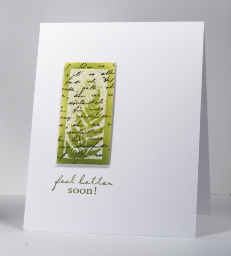
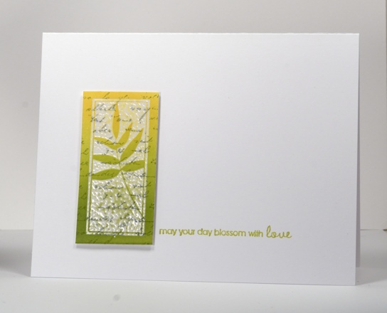
I have two emboss resist cards for you today, one inspired by the Less is More colour challenge for this week Lime Green & Black. Both tiles were created by stamping the letter background first then the tile stamp in versamark next so it could be embossed with clear powder. I finished the tiles by sponging two tones over the panel and trimming back to an even rectangle. The tiles are popped up on dimensional tape.
A note about sentiment placement: These tiles really don’t take up much space on the cardbase so I tried to make a triangle when adding the sentiment, to lead the eye across the card. In order to work out the best position for the sentiment I stamped it on an acrylic sheet with a stamp positioner first so I could move it around and see the possibilities. When playing with the “feel better” stamp above it did not look good side by side with the tile but did work below. I think the eye is lead down by the gradation of colour and ending up on the sentiment. On the card below I was able to create my triangle but not as I expected to, by lining the sentiment up with the base of the tile but by moving it up ever so slightly. All that to say it pays to work with a stamp positioner. There was a time I thought I wouldn’t ever use one but now I pull it out often.
PS. Two posts today! Scroll down for this week’s One Layer Wednesday
Supplies:
Stamps: Letter Background, Feel Better, Every Happiness (PB)
Inks: Memento Dandelion, Pear Tart, Bamboo Leaves, London Fog & Versafine Onyx Black & Versamark(Tsukineko)
Also: Clear embossing powder


Great cards – so simple but classy with it!
Each card is pure elegance. Love the bold & bright colors, simple clean lines. Thanks for some good ideas.
Love your clean and simple cards…these two are real treasures!
Paper Hugs,
Jan
P.S. thanks for the info yesterday…I just did not scroll down enough – LOL!
Two beauties Heather! Gorgeous. x
These are absolutely gorgeous Heather…as ever!
Thanks so much
Chrissie
“Less is More”
So enchanting, Heather! Your work is always genius and inspiring. Thank you for the taking the time to do the tips for us!!
These are so pretty, Heather! Your sentiment placement is perfect. I like my stamp positioner, too. 🙂
Good luck with the lovely *spring* weather headed your way! We’re looking at a lot of freezing rain here, blech.
These are beautiful Heather, yes I use my stamp positioner alot just for working out composition more that precision stamping :0)
Jenny x
lovely card
Such classy cards 🙂 Viv xx
WOW ! Wie schön ! Ich liebe Ihre Ideen !! 🙂
lg Frieda
Both these are gorgeous! xx
This realy looks beautiful and I will surely try this, because the result is gorgous.
Thanks for your inspiration.
Groetjes Gery