Valentine Bag Topper
Posted: February 14, 2009 Filed under: Ever After 2 Comments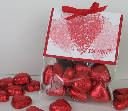
I held a new catalog party last night and this was the make and take, only just in time for Valentine’s Day. As you can probably see it was very simple to make. The red piece of card is 5½”x4¼” scored at 3″ and the white 5¼”x4″ scored at 2 7/8″. I stamped one red heart in the centre of the larger side of the white card, then without re- inking stamped the hearts either side and the “for you” from One of a Kind. I sliced off the open flap end of the translucent envelopes and popped in ten hearts. To seal the packet I stapled the red piece over the envelope and then stuck the decorated white piece on with adhesive. Last of all I punched a hole through the top and tied a red bow.
Supplies:
Inks: Real Red
Cardstock: Whisper White, Real Red
Stamps: Ever After, One of a Kind
Also: Red grosgrain ribbon
Simply Monogrammed
Posted: February 13, 2009 Filed under: Designer Paper, Just Rite 5 Comments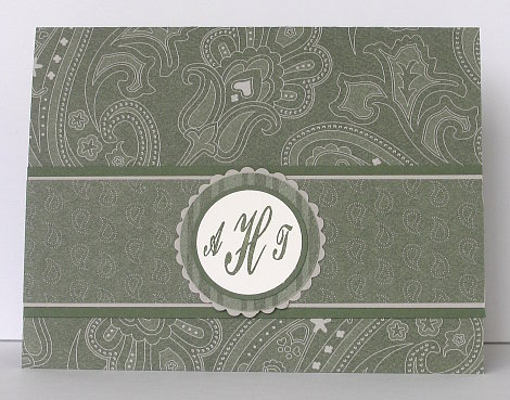
It is challenge time again with Sharon over at No Time to Stamp. The challenge is to make anything with a monogram on it so I decided to make a card with my initials. Apparenty I have messed up the monogram order though. I just checked on Sharon’s blog and I should have my surname initial in the centre!! I would fix it but I have no time or light to photograph it. Perhaps I can give it to someone with the right names…if your initials are ATH leave me a comment and I will send you the card!!
As you can see I have used the textured designer paper again, three different patterns co-ordinated with Always Artichoke and Sahara Sand. The letters are the stylish Trompe Script Font from Just Rite. If I had a scallop punch I would have used that for my scallop circle but it’s still on my wish list so I used the scallop edge scissors instead.
Make sure you check out what the rest of the design team have created this week.
Dee, Tammy, Janine, AJ, Jennifer, Becky and Sharon
Supplies:
Stamps: Trompe Script Font from Just Rite
Inks: Always Artichoke
Cardstock: Always Artichoke, Saraha Sand, To the Nines Specialty D.P., Very Vanilla
Also: Nestabilities circles, circle punch
Muted Silhouettes
Posted: February 11, 2009 Filed under: Designer Paper, Pocket Silhouettes 2 Comments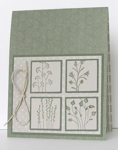
Here is another card I made using the To the Nines Specialty D.P. The overall effect is quite muted as I stamped the images on Sahara Sand rather than a lighter brighter colour. The images from Pocket Silhouettes are perfect to punch out; I rarely use the whole image. I didn’t photograph the inside this time as I just matted a piece of Whisper white in Sahara Sand and attached that.
Not much to it really.
Thanks for dropping in, and thank you for the encouraging comments you have been leaving, I really appreciate them.
Supplies:
Stamps: Pocket Silhouettes
Inks: Always Artichoke
Cardstock: Always Artichoke, Saraha Sand, To the Nines Specialty D.P.
Also: Hemp Twine
A Sweet Little Thankyou
Posted: February 10, 2009 Filed under: Designer Paper, My Kid's cards, One of a Kind 2 Comments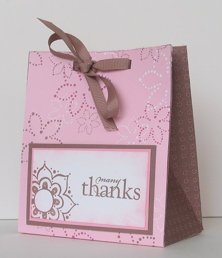
I posted a drawing set decorated by my younger daughter a few days ago. Today I have a little gift bag made by my older daughter. She didn’t make it with anyone in mind, but just thought it would be good to have in reserve. I think she did a beautiful job and it is just the size for a few chocolates or cookies or perhaps some pretty soap. The dimensions are 4½” high, 4″ across and 2″ wide. She made the bag out of Berry Bliss Designer Paper and used Whisper white, Pretty in Pink and Close to Cocoa for the “Many Thanks” panel.
Supplies:
Stamps: One of a Kind, All Year Cheer
Inks: Pretty In Pink, Close to Cocoa
Cardstock: Whisper White, Pretty In Pink, Close to Cocoa
Also: Taupe grosgrain ribbon
To the Nines
Posted: February 9, 2009 Filed under: Designer Paper, Lovely as a Tree Leave a comment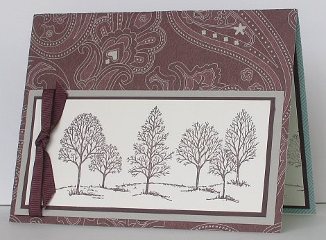
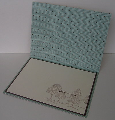
I have been playing with another new product from the Spring/Summer catalog: To the Nines Specialty Designer Paper which is textured and cardstock weight. Like the designer papers there is a different pattern on each side. I know this cardstock does have hearts and paisley on it but I thought it could almost pass as a “male card”. I stamped the trees in Chocolate Chip on the front panel and then without re-inking stamped them on the corner of the inside panel and added the sentiment. I have matted the front with Chocolate Chip and Sahara Sand and the inside with just Chocolate Chip.
Supplies:
Stamps: Lovely as a Tree, Pocket Silhouettes
Inks: Chocolate Chip
Cardstock: Very Vanilla, Saraha Sand, To the Nines Specialty D.P.
Also: Chocolate grosgrain ribbon
Ever After
Posted: February 9, 2009 Filed under: Cuttlebug, Ever After 2 Comments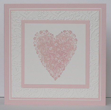
This card happened a little by accident, but I am very happy with the accident. After I had had all sorts of issues with my previous heart card, which had meant that I had stamped the heart, cleaned the stamp, botched it and then stamped the heart, cleaned the stamp, botched it… the stamping scrub was tinged with red ink, so even when I cleaned the stamp I didn’t do a good enough job. I inked up the heart withTsukineko Wheat Versamagic chalk ink, which I had never used before, and stamped it on vanilla cardstock. The colour of the heart was the pale salmon colour in the card above, not wheat. It just happened to match beautifully with Blush Blossom so a few layers and a cuttlebug embossed matte were all that was needed to make this wedding card.
As the card is 5¼” square the cuttlebug matte needed to be wider than the embossing folder. I put it through once and then moved the folder over to the unembossed strip down the side of the square and carefully fitted the folder partially over the already embossed part of the square but also over the rest of the square. Sharon actually explains how to do it with pictures here.
Thanks for dropping in.
Supplies:
Inks: Tsukineko Versamagic chalk ink- Wheat
Cardstock: Very Vanilla, Blush Blossom
Stamps: Ever After
Also: Textile cuttlebug folder
Cuttlebug Valentine
Posted: February 8, 2009 Filed under: Cuttlebug, Ever After 2 Comments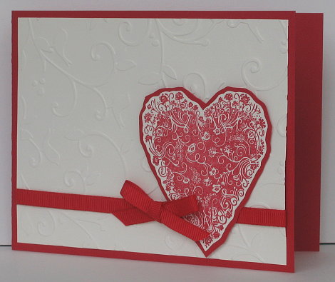
This heart is the first stamp I have from the new catalog. I didn’t have a heart stamp so I decided to get this beautiful one. Simple though this card is, it took me forever! I had hoped to post it a few days ago but I just couldn’t work out what was missing. I changed orientation, added words, removed the ribbon, etc, etc. As it turned out all it needed was the embossed background; I had been working with a blank vanilla piece which was just too plain. The embossed background filled in the space without making it too busy.
I stamped the heart in red, cut it out and cut a matte out of real red. The heart is raised slightly over the ribbon by stampin’ dimensionals. Thanks for dropping in, I have another heart card which I am almost finished which should be up soon.
Supplies:
Inks: Real Red
Cardstock: Very Vanilla, Real Red
Stamps: Ever After
Also: Red grosgrain ribbon, Birds and Swirls cuttlebug folder
Need to be negative
Posted: February 5, 2009 Filed under: Happiness is a Journey, Stamp Simply challenges 10 Comments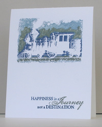
That’s right, I needed to be negative when I made this card. Sharon’s Stamp Simply challenge this week is to use negative images or negative spaces left after using a punch. The stamped image is the only negative thing about this card, because I am actually feeling very positive about being the Stamp Simply Guest Designer for February! Thank you Sharon for including me in your team for the month.
This card is truly a “stamp simply” card. One stamp set, three markers and one piece of cardstock! I coloured directly onto the train stamp and then spritzed some water onto the stamp to blur the edges a little between my colours. After I had stamped one image using these colours I realised how much the green strip looked like foliage so Istamped another using the green marker a little more intentionally to create a background of trees for the train going past. I also used markers to highlight the word “Journey” in the sentiment.
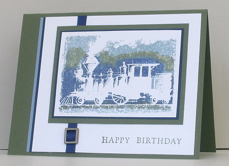
I had a few trial images of the train lying around on my craft table so I decided to make a less simple card and use some mattes and embellishments. You can see the result below. I was happy with it but I prefer the simplicity of the one layer in the first card.
Make sure you check out the designs by the talented Stamp Simply design team:
Julie, Janine, Jennifer, Tammy, Dee, AJ, and of course Sharon.
Supplies:
Inks: Night of Navy, Bordering Blue and Always Artichoke stampin’write markers
Cardstock: Whisper white (Night of Navy, Bordering Blue, Always Artichoke)
Stamps: Happiness is a Journey (Fundamental Phrases)
Also: Navy grosgrain ribbon, hodgepodge hardware buckle
Celery Drawing Set
Posted: February 4, 2009 Filed under: Designer Paper 1 Comment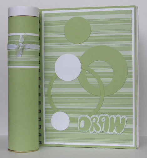
I mentioned the other day that Certainly Celery is one of my daughter’s favourite papers, so I was not surprised to see that she chose to decorate her drawing book with it. She has been very keen on drawing for several years now, but when she first started she always did it on many different little scraps of paper. That’s when we decided that she should always have a sketch book. The one pictured above is the latest in a long line of sketch books which are filled with all sorts of pictures and designs. She had fun trying out my new circle nestabilities for the cover adding her own title drawn with a versamarker then embossed with white e.p. The pencil case is a chocolate tin covered with cardstock, d.p. and ribbon.
Supplies:
Inks: Versamarker
Cardstock: Whisper white, Certainly Celery, Certainly Celery Designer papers
Also: White e.p. , White grosgrain ribbon, celery organza ribbon, circle nestabilities(Spellbinders)
Watercolour blossoms
Posted: February 2, 2009 Filed under: Eastern Influences 2 Comments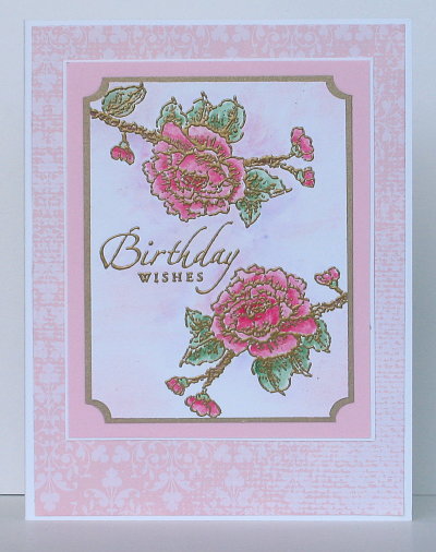
I am inspired by so many amazing stampers whose blogs I visit when I can. Some of them have very individual styles, which has prompted me to wonder whether I have any particular style at all?! When I look back through my archives there are vintage, modern, embossed, watercoloured, overdone, underdone, large, small, etc, etc! Perhaps I have several styles, I do know that I keep on seeing wonderful ideas and techniques that I am keen to try.
I have used watercolouring on my cards in the past, but Jerri Jiminez’s gorgeous watercolours have inspired me to try again, with a gold outline this time. I was fairly happy with the blossoms but could not get the background colour the way I wanted it. My older daughter, whose style is definitely “less is more” told me to” leave it alone, it looks good as it is!” A few days after I had finished this card Jerri posted a very detailed tutorial on watercolouring, so I shall be trying again, with her instructions to guide me.
Supplies:
Stamps: Eastern Influences, Sincere Salutations
Inks: Rose Red, Pretty in Pink, Garden Green, Almost Amethyst
Cardstock: Pirouette Pink, Whisper White, Bella Rose d.p., Brushed Gold
Also: Gold embossing powder, ticket corner punch


