
Blue Sympathy
Posted: April 18, 2013 Filed under: Penny Black, Schizeas, Sweet Melody 13 Comments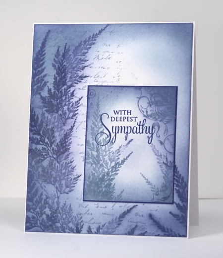
I have been playing with some Versamagic Chalk inks from Tsukineko and really like the soft effects I can create with them. Not only can I get great coverage with sponges, stamped images blend into the sponged areas creating a misty look. As the chalk inks take longer to dry than the Memento dye inks I usually use for sponging I was able to intentionally smudge the fern images by sponging straight after I stamped. Both panels were done with the same two chalk inks, Night Sky and Aegean Blue. I stamped the letter background, sponged over it in both blues, added the ferns in both blues, sponged a little more, added some curly flourishes using the little bird in the Sweet Melody set and finally stamped the sentiment with Versafine Majestic Blue.
I know my posts have been a bit sparse lately; I have been working on samples for some upcoming workshops I am doing. In May I will be doing a workshop using the PB set, Longing at Heather’s Stamping Haven. If you are interested you can see the dates here and the class details here.
Supplies:
Stamps: Schizeas, Letter Background, Sweet Melody PB)
Inks: Versamagic Night Sky and Aegean Blue, Versafine Majestic Blue(Tsukineko)


Very pretty. I should have known you were up to something inky. 🙂
Oh my this is stunning! Gorgeous card~ HI! 🙂
Beautiful and other-worldly! A rhapsody in blue.
Beautiful card…love the finish ..Denise x
I just love this look, stunning! X
A beautiful misty and serene card.
Gery
SOOO beautiful Heather.
Nice weekend and lovely greet
Marja
Wonderful sympathy card & I love the softness. I have the colorbox fluid chalks, wonder if that would work? Don’t have many of the Versamagic chalks…will have to check my stash to see if any on hand would create something with this effect. It is just pure loveliness. TFS & explaining the how-to.Have a great weekend.
Beautiful card Heather, love the soft effect 🙂
Wow, this is a perfect sympathy card. Well, it could be a perfect any kind of card if you wanted it to be. 😉
Nice card! Lovely inking effects I like all the blue variations and stamping. 🙂
Lovely effect! A gorgeous card perfect for such an occasion xx
I really like this! The colouring, shading etc is superb! I get on with pigment inks better than dye inks for some reason…could be the card I use. Versamark chalks are lovely inkpads and it’s great to see how you have used your sponging techniques to create such a beautiful soft design. Wish I could attend one of your workshops…..Can’ find a bus from here to yours!…TFS and bonne chance with the classes!