
Polar bears
Posted: December 18, 2017 Filed under: mosaic pattern, polar bears | Tags: Kuretake Gansai Tambi watercolour paints, Penny Black creative dies, Penny Black stamps 12 Comments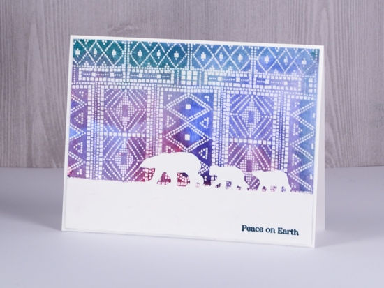
I stamped and embossed four panels of this Penny Black mosaic background recently for a project you’ll see in a few days but then I got another idea and painted over one. When I started painting it I totally forgot that I had not stamped it on watercolour paper but neenah solar white cardstock. I dabbed it dry fairly quickly and although it curled the surface of the paper, it did not end up looking pilled or damaged.
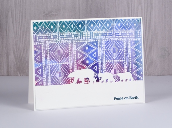
Even though the ‘sky’ is very patterned I still think it gives the impression of northern lights for this little family of bears to wander under. The polar bears die from Penny Black cuts only at the top so the bears appear to be walking across the snow.
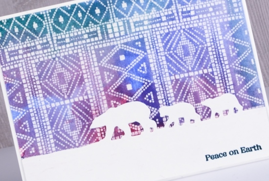
Even though I initially did not plan to do watercolour with this panel I did and it meets the challenge at CAS watercolor this month. As always there is tons of beauty to be found if you check out the team samples and challenge entries.

Supplies
Stamp: mosaic pattern


Die: polar bears

Versamark ink & clear embossing powder

Paint

Berry bramble
Posted: December 15, 2017 Filed under: Berry bramble | Tags: Penny Black stamps, Ranger Distress inks, Ranger Distress stains, WOW embossing powders 12 Comments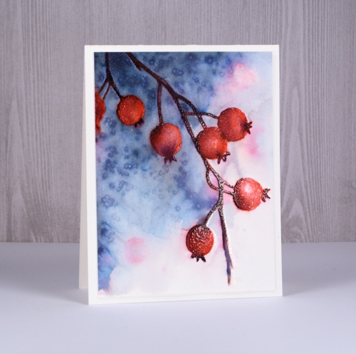
Sometimes it is fun to rediscover and incorporate some techniques you haven’t used for a while. I love to splatter masking fluid over watercolour paper to create the look of falling snow but sometimes I don’t think about it in advance or just don’t want to wait long enough for the masking fluid to dry. Salt to the rescue! While salt does not create bright white dots it does make lighter areas and pretty patterns that look a little like snow or fairy lights.
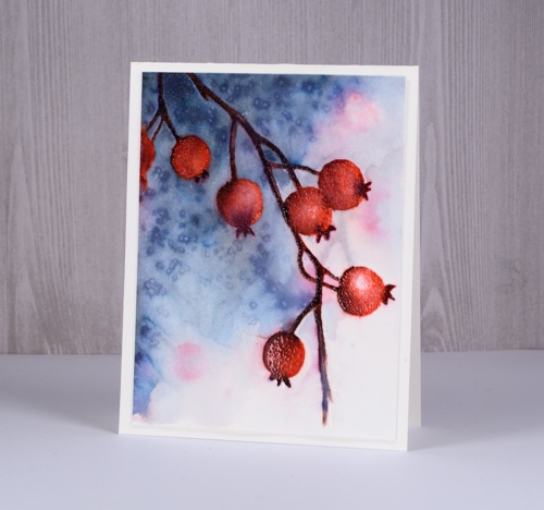
You can see some pale pink and brown pattern in the background of the scene; to create this I wet the whole panel, inked the stamp with festive berries and ground espresso distress markers and stamped it onto the damp paper. I dabbed at the inky impression immediately with a paper towel so I would have soft shapes that would not overpower the foreground image.After drying the panel completely I put it in my stamping platform for all the berry work. First I inked and stamped the whole stamp with festive berries distress ink.
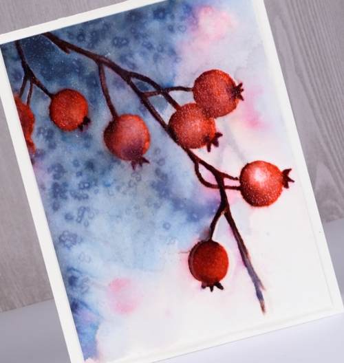
Next I switched to markers and added shading to the berries and darker colours to the twigs and calyx. (yes, of course I had to look that up!) I used barn door and aged mahogany to add depth and shadow to the berries. I used chipped sapphire and ground espresso to darken the stems and calyx. After I had added colour I used a small paint brush and water to blend the stamped colour. Once the panel dried I embossed the berries with versamark and clear powder which gave them a frosty, shiny look. The embossing made them waterproof so I was able to add weathered wood stain to the panel without diluting the berries. I kept the stain dark on the left and diluted it with water on the right then sprinkled salt to created the speckled effect. I decided not to add a sentiment yet as I think this one might be a winter birthday card not a Christmas card. I popped up the whole panel on some foam and added it to a natural white card base.
Supplies
Stamps: berry bramble

Inks: festive berries distress ink, versamark


Distress markers: barn door, chipped sapphire, aged mahogany, ground espresso


Distress stain: stormy sky

Hot pressed watercolour paper

Also: Tonic stamping platform, WOW clear gloss superfine embossing powder, salt

Fine baubles
Posted: December 14, 2017 Filed under: fine baubles | Tags: Darkroom Door stamps, Kuretake Zig clean color real brush markers, WOW embossing powders 5 Comments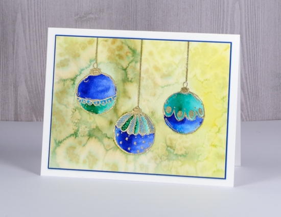
Today I have three pretty baubles out of the ‘Fine Baubles’ set from Darkroom Door. I stamped them on hot pressed watercolour paper in versamark and drew a cord from the top of each one with an embossing pen. I embossed in gold powder then coloured with zig clean color real brush markers. The ink in these markers is so vibrant you need very little on your paper; it is possible to blend it easily with water, or as I did, with a clear wink of stella marker for some sparkle. I used blue, turquoise and green markers for each bauble.
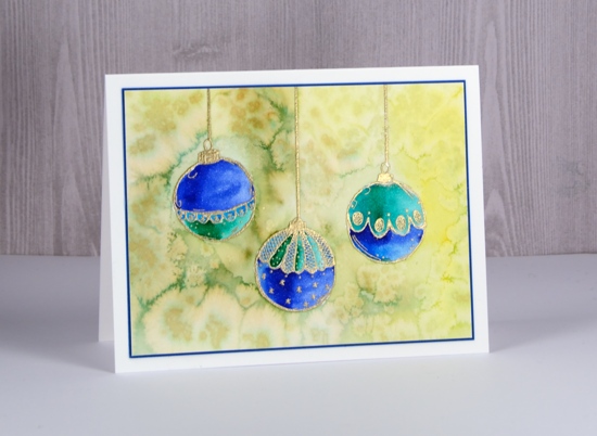
After colouring and blending the baubles I roughly coloured the background with a yellow and an olive green marker. I didn’t need to cover the whole area, rough shading with plenty of gaps was enough. I blended the shading with water to fill the whole background then sprinkled salt over the wet ink to create patterns.
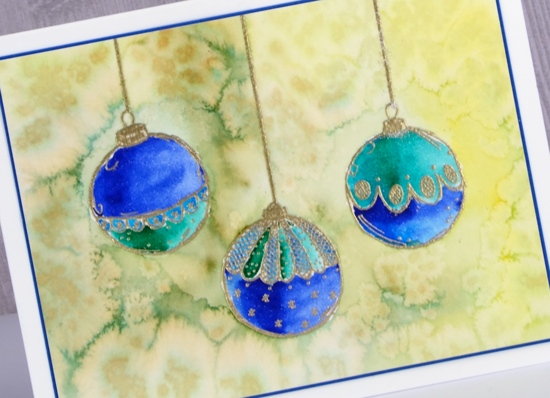
To finish off the card I matched the blue of the baubles with a narrow blue mat and attached to a white card base. I think I’ll be pulling out my tree and baubles any day now.
Supplies
Stamps: Fine baubles (Darkroom Door)

Ink: versamark, versamarker
Paper: hot pressed watercolour, neenah solar white, blue card


Markers: zig clean color real brush markers, clear wink of stella

![]()
Also: WOW metallic gold rich embossing powder, salt

Journey home
Posted: December 12, 2017 Filed under: Joy to All, Nature's Friend, Spread Cheer | Tags: Brusho, Penny Black stamps 10 Comments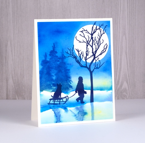
I pulled out of few old favourites for this card, both stamps and techniques. I began by tearing a post-it note mask and positioning it across the bottom of the watercolour paper panel. I then stamped the large tree in onyx black versafine overlapping the mask at the bottom and the boy and sled also in onyx black just above the mask (the stamps and supplies are all listed below). I cut a circle from frisket film and placed it firmly over the tree branches then painted water across the panel from left to right where the sky would be.
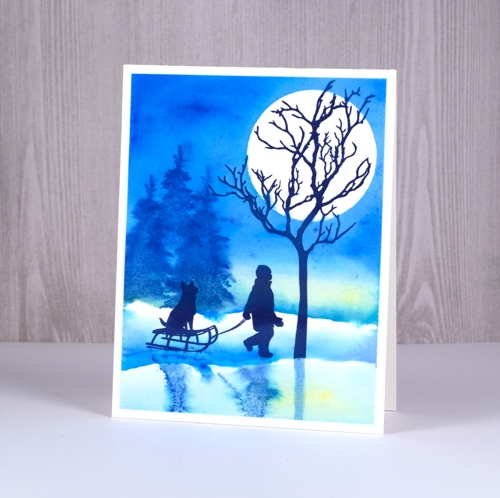
I sprinkled yellow brusho sparingly into the water and blended it to create a ‘glow’ in the sky. Above and below the yellow I painted blue brusho then, while it was still wet, stamped trees in memento Danube blue ink. As the background was damp the impressions have soft blended edges. I mixed a little blue brusho with water on a palette then painted a line of blue below the stamped boy to create a shadowy area where he was walking. I used water to dilute the colour as I extended the colour up towards the horizon. I added more blue below the boy and the tree and diluted that with water.
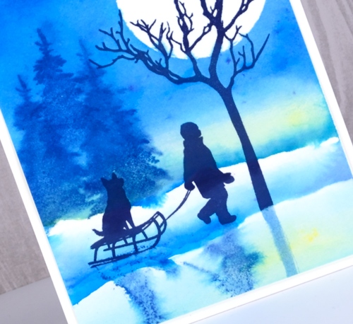
To create the shadow of the boy and his sled I inked the stamp with memento Danube blue and stamped it onto an acrylic block. I stamped the block into the damp watercolour paper where it created a blurred mirror image. I painted straight shadow for the tree also in Danube blue ink. When the ink and paint were dry I removed the moon mask and attached the panel to a natural white card base.
Supplies
Stamps: spread cheer, nature’s friends, joy to all


Inks: versafine majestic blue, memento Danube blue ink


Brusho paints: lemon, cobalt blue


Hot pressed watercolor paper
Also: stamping platform, frisket film, post-it note
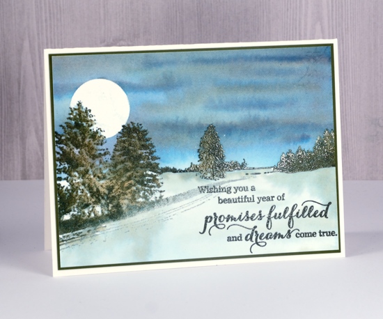
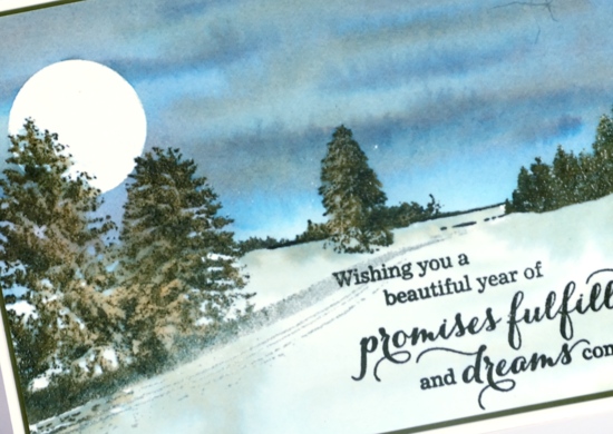
Frozen field
Posted: December 7, 2017 Filed under: restful | Tags: Brusho, Penny Black stamps 14 Comments
I have another frosty winter scene to share today, and of the three I’ve shared this week, this one might be my favourite. The reason is that the scenery round here sometimes looks like this in winter. I will admit the moon is rarely that big but when freezing rain creates a layer of ice on top of snow the fields look very shiny and reflective.
As with the previous two projects I used hot pressed watercolour paper. I placed the panel in my stamp positioner 1mm from the top edge then stamped the ‘restful’ stamp in versamark ink. Next I moved the panel up so it was flush against the top edge of the stamp positioner and stamped the tree in versafine onyx black and the rest of the stamp in versafine smokey grey. I then embossed the panel in clear powder. By moving the panel just 1mm up between the two impressions I was able to create the look of snow on top of the branches and fences and uneven ground.
I decided to go for a super moon so I die cut a large circle from frisket film then sliced off a section to create a straight edge. I pressed it down firmly above the horizon. This time I used brusho to add colour to my scene but filled the sky area first with water then sprinkled prussian blue, dark brown and just a touch of yellow onto the damp paper. I tilted the paper or used a paintbrush to guide the colours to where I wanted them then let it dry completely.
I used same method and colours below the horizon but kept them more diluted especially in the area below the moon. Once that was dry I removed the mask and added diluted blue paint to the moon. I almost didn’t add a sentiment but I ended up using two little stamps from ‘festive snippets’embossed in white powder. To finish I added stars with white gel pen then attached the panel to a white card base. If you are a local you might see why this reminds me of the farmer’s fields along Fallowfield…
Supplies
Stamps: restful, festive snippets


versafine onyx black, versafine smokey grey


Uniball signo white gel pen

Hot pressed watercolour paper, neenah solar white cardstock


Brusho paint: prussian blue, dark brown, yellow


Also: clear embossing powder, white embossing powder, frisket film

Snowy Village
Posted: December 6, 2017 Filed under: snow covered, snowy village | Tags: Peerless Transparent Watercolors, Penny Black creative dies, Penny Black stamps 2 Comments
The second of my winter landscapes this week combines two outline stamps, the little village in the background is from the ‘snowy village set’ and the trees and fence stamp is from the ‘snow covered’ set. I stamped both stamps in versafine onyx black ink onto hot pressed watercolour paper. To make sure the two stamps created a cohesive scene I extended some of the snow bank lines with a black embossing pen both to the right of the village and to the left behind the trees then added some mountains in the background. I embossed all the stamping and pen work with clear embossing powder.
To add colour to scene I used the ‘wet into wet’ technique, painting water first into sky area filling all the space above the mountain tops. I worked with peerless watercolours to next add blue paint, then purple and grey to the wet area gradually filling the sky with colour. One by one I painted water into each hill shape then added blue and purple paint from the bottom blending to pale at the top of each hill. I did the same on all the snow banks.
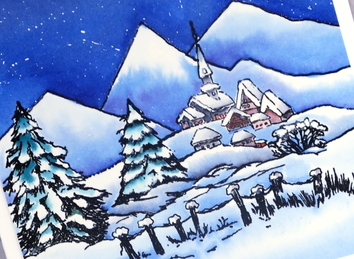
To colour the trees I also painted water over them and added small amounts of green paint while preserving some areas as white. I used grey and red paint to fill the buildings taking care to keeping the snowy roofs white or with minimal grey shading. I splattered white gesso over the sky using a small brush and a toothpick then attached the panel to a white card base.
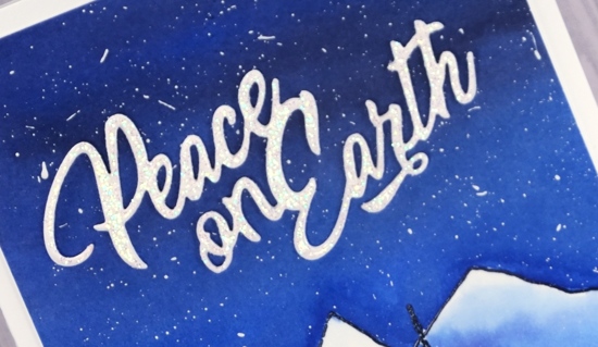
As the sky filled almost half the panel I decided to create a large sparkly sentiment. I cut the ‘peace’ die from white cardstock three times and embossed one with clear sparkle embossing powder. I added glue to the back of each die cut and stacked them on top of each other. I have found the easiest way to get them to line up is to squeeze the layers together from above with a pair of tweezers. It is a quite large card so I did a side fold rather than my usual top fold.
Supplies
Stamps: snowy village, snow covered


Die: peace

Inks: versafine onyx black, black embossing marker

Paint: Peerless transparent watercolors, white gesso


Paper: neenah solar white cardstock, arches hot pressed watercolour paper


Also: WOW clear sparkle embossing powder, clear gloss embossing powder
![]()
Peaceful Winter
Posted: December 5, 2017 Filed under: peaceful winter | Tags: Penny Black stamps, Tsukineko Memento inks 6 Comments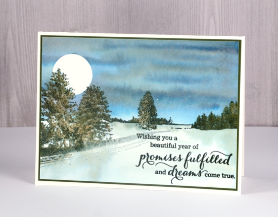
This week I am sharing some winter landscapes here and on the Penny Black blog. I created this wintry scene by combining two stamps from the ‘peaceful winter’ transparent set. I made use of my stamp positioning tool as I wanted to stamp in colour then over the top with versamark. (Jill has created several videos demonstrating this technique. You can find them on the Penny Black youtube channel)
I began by stamping the trees on the left hand side of a piece of watercolour paper in memento northern pine and London fog ink. I spritzed some water over the stamping which made the colours separate into brown, blue and green. I dried the stamping then stamped over the whole image in versamark before embossing it in clear powder to make it waterproof. Next I used the smaller landscape stamp from the same set to add the background trees and used the same technique and inks to stamp a coloured image then emboss it to make it waterproof.
With all the scenic stamping done and embossed I moved on to the watercolouring. I cut a circle of frisket film (clear adhesive film for masking) and stuck it firmly over the top of the left hand trees. I then painted water over the section of sky above the horizon. I pressed both my northern pine ink pad and a memento nautical blue ink pad onto an acrylic block to create a palette of two inks. I built up the sky colour by painting first with nautical blue then creating cloud effects with more blue or northern pine ink. Once the sky dried I removed the moon mask.
I used some diluted northern pine ink to give the foreground snow a bit of colour and shadow then dried the panel. I finished off the card with a sentiment from the ‘love & peace’ set stamped in versafine olympia green and a dark green mat before attaching the panel to a natural white card base.
Thanks for dropping by; I’ll be back tomorrow with another chilly scene.
Supplies
Stamps: love & peace, peaceful winter


Inks: memento northern pine & london fog, nautical blue inks, versamark


Paper: Neenah solar white cardstock, hot pressed watercolour paper

Also: stamping platform, frisket film, WOW clear gloss superfine embossing powder

A Dressember card
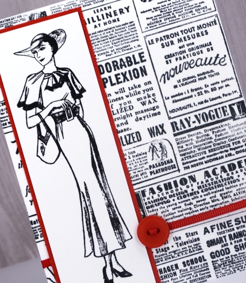
Posted: December 4, 2017 Filed under: 1920s Chic, Gazette | Tags: Darkroom Door stamps, Tsukineko Memento inks, Tsukineko Stazon inks 1 Comment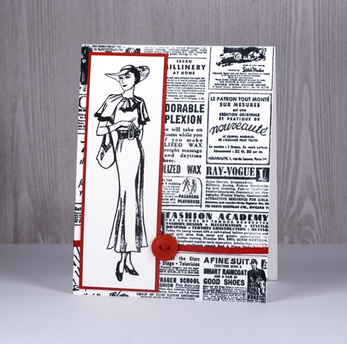
Today’s post is a little different to my usual; it’s more about a cause than a card. I have committed to wearing dresses everyday this month as part of the worldwide Dressember campaign to raise funds to end modern day slavery. This is the second time I have taken this challenge. In 2014 I wore a dress everyday in December and raised $1240. This year I have teamed up with my daughter Alexandra and my friend Nan and our target is $2500.
I would love it if you would support me in raising funds for this cause. If you want to find out more about the cause please click on the links provided earlier in this post. If you would like to donate then click over to my fundraising page.
If you would like to check up and see if I am really wearing a dress everyday in December I am documenting them on my instagram and pinterest feeds. (I’d love to send anyone who donates to Dressember a handmade card so use my contact button to let get in touch if you do)
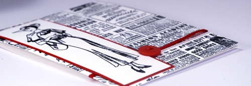
If you would like to know more about these stunning fashion related stamps you can find them at Darkroom Door.


Correspondence
Posted: November 30, 2017 Filed under: Correspondence, World Map | Tags: Darkroom Door stamps, distress oxide inks, Finetec artist mica watercolour paint 7 Comments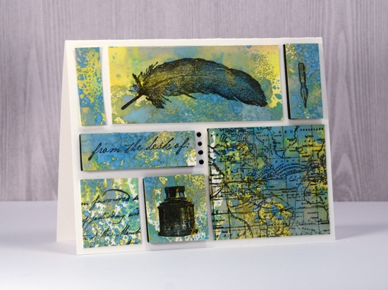
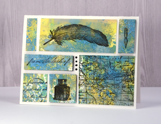
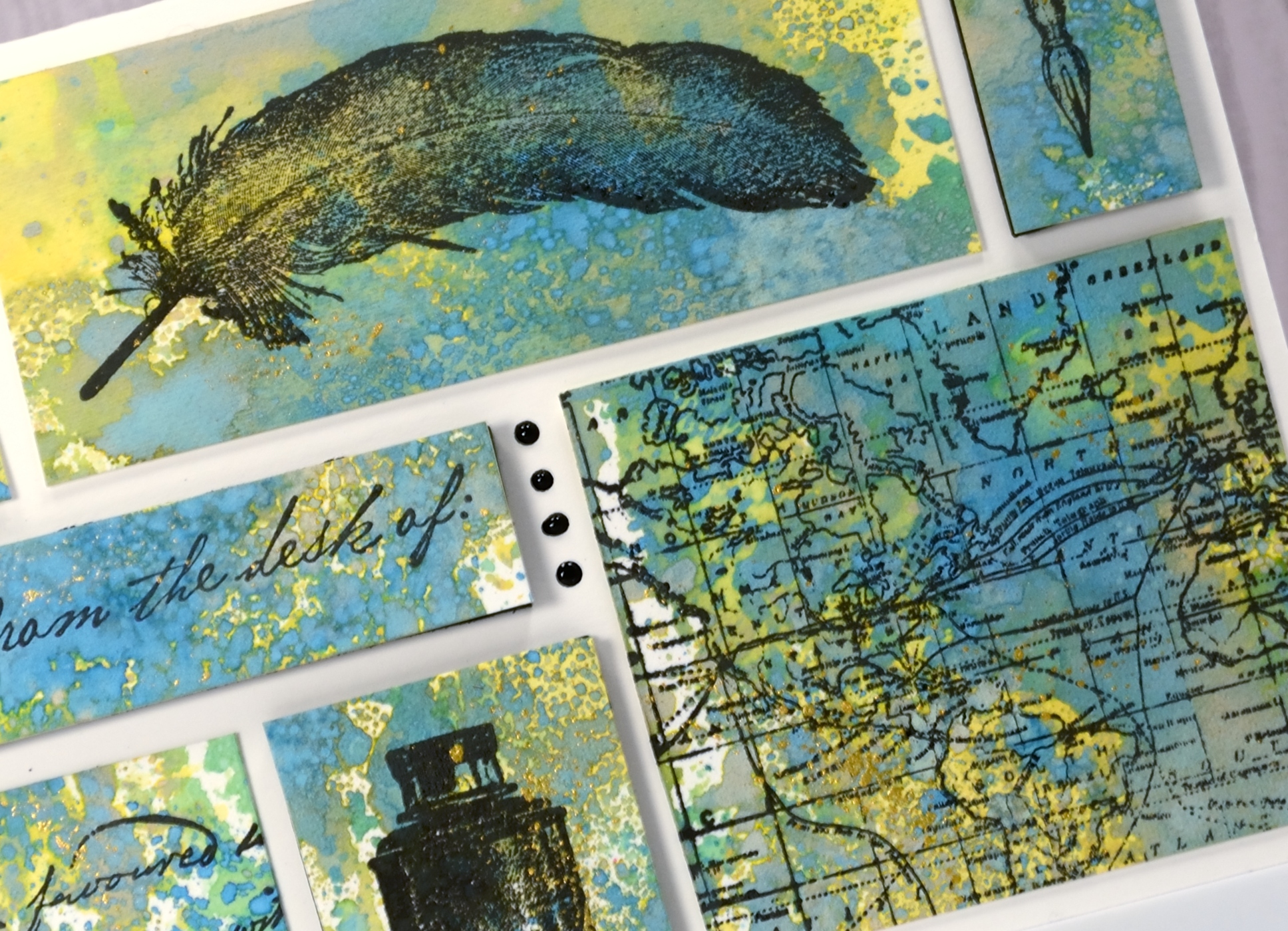
Supplies used:
Stamps: Darkroom Door Correspondence set, Darkroom Door World Map
Ink: Versafine Ink Onyx Black
Distress Oxide inks: Fossilized Amber, Broken China, Cracked Pistachio
Also: gold paint, Nuvo Black ebony crystal drops, black foam sheet, craft mat
Paper: Neenah solar white, Hot pressed watercolour paper
More layered poinsettias
Posted: November 29, 2017 Filed under: Brusho, layered poinsettia | Tags: Brusho, Penny Black creative dies, Penny Black stamps, WOW embossing powders 10 Comments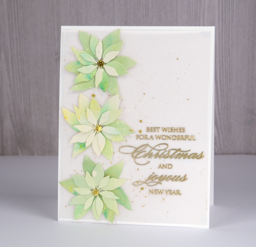
I liked that first layered poinsettia card so much I made another, this time with some pale green brusho to get the ‘white poinsettia’ look. I think I could go even lighter with my paint so there may be another poinsettia card to come. I started with watercolour paper splattered with masking fluid so I would have little white dots over the petals at the end.
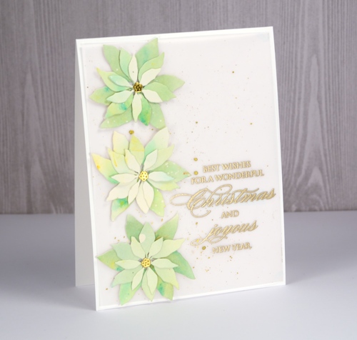
I painted lime green brusho on the watercolour panel but it ended up separated into distinct areas of blue and yellow so I add a tiny bit of olive green brusho to get everything looking greener. When I die-cut the petals I tried to keep the smaller ones a little lighter and the larger ones darker.
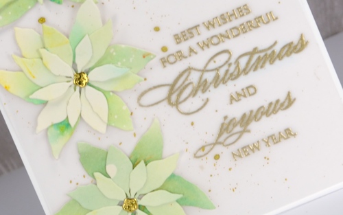
Even though I was aiming for clean and simple when I lay the petals on a white card base, it was a little too stark. A layer of vellum softened the base and I splattered gold paint over it then added an embossed sentiment. Solving the vellum adhesive problem was easy under the die cuts and sentiment but the corners needed something too so I added just the tiniest amount from my tombow tape runner to hold them down to the card base.
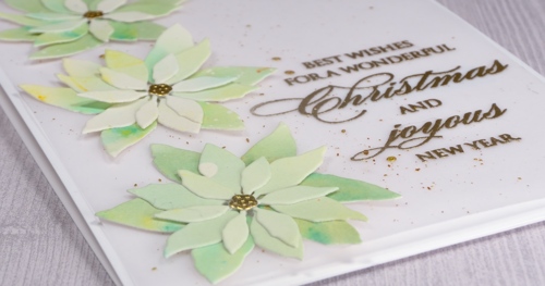
Stay tuned because I think there are another couple of colour schemes yet to be tried with this pretty little die set!
Supplies
Dies: layered poinsettia

Stamps: joy & happiness

Versamark ink, WOW gold metallic rich embossing powder

Paints: finetec mica pearl 12, brusho 12, brusho 8, masking fluid


Neenah solar white cardstock, hot pressed watercolour paper, vellum


