
You’re fantastic
Posted: May 2, 2018 Filed under: ravishing | Tags: Penny Black creative dies, Penny Black stamps, Ranger Distress inks 3 Comments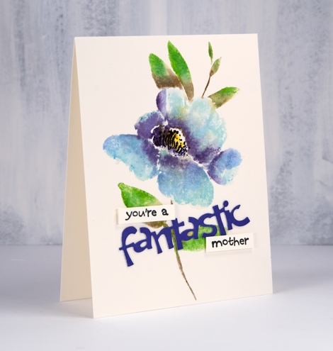
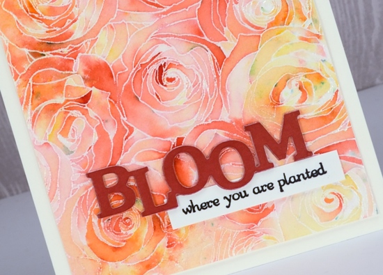
Today I am featuring the new brushstroke stamp, ‘ravishing’. I have chosen to colour it with distress inks and markers in a couple of my favourite colours. Once again I worked in a stamp positioner so I could add one colour at a time. First I inked the petals of ‘ravishing’ stamp with tumbled glass distress ink and stamped. Next I added dusty concord ink to parts of the petals, spritzed them then stamped. The centre I inked with a mustard seed distress marker, spritzed and stamped then finally added some black details on the stamp with a black soot marker. Once all the ink dried I drew some more details on the panel with the black soot marker.
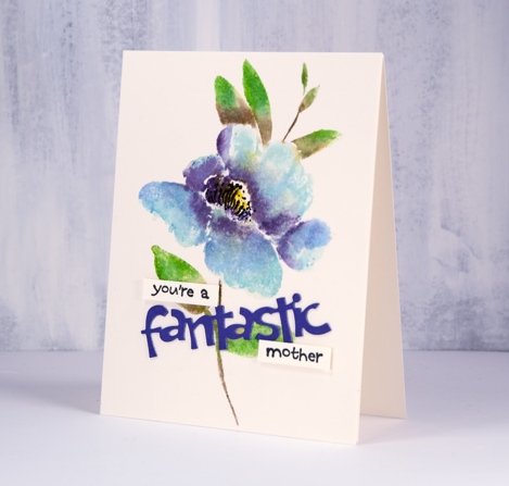
For a sentiment I die-cut ‘fantastic’ twice from purple cardstock backed with double sided adhesive. I stacked the die cuts together and attached them over the stem. I pulled out an older but very handy set called ‘word express’ and stamped a few words in black ink on watercolor paper. I popped them up with adhesive to create an encouraging message for a mother I know.
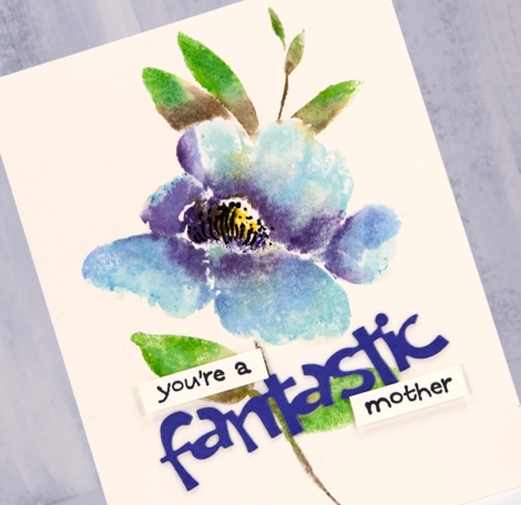
I cut the floral panel to exactly the size of my card base so it appears to be almost a one layer card.
Supplies
Stamps: ravishing 40-589 (PB), word express 30-106


Die: fantastic thank you 51-427 (PB)

Paper: hot pressed watercolour, purple cardstock

Ink: nocturne versafine clair
.
Distress inks & markers: mowed lawn & forest moss inks, tumbled glass, dusty concord, black soot and mustard seed markers


Also: double sided adhesive sheets, foam adhesive, stamping platform


.
Flower Field
Posted: May 1, 2018 Filed under: flower field, Foiling, Zigs & zags | Tags: Foiling, Kuretake Zig clean color real brush markers, Penny Black stamps, Penny Black stencils, WOW embossing powders 6 Comments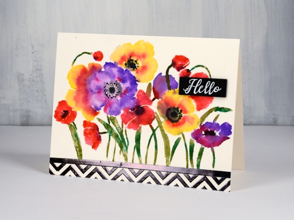
There are an unusual amount of processes involved in today’s card and I will say there are definitely ways to cut corners and get the same effect. It’s a bit like my approach to cooking; if I look at a recipe and the list of ingredients is more than 10, I’m reluctant, if there are multiple processes then I’m not interested! I’m very much a fan of the ‘one pot dinner’. My husband, on the other hand, will create all manner of elements from scratch before even starting the main recipe.
In the case of this card you might happen to have some black and white chevron cardstock to add to the card front. I did not, so I made my own with the Penny Black zigs & zags stencil. My chevron does have the bonus features of texture and shine. I taped my stencil on watercolour paper ( the same type I used for the floral panel) and spread transfer gel over it. I let that dry then lay black foil over it and ran it through the minc. I also ran some adhesive tape over a strip of cardstock and added black foil to that too so I would have a bold strip to position between the chevron and flower panels.
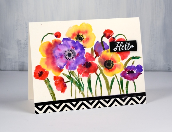
To create my bright and breezy flower panel I put the Penny Black ‘flower field’ stamp in my stamping platform and worked one colour at a time with zig clean color real brush pens. (I remember last time I posted about these pens I hinted that I might just need a few more colours. When I was in Toronto a couple of weeks back I picked up a few more.) I coloured directly onto the flowers with the pens and was able to add colour over colour as the brush tips are easy to clean off by drawing on a piece of scrap paper. I did spritz the stamp a little before stamping on the hot pressed watercolour paper so the images would be soft and blended. I added some black to the centres while the panel was still damp but dried it before adding fine details with a pigma micron pen.
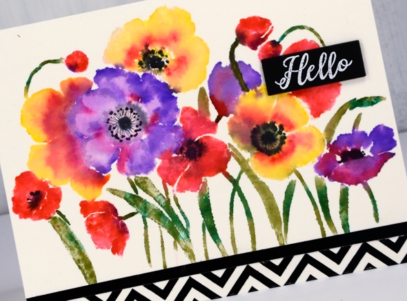
My little sentiment strip is embossed white on black to tie in with the zigs & zags.
Thank you for dropping in.
Supplies
Stamps: flower field 40-594, radiant 30-481


Stencil: zigs & zags (PB)

Ink: versamark

Markers: kuretake zig clean color real brush pens (violet, pink, olive green, carmine red, green, yellow, black), black pigma micron .01


Paper: hot pressed watercolour, natural white, black


Also: transfer gel, black foil, white opaque embossing powder
![]()

Tools: minc, stamping platform

Radiant blooms
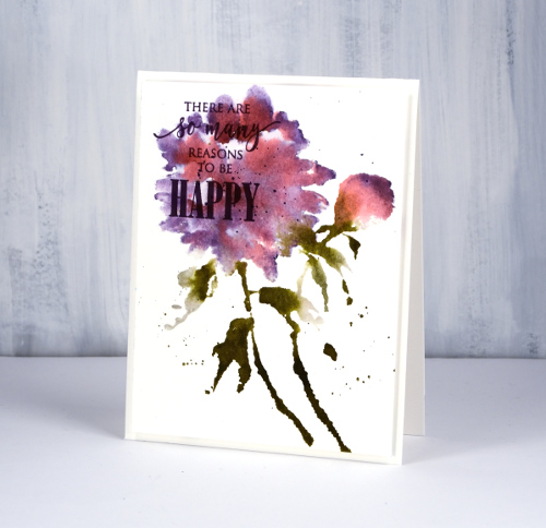
Posted: April 30, 2018 Filed under: Peerless watercolours, radiant | Tags: Faber-Castell Polychromos Colour Pencil, Peerless Transparent Watercolors, Penny Black creative dies, Penny Black stamps, Tsukineko Versafine inks 12 Comments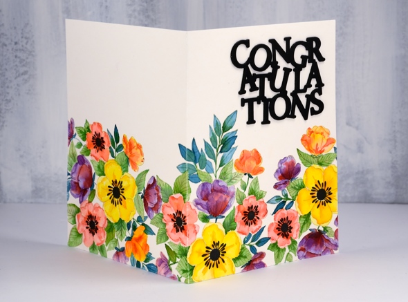
I am sharing floral cards this week here and on the Penny Black blog. This particular one makes me happy. It took me an age to complete but I think it’s bright and sunny. I’ve been wanting to create a card where the design continues across the back and front; my next challenge is one where the design covers back, front and inside!
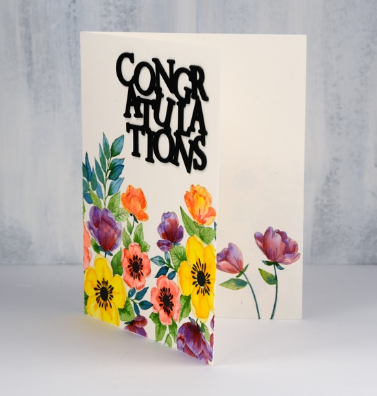
I used the large floral stamp from the transparent set ‘radiant’; it’s part of the new Nature’s Art release from Penny Black. I used my stamping platform and antique linen ink to stamp three prints across the panel. I wanted them to fit nicely together but not look like a repeat pattern so I changed the direction each time. If I had been really diligent I would have masked the first before I stamped the next but I just let them overlap a little. When it came to adding colour I decided which petals or leaves would be in front and painted accordingly. You can’t tell now can you?
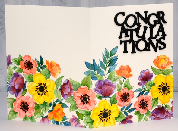
I used quite a few colours but I mixed and matched a bit. Basically I chose a yellow and orange for the large flowers, a peach and a pink for the medium flowers then did some smaller flowers with the orange and the pink (not new colours) I added a purple to the mix but shaded with the pink used earlier. On each flower I painted the lighter colour first then dropped in some of the darker one where I wanted shadow. I painted half the leaves with green and the other half with blue green then added shading to all with a darker green. When the same colour pops up in a few different mixes on your design it keeps things cohesive and visually appealing. Once all the painting was completed I used coloured pencils here and there to darken shadows and add more definition
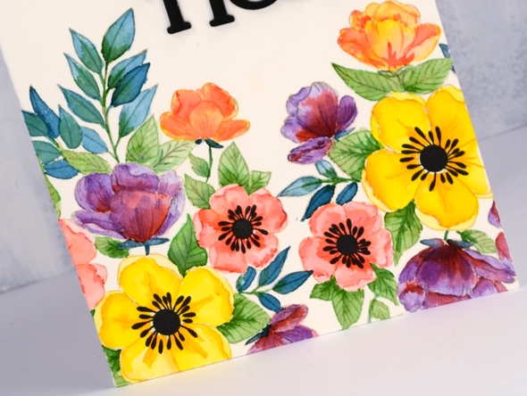
The set includes solid centres in two sizes for the flowers so I stamped them in black and created my die cut stacked sentiment in black also. And I almost forgot to mention I stamped and painted a couple of flowers inside too.
I’ll be back with more bright and breezy florals tomorrow.
Supplies
Stamps: radiant 30-481 (PB)
Die: congratulation 51-439 (PB)

Inks: antique linen distress ink, nocturne versafine clair

Paint: Peerless watercolours

Paper: hot pressed watercolour, neenah black
Pencils: Faber-Castell polychromos pencils
More shimmery leaves
Posted: April 27, 2018 Filed under: fine leaves, Shimmerz | Tags: Darkroom Door stamps, Faber-Castell Polychromos Colour Pencil, Shimmerz 10 Comments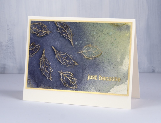
I have a couple more shimmery leafy cards to share today. I created these with leaf stamps from Darkroom Door and Shimmerz spray paints. The panel started out as a square that I intended to turn into a large square card but when it was complete I decided to slice it up!
![]()
I began by stamping the two smallest leaf stamps from the Darkroom Door ‘fine leaves’ set in gold ink on hot pressed watercolour paper. I stamped in gold so I could see where I had stamped, versamark makes it tricky to do that. After I had filled three quarters of the panel I embossed with gold powder and started spritzing the panel with heliotrope shimmerz spritz spray. Can I point out right how that heliotrope’s full name is ‘Walking a Tight Heliotrope’ Shimmerz Spritz Spray! I also spritzed with Bamboo Leaf shimmerz spritz spray and let them blend and pretty much flood the panel. I dried it before adding more spray a couple of times then splattered some droplets over the dried panel.
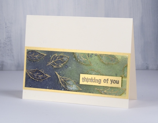
I wanted the leaves to stand out just a tiny bit more so I used a dark blue and an olive green pencil to shade around each leaf so they appear to be lifting slightly off the paper. Once I’d decided to create two cards I matted both panels in gold shimmer cardstock and added embossed sentiments.
![]()
The chipped sapphire ink was exactly what I needed for the little sentiment above so I stamped in versamark first then over the top with chipped sapphire which made it possible to emboss in clear powder and get a blue sentiment.
![]()
Supplies
Stamps: fine leaves (DD), all occasions (DD)


Ink: versamark, chipped sapphire, encore gold
Shimmerz Sprays: Walkin’ on a tight Heliotrope, Bamboo Leaf
![]()
![]()
Paper: hot pressed watercolour paper, neenah natural white, gold shimmer cardstock
Also: WOW gold metallic rich embossing powder, Faber Castell polychromos pencils

Shimmery leaves
Posted: April 25, 2018 Filed under: fine leaves, Shimmerz | Tags: Darkroom Door stamps, Shimmerz 8 Comments![]()
It’s all about experimentation on the blog today. I have some new inky products and some freshly cut stamps. The Foiled Fox team was kind enough to send me some Shimmerz sprays to play with so I teamed them up with the emboss resist techniques and the fine leaves stamps from Darkroom Door.
![]()
To make the panel above I embossed the leaves in gunmetal embossing powder; it’s a new one from Ranger which is not as shiny as silver but shinier that just grey. I like it. I sprayed some shimmerz sprays on my craft mat and swiped the embossed panel through it to pick up colour. I dried it then repeated with a couple of different colours which built up some variety and depth around the leaves. I wanted the leaves to be more prominent so I picked up shimmerz blue and yellow with a paint brush and painted inside some of the leaves. The spritzed background was also done with shimmerz, just heliotrope and blue.
![]()
I found a scrap of light blue cardstock to mat the panel then added all the layers to a natural white card base.
The sprays are quite strongly pigmented but the colours dry with a softness to them. As I was creating these panels I was wiping excess spray onto a couple of journal pages to build up some background colour. I’m excited to try a few more colours and techniques.
![]()
My second panel was completed in a similar way but I added way more shimmerz spray both by swiping off my craft mat and spraying directly on the embossed panel. The leaves and sentiment are embossed with white powder this time.
![]()
It’s a shame you can’t see how pretty the shimmer is on the painted panel and also the gold shimmer cardstock I used to mat it. I love the way embossing catches colour in confined spaces making that one central leaf a mix of dark blue, light blue, yellow and green
![]()
As you can probably imagine I did more experimenting, so I’ll be back with a few more ideas later in the week.
Supplies
Stamps: fine leaves (DD), all occasions (DD)
Ink: versamark
Shimmerz Sprays: Jen B Blue, Eggnoggin’, Walkin’ on a tight Heliotrope
![]()
![]()
![]()
Paper: hot pressed watercolour paper, neenah natural white, gold shimmer cardstock, blue cardstock
Also: WOW opaque white embossing powder, Ranger gunmetal embossing powder

Bold & Beautiful Butterflies
Posted: April 23, 2018 Filed under: Butterflies | Tags: Brusho, Darkroom Door stamps, Kuretake Zig clean color real brush markers, WOW embossing powders 7 Comments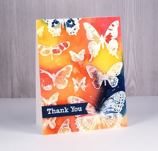
I have ‘Butterflies – Two Ways’ to serve up to you today. The butterflies in the both cards are from the Darkroom Door set, ‘Butterflies’. As the stamps from Darkroom Door arrive uncut I decided to stamp the whole sheet of butterflies a few times before I cut it into thirteen separate butterflies. I stamped it in versamark then embossed in clear powder on watercolour paper to make this card.
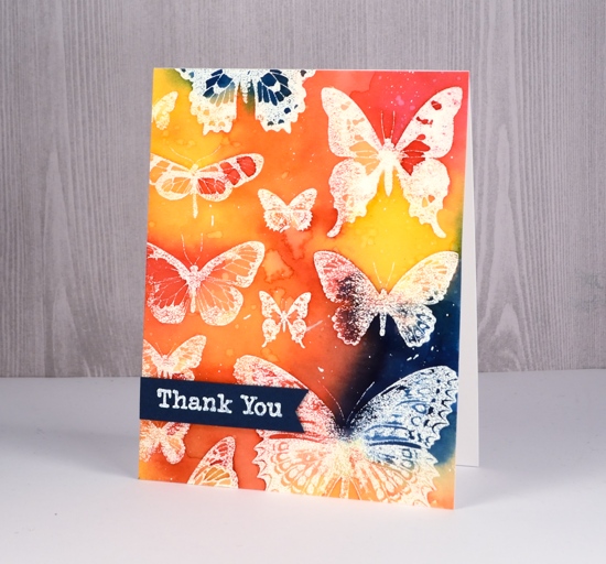
All the colour for this emboss resist design is from my beloved brusho paints. I mixed them in a palette rather than sprinkle and spritz and built up the colour with several layers. Working with prussian blue, yellow, rose red and orange brusho I was able to create some bold contrasts between the primary colours as well as with the white embossing. After completing the painting I dropped some water over the panel, let it sit then dabbed it up with a paper towel. The result is pale odd shaped watermarks. I also splattered some white gesso over the panel to break up the background colour a bit.
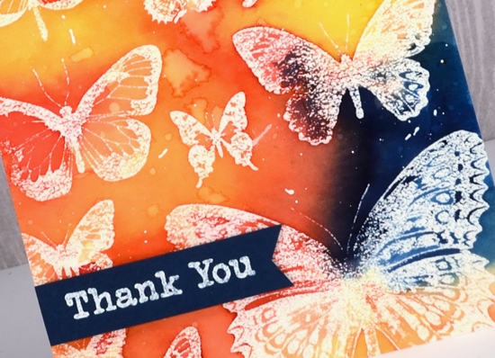
To finish the card I popped up a blue banner with a white embossed sentiment from the ‘Thank You’ set.
Then I went all minimal for my second card made once the set was cut into individual stamps. I have seen similar paintings and cards all over pinterest featuring three watercolour butterflies in a vertical arrangement. I decided to use zig clean color real brush pens to create the watercolour effect. The pens are pretty juicy so I had no trouble applying enough colour to blend nicely on the stamps and panel.
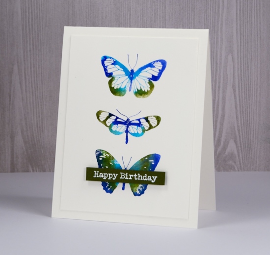
I limited my choice to light green, cobalt blue, blue and olive green, however as I write this post and look at the finished card I wonder if I actually used the light green. If I did I think it got overwhelmed by the darker colours. I applied the ink directly to the stamps, spritzed and stamped. That is it. I wanted the blending to occur on the stamp rather than spritzing the watercolour panel after stamping so the butterflies would keep their clean edges. I debated blending inside the butterflies but the white space in the wings looked pretty so I told myself I don’t need to blend everything.
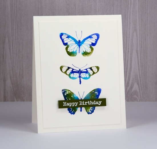
I trimmed the panel so it was ¼” smaller than the card base and once again added an embossed sentiment on a popped up banner.
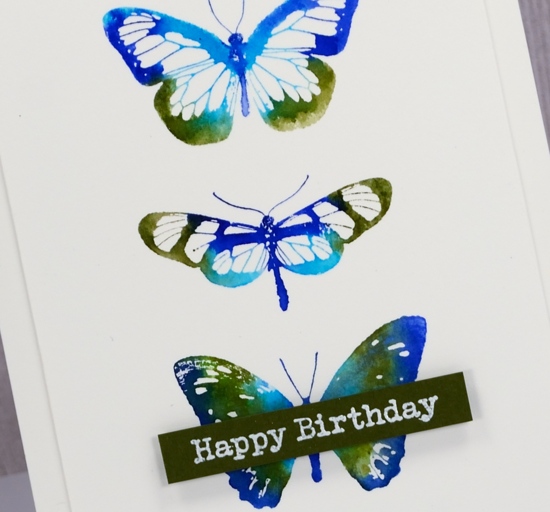
Which do you prefer, colour & paint everywhere or a simple neat little butterfly trio?
Supplies
Stamps: Butterflies


Ink: versamark
Paint: brusho prussian blue, yellow, rose red, orange (bold card)

Markers: light green, cobalt blue, blue, olive green Kuretake Zig clean color real brush markers (CAS card)
Paper: hot pressed watercolour paper, dark blue cardstock, green cardstock
Also: white ep, dimensional tape, MISTI

fantastic
Posted: April 20, 2018 Filed under: Alcohol Ink, curved stitch | Tags: Foiling, Minc, Penny Black creative dies, Ranger Alcohol Ink 7 Comments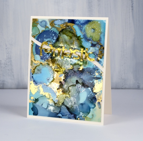
Not long ago I learnt from a couple of friends that foil will stick to some alcohol inks. I posted a card at that time and continued to experiment with foil and alcohol ink panels. If the alcohol ink sitting on the yupo paper is a little sticky the foil will stick more readily than if the inks are long dried. I ran today’s panel through my minc not long after I’d created it and a lot of gold foil stuck. Foil doesn’t stick to all colours of alcohol ink and I’m sorry to say I have not done exhaustive testing to know which ones work. I just layer on some foil, run it through the minc and see what I get!
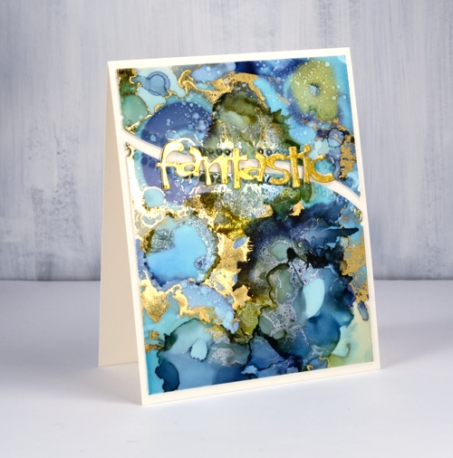
I was pretty happy with what I got this time there were some really pretty gold highlights, but a few more than I wanted. I decided to see whether I could add alcohol ink over the top of the foiling just to tone some of the gold down a little. I was pleasantly surprised to see the gold foil change to a dull silver when it came in contact with the ink. It is definitely hard to photograph the results but my blue and green panel has gold highlights as well as subtler silver patterns.
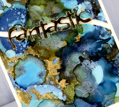
To turn my panel into a card I backed the yupo with white cardstock then cut it in two using the curved stitch die from Penny Black. I stacked some gold die-cuts to make the word ‘fantastic’ look a little more fantastic and added it all to a natural card base. I think this one might turn up as a graduation card this June.
Supplies
Dies: curved stitch, fantastic


Inks: ranger alcohol inks aqua, willow, denim


Paper: yupo, neenah solar white, neenah natural white, gold foil


Also: gold foil, minc, rubbing alcohol

Roses in bloom
Posted: April 18, 2018 Filed under: Brusho, Roses all over | Tags: Brusho, My Favorite Things, Penny Black creative dies, Penny Black stamps 8 Comments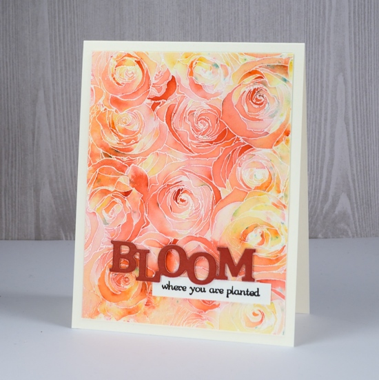
The first card I made using this lovely rose stamp from My Favorite Things featured bister powder; this one was done with a couple of brusho colours. I used the same technique for both and have been asked several times about the amount of powder and the amount of water. I hope to do a video soon showing my method with paint powders.
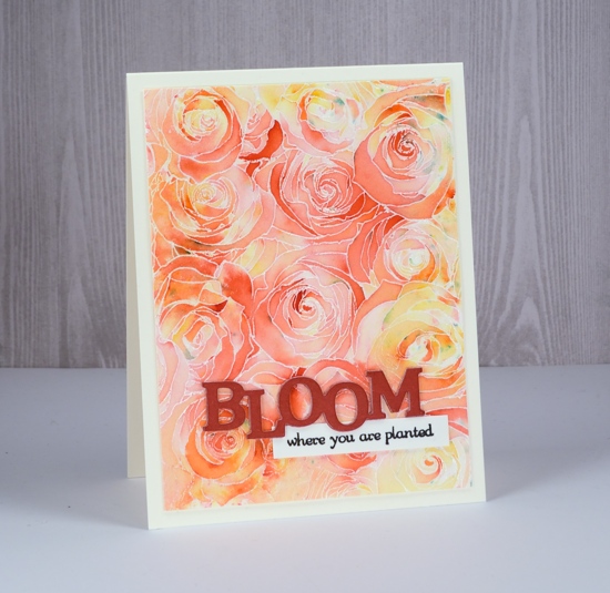
I used two colours on this panel, a red and a yellow. You can see there are some specs of blue also, I think they were on the surrounding scrap paper and just transferred to my panel. I embossed the roses all over stamp with clear powder on hot pressed watercolour paper then sprinkled red brusho in the centre and yellow brusho on the edge of the panel. I spritzed with water then tilted the panel to activate the powder. Where there was too much water or colour I used either a paper towel or a ‘thirsty brush’ to sop it up. (A thirsty brush is a paintbrush dipped in water then squeezed or dabbed dry so that it can absorb water or paint from the painting.)
I cut three layers of the rusty red cardstock with the ‘bloom magical’ die and stacked them. The sentiment from the PB ‘friendship flowers’ set works perfectly with the die so I stamped in black and slipped it under the stacked die cut.
Have a wonderful day.
Supplies
Stamps: roses all over (MFT) friendship flowers 30-223 (PB)


Dies: bloom magical 51-420(PB)

Paper: hot pressed watercolour paper, neenah natural white, red cardstock
Ink: versamark, versafine onyx black


Paint: brusho
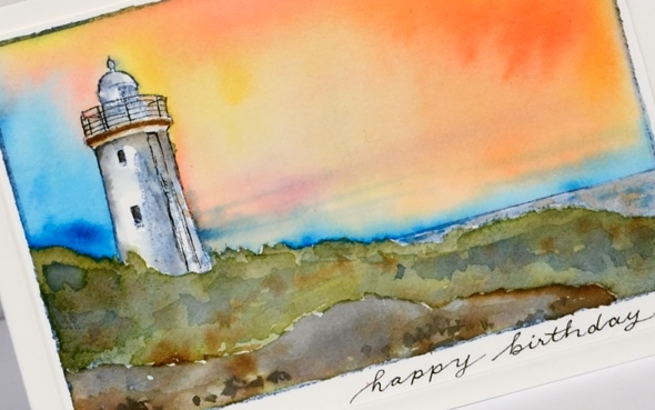
Norah Head lighthouse
Posted: April 16, 2018 Filed under: lighthouse | Tags: Darkroom Door stamps, Ranger Distress inks, Ranger Distress stains 19 Comments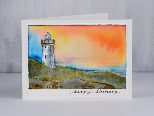
Today’s card has been sent to my dad for his birthday but considering the time it takes for mail to get from Canada to Australia these days and my own postal disorder it did not arrive in time. He is currently visiting my brother so this post provides a sneak peak before the real thing arrives in his mail box. Happy Birthday, Dad! I chose this stamp from Darkroom Door for several reasons. When I first visited Darkroom Door in 2016 I enjoyed visiting and talking with the owners Rachel and Stewart. When my dad returned to pick me up he walked in, looked at all the DD stamps displayed and was drawn to two stamps in particular; this was one of them. During the same 2016 trip Dad and I went to the Norah Head lighthouse, featured on this stamp and not too far from my parents’ home. We went for a quick look and discovered there was a guided tour about to start so we joined in. We heard the history of the light and enjoyed the views from several vantage points.

To paint this scene I stamped the scene in distress inks, the top border, sea and light in stormy sky, the land around the light in forest moss and the foreground rocks in black. I then used stains to paint the scene; I’ve listed them below. After painting I used a fine tip micron pen to re-draw the railing and details on the light then wrote a sentiment.
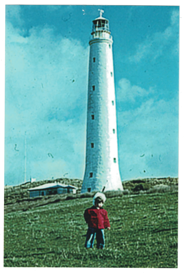
My father has been interested in lighthouses for years and has visited many around the world. I have a connection to one from very early in my life. I was born on King Island in Bass Strait, off the coast of Tasmania and home of the tall Cape Wickham lighthouse. Although I don’t remember the occasion I have a photograph Dad took of me in front of the light.
Supplies
Stamp: lighthouse (DD)

Inks: stormy sky, forest moss, black soot distress inks & markers


Stains: worn lipstick, mustard seed, salty ocean, forest moss, black soot, stormy sky, vintage photo distress


Paper: hot pressed watercolour paper
Tools: stamping platform
Also: micron pen .01
Becoming
Posted: April 12, 2018 Filed under: becoming | Tags: Penny Black stamps, Ranger Distress stains, Tsukineko Versafine inks 5 Comments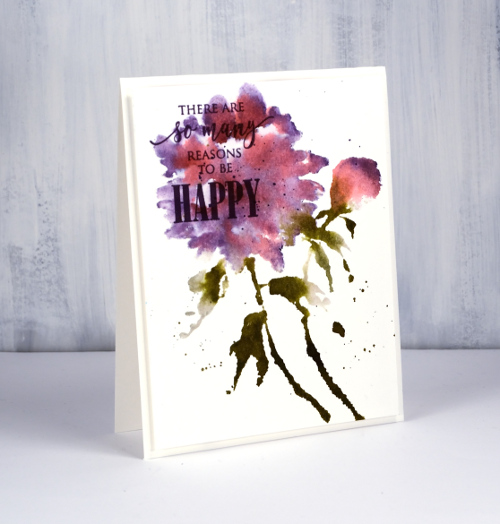
I am sharing this card on the Foiled Fox blog today, a great place to visit if you are looking for some inspiring content or some lovely products (in their online store). I am grateful to The Foiled Fox for supporting my creative work in a variety of ways and I want to let you know my blog includes affiliate links to their online store which give me a small commission.
Yet again I used my distress stains to work with a Penny Black floral stamp. You may have heard the distress stain daubers are being discontinued but the spray stains are not so I intend to refill my daubers from my spray stains; the stain is the same in both bottles. If you don’t want to get messy and do refills you can just paint stain onto your stamp with a brush or use an ink pad and spritz your stamp for a looser, more watery look.
I started in my stamping platform by inking the flower and bud with worn lipstick stain. I stamped then cleaned the stamp so I would not contaminate the dauber of the dusty concord distress stain when I added that next. I kept the dusty concord mainly around the edges of the flower and tip of the bud but it blended into the flower a little which is what I was after.
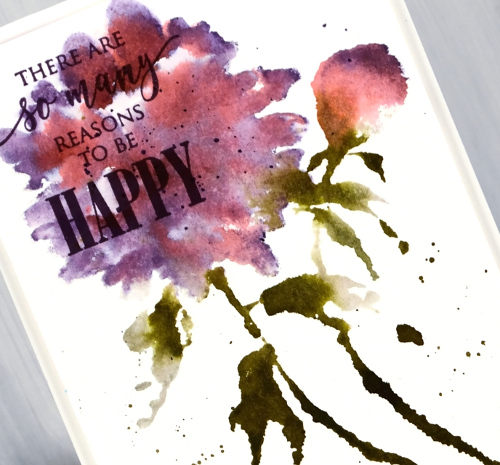
I added a sentiment in versafine clair monarch ink then popped up the whole panel on white foam before adding it to card base.
Supplies
Stamps: PB Becoming, Just Believe


Distress stains: pumice stone, forest moss, worn lipstick, dusty concord


Ink: versafine clair monarch
Paper:
Also: white foam


